The default WooCommerce product pages are good looking and functional but nothing special to look at. As one of the most important pages in any WooCommerce store, the product page has an incredibly important role to play. Yet the default page doesn’t really deliver.
That’s why customizing product pages is so important.
Customizing the product page creates a unique shopping experience for your customers and goes a long way to making your store stand out from the thousands of others competing for the same audience.
This is essential if you want your online store to survive and thrive!
This post will show you how to customize the product page using the Elementor WooCommerce Builder plugin. Customizing the page visually is paramount to maintaining the same style throughout your WooCommerce store.
Elementor is easy to use. All you need to do is to visually drag and drop different elements of the product page, customizing the design according to your specifications.
Elementor Pro gives you full control to customize the Astra theme’s single product page, as this theme was designed to integrate seamlessly with Elementor.
What Do You Need to Customize the WooCommerce Product Page?
What Do You Need to Customize a WooCommerce Product Page?
For this tutorial, you should have a working WordPress installation and WooCommerce added on top of that.
You also need the Astra theme and the Astra Pro addon. Astra Pro is an addon plugin to the super-lightweight Astra theme. It gives you complete control over the website. You can customize the layouts, color, typography and a whole lot more.
Install and activate WooCommerce and the Astra Pro addon.
In this post, you will see how you can customize a single WooCommerce product page layout with Astra Pro.
We will customize every element using drag-and-drop tools and without having to code.
How to Customize WooCommerce Product Page
Here are the steps you need to follow when customizing the single product page in WooCommerce.
Step 1: Activate Astra Pro Modules
Once you install the Astra Pro addon and activate it using a license key, you will be able to unlock all of its modules.
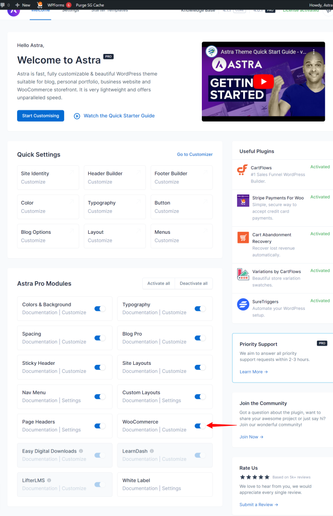
While you can decide whether you want to activate all of them or not, the important one is the WooCommerce module.
- Go to Appearance > Astra Options
- Click on the Activate All button to activate all modules
- If you just want to activate the WooCommerce module, click on the link to its right.
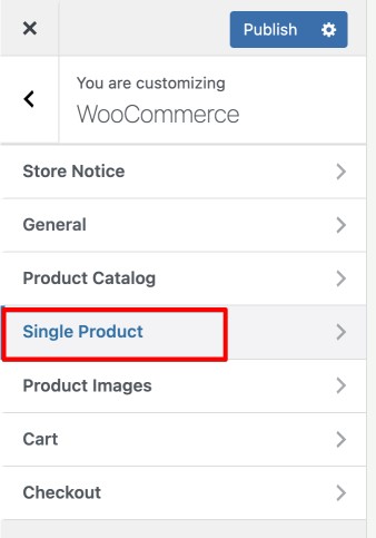
- To start customizing, go to Appearance> Customize > WooCommerce
Here you’ll find all the settings related to your eCommerce store.
- Since we are customizing a product page, select the Single Product option.
Step 2: Customize Image Dimension
Let’s start customizing the images. In an eCommerce store, images play a vital role in conversion.
So it is essential to arrange the images so that your product is clearly visible and all the used cases are clearly depicted.
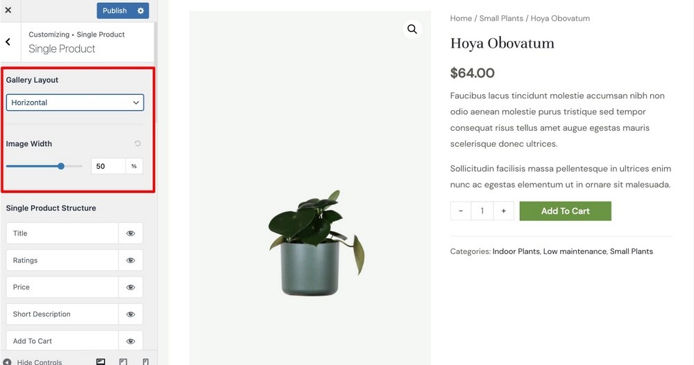
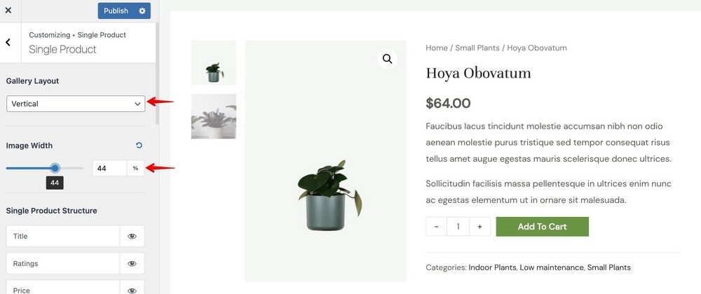
As soon as you enter the Single Product customizer, you will see the setting to edit the Gallery Layout and Image Width.
If a vertical gallery looks better than a horizontal one, you can keep the setting as such. The image width section is pretty straightforward. You basically control the portion screen the image covers.
You can play around with the settings to find the sweet spot and see the front-end changes in the Live Preview.
Step 3: Customize Product Structure
In this section, you can control the content of the product you display. You can arrange where you want to add your title, ratings, price, short description, add to cart, and product metadata.
You can click on the ‘eye’ icon to enable or disable a particular element.
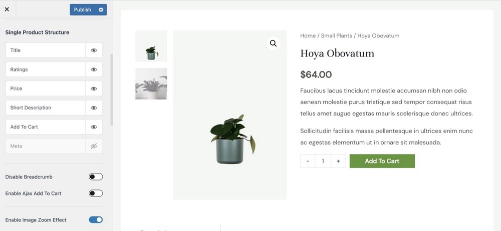
You can also enable or disable the breadcrumbs ( the product path above the title) and enable Ajax Add to Cart functionality.
Enabling this page will restrict the page from reloading when a customer adds a product to the cart.
The Image Zoom Effect zooms into the image when you hover your mouse over it,
In this case, let us make the following changes:
- Disable the metadata that displays the category of the product
- Disable the breadcrumbs. It looks cleaner that way.
- Enable Ajax Add to Cart
- Enable Image Zoom Effect
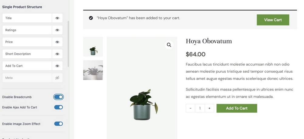
You can choose to play around and create your settings as you need.
Step 4: Customize Page Navigation and Product Tabs
If you have multiple products, you can have navigation arrows on the top right corner where customers can navigate between products.
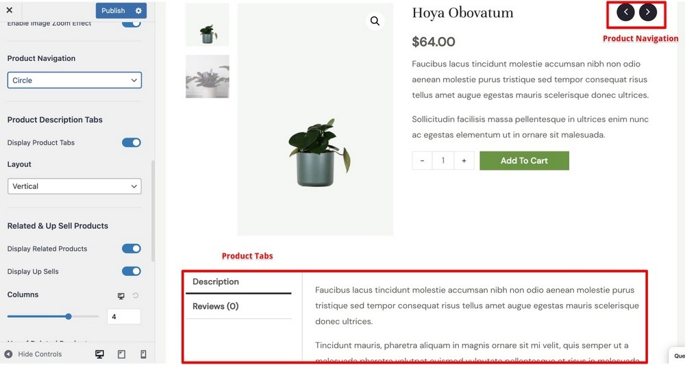
The Product tab contains the long form description, product reviews, and sometimes additional information about the product.
You can set the tab positioning to vertical or horizontal, whichever looks better to you.
Step 5: Upsells and Cross-sells
You can also add upsells and cross-sells to your product. You could name it Related Products.

You just need to use the toggle button next to Display Related Products and Display Up Sells options.
You can also customize the number of columns you want to display here.
Step 6: Customize Color and Typography
Finally, you can decide to customize the color and typography of the page. Though you can set global colors and typography, you can also change them in individual page types.
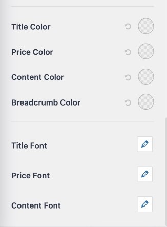
Just click on the icon next to the element color or typography you want and start designing.
Once you are happy with the outcome, click the Publish button to make the changes live.
How to Create a New WooCommerce Product Page With Elementor
We recommend adding a few related products to your site so that you can follow along.
It is also worth mentioning that if you don’t have WooCommerce installed and activated, you will not access Elementor’s product templates.
Here are the steps that you need to follow when customizing the single product page in WooCommerce:
1. Choose a Pre-Designed Product Page Template
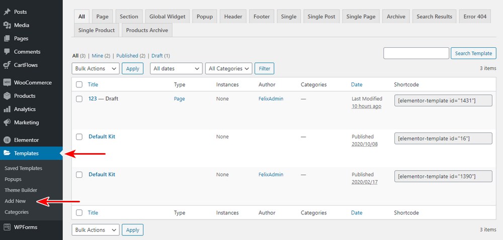
Under Templates > Theme Builder > Single Product > Add New, from the dropdown, choose Single Product, give it a name, and click Create Template.
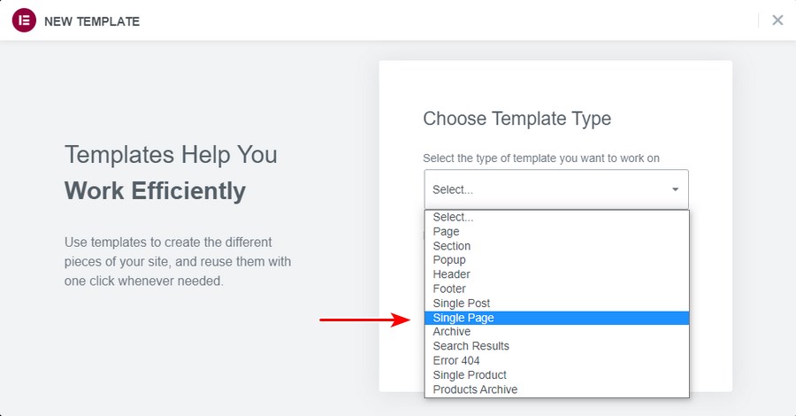
We highly recommend selecting one of the pre-designed product page templates and customizing it to fit your brand. Elementor Pro has several different styles that you can choose from.
You can also create a new template if you have the technical knowledge. Creating your template from scratch will take a lot of time but can be worth it if you have the skills.
Choose a Single Product Block and Insert, as shown below:
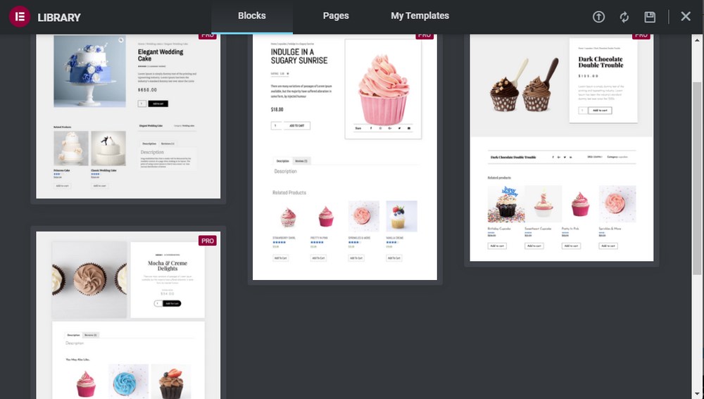
This will fetch the template so that you can add the new elements you need on the page.
The template you select will be added to the Elementor canvas. This will allow you to customize the template using the widgets on the left.
You can also customize the current widgets or remove the elements you don’t need. Elementor gives you full control on how you can customize the layout and style.
There is an array of elements on the left sidebar such as Product Images, Product Title, Product Price, and every piece of data that WooCommerce displays on the single product page.
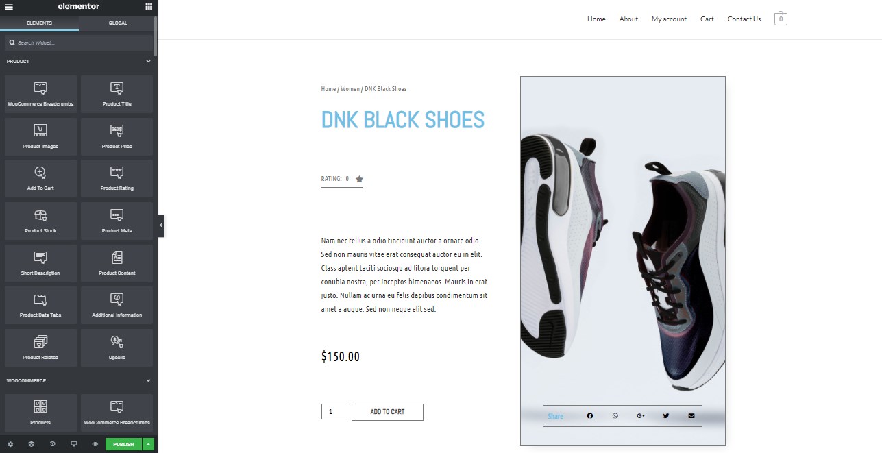
Before you can add widgets to customize this page, make sure you are working on a full-width product page.
Elementor allows you to drag the elements and place them at the exact spot where you need them.
2. Adding Colours That Match Your Brand
The single product page that you have selected looks nice, but it probably doesn’t match your brand perfectly.
One quick fix is to adjust the background colour, font colour, and various typography settings.
To adjust any element on the page, click on the pencil icon in the top right corner of the block:
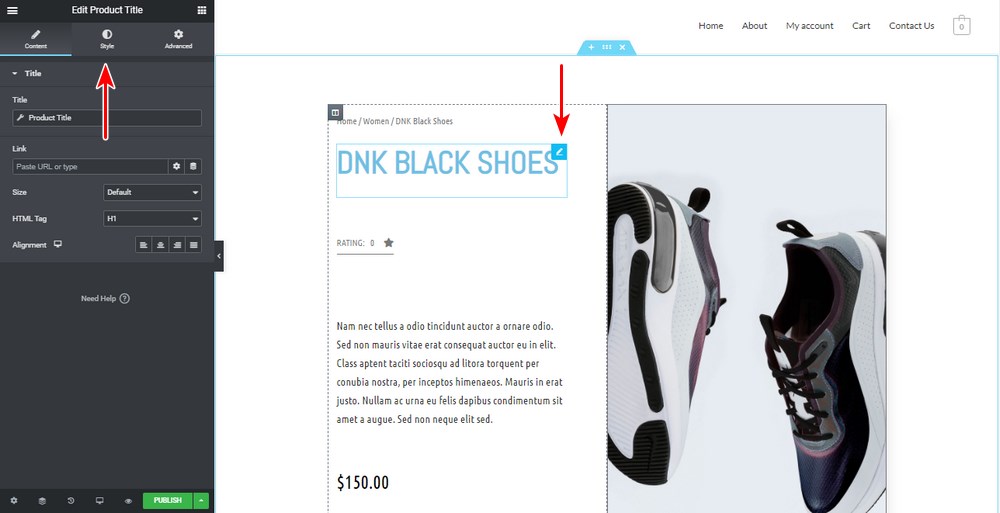
To perform any styling or visual customization, switch to the Style tab, as shown below:
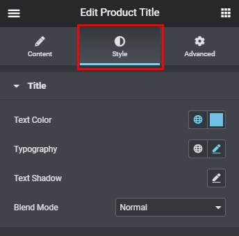
In the example above, you can change the text colour, typography, and shadows for the Product Title block.
Click on Typography. This will open another box with typography settings where you can change the font and other parameters, as shown below:
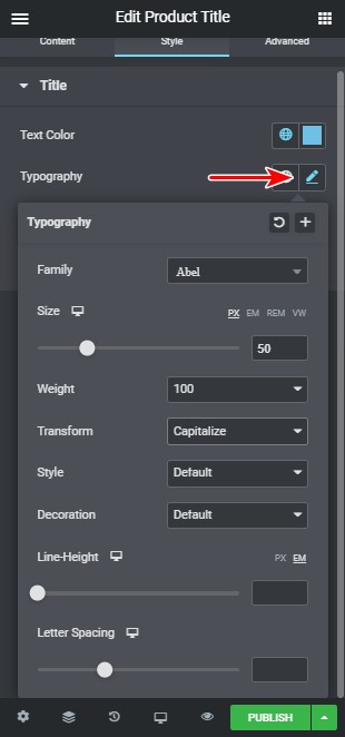
Proceed through all the sections and edit them until you achieve your desired result.
When it comes to the price block, please pay special attention to how it is displayed. This block needs to be clear so that customers can easily see it without any confusion.
3. Adding Product Widgets That Will Make up Your Page
If you want your customers to have a unique shopping experience on the single product page, make sure it contains some product widgets.
Elementor allows you to have full control of the look and feel of all the elements that make up the product page.
You’ll have many new widgets at your disposal including Product Title, Gallery, Images, Price, Rating, Short Description, Breadcrumbs, Data Tabs, Stock, Related, Upsell, Add to Cart, Meta, Content, and Additional Information.
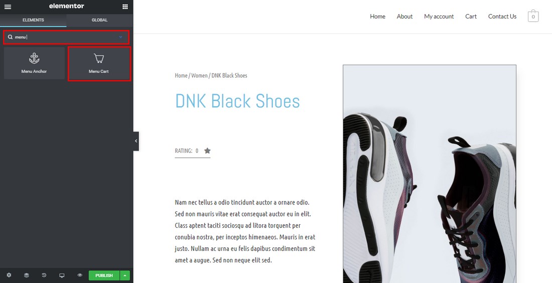
Another widget is the Menu Cart.
Here are the product widgets you can add to this page:
Menu Cart
The menu cart widget opens up the cart in a new window. You can use it to display the cart on any page:
WooCommerce Breadcrumbs
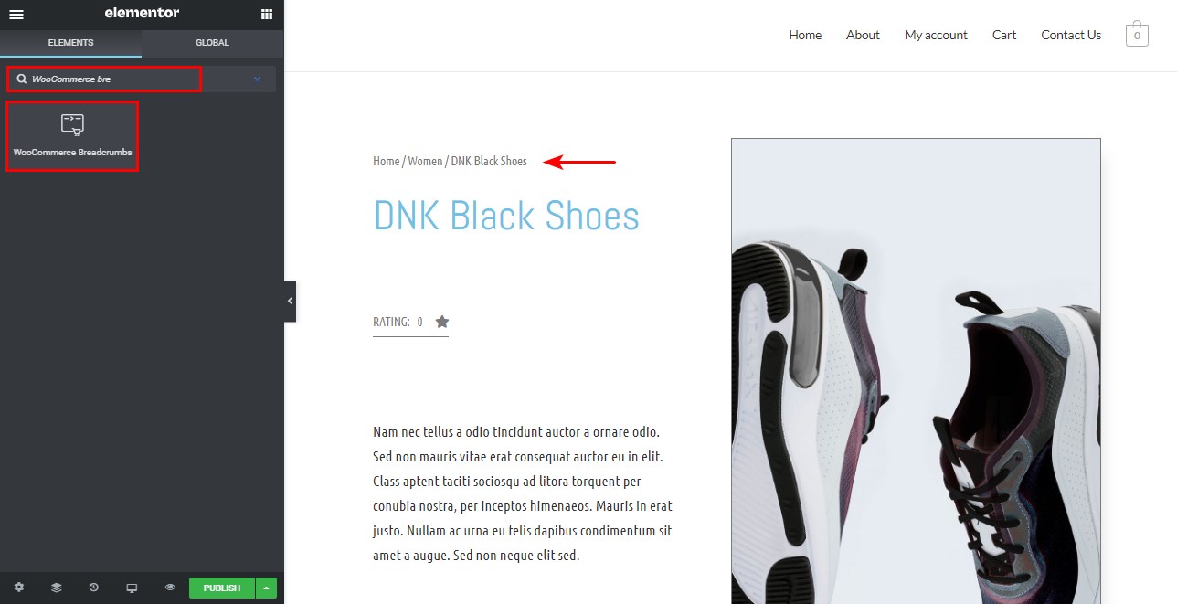
The WooCommerce breadcrumbs widget controls the layout and colour of the WooCommerce breadcrumbs on the page:
Product Title
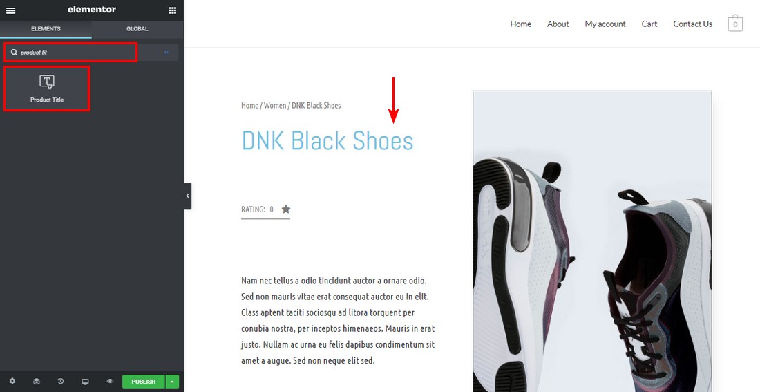
The product title widget controls the style and layout of the product title:
Product Price
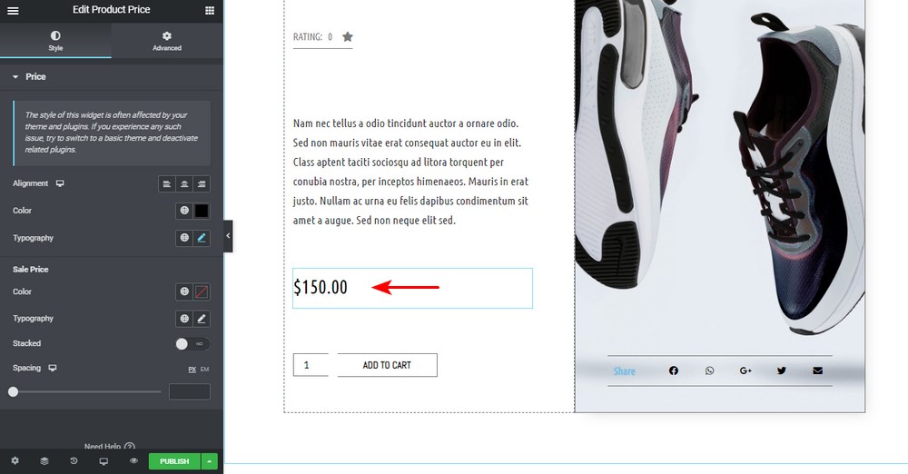
The product price widget allows you to set the product price position and style:
Product Rating
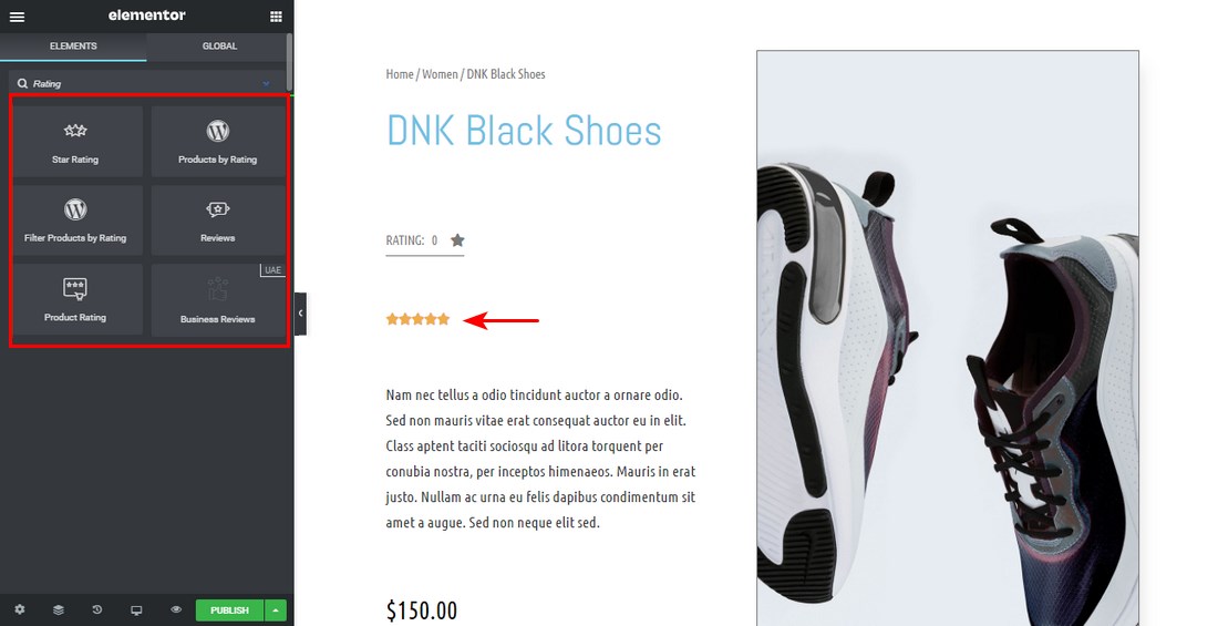
The product rating widget enables you to display the product rating. Displaying product ratings on your single product page encourages potential customers to buy your products. This means that you need first to have some ratings.
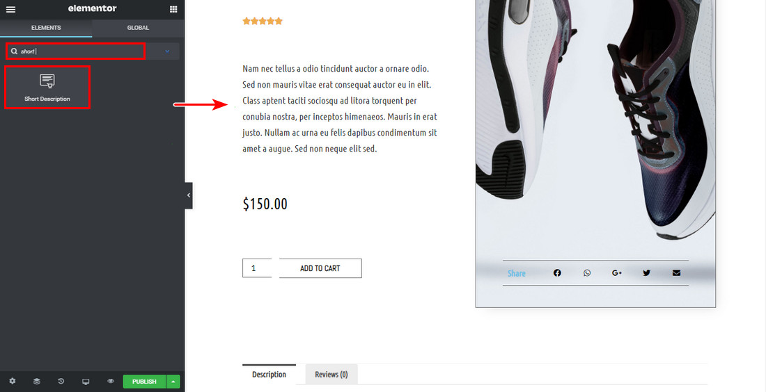
Short Description
The short description widget controls the short description layout and style. You can add a short description in one of the fields you fill when creating a new product.
We recommend displaying this widget near the top of the single product page:
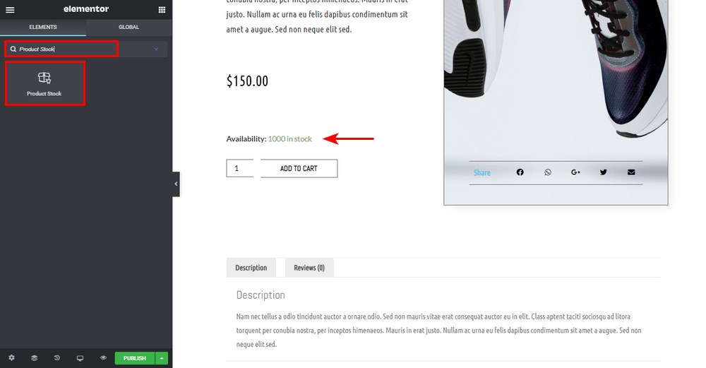
Product Stock
The product stock widget displays the remaining product stock. You can add the stock details on the product data section when creating the product:
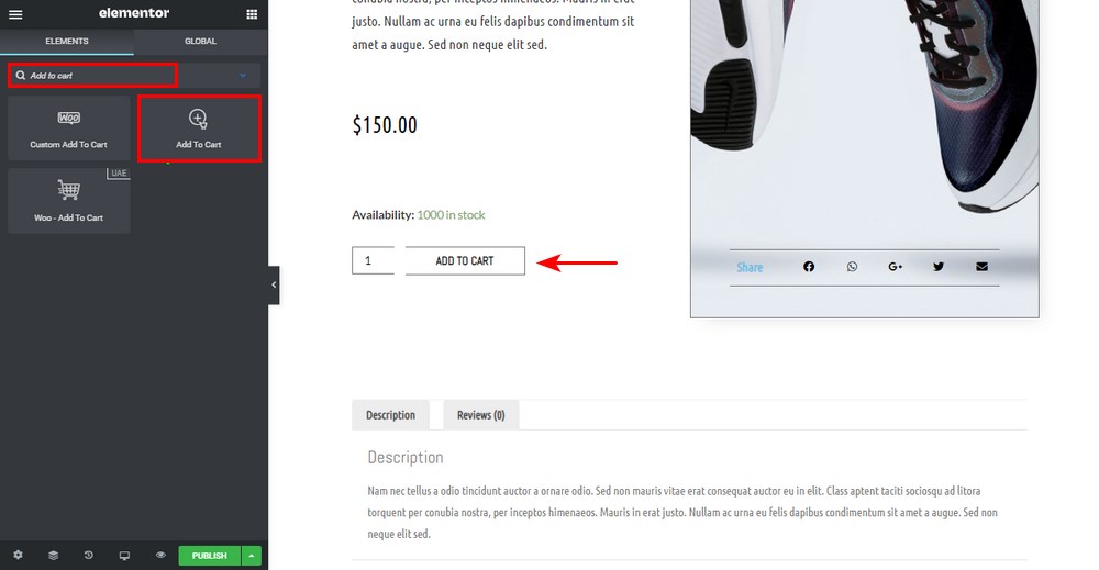
Add to Cart
The Add to Cart widget controls the layout and style of the add to cart button. This is one of the most important calls to action on any product page. It allows users to add products into the cart and later on proceed to the checkout page:
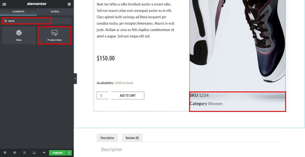
Meta Data
The meta widget sets the distance between the text. You can display it either stacked or inline.
You can also control the style of your metadata:
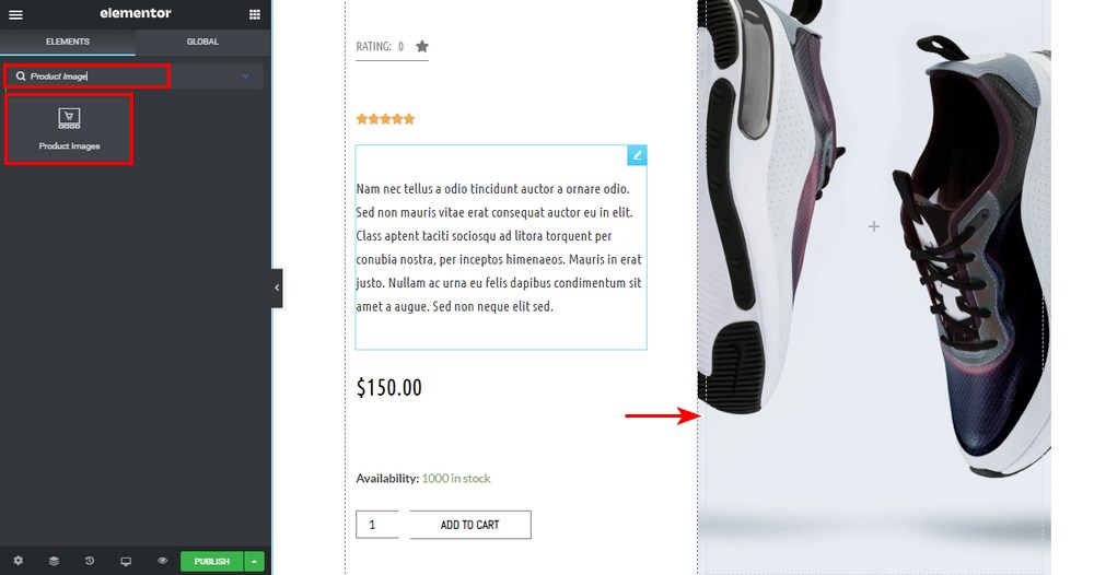
Product Image
The product image widget is used to set the image or gallery you want to display:
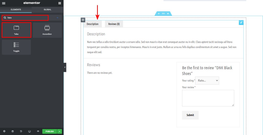
Product Tabs (Additional Information, Reviews)
The product tabs widget houses the main information of the product.
We highly recommend that you make sure the product tabs are in a visible spot so that users can learn about the product:
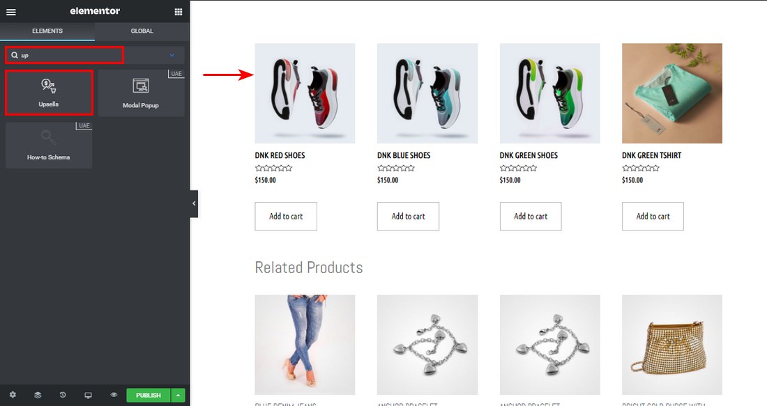
Upsell
The upsell widget allows you to set your style to the upsell products. You can name it ‘Products you may like’ or something similar.
You can use this section to add products that are typically purchased together:
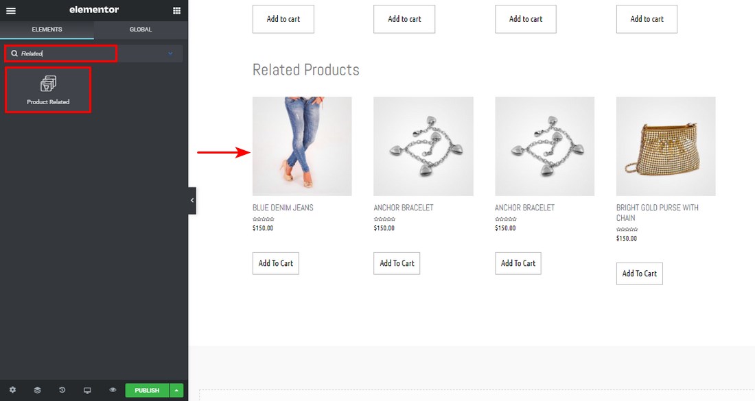
Related Products
The related products widget allows you to set your style to the related products.
This widget uses the WooCommerce related products function to link products with the same category and tag.
4. Tweaking the Mobile and Tablet Views
Many people access the web from their smartphones than from laptops and desktop computers. This means that your store must be optimized for mobile viewing, or else your sales could be negatively affected.
WooCommerce is mobile-optimized out of the box. Since we are creating a custom product template, we need to ensure that the new product page template looks the best it can be.
To see how the page looks on mobile devices, you can click the button labeled Responsive Mode in the bottom left corner of the Elementor interface
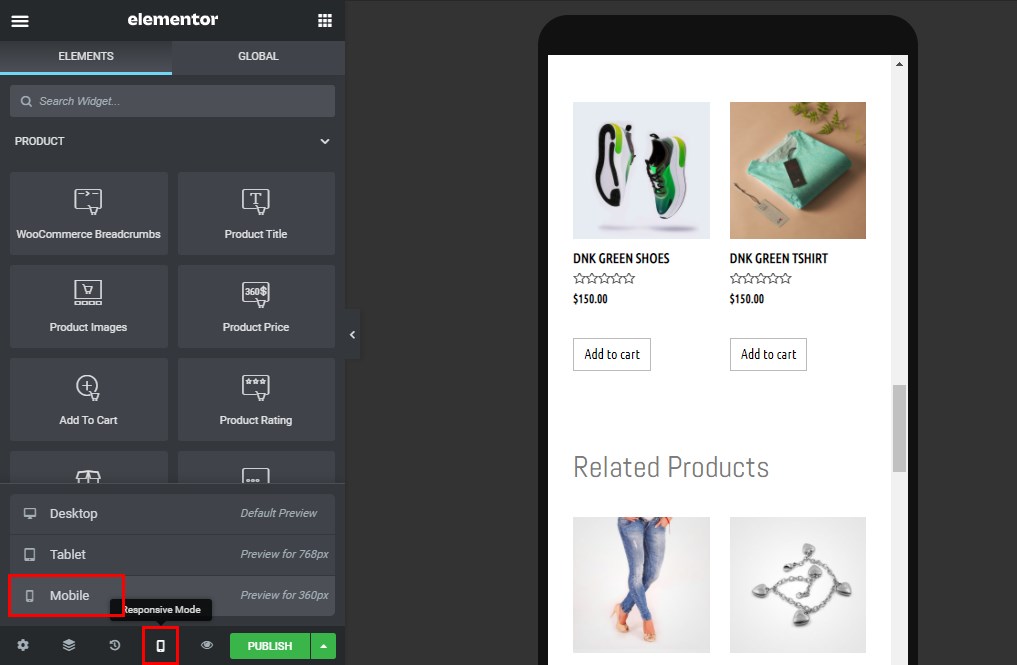
Clicking this button will allow you to switch between the Desktop, Tablet, and Mobile views. You can tweak the design of each view as desired.
You can also change your blocks’ display settings so that they can be displayed well on mobile or tablet views.
For example, if you want to increase the price block’s font size on mobile view, click on the pencil icon in the price element. Click to edit the typography and switch to Mobile. Set the desired font size.
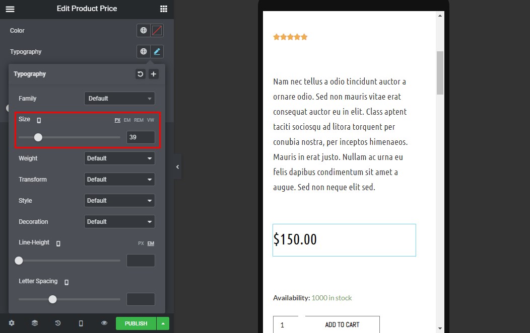
If you change the font size here, only the mobile view will be affected.
We recommend going through all the elements until the whole page is configured for mobile and tablet viewers.
5. Preview the New Product Page
To make sure the template has the desired style, we recommend that you preview it with other products.
To preview the new product page, click the eye icon on the bottom left panel, then settings.
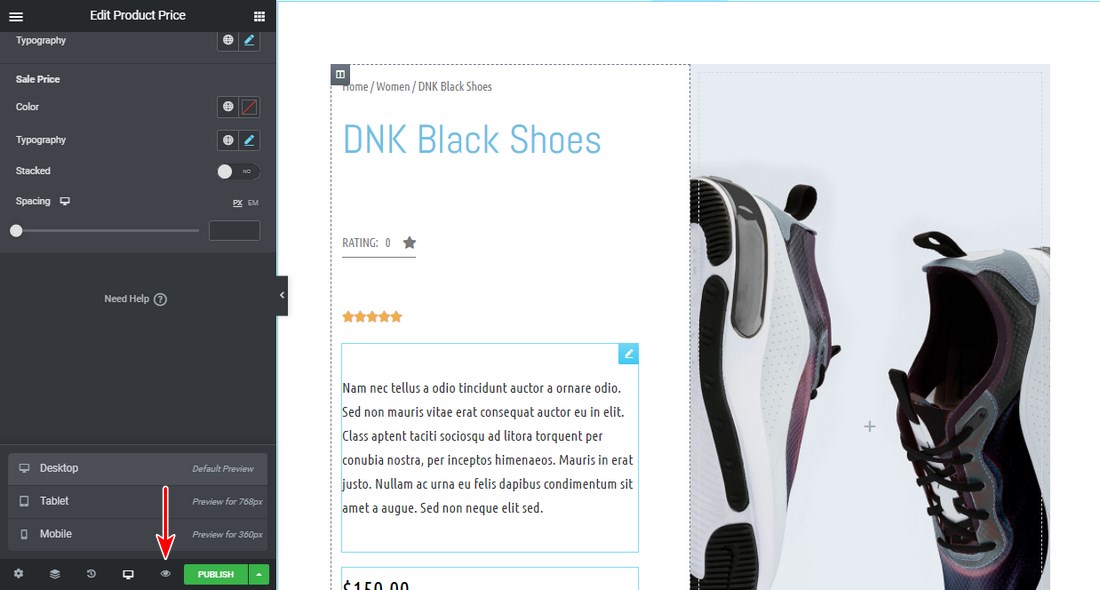
Choose the product you want to display under the preview settings.
Apply and review to see how the product will be displayed.
6. Publish the Custom WooCommerce Product Page
If you are satisfied with how all the elements are displayed, click on the Publish button in the bottom left corner of the Elementor interface.
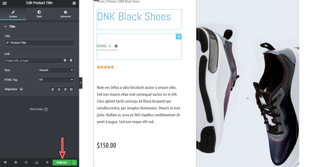
After that, a new window will appear, asking you to add a condition when this template should be used.
7. Set the Conditions
By default, the template we have created will affect all the product pages on your WooCommerce store. When setting the conditions, you can select a specific product category.
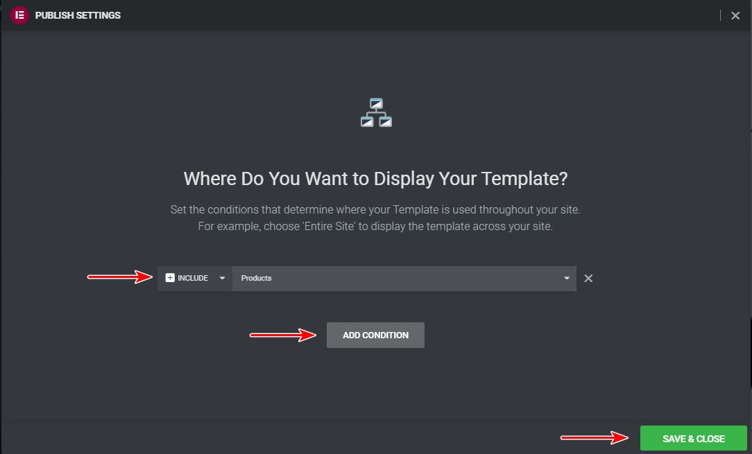
Click on Save & Close, and all the conditions you add will be set.
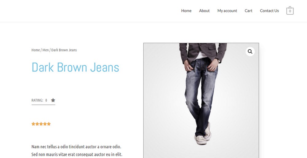
This action will save and replace the default product page. You can visit any product page to see how it is displayed on the front end.
Related: How to Create a Single Product WooCommerce Website
Features to Add in WooCommerce Product Page to Optimize Your Conversion Rate
In this section, we’ll discuss features that you can add to your WooCommerce single product page to boost conversion rates
1. Smart Product Page Filtering
Including a product-filtering feature in your WooCommerce store helps you to optimize the page experience. It also makes it easier for customers to get their desired product.
WooCommerce products, by default, are sorted in reverse chronological order. This means that the first product you add will be added at the bottom. The recently added products will be displayed at the top.
When a customer visits an online store, they often filter products based on:
- Product pricing
- Best-selling product
- Recently added product
- Product rating and reviews
If you want to optimize your store, you can use a product filter or shorting plugins. These plugins allow you to add different shorting options depending on what you need.
Your customers can sort products by using:
- Pricing (ascending order)
- Pricing (descending order)
- Rating
- Popularity
You can add more depending on your requirements.
2. Information Hierarchy
Arranging various product information in a hierarchical order makes it easy for your customers to know more about your product, as well as the services offered.
Adding the product details helps customers to know more about the product. It also encourages them to take action on your product page.
For example, if your store is operating in different countries, you need to have a selling policy that all customers must comply with depending on their country’s regulations.
Adding this information on the single product page will help to build customer trust.
3. Improve Your Product Images
Your product may be good, but your sales are likely to flatline if the product images don’t showcase the product at their best. It is important to have clear product images, which will be able to sell your product.
Anyone visiting your store wants to see product-focused, high quality images with a clear background. You can also add contextual images that show the products in their environment.
For example, for kitchen appliances you can take pictures of them in the kitchen.
This will require a professional photographer who will take pictures of the product from different angles. The more a customer can see the product in those images, the more confident they’ll feel about making the purchase.
You can use a swap plugin to display secondary product images when a user hovers on the product.
We recommend using high-resolution images to show product details. High-resolution images slow down your site, but you can optimize them using image optimization plugins.
4. Improve Product Description
Your product page needs to have a long and short product description.
The short description provides customers with helpful, relevant information.
The long description follows up by providing relevant facts about the production of the product.
Here you can expand on the short description and tell an enticing story about your product that goes beyond the basic features. This can help make customers more comfortable when making a purchase.
5. Pricing Placement
Customers always want to know the price before making a purchase. You need to test your pricing placement. If you want customers to quickly understand the price, customize the product page to display the price in a large font.
The price should be one of the largest elements on the product page.
Ensure that the text is in bold. You can use a contrasting colour to make the price ‘pop-out’.
Highlight any discounts and show the original price next to the new price.
If your price isn’t instantly clear as soon as customers land on the product page, you need to rethink your design.
You can start off by applying the tips above then test it again.
Conclusion
At this point, you should be able to customize the WooCommerce product page comfortably.
You’ve seen how Elementor’s WooCommerce Builder gives you the design flexibility to customize your product page visually and how easy it is to customize pages to make them unique.
Elementor has tons of templates that you can choose from, which saves you a lot of time but also gives you the freedom to experiment.
Follow this tutorial, and you will be able to create a stunning product page in no time at all!
Disclosure: This blog may contain affiliate links. If you make a purchase through one of these links, we may receive a small commission. Read disclosure. Rest assured that we only recommend products that we have personally used and believe will add value to our readers. Thanks for your support!




Hi,
I m using free version of Elementor and on a tight budget. It is possible to customize WooCommerce product page using any other free plugin?
Please let me know.
I have added rating widget in my product page using the method you have shown me in above post. But sadly it is not showing in google search results. Did I miss something?
Hello Bruno,
Please ensure you have the Ratings enabled and some ratings provided to the respective product. 🙂
By doing this aren’t we are making our website slow? WooCommerce is already pretty heavy and with elementor, I don’t think this is good for performance.
Hello Julian,
We have seen many users with a similar environment with WooCommerce and Elementor and they seem to be working fine. Do give it a try and see it goes. 🙂
Very nice tutorial, only have one problem. My related product images are not displaying well. Like they are not the same size.
How can I fix this?
Not into page building stuff, But love to checkout this feature of Elementor.
Hello Wiley,
Glad you found the article useful! 🙂
I appreciate the way you have written and explained. Before this, I didn’t know that Elementor’s WooCommerce Builder gives that much design flexibility to visually customize product pages; I must say that it is easy to customize product pages to make them unique.
Hello Briana,
Glad you found the article useful! 🙂
Thank you for the article! I’m building my product page, and I’m not too fond of the default view. I searched for How to Customize the Product Page in WooCommerce and found your guide; I will try to implement this.
Hello Team, I want to thank you for this great tutorial. This is what I was looking for – a custom product page based upon the category. Very well explained.
Hello,
Glad you found the article useful! 🙂
Hello, We are using Astra with Elemento Pro. We have created a template for the archive products. But unable to display a sidebar on the archive page. We want the always-on sidebar to display; how can we display a left sidebar on the archive product page?
Detailed information on how to customize the WooCommerce Product Page. It easy to follow and implement. Thanks for sharing this.
Hello Albertina,
Glad you found the article useful! 🙂
You cant set the condtions without elemntor pro. You can only publish the page and use it as a template.
Hi
It seems that when using Elementor Theme builder to create custom design for single product, All Schema info about the product is lost. Is there any fix to include the astra Schema markup in Elementor custom design?
Let me know if you need any documentation on this.*
Hello Lars,
Sorry, we are unaware of the issue. Can you please open a support ticket with the findings in a detailed manner so that our team can get it resolved quickly? Looking forward to hearing from you.
I can’t find the product navigation when creating a new WooCommerce product page using Elementor, can you help me