As a WooCommerce store owner – you have spent lots of time and money driving traffic to your store and then leading your visitors down the path to conversion – only to find out that the vast majority of them leave without making any purchase.
To increase your store’s sales and improve profits you must use effective checkout optimization methods.
In this guide, we will cover a few checkout page optimization ideas to reduce some of the friction in your visitor’s purchasing journey, and help you maximize those conversions – thus driving more revenue and customers.
- 1) Hide Unnecessary Fields
- 2) Use ‘Shipping Address’ as ‘Billing Address’ by Default
- 3) Make the Coupon(s) Less Prominent
- 4) Use Inline Error Validation
- 5) Remove Labels from Form Fields
- 6) Remove Any Page Distractions
- 7) Auto-detect Their Country (Using IP Address)
- 8) Auto-detect Address Based on Zipcode
- 9) Include Multiple Payment Options
- 10) Highlight Security and Trust Seals
- 11) Reassure Customers Their Card Details Are Safe
- 12) Highlight Customer Reviews
- 13) Send Abandonment Emails
- 14) Add Exit Intent Popup
- 15) Add a Flashing Browser Tab
- 16) Add an Order Bump
- Conclusion
1) Hide Unnecessary Fields
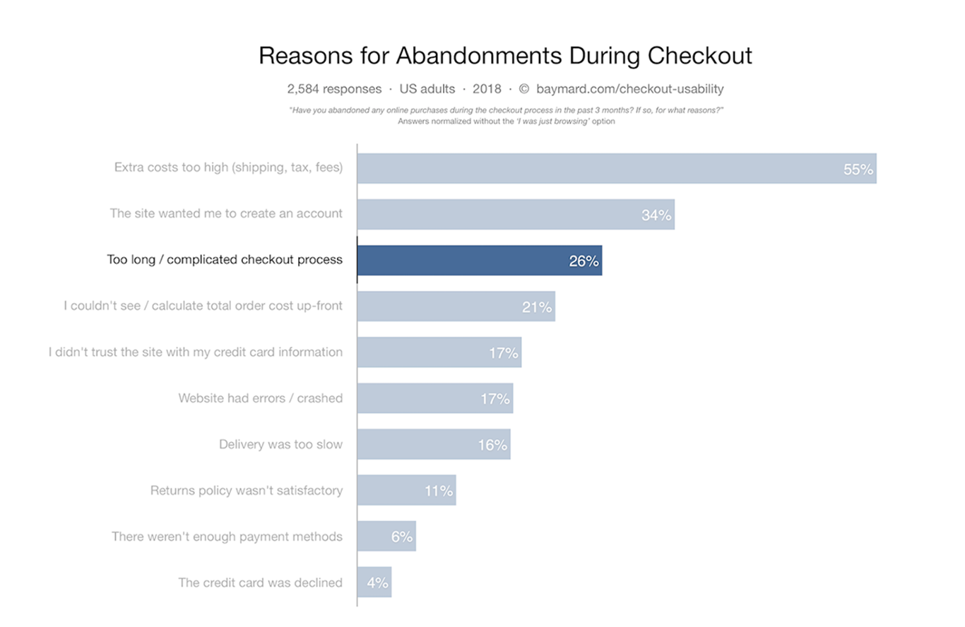
About 26% of shoppers abandon their potential purchase due to multiple checkout form fields.
Research by Baymard Institute found that the average checkout flow has 14.88 unnecessary fields.
Shoppers are usually frustrated and confused when seeing a high amount of form fields and selections for them to complete the checkout process.
Related: How to Customize WooCommerce Checkout Page
The fewer form fields you show your visitor – the less overwhelmed they are and the better chances of them converting into a customer.
The sweet spot is between 6 to 8 form fields for physical products as per the Baymard Institute study of the largest retailers.
Anything you can do to reduce the number of fields increases the odds of them converting into your customer.
There are close to 18- 20 fields in a standard WooCommerce checkout page.
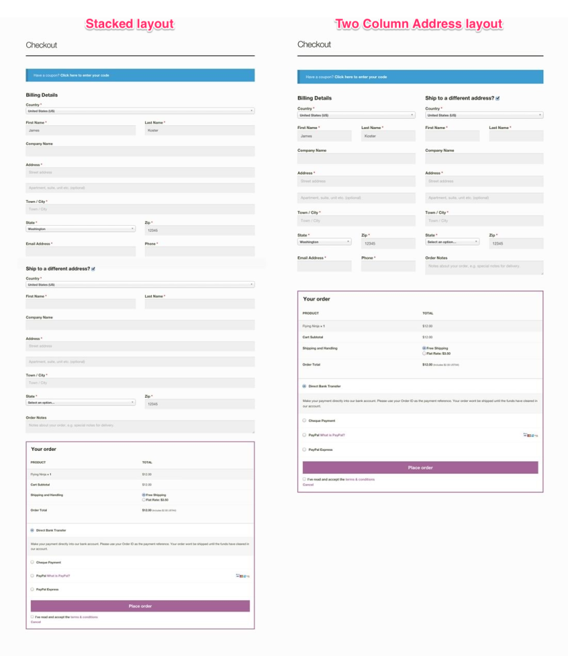
Let’s look at some low-hanging fruits – form fields that you can optimize or remove immediately.
a) Hide ‘Company Name’
By default, “Company name” is a required field in a typical WooCommerce checkout page.
If you are selling strictly in the B2C space (directly to consumers), then this field is not relevant to them at all. So why ask them to fill this out?
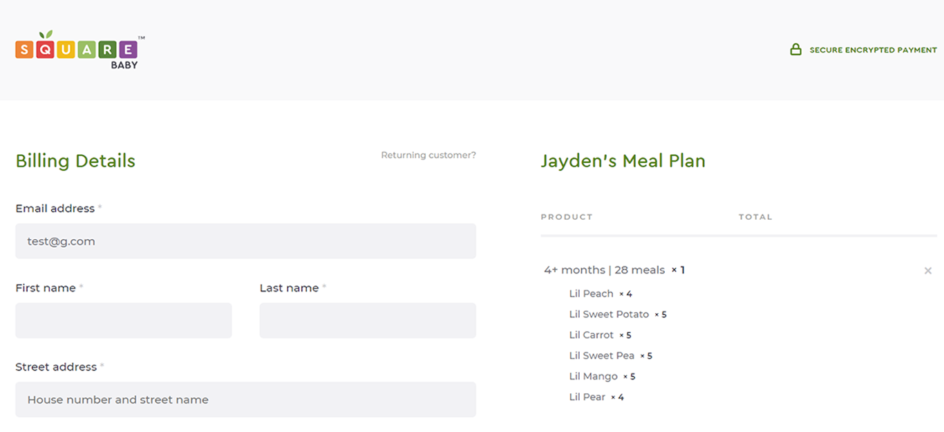
Here’s an example – Square Baby Food is a WooCommerce merchant and sells organic baby food strictly to parents (consumers).
They have completely removed the fields.
What if you sell to both consumers and businesses?
Then you might want to keep this field as an option rather than hiding it.
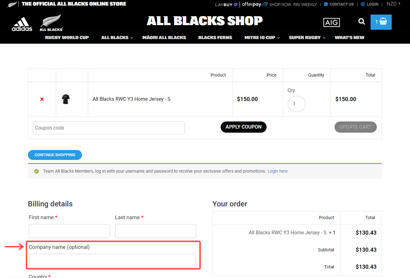
Here’s an example – AllBlacks (New Zealand’s National Rugby Team) sells its merchandise to individual fans as well as companies.
They do display the “Company Name” but the field is optional, and the customer has the choice to fill it out.
b) Hide phone number field
Privacy is a top concern for consumers today, and this shouldn’t come as a surprise.
In one study by E-Marketer – about 71% of consumers were concerned about how marketers and brands are using their data.
So there is a natural skepticism about sharing any type of personal data (personal emails, phone numbers, name, address, credit card information, etc.)
The EU launched GDPR in 2018, and soon more US states and other regions will follow to protect consumers with their privacy.
Requiring a customer to share any personal information has become difficult, and this applies to ask for their phone numbers.
Also, asking for visitors to input their phone numbers have proven to reduce conversions.
A split-testing experiment by an agency named VITAL – proved that by adding the phone number field – their conversion rate on one of their landing pages dropped by 48%.
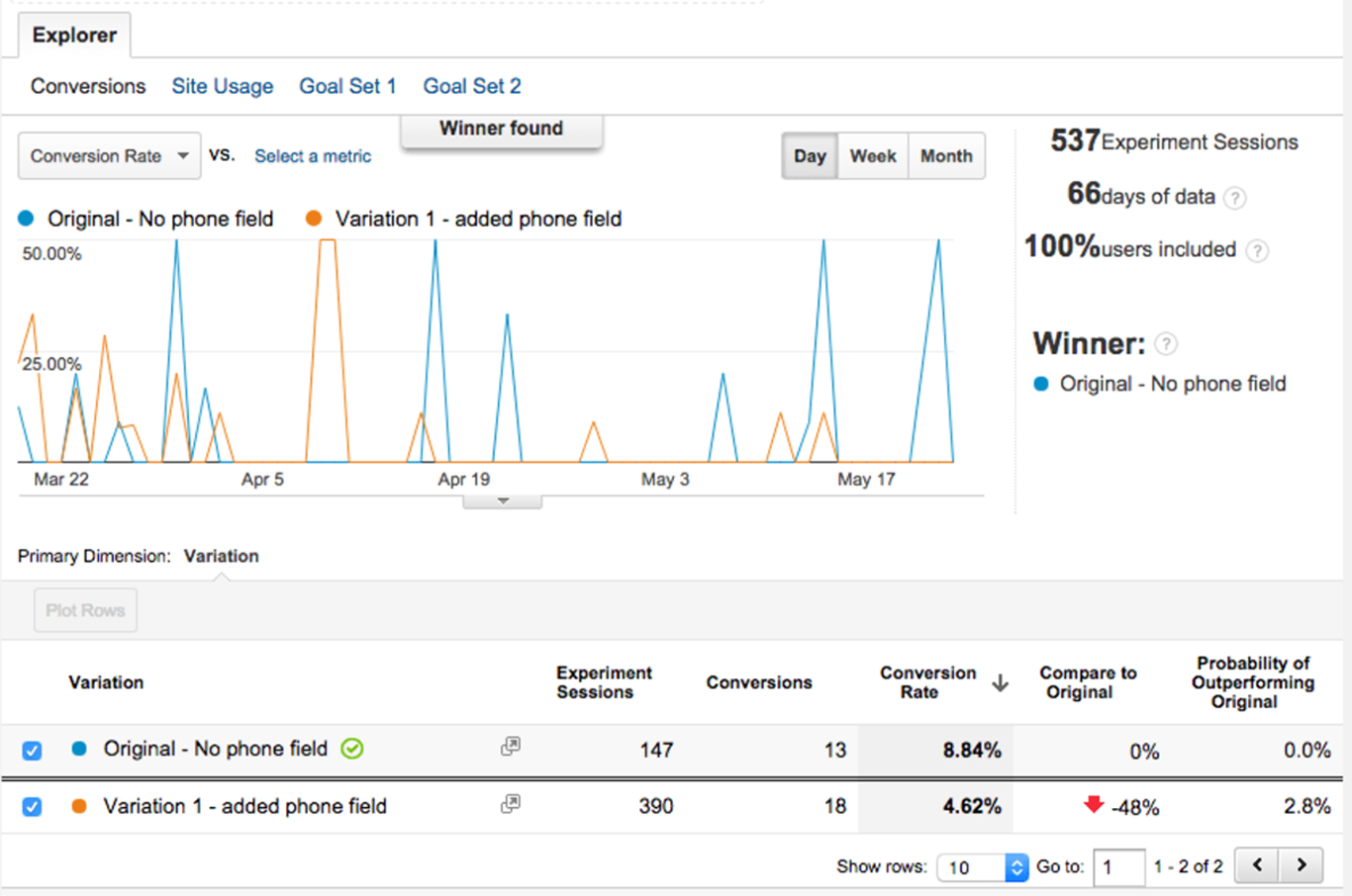
This applies to checkout pages as well.
Asking for a phone number increases their skepticism and increases their odds of cart abandonment.
WooCommerce checkout pages have a default “phone number” field.
We recommend that you hide or remove this field unless you really require their phone numbers (for customer service, order confirmation,etc.)
c) Hide the 2nd ‘Street address’ field
In UX tests conducted by Baymard Institute – “Address Line 2” or “2nd Street Address” is one field that causes visitor confusion and brings the purchase process to a halt (about 30% of the time).
Also, the 2nd “Street Address” is not universal.
Second addresses typically apply only to a minority of users (not every consumer has one).
So, we recommend that you hide this field completely.
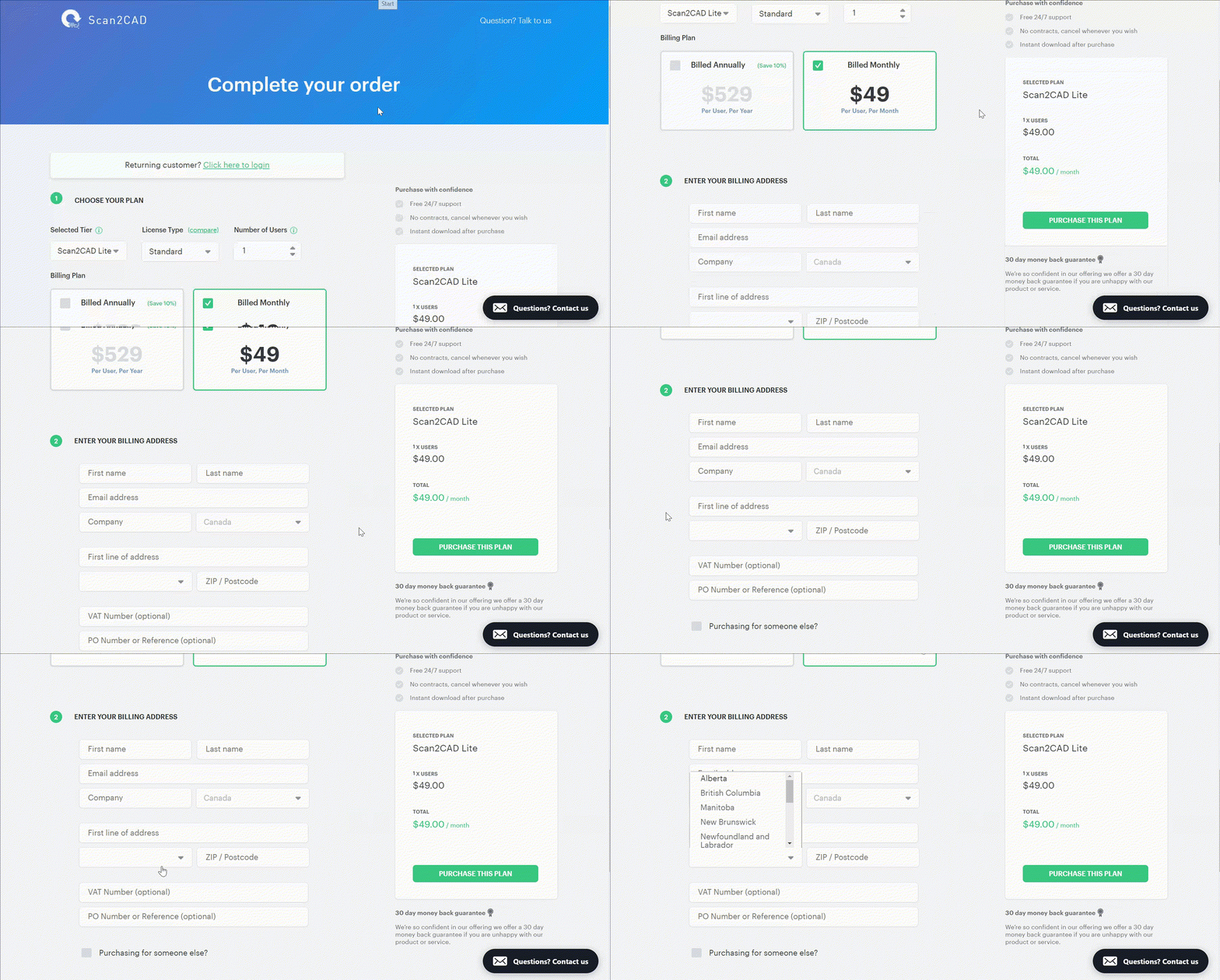
Here is an example of an optimized WooCommerce checkout page.
Scan2Cad is a software company based out of the UK.
They have completely removed the 2nd address line from their checkout page.
2) Use ‘Shipping Address’ as ‘Billing Address’ by Default
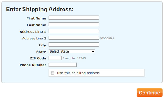
As we have discussed above – the fewer form fields you show your visitors the faster they complete the checkout process and sooner they become your customers.
The “Billing Address” is another group of form fields that require additional keystrokes from your visitors, and it adds more time.
In most cases, you would not even require them to fill this out. Most customers have the same billing and shipping address.
The primary reason e-commerce merchants ask for billing address is to match the payment/credit card information and reduce the risk.
However, if that process is already optimized by your payment provider ( Stripe or PayPal) – this step may not be required at all.
3) Make the Coupon(s) Less Prominent
Coupons definitely have their place in helping your e-commerce business grow.
You can use them to draw new customers to your store.
You are able to encourage “window shoppers” to convert by enticing them with a discount.
Also, coupons can be used to gain a new customer, and then potential upsell them in the future.
Coupons also have their disadvantages.
The most obvious of course, it reduces your profit margin as a business.
Also, it gives the visitor a reason to leave your checkout page.
The customer might already be ready to buy, but they see the coupon field.
So what do they do?
They leave your cart and head off to search for promo codes on the web.
As a shopper – we have all done this, right?
WooCommerce checkout has this universal problem.
By default – the coupon section is displayed and it is hard not to ignore.
There are many creative ways to rectify this.
You can either hide them completely or rename the field to something else.
You can also move the location on the form field to another location – ideally above your required form fields.
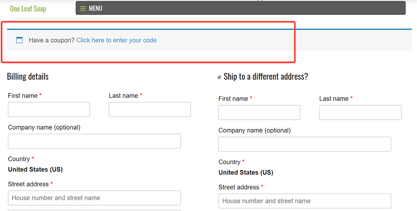
Here’s an example.
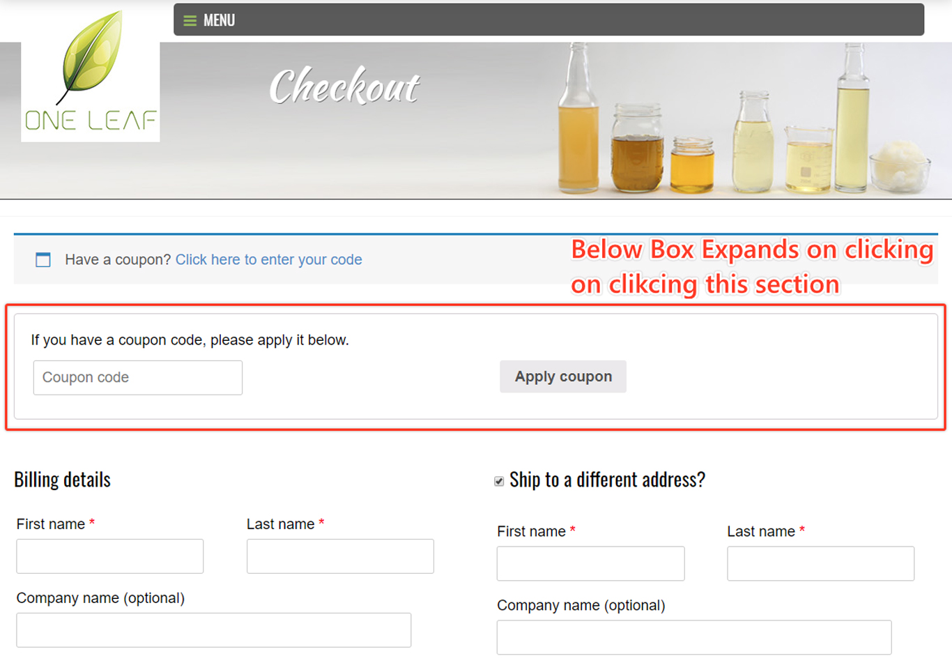
One Leaf Shop sells organic soaps and they are powered by WooCommerce.
They display a “Have a Coupon?” icon the other required form fields.
When the visitor clicks on the button/icon – it expands
This is less disruptive than the default setting.
4) Use Inline Error Validation
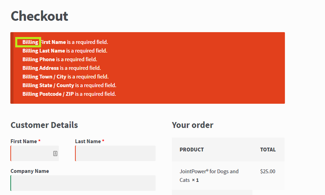
Another WooCommerce Checkout page default – it displays all the error messages at the top of the page.
For the visitor, this is a frustrating user experience, and it definitely slows down the checkout process.
Now the user has to search for the appropriate field and make the necessary changes one-by-one.
It also is bad UX practice. Imagine being a customer and seeing this giant flashing red signal at the top.
Instead, use an inline error validation.
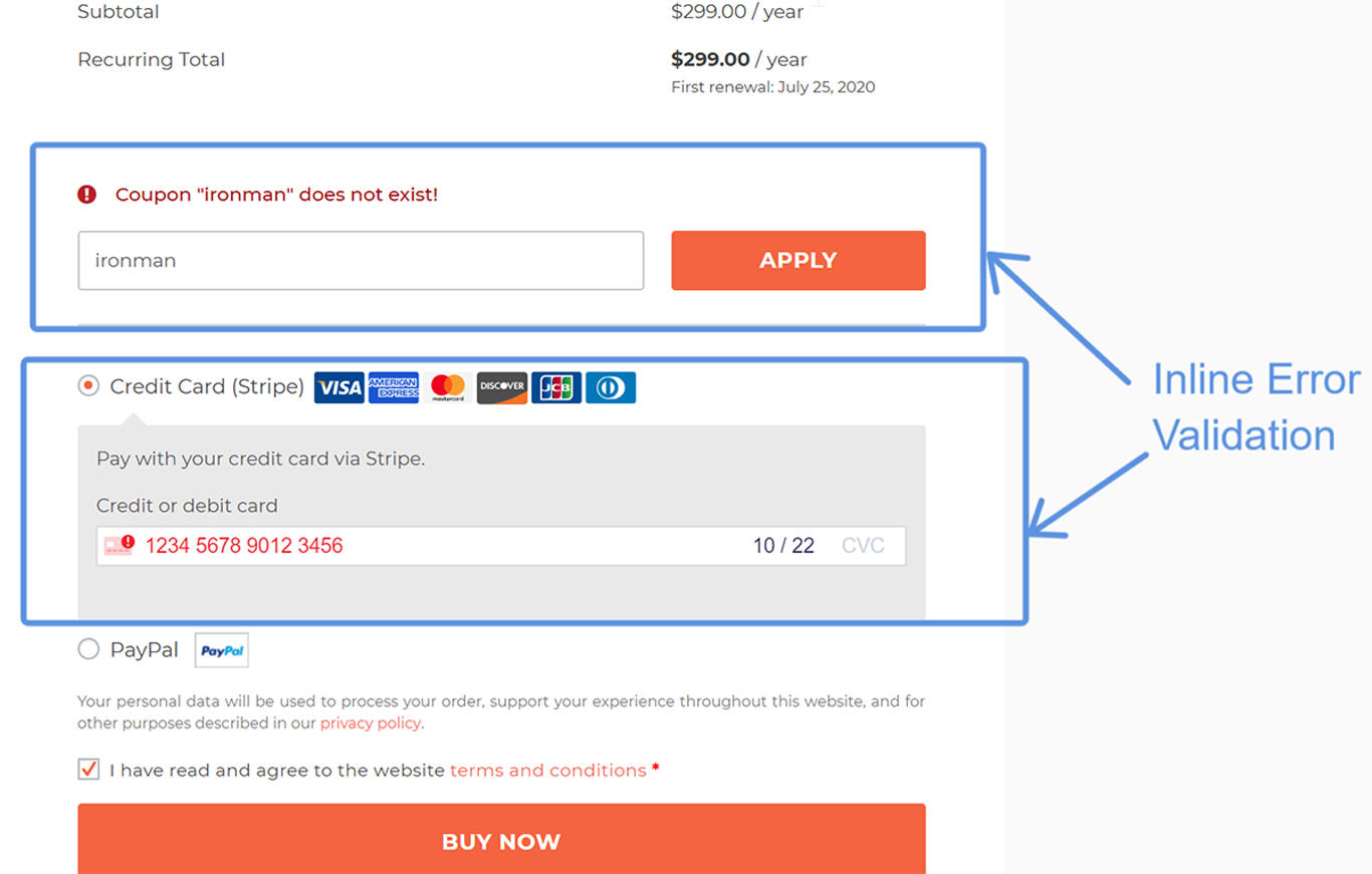
By enabling this – the visitor knows exactly what they need to fix to proceed with the next steps.
Here’s an example – look at our own checkout page here at Cartflows.
The error messages are shown inline in the appropriate fields.
This provides for a cleaner UI, and the user knows exactly where they need to make changes.
5) Remove Labels from Form Fields
An overwhelming amount of e-commerce sites use labels in all their form fields.
It does look like you are trying to guide your user by displaying all the information that you want them to complete.
However, usability tests and studies have shown that labels cause more confusion.
They actually make it more difficult for users to fill out the field.
A study conducted by UX Matters found that the most effective and recommended method is to have no inline labels, but rather have them displayed above the input fields.
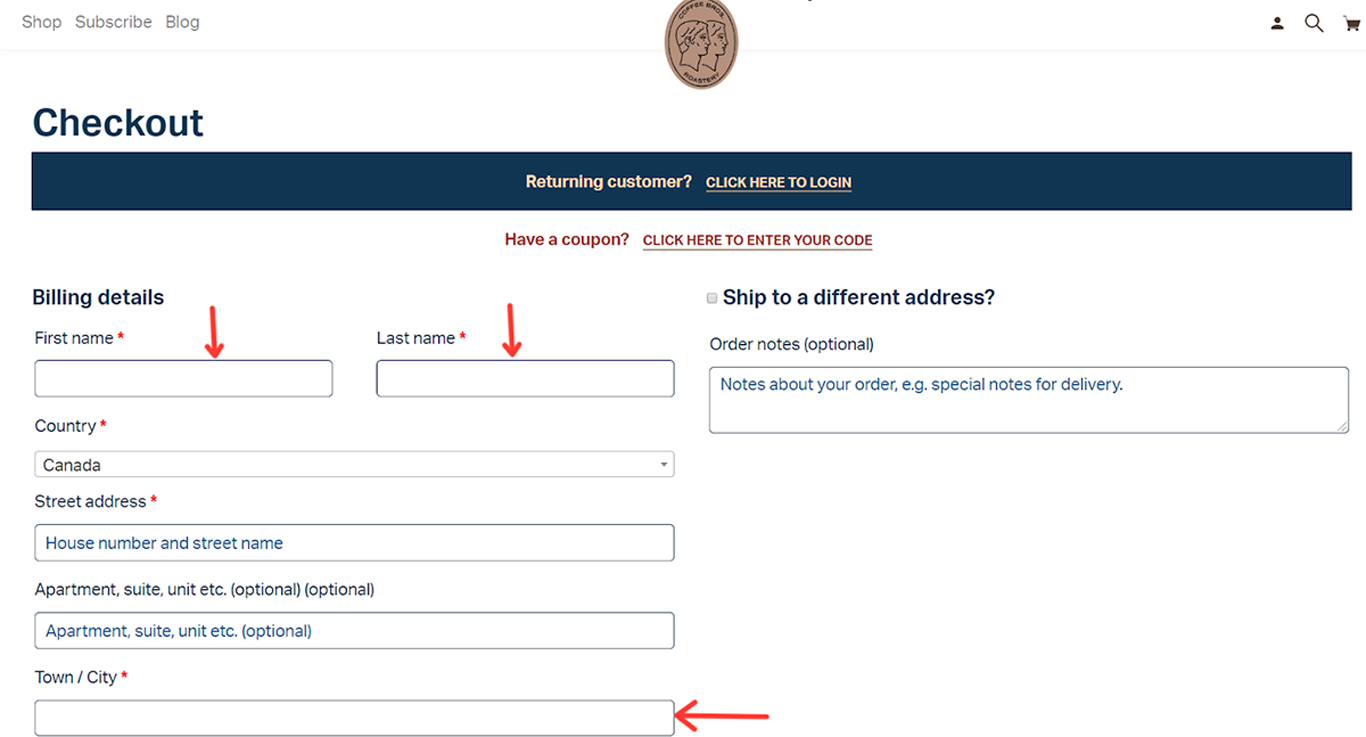
Here’s an example – CoffeeBros sells coffee beans online, and they use WooCommerce.
First impressions – their checkout page UI is very clean.
It looks clutter-free because of the lack of labels.
For the visitor – they know exactly what to fill out, as the labels are placed above the input fields. This also makes for a very user-friendly mobile checkout experience.
6) Remove Any Page Distractions
What is your ultimate goal from your checkout page?
More conversions, more sales, and more customers, right?
If that’s the goal – then do not display anything that does not need to be shown.
The more clickable buttons you show i.e products, social media icons, etc. – the more likely they are going to click and leave the checkout page.
This applies to both landing pages and e-commerce checkout as well.
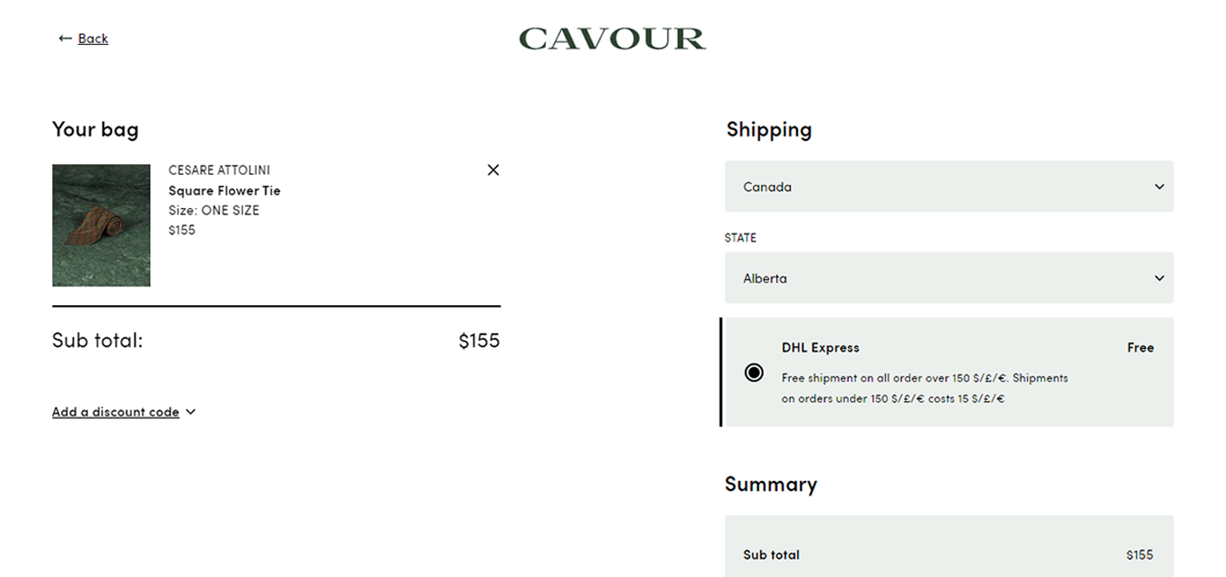
Here’s a good example from Cavour (a high-end menswear store).
In our research, it is probably one of the cleanest WooCommerce checkout pages we have come across.
They have completely removed the header, footer and this page only shows the information they need from the consumer to complete the sale.
7) Auto-detect Their Country (Using IP Address)
If your visitors are from different parts of the world – then your payment options, shipping options, currency, etc. will have to change based on their location.
You might not even have the ability to ship or sell to that country. You are better off telling them upfront instead of having them go through the entire process and be surprised at the end.
To solve this problem – use auto-detection of their IP addresses.
Based on their IP address your checkout page will automatically choose their country and display the right information.
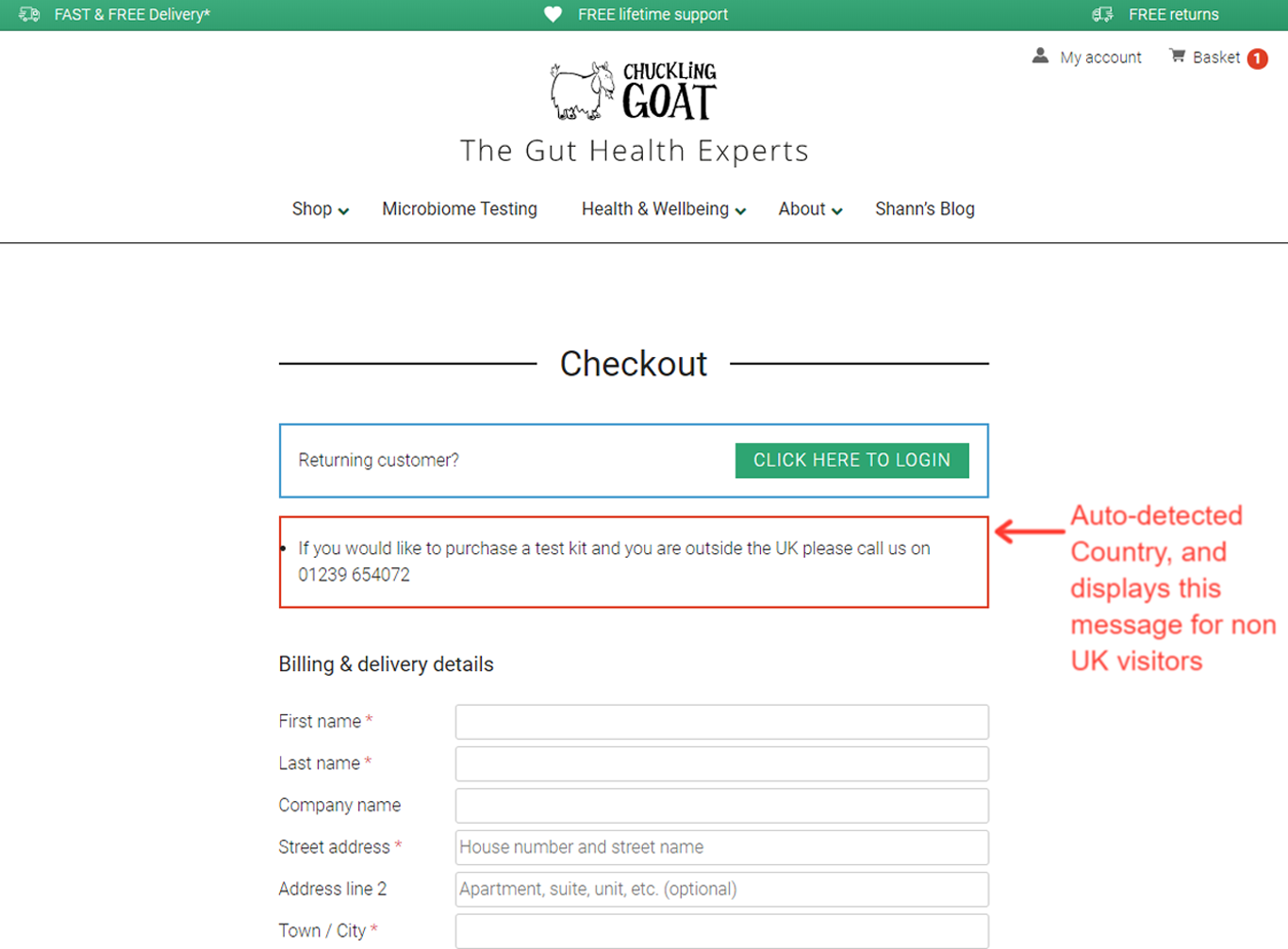
Here’s an example – Chuckling Goat produces and sells goat milk and goat milk by-products in the UK.
We were researching their checkout page – the site automatically detected that we are not in the UK and it displayed this message.
This saves the visitor time and they are immediately notified if they can get the product or not.
8) Auto-detect Address Based on Zipcode
Shipping errors are caused by about 4.7% of consumers.
That number does not look significant, but it costs merchants like you an average of $35 to $70 for each shipment error.
In the long run, this definitely adds up and affects your profit margin.
To reduce the risk of sending items to the wrong address use Zipcode/ Postal-code validation.
This will reduce your overall shipping costs.
It will also reduce the number of form fields that the visitor has to complete – saving time and reducing the chance of cart abandonment.
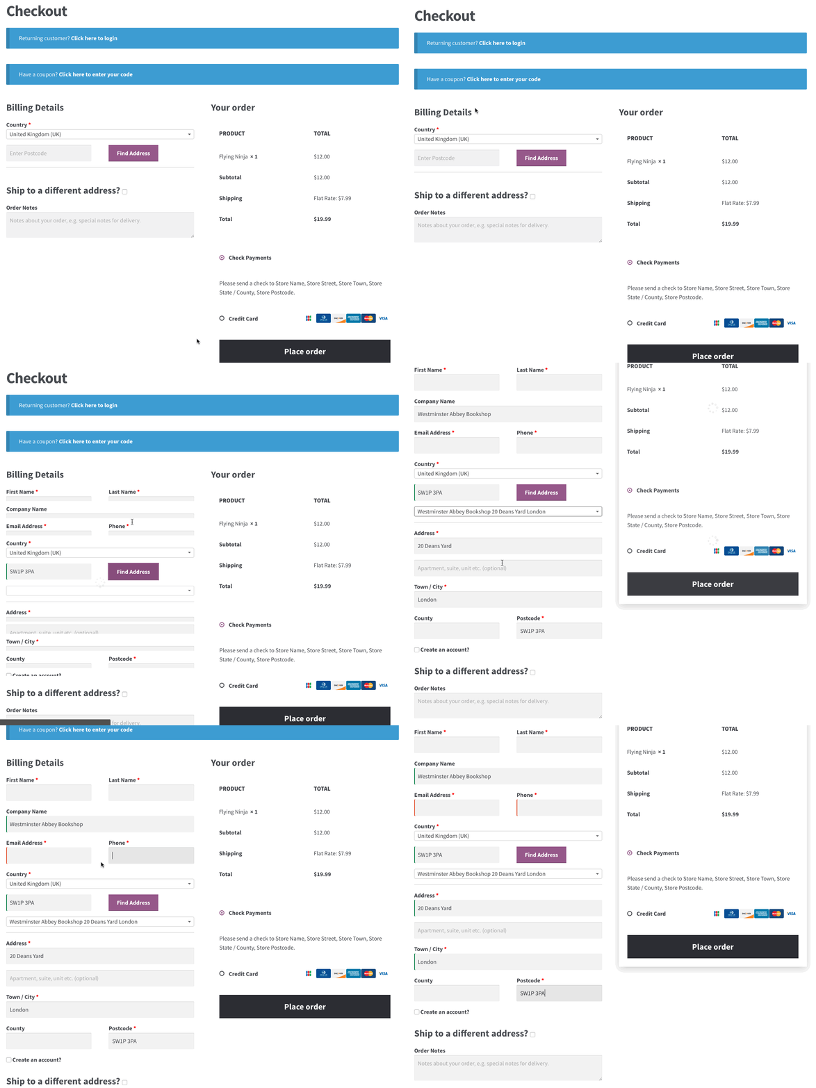
There are WooCommerce extensions that will help you with this problem.
You only have to ask them for their ZIP Code and address verification takes care of itself.
9) Include Multiple Payment Options
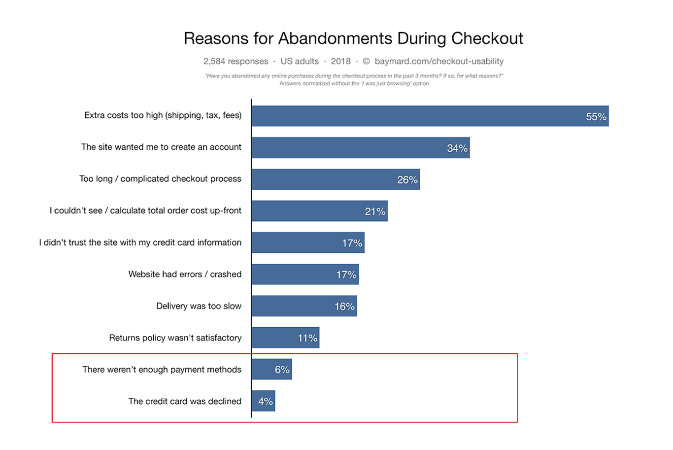
6% of users abandon their carts because of not having enough payment options. Another 4% abandon because their credit card was declined.
In a mobile-first digital world – consumers today have more payment options than ever, and they want more choices when making purchases (both offline and online).
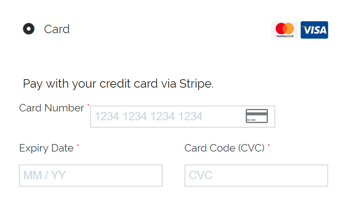
If you are only providing the traditional options (VISA, MasterCard) – then you are missing out on customers who do not want to use these cards and want to make payment with other cards or systems.
We have been speaking about frictionless checkout process and one definite way to do this to provide multiple payment options to your customers.
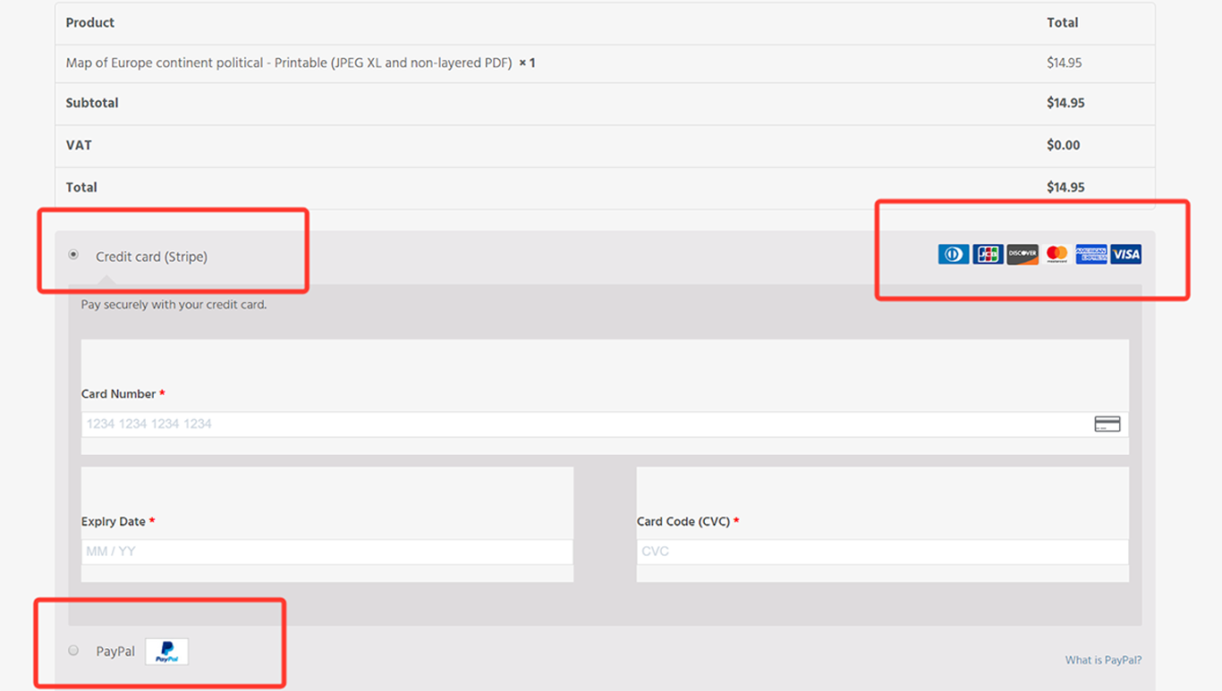
Here is an example – OneStop Map is a WooCommerce store that sells digital maps.
They offer multiple credit card options (Visa, MasterCard, Amex, Discover, JCB) – so they have got all credit card holders covered. They also provide an option to pay using PayPal which continues to grow as a choice for e-commerce payments.
10) Highlight Security and Trust Seals
As we have discussed before, privacy is top of mind for consumers today.
In some surveys, as many as 61% of participants said they had decided not to purchase a product from a store because it was missing a trust seal or was not SSL encrypted. 17% of shopping carts are abandoned because customers didn’t feel safe.
To put your customers at ease and make them feel secure – add trust seals. Also, make sure that your site is SSL encrypted.
Blue Fountain Media conducted a split test on their checkout page – just by adding a Verisign Trust seal, they noticed that their conversion went up 42%.
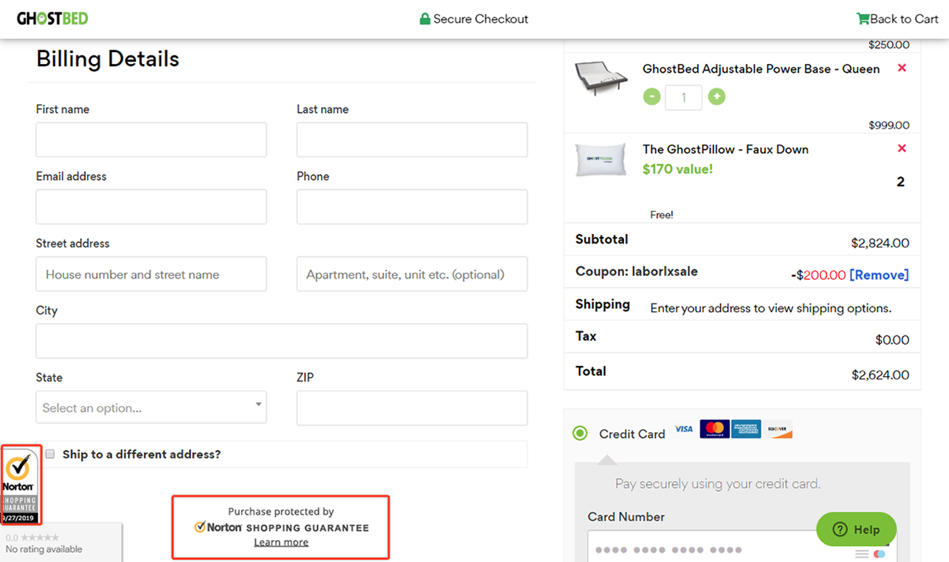
Though there are many trust seals to choose from – Norton is the most trusted by consumers.
Here’s an example – Ghostbed, a mattress retailer has done a terrific job of highlighting their Norton Trust seal on their WooCommerce Checkout page.
11) Reassure Customers Their Card Details Are Safe
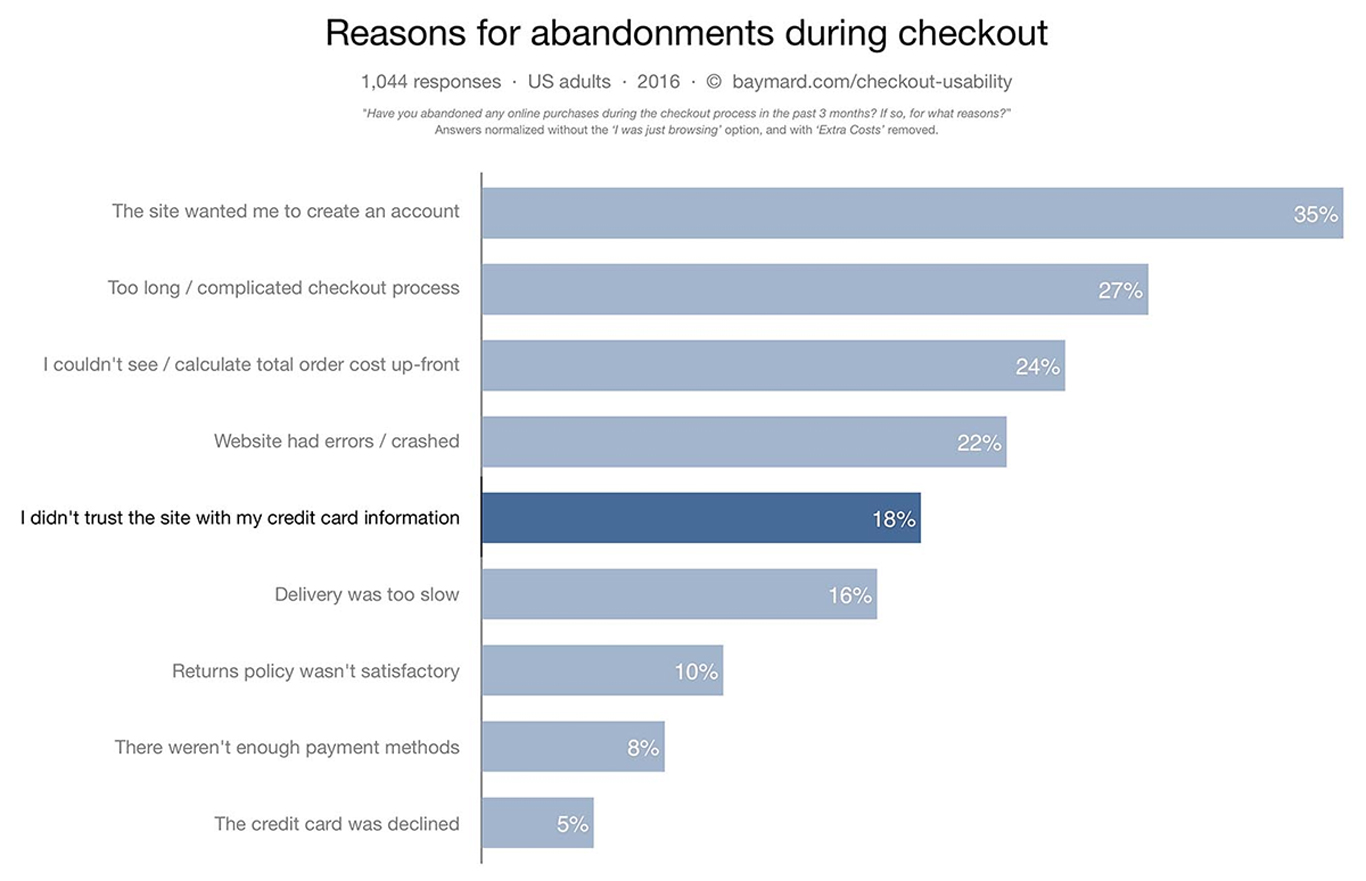
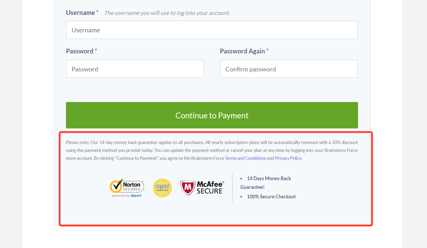
About 18% of customers or consumers would leave a cart if they are not sure of their credit card safety. Credit Card Fraud increases every year, and customers want assurance that by shopping on your site that they will not be a victim of fraud.
By installing SSL, adding trust seals and by clearly displaying your privacy policy – you can reduce their fears and provide the assurance that it is safe to purchase from you.
We have chosen to do this on many of our checkout pages at Brainstorm Force. We have displayed the trust seal and all our policies in one area. We find this every effective because the visitor sees this even before they start entering payment information.
12) Highlight Customer Reviews
A large number of your site visitors are not ready to buy yet.
They are ‘window shoppers’ who are just browsing or price-checking.
So once they visit the checkout page – they are definitely going to bounce.
You can’t convert all of them but you can definitely influence a few by displaying some social proof.
Customers reviews are perfect for this.
Amazon is a prime example of using customer reviews.
If you try to purchase anything on Amazon – they do a splendid job of displaying reviews.

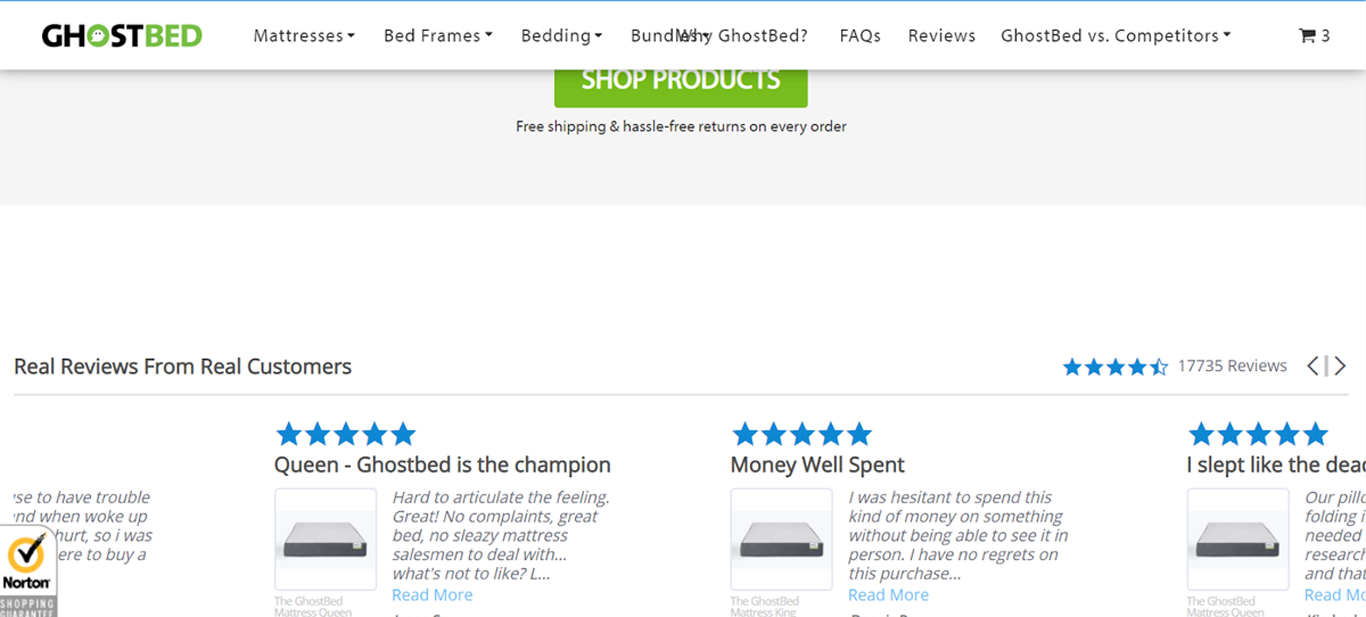
Ghostbed, a WooCommerce store does this very well by displaying customers reviews on their checkout pages but also on their home page.
Even before the customer reaches the checkout stage – they get the comfort and confidence that this product has been purchased and reviewed by over 17000+ other customers.
13) Send Abandonment Emails
Email marketing is still one of the most effective marketing channels – for every $1 spent on email marketing it generates $32 in ROI.
One place to use email marketing to its full effectiveness is definitely in e-commerce.
Sending cart abandonment emails is a widely used strategy by almost every large retailer.
Why? Because it works!
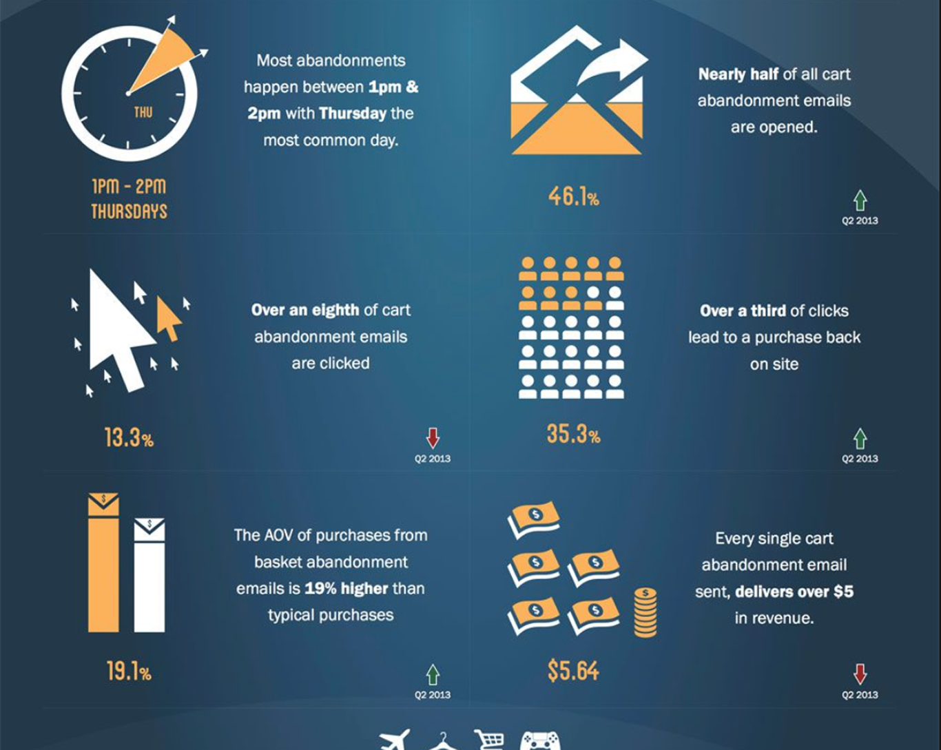
A study by GetElastic found that nearly 50% of all abandonment cart emails are opened, and over 1 in 3 of them who click back to the site ends up in a purchase. Every single cart abandonment email generates $5 in revenue.
(infographic below).
So, you can see why almost every large retailer uses this checkout optimization idea.
Cart abandonment emails are not only a simple and smart way to get your users to come back, but they also increase revenue ( the average order value of recovered carts is 19% higher than regular purchases).
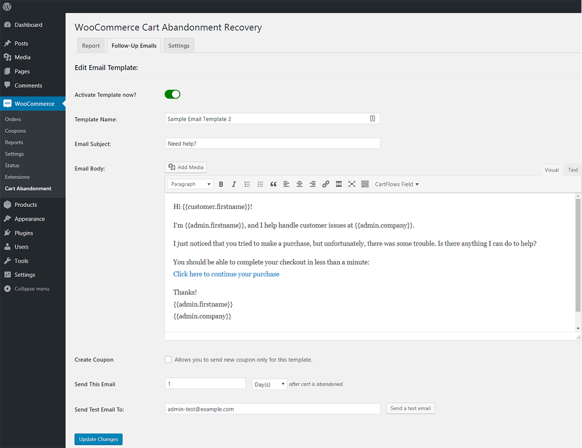
We’ve built a free Cart Abandonment plugin that will help you with this.
This plugin helps you build an email from scratch or even use a ready proven template among those that are already available in it.
You can also integrate it with external tools like Mautic, ActiveCampaign, etc. to take care of your email campaigns.
14) Add Exit Intent Popup
A simple and easy to implement a solution to reduce your cart abandonment is to offer an exit intent. It is definitely a last-ditch effort to save a customer before leaving the site.
Exit Intents are widely used in many places – web pages, blog posts, landing pages and of course in e-commerce.
It has proven to save about 10 to 15% of abandoned cart visitors.
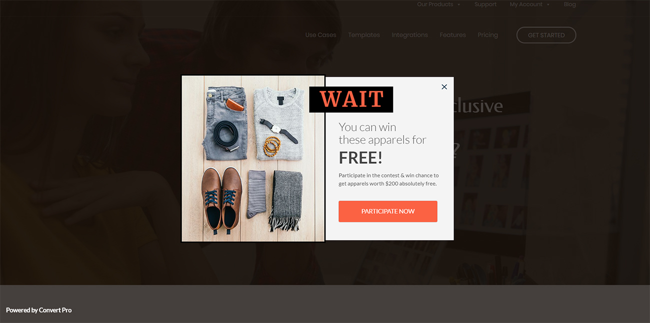
An additional benefit of exit intents is that it helps you capture their email addresses (at the least), which you can later use to nurture them.
Nurturing Campaigns have 4 to 10% response rates over traditional email campaigns.
This gives you an opportunity to build a relationship with the visitor, thus warming them up for future purchases..
15) Add a Flashing Browser Tab
In the middle of their checkout process – your visitors might go to a competitor site or Amazon to compare prices.
They might even open a new tab to search for coupons or promo codes.
At this point, their attention is no longer on your site – it’s on another page/tab.
You can get their attention back to your site by using a flashing browser tab.
You can set up custom notifications in the browser tab that prompts them to come back to your page.
This might also save you money. Before you invest money into retargeting ads – this could be a simple fix to get those customers back immediately.
Here’s a good example of a browser tab from an e-commerce store – ThreadJungle, which sells streetwear clothing.
In the image below – you will notice that as soon as we open another tab – the ThreadJungle browser tab displays a message “ You Forgot Something”.
It definitely catches our attention and entices us to go back to their site.

16) Add an Order Bump
Not to be confused with cross-sells or upsells – order bumps are an effective checkout optimization idea to maximize your AOV (Average Order Value) from an individual customer.
An order bump is displayed during the checkout just before they are ready to complete the transaction.
It could be a complementary product or an add-on to something they are ready to purchase.
The main thing to keep in mind is that the value of the order bump has to be smaller than the original purchase.
Here is a classic example – whenever you buy any electronics from Amazon – they always display the extended warranty option just before your final checkout.
Another example of an order bump from Amazon is “priority shipping”
Order bumps are effective because the customer is already primed to make a purchase from your store.
The psychological resistance is already lower and they are more likely to purchase an additional item.
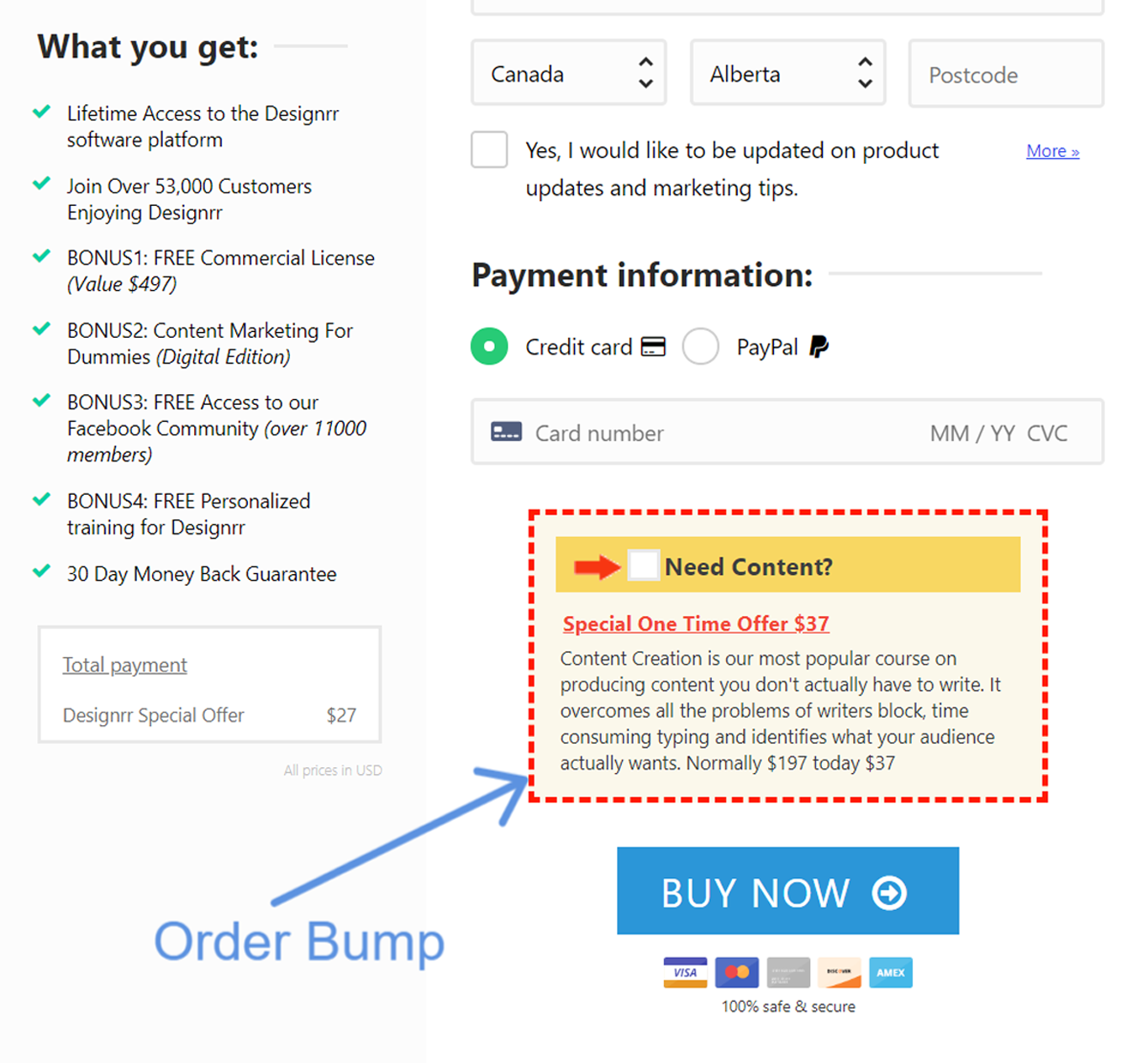
Here’s an example from Designrr (an ebook creation software).
Above the “Buy Now” button – they display an order bump with a limited offer.
The price is relatively small and since this product is related to the original purchase – the customer is more likely to explore this.
Conclusion
There you have it – we have covered 16 proven checkout optimization ideas that you can implement right away to reduce your shopping cart abandonment and increase your store sales.
Sign up for our newsletter below to know about our future posts.
Disclosure: This blog may contain affiliate links. If you make a purchase through one of these links, we may receive a small commission. Read disclosure. Rest assured that we only recommend products that we have personally used and believe will add value to our readers. Thanks for your support!


What an excellent article! Thank you very much for your efforts, I did get quite a few ideas that I’ll be looking to implement to my store. I have to admit that seeing all this great content makes me want to support the Astra theme.
Excellent!
Hi – great article but where is the followup article with the step-by-step implentation on wordpress?
I can achieve this on Shopify but am keen to discover your solutions for wordpress.
I can’t see that all this can be achieved using wpastra and related plugins!
Look forward to your reply
You can do this to some extend using CartFlows but it comes at a cost. Some of it can be done with custom filters but with those there is always a risk of things breaking when WooCommerce is updated.
The biggest problem with WordPress / WooCommerce for eCommerce is the total cost of ownership. If you want to build a site that works well in converting you be looking at buying a number of plugins and paying an annual maintenance fee to keep them up to date. It’s worth comparing that cost with just signing up for a Shopify account. Especially if you don’t have anyone looking after the backend of your shop solution Shopify can be a cheaper option.
Further, CartFlows is also available for Free as well on the WordPress repository. And thanks for sharing your thoughts.
Hi,
thanks for the tips but how can I do this with WooCommerce?
This was a great article thank you for the great tips! The flashing browser tab was a great idea that I hadn’t thought of.
Glad that you found this article and tips helpful, Ashley! 🙂
woocommerce billing and shipping address is useful plugin can Adding and delete Multiple Addresses.