Like always, we are thrilled about the latest WordPress update – WordPress 6.4!
We have spent quite a lot of time playing around with it over the past few days.
The new version gets lots of great improvements for easy website management.
It is now smoother and more polished. It’s become far more advanced compared to the classic editor days.
Eager to explore the fresh features of WordPress 6.4?
Let’s dive in!
🆕 New: Improved Site Editor
The headline feature of WordPress 6.4 is the upgraded Site Editor.
There’s a new Templates and Patterns menu and the ability to customize navigation without having to switch to the Menus screen.
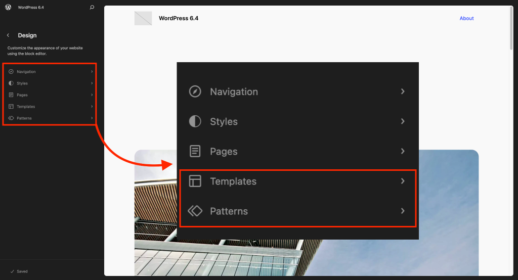
Getting started with the Site Editor is straightforward, but mastering it might take a bit of time.
As long as you have a compatible block theme installed, you have some new screens to experiment with.
You can enter Site Editor from Appearance > Editor and get a high-level view of your theme and make sitewide changes.
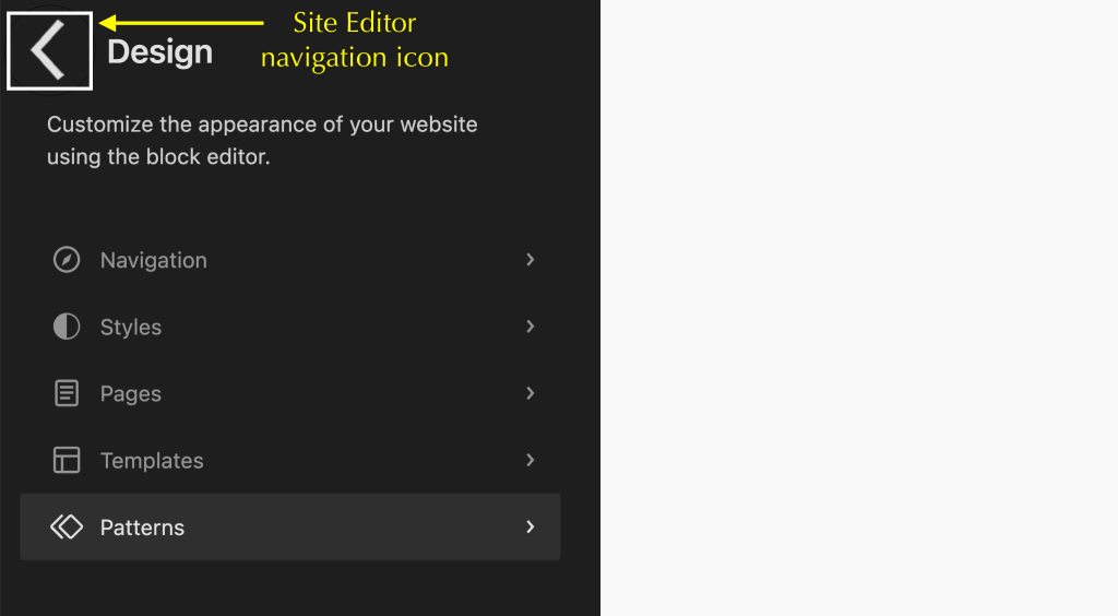
You’ll see a black menu on your left with your main options. Select the one and you’ll move to the respective page.
To go back, click the small arrow icon until you return to the main Site Editor screen.
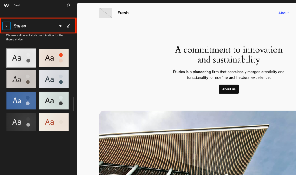
For instance, click on Styles and you’ll access the default style palette in use for your theme.
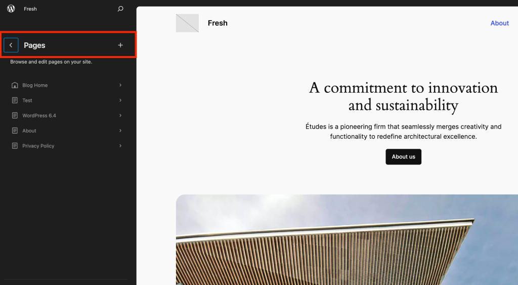
Similarly, select Pages and you’ll see a list of every published page on your website. Clicking one takes you to the page editor.
🆕 Block Editor’s New Features
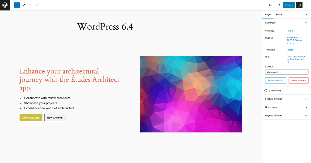
When you start editing a page, the editing screen will look familiar. It operates quite similarly to before, but now there are a couple of extra perks.
Lightbox effect, fixed template for images, vertical text, and query loop pagination are the new additions for content creators and developers.
The blocks transition smoothly, giving you the freedom to adjust, move, or add content as you wish.
Now, let’s dive in to know what’s new.
Lightbox effect
You might be familiar with the lightbox effect used for images in various plugins and themes. It’s now part of WordPress 6.4!
You can apply this effect easily in the block editor.
When an image is selected on your page, head over to the right sidebar settings. There, you’ll find a toggle called Expand on click.
If you want the lightbox effect, just flip this toggle on.
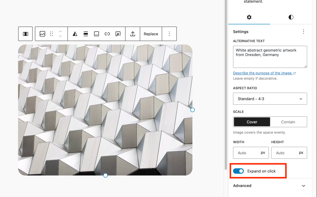
On the front end, when you hover the mouse over the image, you’ll spot a zoom icon. Click on it and the image expands smoothly using the lightbox effect.
To return to the original size, click the image once more or hit the ‘X’ in the top right corner.
Remember, this feature isn’t activated automatically. You’ll need to enable it for each image you want the lightbox effect on, even in galleries.
Background Images in Group Blocks
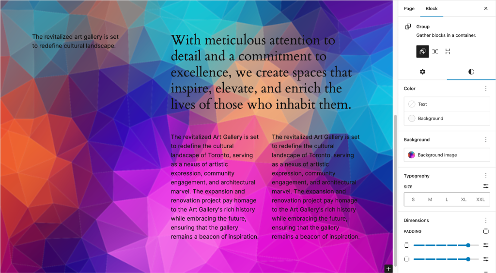
Now, you can spice up group blocks with a background image.
Start by picking the group you want from the List View.
This action will also open up the related settings in the sidebar on your right.
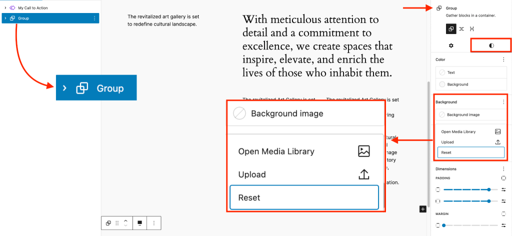
Next, head over to the Style tab. Look for the Background option and click on it.
From there, you can either choose an image from your media library or upload one directly from your computer.
If you change your mind, there’s a Reset option available to remove the added image.
Placeholder Image Ratio
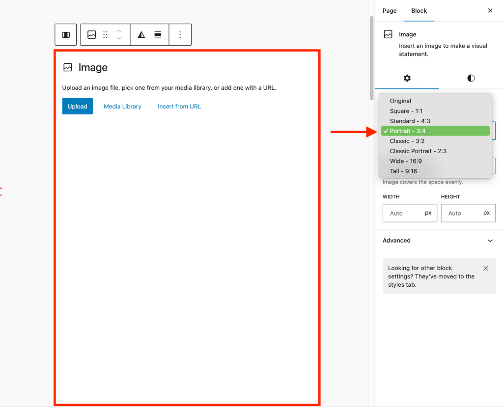
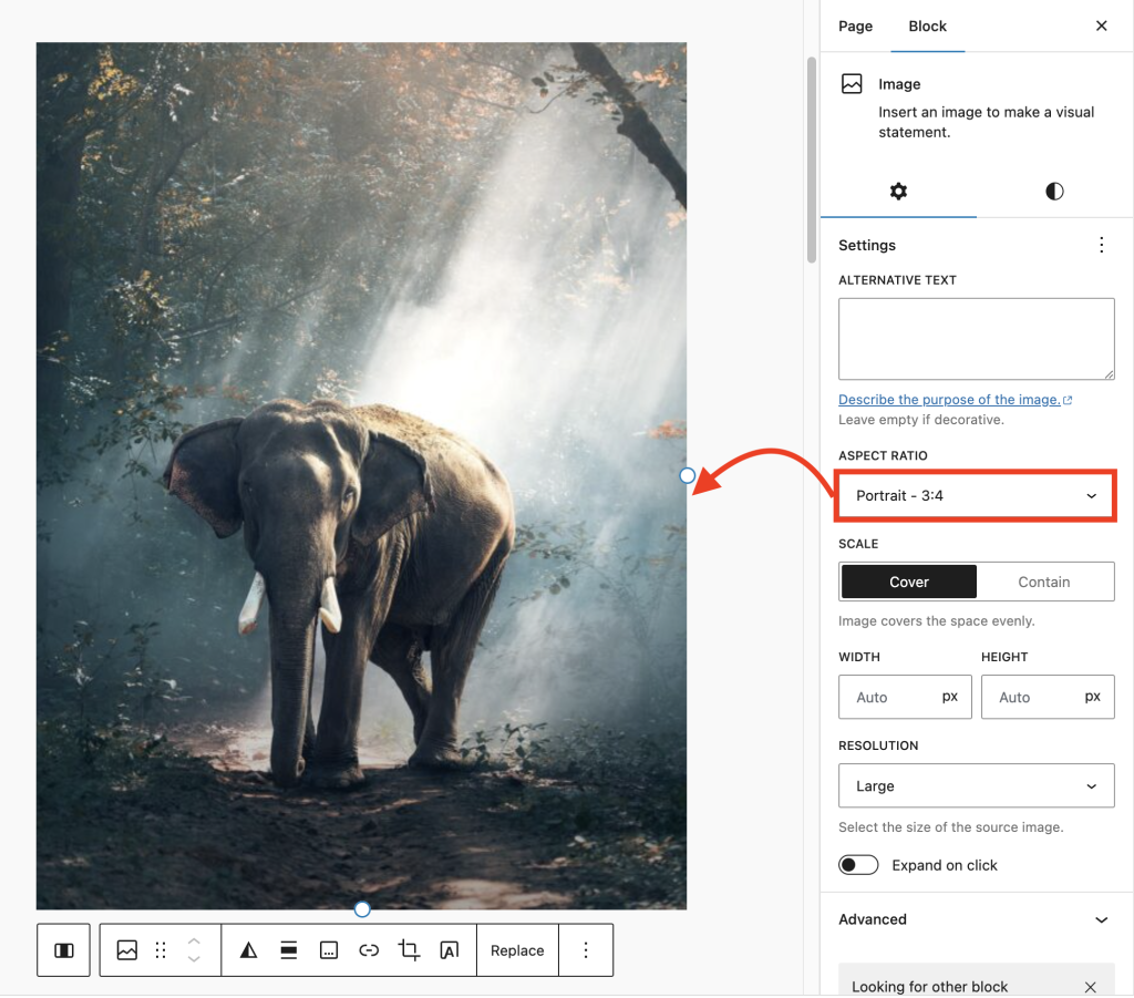
Placeholder images can now keep a specific aspect ratio locked in place, which is handy when creating image templates on your page.
Let’s walk through an example. You’ve got a block on your page with an image inside that has a standard 4:3 aspect ratio.
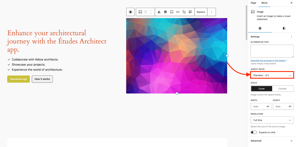
Start by removing the image, then click the ‘+’ sign to add an image block again.
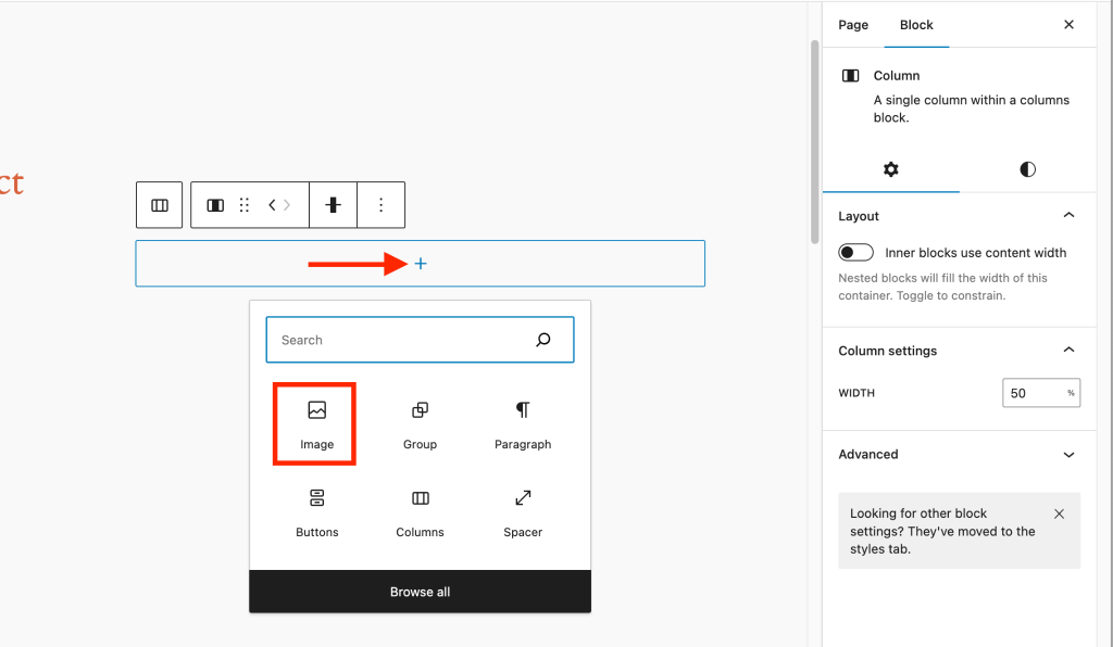
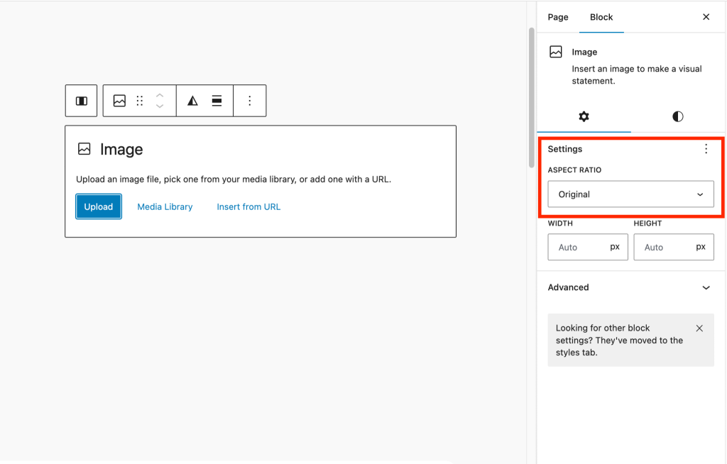
When you select the image block to add an image, you’ll see the aspect ratio field appear in the right sidebar.
From the drop-down list, choose a different aspect ratio than the original image. For instance, let’s select a Portrait 3:4 aspect ratio here to demonstrate how the locked aspect ratio works.
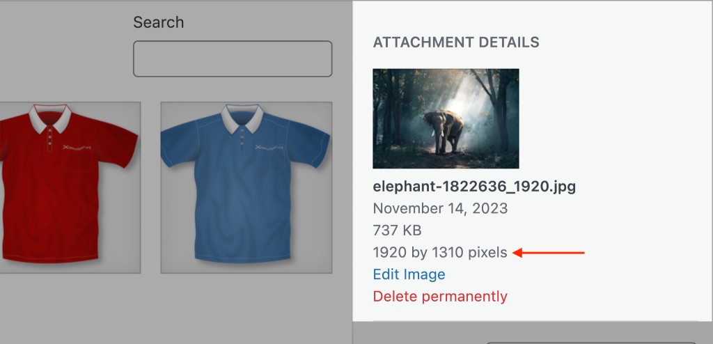
Now, add an image that has a different aspect ratio from the one set for your placeholder. For our example, the image is sized at 1920×1310 pixels.
You’ll notice the image gets cropped neatly to fit the aspect ratio we’ve set. This means you’ve created a template with a fixed aspect ratio
Whenever you add an image in this placeholder, it’ll disregard the image’s original aspect ratio and adjust automatically to match the set value
Vertical text
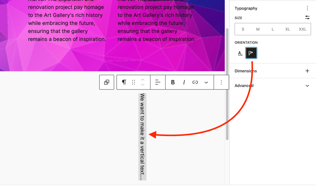
In WordPress 6.4, you’ve got the ability to switch up your text’s orientation. It’s a handy tool for various needs, especially if you’re after an artistic touch.
To make this change for a paragraph block, head over to the Typography options in the right sidebar.
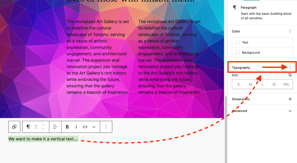
Click the three-dot menu for more choices. Within that menu, you’ll spot Text orientation.
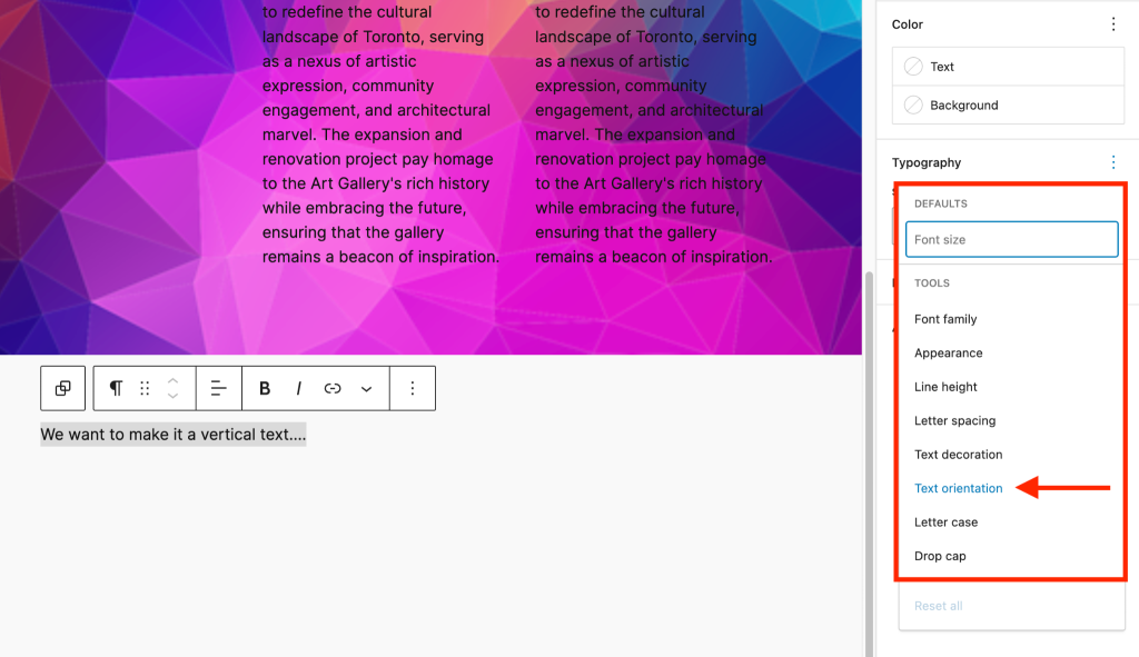
This will show you two orientation buttons. Click on the vertical orientation button to see how it alters the text.
Query Loop Pagination Improvements
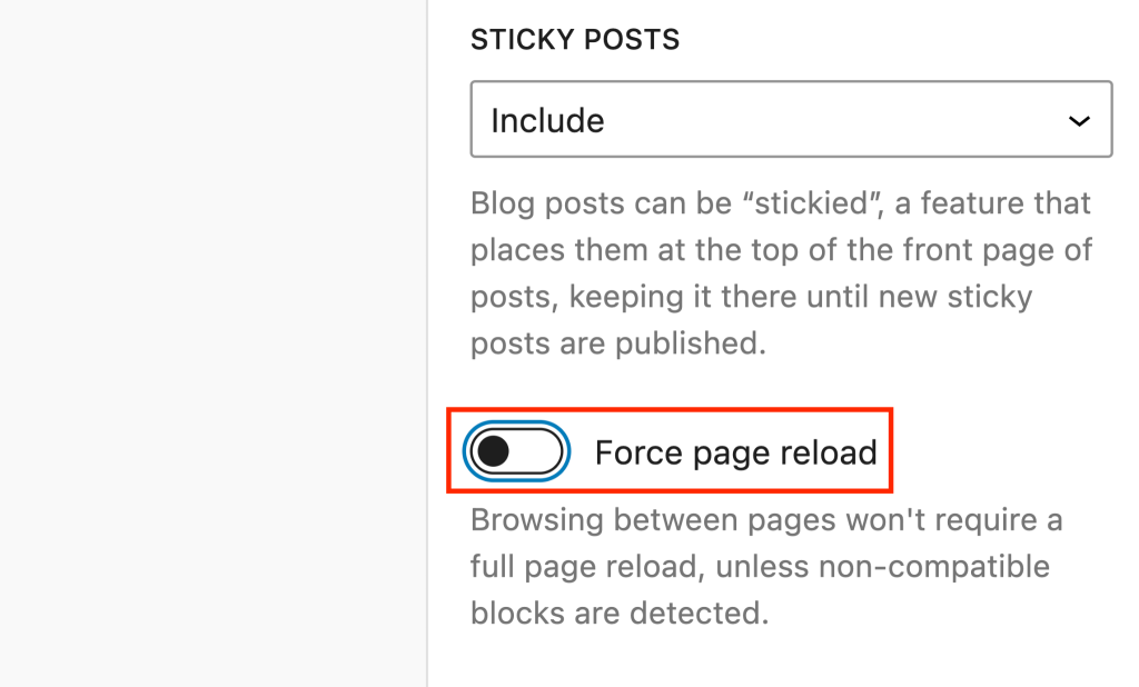
The upgraded pagination feature within the Query Loop block is quite noteworthy.
Currently, moving between two pages in the Query Loop block triggers a complete page refresh. However, in version 6.4, this issue has been addressed.
Here’s how you can do it:
- Simply click on the Query Loop block.
- Then, go to the settings sidebar, scroll down a bit, and below the Sticky posts option, you’ll find Enhanced pagination.
- Activate this feature, update your settings, and preview the page in a new tab.
Now, when you navigate to the next page, you’ll notice that the page no longer reloads.
Block Hooks
Block hooks are a new developer feature that allows you to ‘hook’ a function into a block.
Inspired by the hooks in WordPress core APIs, block hooks enable developers to dynamically extend blocks.
This means plugins can introduce their unique options to a block. Users will then see these additional options in the block settings panel, giving them the ability to toggle these options on or off.
🆕 Workflow Improvements
In WordPress 6.4, we see a lot of improvements in workflows that make day-to-day website maintenance, admin tasks, and content management easier.
Here are the updates:
Improved Command Palette
The Command Palette is a shortcut for common commands within the WordPress editor and was initially released in WordPress 6.3.
This updated version is more usable as the text is darker and there are some new keyboard shortcuts.
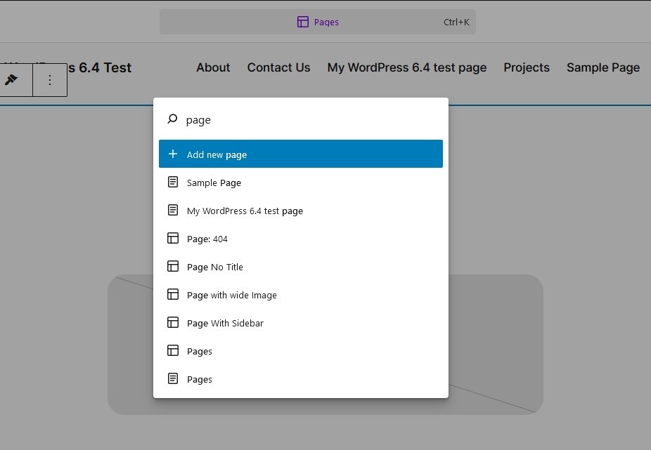
Hit ⌘+k on Mac or Ctrl+K on Windows or select the new menu at the top of the edit screen and you’ll see a popup with search.
Type anything into that to see relevant commands. For example, type ‘page’ and you’ll see all possible page commands you can use.
Select an option and you’ll be taken immediately to that resource, whether it’s a new page, the edit screen or elsewhere.
Style Revisions
Revisions are one of the most useful parts of a page builder and another reason Elementor is so popular.
WordPress 6.4 now joins the party with Revisions.
Look at the bottom of the left pane in your Site Editor, you’ll see a blue Revisions or Review 1 change… button.
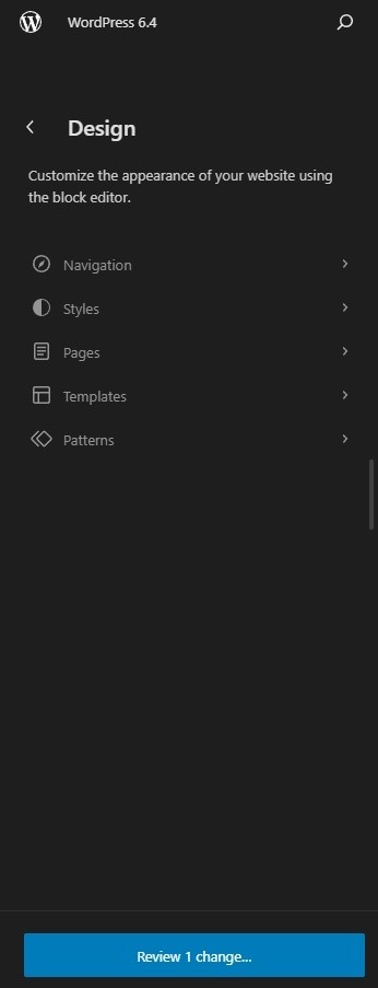
What you see will depend on whether you have made any changes and how many you made.
Click the blue button and a popup will show you recent changes and ask you if you want to save them.
Image Preview
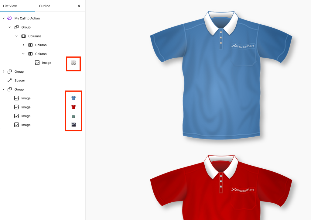
In WordPress 6.4, finding images within the List View (a.k.a Document Overview) is now simpler.
This is super handy, especially if you’ve got loads of images on a page and need to quickly spot a specific one with the help of a small preview.
Rename Groups
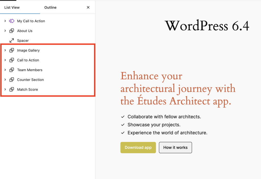
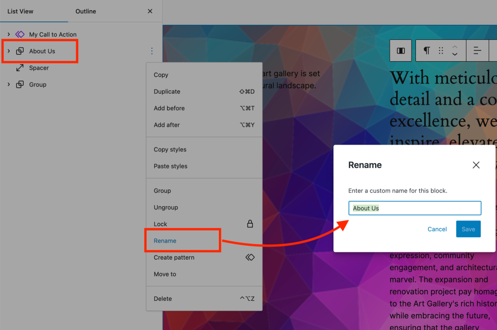
Now, managing your groups is easier with more descriptive names. You can rename your group now in the List View to whatever suits you.
For instance, if a group has ‘about us’ information, you can name the group likewise to spot it quickly.
To rename a group, pick the one you want in the list view, click the three-dot icon, and select Rename from the menu. Then, type in the new name and hit Save.
Toolbar Improvement
This looks like a minor improvement that might go unnoticed but we believe it will have a significant impact on your workflow.
In WordPress 6.4, the toolbar is now consistent for parent and child blocks such as quotes, navigation, and lists.
No matter if it’s the main content or the secondary cite block, the toolbar stays in the same spot.
It’s a subtle tweak, but it significantly enhances the user experience. Let’s check its impact on a list item.
Open Link in New Tab
Many users like to open links in new tabs. It saves them from leaving the current page.
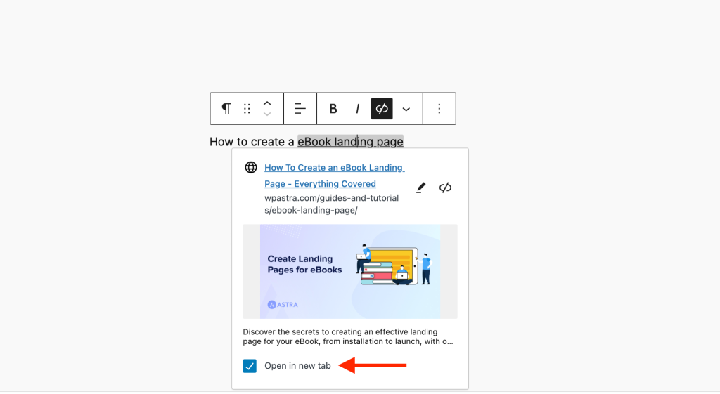
In WordPress 6.4 website admins can decide if a link on the page should open in a new tab or the current one.
Now, whenever you add a link anywhere on the page, you’ll notice a link preview and a checkbox underneath. Check the box and the link will open in a new tab for users.
Attachment Pages Disabled
Starting with WordPress 6.4, attachment pages won’t be activated by default. This resolves a long-standing issue in WordPress sites.
Previously, when you uploaded attachments (images), WordPress automatically generated pages that showed the file and its description. Search engines indexed those pages which impacted your site’s SEO.
To fix this, users relied on SEO plugins like All in One SEO or Rank Math to disable attachment pages and guide users back to the original post.
While this change will apply to new sites, older sites built before WordPress 6.4 will continue to function as they did.
If you want to disable attachment pages on your website, you can implement the following custom code.
update_option( ‘wp_attachment_pages_enabled’, 0 );
🆕 Pattern Personalization and Customization
Block Patterns have been a key benefit of Spectra and Elementor for a while now. The feature was added to WordPress in version 6.3 but is now much better.
Here are some of the improvements and new features added to patterns in WordPress 6.4:
Categorize Patterns
You can now organize (categorize) your custom block patterns for better management across your site. It’s like having your own toolbox filled with your favorite patterns, ready to be reused whenever you need them.
One easy way is to do it from within the list view.
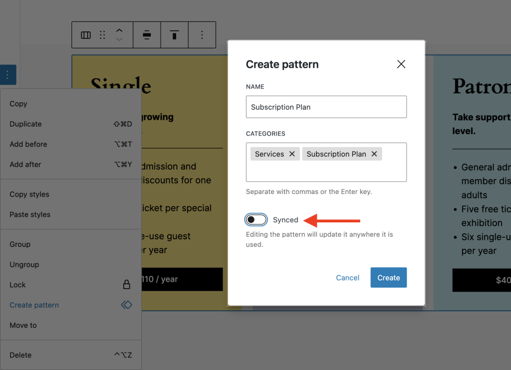
Click on the three-dot menu at the edge of a group or parent column to open the menu.
Next, select the Create Pattern option to open a box where you can set a pattern category name and choose from available categories.
WordPress has default categories to help you categorize your patterns easily. You can also create your own category name.
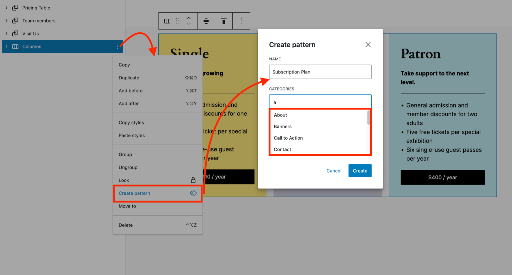
Add multiple categories if needed and click Create once you’re done.
Remember to turn off the Synced option, which we’ll discuss next.
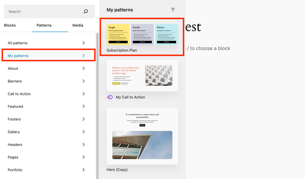
Whenever you want to use this pattern on another page, go to Block Inserter > Patterns to find the folder named My Pattern where your custom patterns are stored.
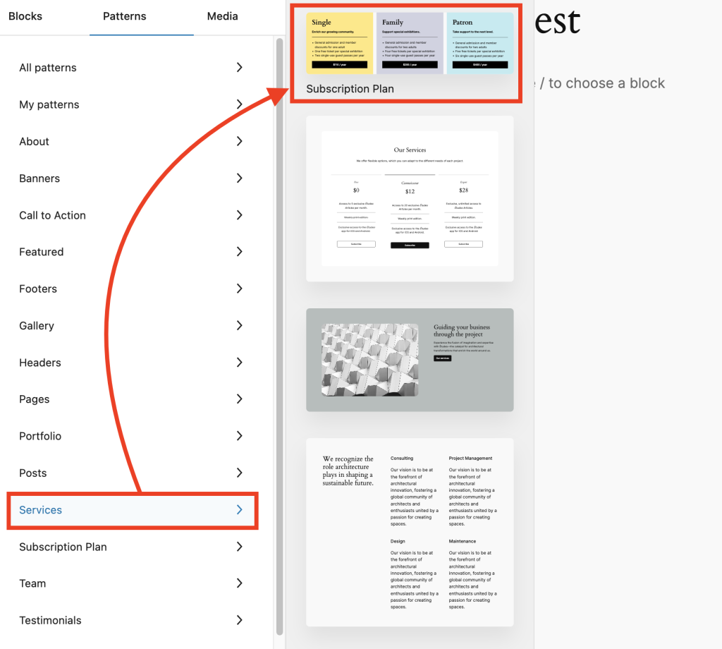
You’ll see these specific patterns in each category you selected while creating them, like the Services category in our example.
Import and Export Patterns
WordPress users now have the ability to share patterns across multiple websites. To do this, you’ll export your preferred pattern as a JSON file and import it into any other website you desire.
Here’s how you can do it:
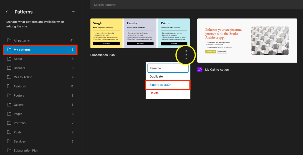
Open the site editor by going to Appearance > Editor and clicking on Patterns in the left sidebar.
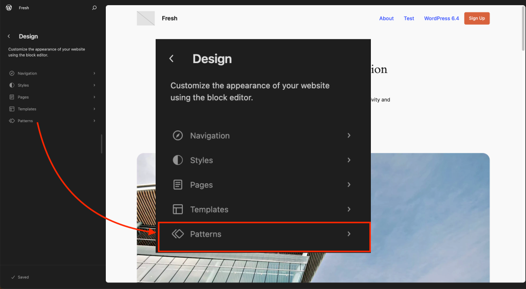
Next, go to My Patterns to view your saved patterns. Click the three-dot menu button and select Export as JSON to save the file on your computer.
When you are on a different website, open the site editor and go to patterns.
Click the ‘+’ button at the top left and select the Import pattern from JSON to bring in the desired pattern.
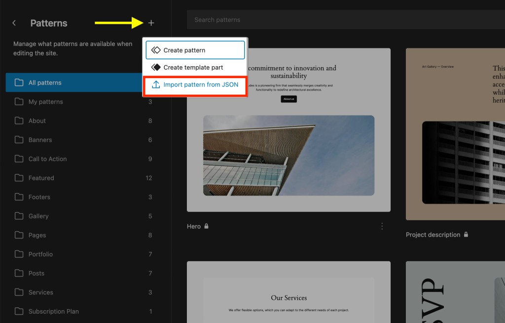
That’s it! You’ve now successfully created a pattern on one website and imported it to another.
Note: Sometimes, the styling of the imported pattern may not match exactly on the new website. In such cases, you can manually customize the pattern to suit your preferences.
Synchronize Patterns
We’ve long used global settings in page builders like Spectra and Elementor. Now, from WordPress version 6.4, this feature is part of the default WordPress offerings.
Remember the Synced option we talked about while creating patterns? It allows you to create a pattern that updates globally wherever it’s used.
Let’s revisit the page editor and create a pattern from the list view just like before. This time, keep Synced enabled, which is the default setting for all patterns.
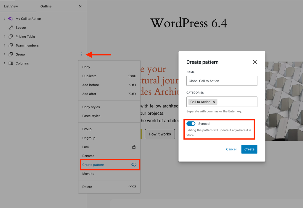
When you make changes to this pattern, the changes automatically apply everywhere it’s used.
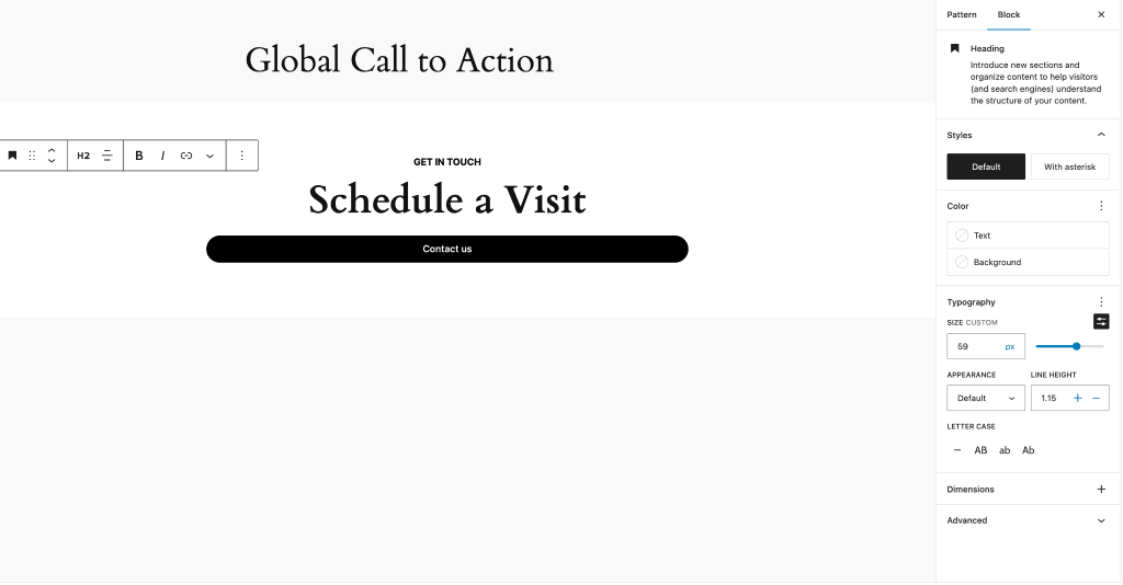
Another way to tweak a pattern is through the pattern editor.
Go to Appearance > Editor and select Patterns. Then, at the bottom of the left sidebar, click Manage all of my patterns to access them.
From there, open the pattern you want to edit (like ‘Global Call to Action’ in our case).
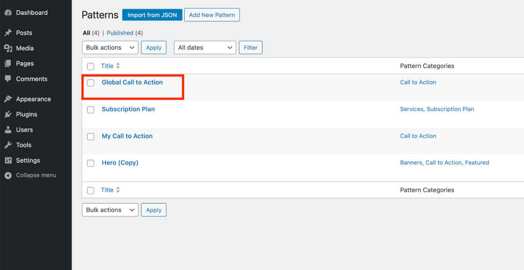
Any changes you make here will update all copies of that pattern you’ve created.
🆕 Add Buttons to Navigation Bar
From WordPress 6.4, adding buttons to your navigation bar becomes easier, even for noncoders!

For instance, let’s say you want to add a signup button. Here’s how in a few simple steps:
- Open the page template to access the navigation block.
- Click within the navigation block to reveal the black ‘+’ sign. No need to click it.
- Head to the right sidebar under the navigation menu items and hit the blue ‘+’ block inserter button.
- Choose the button item and customize its appearance as desired.
🆕 Twenty Twenty Four Theme
WordPress 6.4 introduces the new default theme, Twenty Twenty Four.
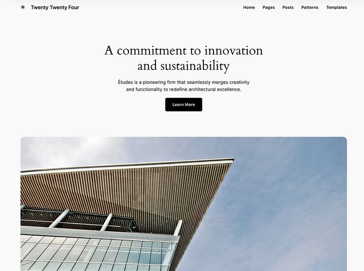
Similar to its predecessors, it’s a sleek block theme, but this time it offers a bit more.
When you open it in the Site Editor and go to Styles in the menu, you can preview different looks using presets.
Choosing a style instantly updates the appearance. Once you find a style you like, hit the blue Save button at the bottom left.
While few will actually use Twenty Twenty Four for a live site, it’s a great way to explore what WordPress 6.4 offers.
It’s one of the most practical default themes we’ve seen so far.
Theme Preview
In WordPress 6.4, theme preview gets a mention as a minor update, but it’s actually pretty handy.
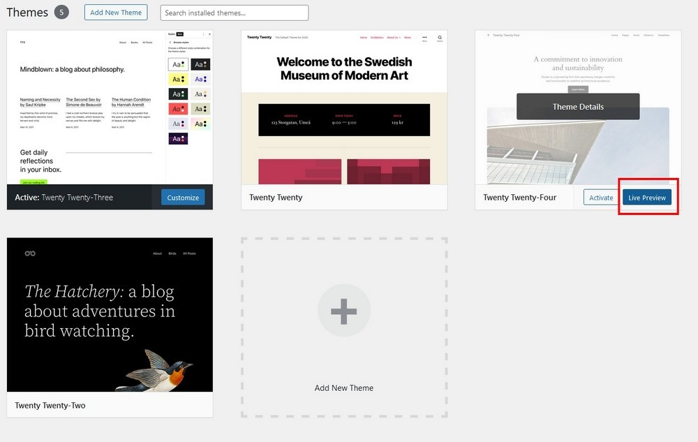
Instead of activating a theme to see how it looks, now you can preview it right in the Site Editor.
This allows you to check it out, and decide what works, and what doesn’t before making it your active theme.
For those who enjoy experimenting with themes, this is a major time-saver!
To try it, head to Appearance > Themes.
Hover over a theme you’re interested in and click the blue Live Preview at the bottom of the theme block to load the preview window.
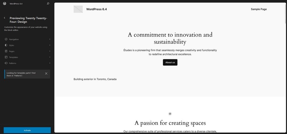
If it’s an inactive theme, you’ll also spot a blue Activate button at the bottom left to set it as your default theme.
Convenient, right?
🆕 Other Improvements in WordPress 6.4
WordPress 6.4 introduces 170+ performance updates to help improve page load time across the board. Here are some worth mentioning updates:
- Admin notices function: WordPress 6.4 introduces two functions for admin notices instead of using the old approach of blending HTML and PHP codes.
- Split queries in object caching: This feature helps WordPress break down complex queries into smaller, more efficient ones. This significantly improves website speed.
- More accessibility: Over 50 accessibility improvements include better labeling, better navigation, revised headings, and new controls for the image editor to help people navigate better.
- Footnotes block: If you want to add annotations to pages and posts, you can use the new Footnotes block.
- Details block: The new Details block allows you to add expandable content sections for FAQs or to combine short and long answers within the same section.
- PHP Recommended Versions: WordPress relies on PHP for its working. You are suggested to use PHP 8.1 or 8.2 on your server for WordPress 6.4 to work smoothly.
- Template Loading Improvement: The newest version comes with several improvements in loading templates to make things faster and more efficient for both WordPress developers and users. These upgrades include Reduced file lookups and file system access, Optimized block template lookups, and Improved error handling.
The Astra Theme and Other BSF Products
As there are no big structural changes to WordPress in this update, there will be no big changes to the Astra theme or other Brainstorm Force products.
We will, of course, be thoroughly testing Astra and every Starter Template to make sure it works flawlessly with the new update.
We will be making sure Spectra still works at its best and every product we make will be thoroughly and exhaustively tested.
That includes SureCart, SureMembers, SureTriggers, SureWriter, CartFlows, Presto Player, ProjectHuddle, WPPortfolio, and all the other plugins and products we create.
Rest assured, if you use any product created by Brainstorm Force, we’ll make sure it will work perfectly with WordPress 6.4!
WordPress is looking good!
These are some nifty additions and improvements in WordPress 6.4 that we’ve tested so far.
There are lots of other smaller changes and we are discovering more all the time. We’ll update this post if we find any particularly amazing features to keep you in the loop.
Have you tried WordPress 6.4 yet? Like what you see? Enjoying the direction WordPress is taking? Tell us your story in the comments!
Disclosure: This blog may contain affiliate links. If you make a purchase through one of these links, we may receive a small commission. Read disclosure. Rest assured that we only recommend products that we have personally used and believe will add value to our readers. Thanks for your support!
