Selecting the right typography for your website can make or break your project. The right typeface can seriously enhance your design. Get it wrong, and you could lose your visitors because it’s too hard to read, not easy on the eye, or giving the absolute wrong impression about what you do and who you serve.
The saying ‘good design is invisible’ is especially true when it comes to digital. The digital designer will have far less control over how the end-user will choose to view their creations. Device/screen size, screen resolution and even screen calibration, will all take their toll on carefully selected design decisions.
Whether you’re a designer or developer, this article will help you unpack the essentials you need to know to get typography right, so you can deliver beautiful and practical in perfect harmony.
Know Your Type – the Basics
Typeface vs Fonts – What’s the Difference?
Well, if we’re being technically correct (and technically we should be), then I should say this:
“Typefaces and fonts are not the same things”.
I can see why you might get confused, as the terms are so often used interchangeably, but to offer some clarity around why they are different things, here’s what you need to know:
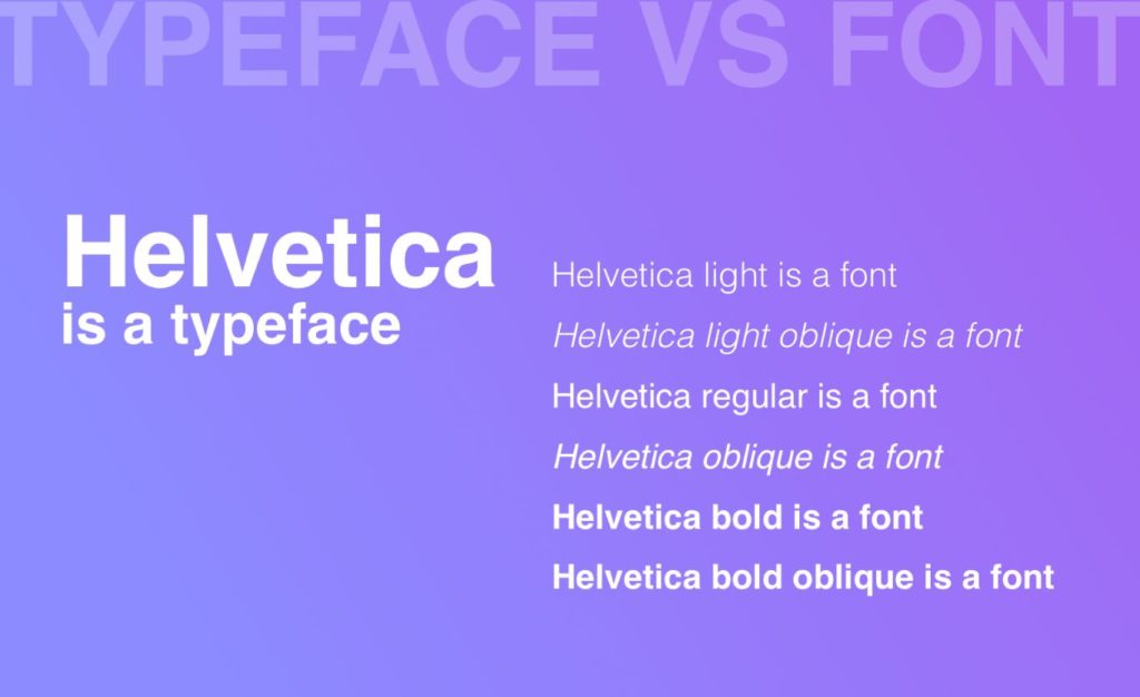
Typeface: refers to the overall design of a type. It includes all the styles within that type. For example, Helvetica, in its entirety, is classed as a typeface.
Font: is a style (or file) within a typeface. For example, Helvetica Italic, or Helvetica Textbook Bold, are both fonts. They are fonts belonging to the Helvetica family/typeface.
As time moves on and the terms are being used interchangeably, hence there is no need to get too bogged down with the terminology.
Recommended reading: The Visual History of Type
Types of Types
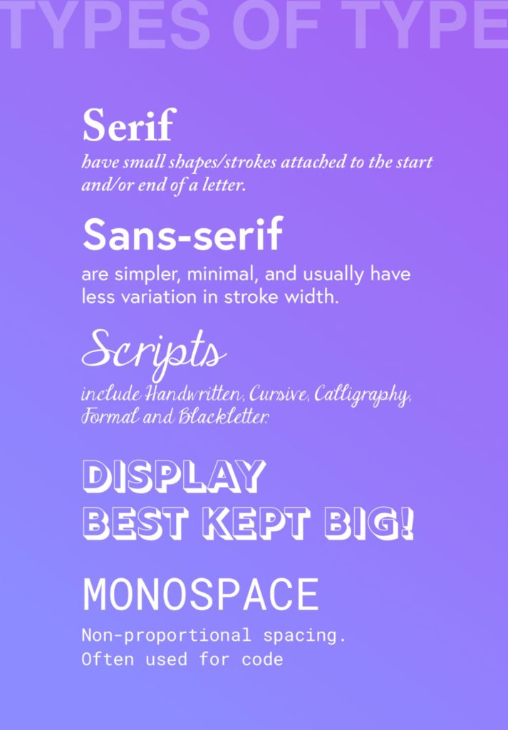
Typefaces can be broken down into 5 main categories. Here is a very brief overview:
Serif
A serif is a small shape or stroke, attached to the start or endpoint of a character/letter. A serif typeface comes in different flavors, such as Old Style, Traditional, Neoclassical and Slab. They can be used in headings and body copy. Serif fonts are arguably considered the easiest type of type to read.
Sans-serif
Sans (without) Serif typefaces are simpler, minimal and often considered to be a more modern alternative to Serifs. They usually have less variation in stroke width than Serif typefaces. Much like Serif typefaces, they can also be used for headings and body copy.
Variations within the Sans-Serif family include Grotesque, Square, Geometric and Humanistic.
Scripts
Scripts include Handwritten, Cursive, Calligraphy, Formal, and Blackletter typefaces. Often best reserved for headings and decorative content.
Display/Decorative
As the name might suggest, Display typefaces are intended to be used at a large point size, which means they are only really recommended for use in headings. Great if you’re looking for something unique and maybe a little novel or edgy.
Monospace
Often reserved for use in applications that need to output code, monospaced typefaces are not proportional – each letter takes up the same amount of space.
Considering Readability, Accessibility and Best Practice
Good typeface selection is essential to good user experience. So before we dig any deeper, let’s look at a few essentials that should be considered before you begin to search for your perfect type.
1. Keep the Number of Fonts in Use to a Minimum.
There are many ways to create hierarchy and establish a unique design without using a different typeface for every element. In fact, you can often achieve more clarity with less. A single typeface might have 10 different font styles within it, making it easy to create stunning results with just a single typeface.
2. Think About Contrast.
Whilst a soft pale grey font might look beautifully subtle in sketch or photoshop (especially on your shiny new 27” iMac), what happens to it if your user is trying to read it whilst outside? Or on the bus with the sun shining over their shoulder? What if they are not using the latest retina display and have an old monitor that doesn’t even make Toy Story 3 look good? What if your user is over 40 and needs glasses? What if they just have a poor eyesight period?
Clarity is king. Don’t let pretty get in the way. This is a really easy one to fix. Tools like contrastchecker.com can help you make sure you’re not designing for form over function by checking your color scheme meets minimum accessibility requirements for contrast. If you want people to read your content, make it easy for them!
3. Remember Negative Space/White Space.
Not only does negative space help to establish hierarchy and draw attention to elements and specific content, it also makes your website a whole lot easier to read.
Less is always more. You really don’t need to fill every corner of the screen to get your message across. A great wall of text will easily overwhelm your visitors, so make good use of line-breaks, paragraph spacing and white space for optimum readability.
4. If You Confuse, You’ll Lose.
Tempting as it might be to do something quirky and clever with your copy, don’t forget: “The main thing is to keep the main thing the main thing”. – Steven Covey. There’s a place for cute, and it is never when you’re trying to explain something on a website. Simple wins.
5. Line Length.
This one is a pet hate of mine. If you have ever visited a website where the copy went all the way from the left side of the browser to the right side, I’m confident you must share my frustration. Text that spans the full width of a large display is incredibly difficult to read. There’s a reason newspapers use columns, and this is it!
There are many ways to work out exactly what the optimum number of characters is per line, but as a rule of thumb, if you stick between 45 and 75 characters, you can’t go far wrong. I tend to work to a max-width of 650px for paragraph text.
Further reading: Size Matters: Balancing Line Length And Font Size
How to Select a Typeface
With the basics in mind, we can move to the fun part – choosing the right typeface for your design. There are literally millions of fonts available to download. So how do you find the right ones for your project?
Let’s start with what you already know about your clients’ client (your target audience):
- Who is the website actually for?
- Do you have any user personas? What do you know about the end-user?
- What is the website about?
- How do you want the target audience to feel when they view your site?
- What kind of vibe or mood are you trying to convey? Entertaining or professional and business-like? Serious or fun and quirky?
- Does the intended audience have any special requirements? (For example, are you creating a website for older people?)
- What are your visitors going to do on the website? Are they just browsing to pass time, to research, or looking to complete other tasks? What are the ‘jobs to be done’?
- What types of content need to be presented? (Research, posts, poems, essays, visuals?)
- What do your users consider the important thing?
Next, consider whether there are any client-imposed restrictions, such as:
- Branding
Is there an existing brand/style guide that should be maintained? If this was originally created for print, how well does that translate for use on the web? A print-based style-guide can be an awesome starting point, but you may need to tweak and refine that to offer a seamless brand identity for digital.
- Functionality
How important is the speed of the site? Does it matter if your typeface choice impacts the time it takes the page to load? Do you need more than one typeface to get the desired look and feel and does the need for that design decision negatively impact the page speed? Check the file size of your typeface to see how it could affect the time it takes your page to load – you can use this to help your selection process.
- Licencing
Is the client prepared to pay for a license to use a premium font that might enhance and/or strengthen their brand, and if they are, do they really need to? Could you still represent the brand with a faster-loading alternative to its premium typeface? Will they buy the font outright or use a subscription service like Adobe
- Versatility
This is where using actual content can be really helpful. Does your chosen typeface have enough fonts (weights and styles) to support the different types of content you are designing for?
- Language
Will the website be in English? Does it need to be translated into any other languages? Might it need to be translated in the future? If so, does your chosen typeface support that?
(Performance tip: You can reduce the file size of your fonts if you exclude any unrequired languages).
Working through the questions above will help you to make some logical design decisions for typographical selection. The goal is to come up with a shortlist of requirements, eliminating anything deemed unsuitable based on your answers.
Once you’ve done that, it’s safe to start playing with a couple of options from your shortlist and seeing what works best!
Where to Find Typefaces/Fonts for Websites
If you followed the process above, you’ll already know whether your search should be of premium (paid) typefaces or free, open-source ones.
Way back when, a handful of ‘web-safe’ fonts were all we had. Today, we have so many to choose from it’s become an art form in itself. There are endless options available from hundreds of different suppliers.
Finding Web Fonts
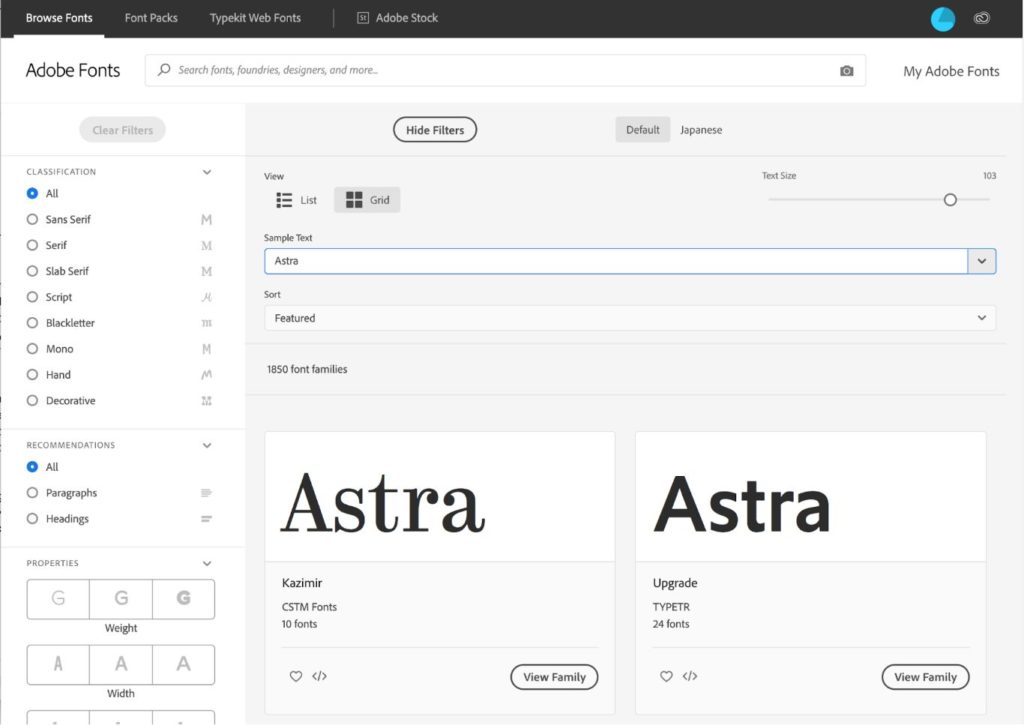
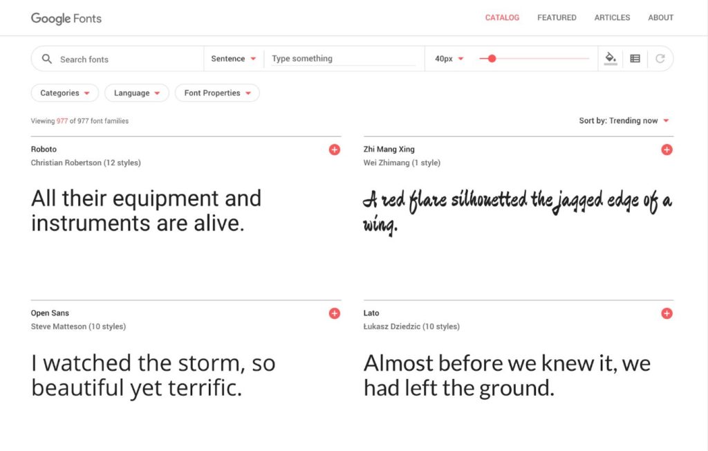
Google Fonts (free), Adobe Fonts (paid) and MyFonts.com (paid), are just a few examples of where you might find web fonts. Each provider has its own licensing terms, so it’s worth getting to grips with those and making sure your client is across them too.
As you might expect, the free fonts from Google are widely used, the ‘good’ ones especially so, hence if you’re looking for something unique or on-brand, then you’ll probably be checking out a premium (custom) option.
Custom typefaces don’t come without their own problems. A ‘flash of unstyled text’ (FOUT) can appear for a second or two while your custom font loads via Javascript. For people with a decent internet connection, it is barely noticeable, however, if you know your target market isn’t going to have access to speedy internet, then this is probably something you’ll want to avoid. Developers have devised a few different ways of dealing with FOUT, but at time of writing, none of them are perfect.
Webfonts used to require different files for different browsers – that list included a TrueType file (.ttf), Web Open Font Format file (.woff), Embedded OpenType file (.eot) and a Scalable Vector Graphics (.svg) file. These days, (assuming you don’t need to support Internet Explorer), the only files you need are .woff or.woff2, however, if you want to cover your bases you might also include .eot and .ttf.
Read: The complete list of font formats and their use.
There are plenty of free resources available to help you find typography inspiration. I’ve added a few below, but in addition to sites like this, it can help to keep a list of sites you come across as you browse the web. A quick look at the source code will provide you with the name of the typefaces in use. This too can be a good starting point.
Check out:
How to Select a Solid Font Pairing
If a single typeface isn’t meeting your needs, then you can look to add a second typeface to your stack. The perfect font pairing can be a thing of beauty, creating a visually engaging layout without the need for additional elements, however finding the right combination can be tricky. Too similar, and your design will look messy, too different and the result will be jarring.
So how do you find the perfect font pairing? Every designer has their own way of tackling this. For me, I’ve found the easiest method is to select either a header or body font first (using the selection process we talked about earlier), then start a process of elimination.
Go back to your design brief and find a typeface that meets those needs first – lock it in. This will make it much easier to find a good match, as opposed to looking through a million possible combinations.
You will also want to keep the following in mind when looking for a strong font pairing:
- Hierarchy
Going back to the content, what types of content do you need to present and how can your font stack help you do that? You may have headlines, sub, headings, body copy, button text, quotes and so on.
Which typefaces work with your initial selection to help you to establish a strong visual hierarchy. Where do you want the reader to look first and can your selection help you to achieve that? Be careful not to rely on font color to indicate hierarchy (an accessibility no-no).
- Readability
You might find an awesome display typeface and decide it’s perfect for your headlines, but what about the rest of the content? How much content is there and how can you make sure it’s easy to read? Much like your single type selection, clarity is key when choosing a pairing.
- Complementary
If your selected typeface has a number of font styles (weights, upper/lower case etc), you can achieve good harmony using a selection from the same family. (Technically not a pairing but be sure to check this before you start looking for an alternative). Also, finding fonts with similarities to your initial selection can help. For example, fonts with a similar x-height often go well together.
- Contrast
Through tweaking style, size, weight, spacing/leading, and even color, you can create sufficient contrast to keep your design visually stimulating and inclusive.
- Classic pairings
If all else fails, try a classic font combo. Serif with sans-serif (and vice versa) is often a great starting point. A quick Google of ‘Font pairings’ will return hundreds of results that you can browse to see if anything looks like a good fit for your project.
Whilst not so unique, these tried and tested combinations are popular for a reason. There are websites dedicated entirely to helping you master the art of the perfect font combination.
Check out: The Ultimate Collection of Google Font Pairings
Search for a font pairing: FontPair, FontJoy, Typespiration.
Further reading:
- Quick Guide to Web Fonts
- Getting Started with Google Fonts
- Adding Adobe Fonts to your website
- Using @font-face to add custom fonts to your website
Are You up to the Challenge?
95% of the information on the web is written language, yet typeface is often an afterthought or selected based on personal preference.
As a designer, it’s a given that you want to create visually stunning layouts for your digital projects, but where the typeface is concerned, visually stunning is just the start of it. As the demand for inclusive design increases, perfecting typeface in your designs is a skill worth mastering.
As a developer, creating accessible, human-centered websites and products is something to aspire to and in the opinion of many, (us included), should be standard.
The content of any website or product is literally the most important thing. Using the methodology above, you are on track to delivering online experiences that combine form and function to deliver the best possible outcome for everyone.
Disclosure: This blog may contain affiliate links. If you make a purchase through one of these links, we may receive a small commission. Read disclosure. Rest assured that we only recommend products that we have personally used and believe will add value to our readers. Thanks for your support!
