Did you know that as high as 70% of visitors to ECommerce stores abandon carts?
This means that out of every 10 people who reach your checkout page, 7 decide to leave without making the purchase. Now that’s a whole lot of lost revenues!
And the numbers only get worse when it comes to mobile. On a mobile, the average abandonment rate is higher than 85.65%!
Do you have a similar situation with your e-commerce store? Are you experiencing high cart abandonment rates?
If so, do you want to know why these people leave? What can you do to prevent them from leaving? And how can you get them to complete the order so you can stop losing money?
By the end of this comprehensive guide (with research backed data), you will know the answers to all these questions and more.
Most importantly, you will learn exactly what you are doing wrong that is causing your visitors to abandon their carts and the strategies you can implement immediately to retain them and maximize your profits.
And that’s not all.
In the second part of this article, we will also take a look at how you can use powerful tactics like email marketing, retargeting and personal outreach to bring back customers to complete their abandoned transactions thereby boosting your revenues by a substantial margin.
Here’s what we will be discussing in this article:
- What Is Cart Abandonment?
- How Do You Measure Cart Abandonment Rate for Your E-Commerce Store?
- Which Industries Have the Highest Cart Abandonment Rates?
- Why Do People Abandon Their Shopping Carts?
- 21 Strategies to Reduce Cart Abandonment – Recover More Customers by Reducing Abandoned Carts
- How to Design a Professional Checkout Page Using CartFlows?
- Wrapping Up
What Is Cart Abandonment?
To put it simply, cart abandonment happens when a customer adds a product(s) to their shopping cart and then leaves without making the purchase.
Here’s what happens:
A user visits your eCommerce store.
They browse around, add product(s) to the shopping cart.
They go to the checkout page. Some even start filling details on the checkout form, like their name, email address, etc.
But then out of the blue, they decide to leave without completing the transaction.
As you would have realized, cart abandonment is specific to online retail.
In a typical brick and mortar shop, you won’t often get to see someone adding products to their shopping cart and then simply walking away without buying the products. That would be considered absurd.
So why is it so common in e-commerce?
Before we look at the answer, let’s first see how you can measure the cart abandonment rates for your e-commerce store and the industries that have the highest cart abandonment rates.
How Do You Measure Cart Abandonment Rate for Your E-Commerce Store?
The answer is simple – using Google Analytics.
You can easily calculate the cart abandonment rate for your e-commerce store by setting up a Goal (and related funnels) in Google Analytics.
Here are the steps you can use to do this quickly.
Step 1
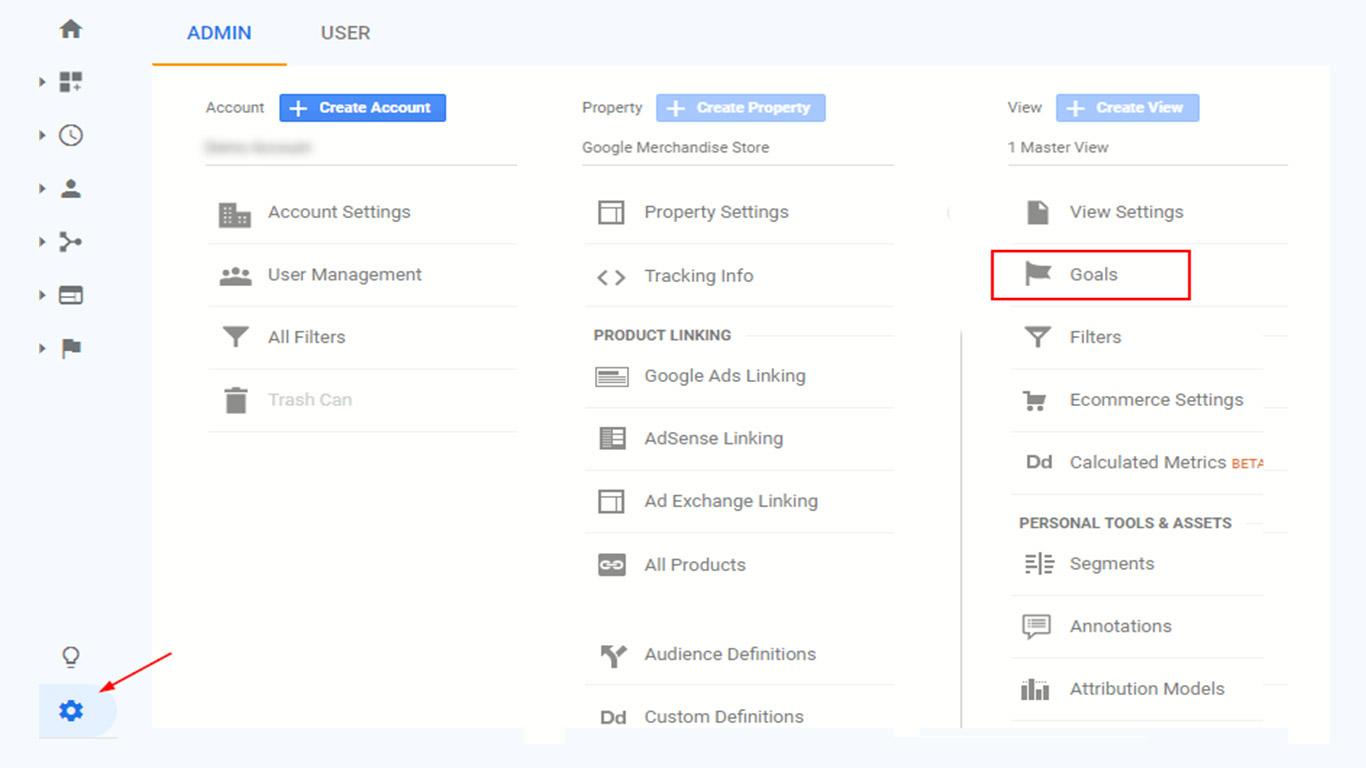
Enter the Admin panel of your Google Analytics account by clicking on the gear icon located toward the bottom left-hand corner of your screen. Once there, click on ‘Goals’ as shown in the image below.
Step 2
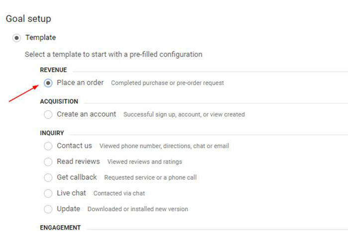
On the screen that follows, click on the ‘New Goal’ button to create a new goal and then select the ‘Place an order’ template under the ‘Goal Set-up’ menu and click ‘Continue’.
Note: Depending on your industry settings (in Google Analytics), the options you see under ‘template’ might differ. So if you do not find a ‘Place an Order‘ template, select any template that has the tagline, ‘Completed Online Purchase‘ or ‘Completed Online Payment‘.
Step 3
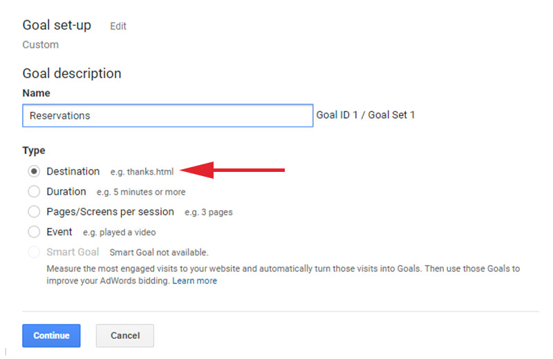
Under the ‘Goal Description’ menu that follows, give your goal a name, select, ‘Destination’ as your goal type and click ‘Continue’.
Step 4
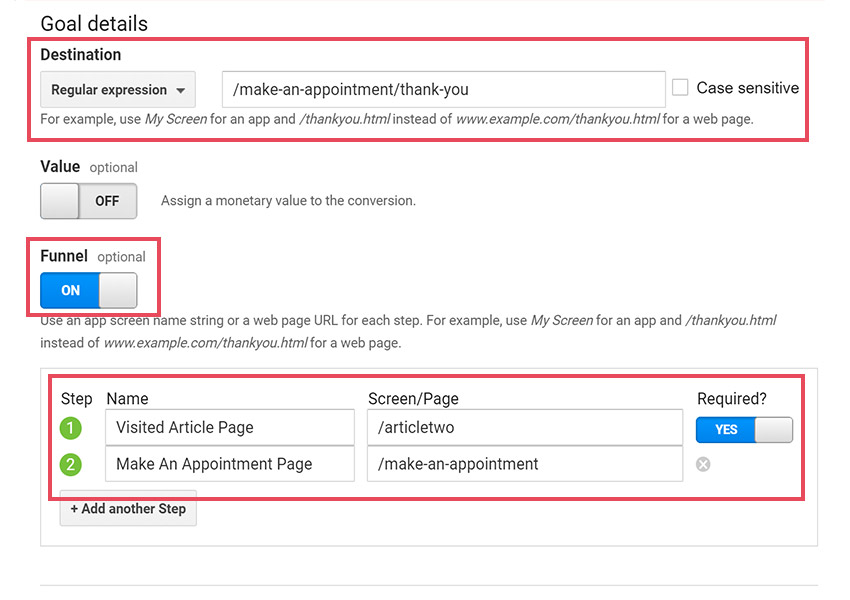
Under the ‘Goal Details’ menu, select the destination as the URL of your ‘thank you’ (or order completion) page. Select the funnel option and enter all your checkout steps in the space provided. For this example, we will use cart URL and checkout URL as the two steps for the funnel as shown in the image below.
Now your goals and funnels are all set up.
In order to see your cart abandonment rate, go to Conversions > Funnel Visualization, select your goal from the drop-down menu and you should be able to see visualization as follows (of course, you will need to wait for a couple of weeks to see accurate data).
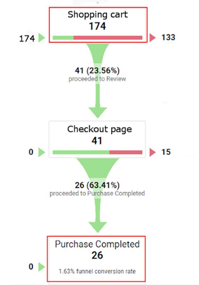
As you can see, this visualization gives you the number of people who entered your shopping cart and the number of people who completed the purchase.
You can calculate your shopping cart abandonment rate by dividing the total number of customers who have completed the purchase with the total number of customers who added your product to their cart, subtracting the result by 1 and then multiplying the result by 100.
1 – (Total No. of customers who completed the purchase / Total No. of customers who entered your cart page) x 100
In our example (refer image above), 174 people entered the shopping cart page and 26 of them completed the purchase.
So using the formula, we get:
1 – (26/174) x 100 = 86%
So your cart abandonment rate will be 86%.
Now let us take a quick look at the industries that have the highest cart abandonment rates before we understand the main reasons why people abandon the cart in the first place.
Which Industries Have the Highest Cart Abandonment Rates?
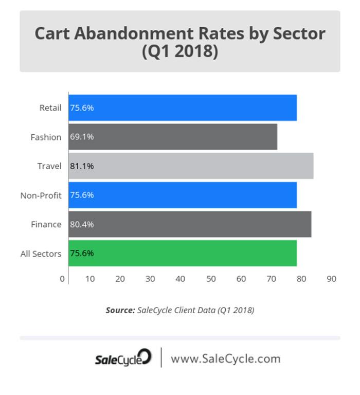
According to data from SalesCycle, the two industries that have the highest cart abandonment rates are Finance and Travel.
The Finance industry has a cart abandonment rate of 83.7%, followed by the Travel industry at 82.2%.
The industries with the lowest cart abandonment rates are Fashion and Gaming, with Fashion at 67.6% and Gaming at 67.4%.
The following graph gives a better representation of this data.
Let us now look at the real truth behind why such a large majority of people abandon their carts.
Why Do People Abandon Their Shopping Carts?
Plenty of studies have been done over the years to identify the root causes of cart abandonment. Let’s see what some of these studies have found.
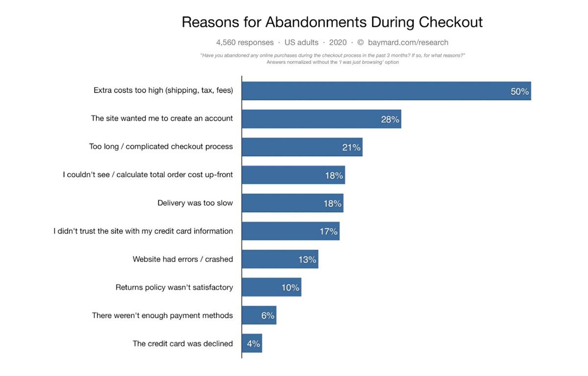
According to a survey done by Baymard Institute,
- 55% of buyers abandon their cart because of unexpected charges like high shipping costs.
- 34% of buyers leave because the site forced them to create an account.
- 26% leave because of a complicated checkout process.
- 21% leave because of hidden charges that appeared later in the checkout process.
- 17% leave because of trust issues.
- 16% leave because the shipping was too slow.
- 11% leave because of a bad returns policy.
- 6% leave because of a lack of available payment methods.
- 11% leave because of website issues.
In addition to the above, other surveys like this one by Forrester suggests that a large majority of people (over 41%) leave because they were not ready to make a purchase or they wanted to compare prices on other websites.
The same study also found that around 12% leave because the site was asking for seemingly unnecessary personal information (like a phone number).
And around 10% leave because they did not have enough information to make the purchase. This could be information about the actual product or how to complete the checkout process.
In addition to these, there could be various other reasons like for example, distraction is considered one of the primary reasons why people abandon carts.
Perhaps the prospect got distracted because they got a phone call in the midst of making the purchase, or perhaps they had to run an errand or were running late for a meeting.
Now that you know the real reasons behind cart abandonment, imagine how much more in profits you would make if you could reduce your cart abandonment rate even by a small percentage?
And what if you could reach out to people who abandoned their carts and persuade them to come back and complete their transactions? Now that could take your revenues to a whole nother level.
The good news is that reducing cart abandonment is easier than you think. You can achieve that by making a few simple optimizations to your website and checkout process.
What are those optimizations? That is exactly what we will be discussing in the remaining part of this article. So keep reading.
21 Strategies to Reduce Cart Abandonment – Recover More Customers by Reducing Abandoned Carts
Every problem has a solution and the problem of cart abandonment is no different.
Even though you cannot bring down the abandonment rates to 0%, you can reduce it by a substantial margin by identifying and fixing problem areas on your E-Commerce site.
But before we see how you can do that, let’s first categorize the reasons for cart abandonment so we can bring things into perspective.
The reasons for cart abandonment can essentially be categorized into the following 5 issues:
- Checkout related issues.
- Shipping related issues.
- Trust Issues.
- Payment issues.
- Website-related issues.
By systematically addressing these issues, you should be able to drastically bring down your cart abandonment rate.
Let’s look at 21 strategies you can implement today that will fix all these issues, reduce your cart abandonment rate and substantially boost your profit margins.
If you are in a hurry, here’s a quick look at the solutions we will be discussing.
Optimize the Checkout Process:
- Don’t make registration compulsory (Offer guest checkout).
- Display the cart icon prominently on all pages.
- Show a checkout progress indicator.
- Clearly label your checkout buttons.
- Inform the customer why you need personal information.
- Optimize your checkout form.
- Keep your checkout page distraction-free.
- Create a professional yet functional checkout page.
Optimize Shipping Processes:
- Offer free shipping or low-cost shipping options
- Give clear delivery estimates.
- Offer faster shipping options.
- Be upfront about additional charges
Build Trust and Credibility:
- Address concerns about payment security.
- Have a friendly return policy.
- Offer many channels of communication.
- Provide social proof.
Improve Payment Usability:
- Offer a variety of payment options
Resolve Website Related Issues:
- Improve your site’s mobile usability.
- Keep your website error-free.
Other Strategies:
- Use scarcity to your advantage.
- Use exit pop-up to prevent people from leaving.
Let’s look into each one of these strategies in detail and while doing so, see if you are committing any of these errors so you can start fixing them.
Optimize the Checkout Process to Reduce Cart Abandonment
1. Don’t Make Registration Compulsory (Offer Guest Checkout Option)
Research indicates that over 34% of users abandon carts because they had no other option but to register.
Compulsory registration acts as a deterrent. It makes people angry because it shows that the retailer does not value their time or opinion.
One of the simplest ways to avoid this from happening is to offer a guest checkout option.
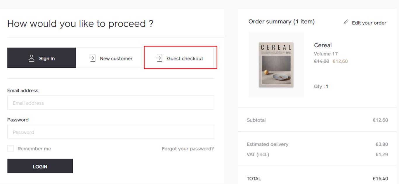
And if you want customers to register, you can still do it using this great strategy from Peep Laja of ConversionXL.com.
According to Peep, an effective way to get customers to register is to offer them an option for registration on the ‘Thank You’ page (after they have made the payment). This way, you already have all their information and the only thing required is a password.
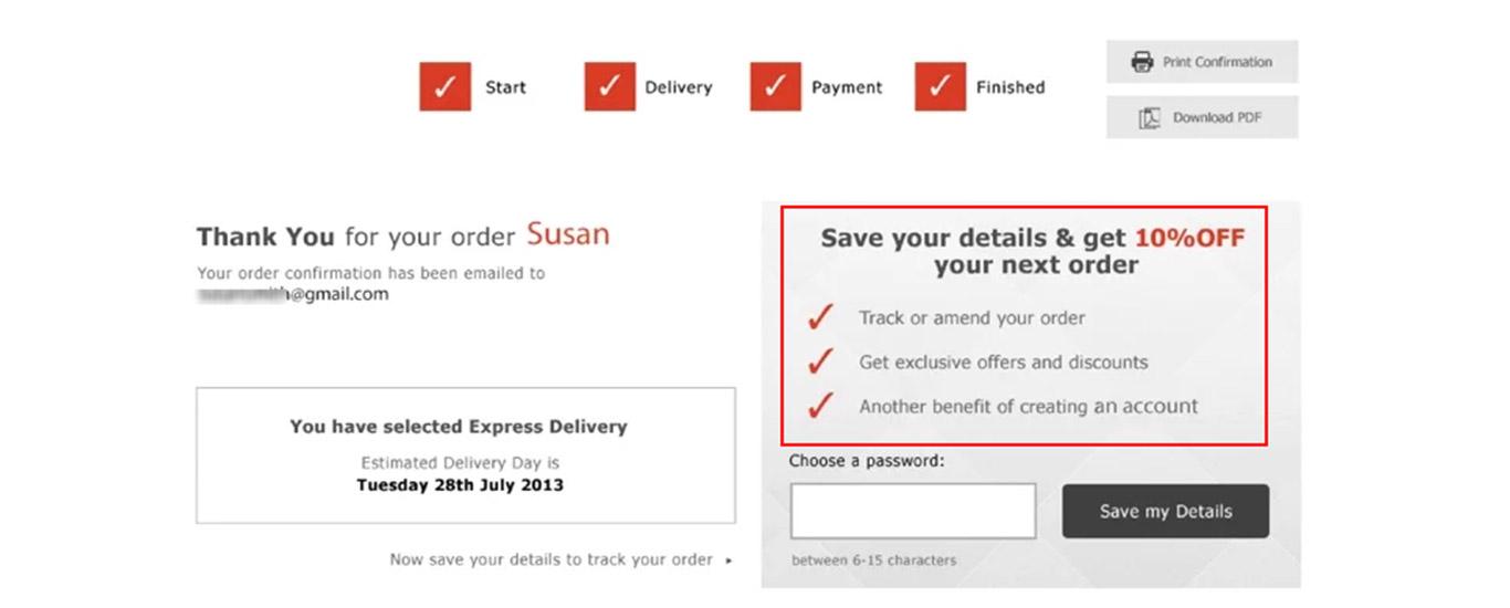
Even better, offer them an incentive to register. For example, this company (image above) offers the customer a 10% discount on their next order and also allows order tracking upon registration.
2. Display the Cart Icon Prominently on All Pages
Have you ever been on a website where after clicking the ‘Add to Cart’ button, you couldn’t even tell if the product was added to the cart and you had to make an effort to search for your cart?
This is a usability flaw and can annoy people to the scale of abandoning their purchase.
To avoid this from happening, always give a clear indication that the product was added to the cart. Also, have a prominent cart icon visible on all pages clearly displaying the number of products in it.
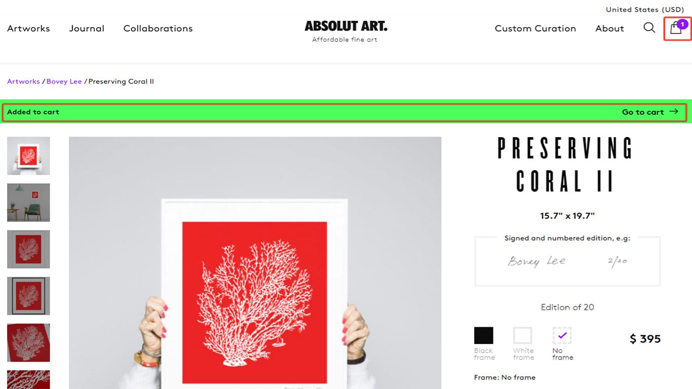
As you can see from the image above, as soon as the user clicks the ‘Add to Cart’ button, a prompt appears indicating that the item was added with a link to the cart. Similarly, the cart icon on the top right indicates that there is 1 item in the cart.
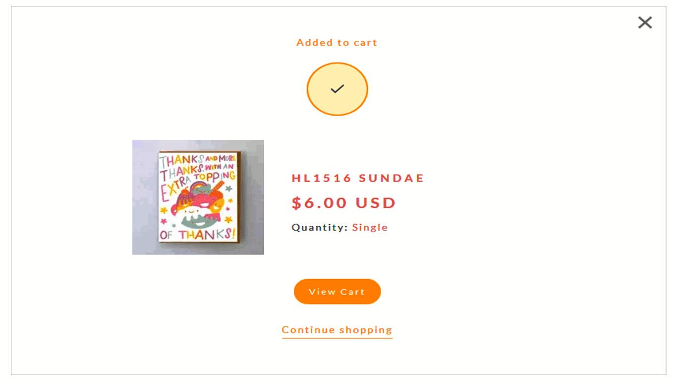
Another way is to use a pop-up to indicate that the selected item was added with links to the cart or to ‘continue shopping’ as shown in the image below.
3. Show a Checkout Progress Indicator to Reduce Friction
Let’s face it. The checkout process is boring and any customer would want to get it over with as quickly as possible.
A study by UPS suggests that 20% of customers abandon their carts because they found the checkout process too long and confusing.
It has also been found that over 27% abandon their cart because of time restraints.
To make things easier for the customer, you should have a progress indicator on your checkout page, especially if you have multiple steps to your checkout.
A progress indicator tells the customer exactly where they are in the checkout process and how many steps are left before they can finally make the purchase. This can also help someone pressed for time to complete the purchase.
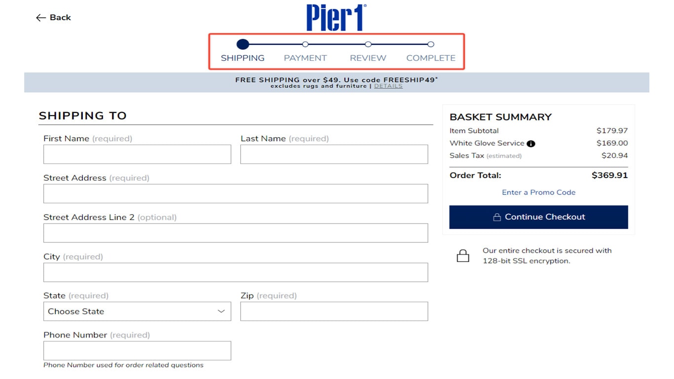
The above image is a great example of a progress indicator done right. It’s clear to the customer that there are only 4 steps and that they are at step number 1.
Also, it is best to keep the number of checkout steps to a minimum, preferably no more than 2 to 3 steps, so the checkout process does not seem too long.
4. Clearly Label Your Checkout Buttons for Higher Conversions
Just like it’s important to have progress indicators, it’s also important to label your CTA (call to action) buttons correctly so the customer knows exactly where they are going upon clicking.
Of-course, the progress bar is indicative of that, but button labels are like a secondary confirmation.
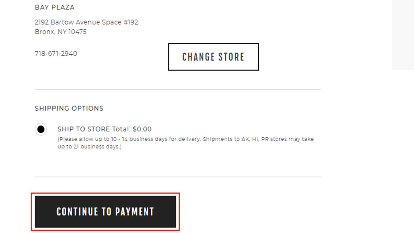
Avoid labeling your buttons with some generic words like ‘Continue’ or ‘Next Step’.
Instead use intuitive labels like ‘Continue to Payment’, ‘Continue to Review’, ‘Next: Order Review’ etc. as shown in the image above.
5. Inform the Customer Why You Need Personal Information
A study by Baymard indicates that many customers feel their privacy invaded when checkout forms asked for personal information like a phone number or email address.
Customers were also worried if their information will be sold to marketing agencies who will pester them later.
But the study also found that when customers were presented with a valid reason why the said information was required, they felt much more secure.
So if you are asking for personal data in your form field, explain clearly why you need it.
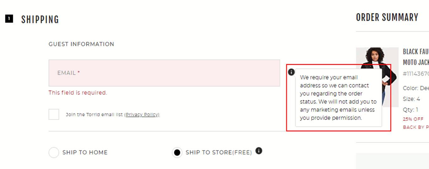
You can use tooltips for this (as shown in the image above) or state the reason directly in the form’s description.
6. Optimize Your Checkout Form
The most boring part about buying online is filling forms and this can become annoying when the forms are too long or ask for unnecessary information.
As mentioned earlier, over 26% of buyers abandon their cart because the checkout form looked complicated.
Make your checkout forms minimal by removing fields that are unnecessary or by clearly labeling them as optional.
You can also consider having a 2 step or 3 step checkout process so you can split the forms between these steps making them appear shorter.
Here’s a great example of a minimalistic 2 step checkout form created using Cartflows:
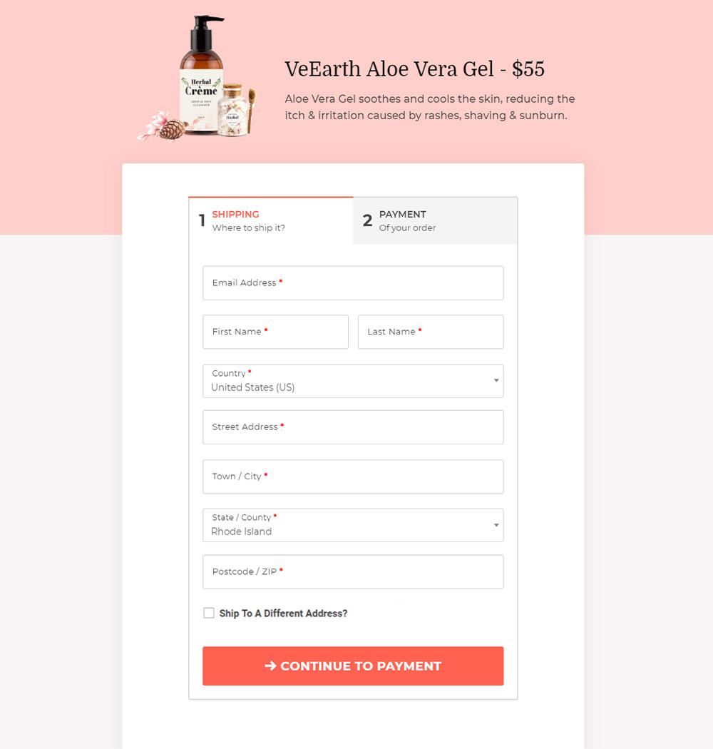
As you can see, the first step only displays the shipping fields and the second step will display the payment related fields. This helps make the form look shorter and easier to fill out.
Similarly, the form also has a ‘ship to a different address’ checkbox which the customer can select in case their shipping address is different from their billing address. This way you don’t need to show two separate forms to the customer.
By the way, If you use WooCommerce, you can build professional checkout pages along with checkout forms using Cartflows. We will look into this in detail later in this article.
From a usability perspective, it is also better to avoid too many multi-column fields and use single column fields instead. Research indicates that multi-column fields are prone to misinterpretation and cause errors.
Here’s a great example of a minimalistic checkout form from Crutchfield.com with all single column fields.
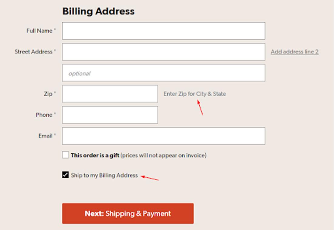
This form has only 5 mandatory form fields and clearly labels the 2nd address as optional. It also automatically populates the City and State fields once a user enters the Zip code. This simple feature makes the form 2 fields shorter.
You also need to ensure that your checkout form uses inline error validation as shown in the image below.
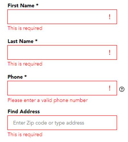
This way the customer will know exactly what needs to be corrected in case of erroneous entries.
7. Keep the Checkout Page Distraction Free
One of the prime reasons why people abandon carts is because they get distracted. You can’t do much about external distractions but what you can do is ensure that your checkout page is distraction-free.
It is best to replace or minimize the header and footer, remove unnecessary navigational links, and keep only the links that are most important, for example, a link to contact support (live chat, phone number and/or email address), return policy, privacy policy and trust signals as we discussed before.
The image below is an example of a clean, distraction-free checkout page.
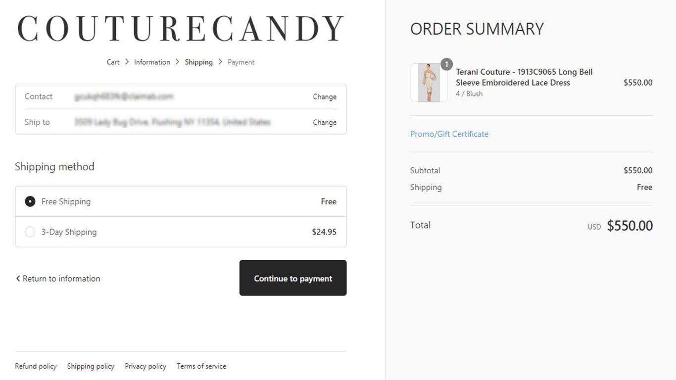
Also, avoid adding links to other products on this page as even that has the potential to distract the user.
It is also a good practice to not have any coupon or discount code fields on the checkout page. When users see a coupon field, they feel like they are missing out on a better deal and shift their attention to finding a coupon, eventually resulting in an abandoned cart.
Studies show that around 8% of buyers leave simply because they failed to find a coupon code on the site.
If you must, use a text-based link which when clicked opens the coupon field.
8. Have a Professional Looking Checkout Page
Research shows that over 75% of consumers judge a business’ credibility based on how professional their website looks.
If you have a badly designed checkout page that lacks important functionalities, the buyer will lose trust in your business. As we saw earlier, a lack of trust is one of the prime reasons for cart abandonment.
So make sure that your checkout page is well designed and intuitive so the customer knows how to proceed without needing to think twice.
Here are a few points to bear in mind.
- The design of the checkout page needs to match your site’s look and feel.
- Similarly, your checkout form needs to be designed professionally with the user in mind. The form must be short and easy to fill and should have inline error validation for easier amendments.
- There should be clear and prominent call-to-action buttons (as discussed earlier).
- The checkout page should also have a prominent product image with information about the product cost, shipping costs, taxes, and delivery estimates.
- The cart should be easy to edit. The customer should be able to remove products from the cart, change quantities or change other variables like color, size, etc. (where it is applicable).
- The checkout page should also have signs that reassure the customer all the way through like trust seals, security information, contact information, testimonials, etc.
If you are using WooCommerce to run your store, you know that their default checkout pages are pretty basic. But this can be changed. Later in this article, we will see how you can use CartFlows to design highly professional and functional checkout pages.
Optimize Shipping Processes
9. Offer Free Shipping or Low-Cost Shipping Options
Shipping costs are universally loathed. No wonder this is one of the biggest reasons for cart abandonment.
According to a Forrester survey, 62% of buyers want to avoid paying shipping fees and opt for the cheapest shipping option when free shipping is not available.
38% said that they have bought from a specific retailer purely based on a free shipping option.
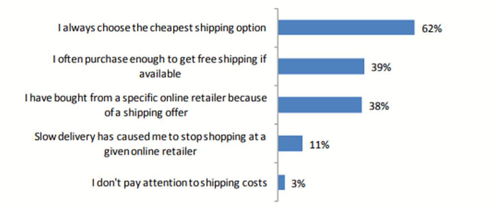
Data from Baymard suggests that 55% of buyers abandon carts because the shipping costs were too high.
Therefore, if free shipping is not a possibility, try to minimize your shipping rates as much as possible. You can even consider increasing the product price a little to offset the lower shipping cost, so your profits don’t take a hit.
10. Give Clear Delivery Estimates
Customers want to get a hold of their products as soon as possible. So when you don’t give delivery estimates, they assume that the shipping will take too long and don’t proceed to buy.
The way to prevent this from happening is to give your customers clear delivery estimates. In most cases, it’s not possible to offer an exact estimate but at-least a rough estimate should be given.
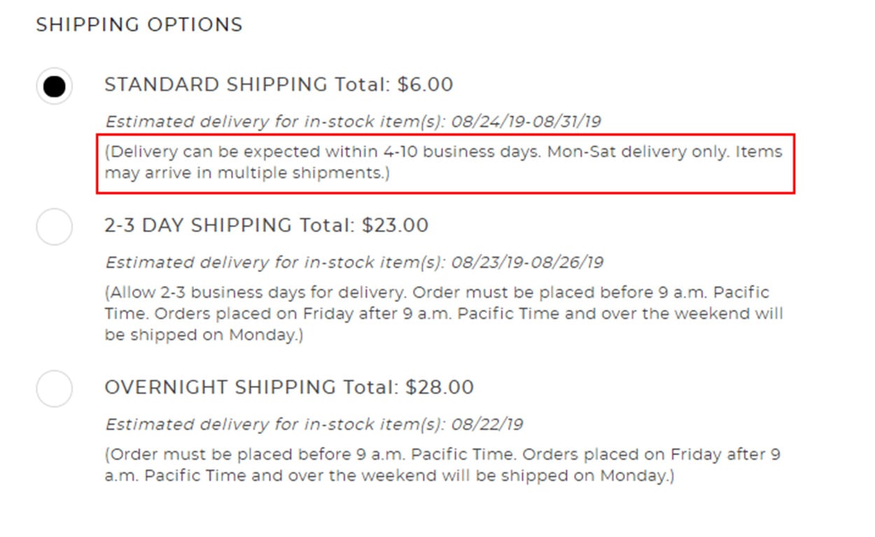
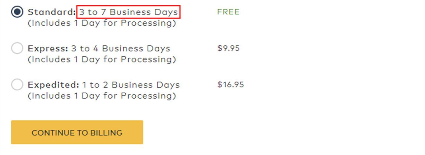
The above image is a good example of clear delivery estimates. Even though the standard shipping option seems slow it at-least lets the customer know all the required details. Plus there is an option for overnight shipping for anyone who is in a hurry.
The following image is another example of a simple form that gives proper delivery estimates along with offering express and expedited shipping options.
Another great option is to allow the customer to track their order.
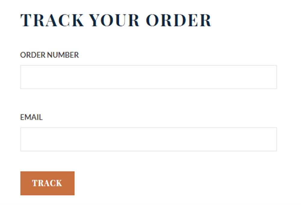
Tracking allows the customer to find out exactly where their shipment is at any given point and when it will arrive.
This is the best way to minimize customer’s anxiety about product delivery.
11. Offer Faster Shipping Options
One of the main drawbacks of online retail over offline retail is that you cannot immediately take possession of your product after making payment. And for most buyers, the wait can be agonizing.
According to Baymard, over 16% of buyers abandon their carts because the delivery was too slow.
Therefore, if you don’t already have it, see if you can add expedited delivery options for an extra cost along with the standard shipping option.
12. Be Upfront About Additional Charges
According to Baymard, 21% of buyers abandon carts because shipping and other related costs were presented to them too late during the checkout process.
People simply loathe hidden charges that pop up from nowhere at the very final step of the checkout process. When that happens, it’s easy to feel annoyed and think that the store is trying to manipulate you.
Therefore, as far as possible, be upfront about all additional charges the customer is going to incur.
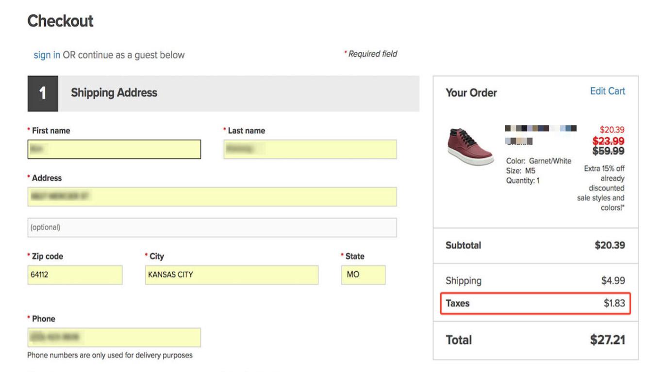
A good practice is to display the total cost on the ‘Shopping Cart’ page (or first checkout step) instead of showing them on the final ‘Checkout step’.
If shipping and other charges can only be calculated later in the process, let the customer know that the price is just an estimated total as shown in the image below:
Build Trust and Credibility
13. Address Concerns About Payment Security
Data suggests that over 17% of buyers abandon carts because they don’t trust the website with their credit card information.
A survey by Actual Insights found that over 61% of people abandoned their cart because the site did not have a trust logo or used a logo that was unrecognizable.
A simple way to address these issues is to assure the customer all the way through that their payment information is secure and will not be misused.
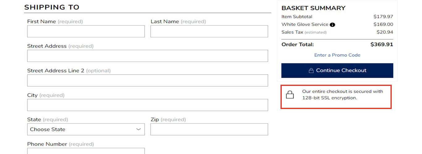
The following image is a good example. There is a clear indication right below the checkout button that the checkout is secured with 128-bit encryption. The padlock icon is used to subconscious reaffirm the message.
Here’s another image that prominently displays the Norton security seal right next to the payment button.
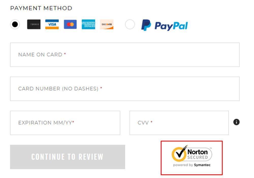
According to a survey, the Norton security seal is one of the most trusted seals among buyers followed by McAfee Secure, TRUSTe, BBB, Thawte, Trustwave, GeoTrust, and Comodo (in that order).
The following image is an example of a trust seal and security assurance displayed on the footer of the checkout page.

So if you don’t already have it, consider using one or multiple trust seals and security related text/icons on your checkout page to make your customers feel secure.
14. Have a Friendly Return Policy
Shopping online requires a whole lot of trust because you cannot see (except for images), touch or feel the product you are buying. This is why people want to be assured that if there is something wrong with the product, they can return it and get their money back.
It doesn’t come as a surprise that over 11% abandon carts because of a bad return policy or because they were not able to find one.
Therefore, make it a point to prominently display your return policy throughout your site including your Cart and Checkout pages.
You can also consider displaying a small version of your return policy right below the ‘Add To Cart’ or ‘Payment’ button as shown below.
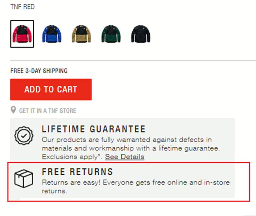
A link to the return policy that triggers a pop-up is a good way to ensure that your customers don’t move away from your checkout page to read the policy.
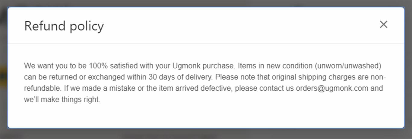
In most cases, people look no further than the smaller version. They just need to be assured that you offer an easy and friendly return policy along with a money-back guarantee.
15. Offer Many Channels of Communication to Address Customer Queries
Often times, a customer might need help to complete the checkout process but they find that there is no easy way to get in touch with you. When people see a lack of customer support, they lose trust which leads to cart abandonment.
According to a study by Forrester, 10% of people abandon carts because they could not find enough information about the product or about the checkout process.
To prevent this from happening, offer a multitude of ways on the checkout page (and other pages) where people can contact you for quick queries and clarifications.
Have a phone number (preferably Toll-Free) and email addresses (for support) on your checkout pages.
One of the most effective ways is to offer a live chat option.
This way hesitant buyers can ask a real person questions about the issues they are facing in completing the purchase.
A free option is to add the facebook messenger to your site. This way you can also keep spammers at bay.
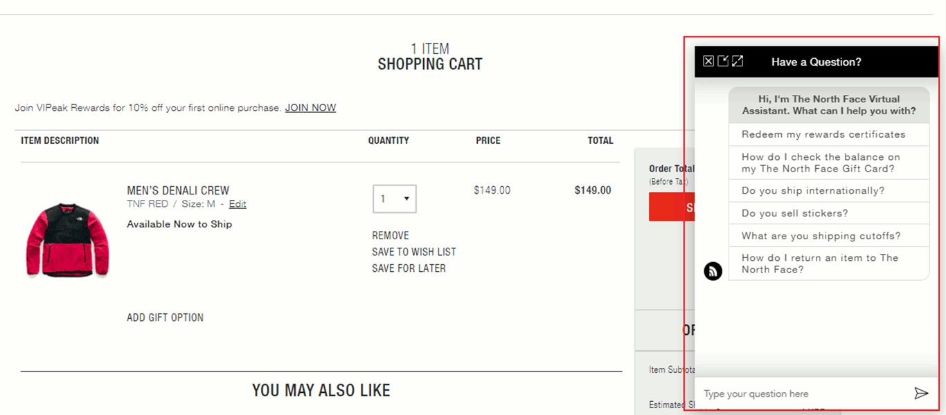
When your team is offline, you can use the live chat form to accept customer queries or even offer a virtual assistant to answer some of the most common queries (as shown in the image above).
16. Provide Social Proof
The concept of “social proof” appears as one of the key ideas from Dr. Robert B. Cialdini’s six principles of persuasion.
As humans, we are social beings and we find safety in numbers. We also have a tendency to follow and obey authority.
This is why testimonials and recommendations from people who are seen as industry experts are so valuable in influencing the customer’s mindset and increasing product favorability.
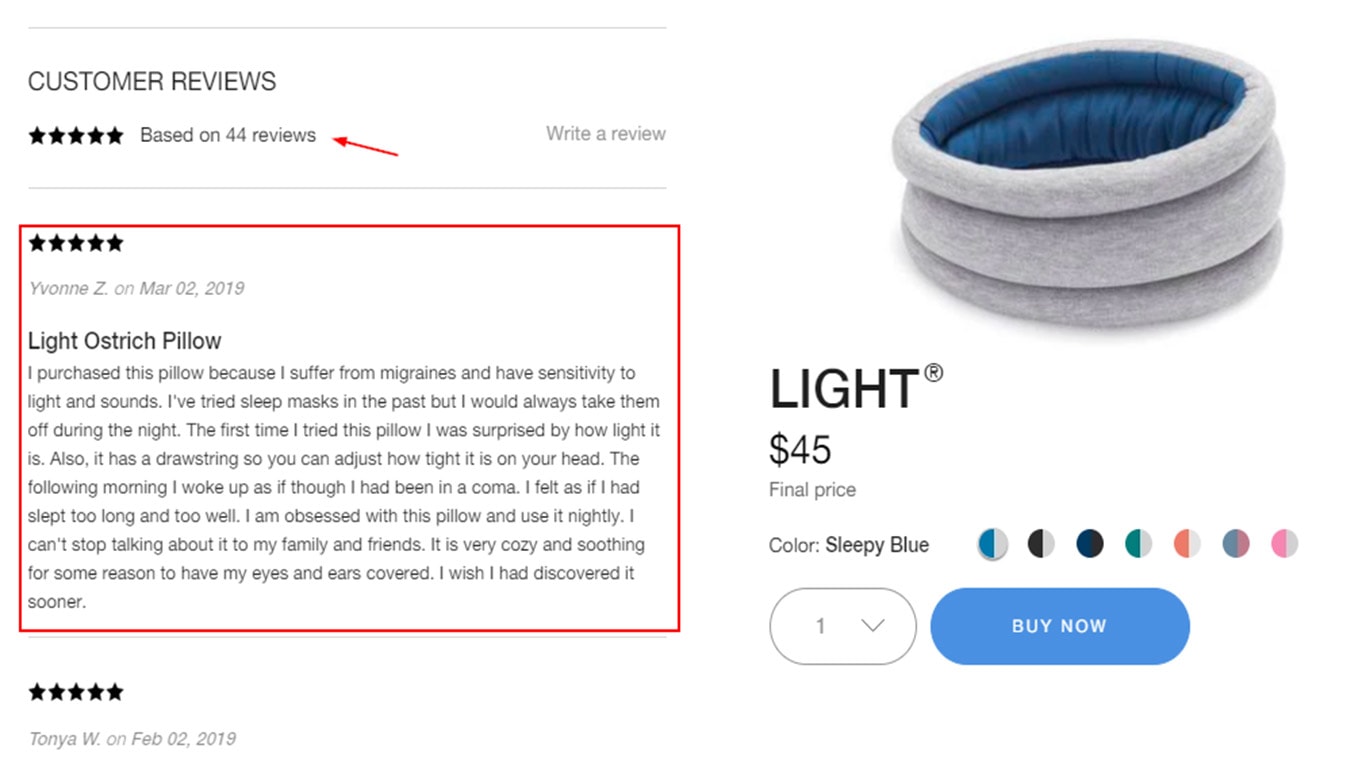
One of the main reasons why Amazon is so popular is because they allow unbiased customer reviews and ratings.
You can increase social proof by allowing customers to leave product reviews or by displaying testimonials from industry experts.
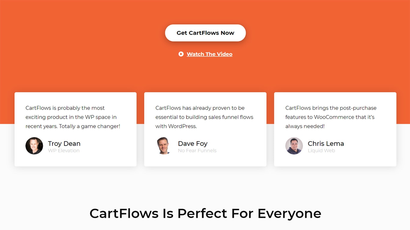
If you have received positive press let it be known.
Display any testimonials you have received from industry experts. The following image shows testimonials from experts on the CartFlows plugin.
Proactively ask for and add customer success stories that you have received.
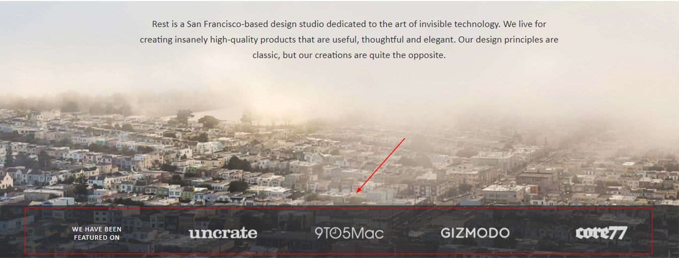
Display any awards that you have won.

If your product has been featured on popular websites, let your customers know by including brand images as shown in the image below.
If possible, allow for customer reviews and display reviews prominently.
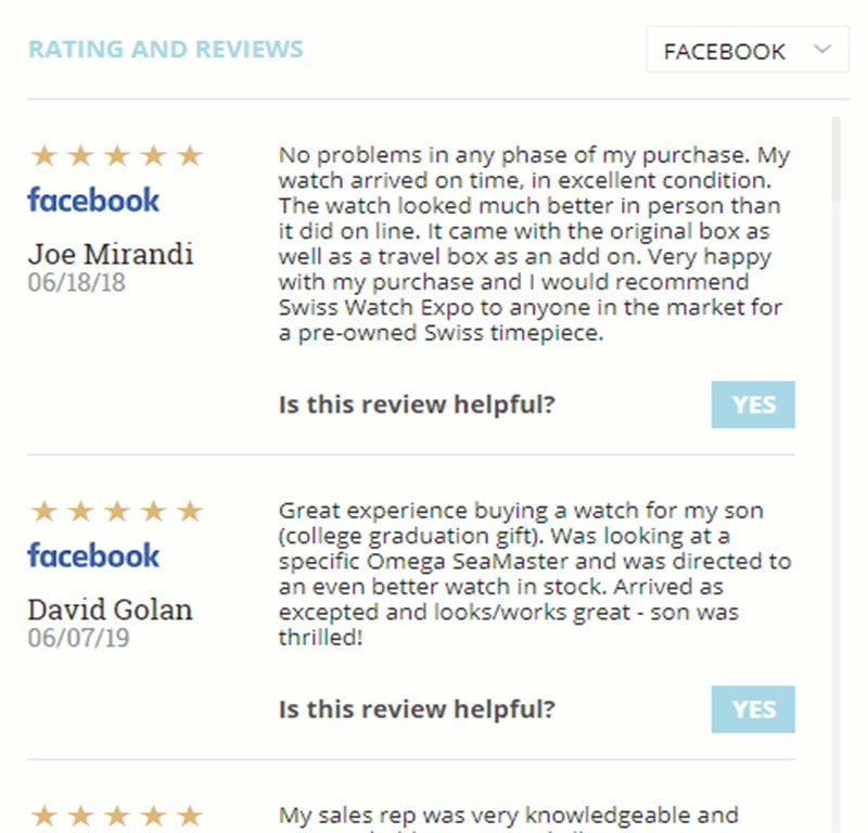
You can also consider adding your Google, Facebook or Yelp reviews on your website. This can be easily done using a social media plugin if you are using WordPress.
Improve Payment Usability
17. Offer a Variety of Payment Options
Data suggests that over 6% of buyers leave because their preferred payment method was not available on the site.
People are habituated to pay using their favorite means. Some prefer to pay via their credit card whereas some prefer to use alternatives like Paypal, Google Pay or Apple Pay.
Considering all the payment options available today, it is best to offer the standard credit card gateway along with express checkout alternatives like Paypal, Google Pay, Apple Pay or Masterpass.
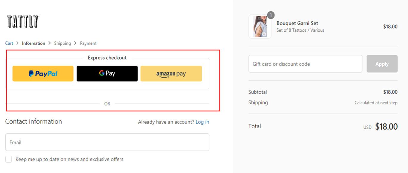
Express checkout options like Paypal and Google Pay allow your customers to checkout without needing them to manually enter their credit card information.
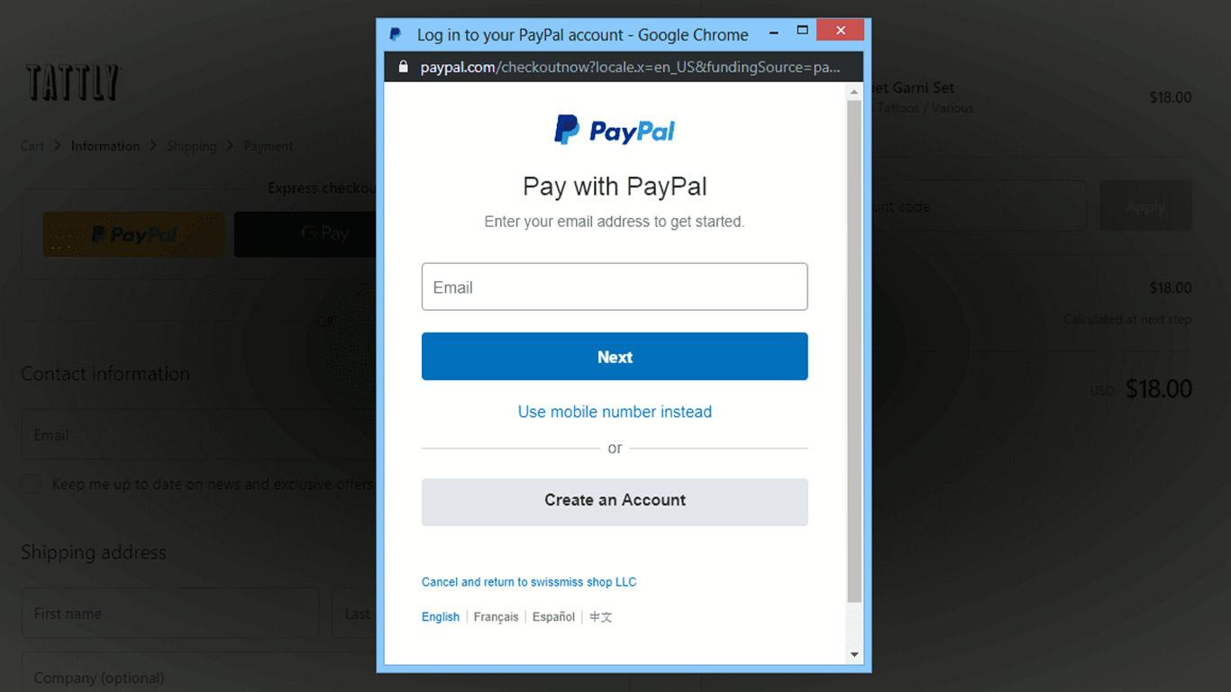
In addition, these services also offer what is called an in-context checkout experience where the customer will not be redirected to Paypal (or any other external site), but instead will stay on your site by means of a pop-up as shown in the image below.
An Express Checkout is also a great option for mobile users as they don’t need to manually enter a credit card number.
You can also consider using a versatile payment gateway like Stripe that gives you a variety of options.
Stripe allows you to accept all major credit cards and debit cards from various countries like Visa, Mastercard, Discover, American Express, etc.
It even allows you to integrate some alternate payment methods like Visa Checkout, Google Pay, Apple Pay, American Express Checkout and ACH transfers among others.
So coupling a payment gateway like Stripe with Paypal helps you cover a whole range of payment options.
In fact, studies show that websites have shown an increase of 6.7% in revenue after implementing Stripe.
Resolve Any Website Related Issues
18. Improve Your Site’s Mobile Usability
Mobile phones have the highest cart abandonment rate at 85.65%.
Tablets follow at 80.74%.
This makes sense because a whole lot of e-commerce sites are not optimized for mobile phones. They make use of unnecessary functionalities that increase page load times by a huge margin.
Additionally, many sites are non-responsive or use designs that are not optimized for the mobile screen.
In order to reduce your mobile cart abandonment rate, the first thing you need to do is to ensure that your site uses a responsive design.
Secondly, you need to test your site and particularly your checkout pages, checkout forms, call to action buttons and payment gateways on various mobile screens to see how things work.
You can easily carry out these tests using sites like ready.mobi and mobiletest.me.
Testing will reveal if there are any difficulties users might experience while using your site.
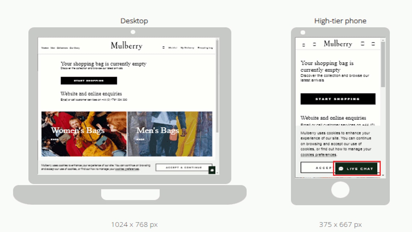
For example, if your buttons or links are too close, the user can click on the wrong links. Similarly, fancy features like slides and pop-ups that look great on a desktop can cause scrolling issues on mobile.
In the following image, you can see that the presence of the ‘Live chat’ button will cause difficulty in scrolling and is best removed from the mobile version.
You also need to ensure that your site loads quickly. You can check your page speed scores on Google page speed insights and then make necessary changes based on the recommendations they offer.
Another option is to use a site like ready.mobi. They give you a lot of details on how your site performs on mobile and offer recommendations to remove problem areas (refer to the image below).
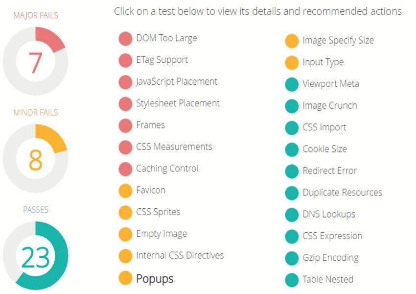
Ideally, you need to optimize your images, reduce javascript dom elements, remove render-blocking scripts, avoid frames, remove fancy elements and use quality caching to increase your page load speeds for mobile.
Another tip is to offer express checkout options like Paypal, Google Pay, Apple Pay, Amazon Pay, etc. so the customer does not need to manually add a credit card number which can be tedious while on a mobile phone.
19. Keep Your Website Error-Free
Data suggests that over 15% of buyers abandon their cart because of website-related technical issues.
The simplest solution for this is to keep checking your site and checkout process on a constant basis to ensure everything is working fine.
Secondly, you need to optimize your website for speed. As with mobile, you can use Google pagespeed insights to check how fast your site loads and if it is slow, try implementing the recommended solutions as suggested by the tool.
You also need to ensure that you use good quality hosting that offers a 99.99% uptime guarantee and uses the latest technologies.
Use a website monitoring service like Pingdom, Uptime Robot or Site24x7 to keep track of your site’s downtimes. These services will send you a message whenever your site goes down and will also give you a monthly report so you know if your hosting is good enough.
If you are using WordPress, make sure to keep your WordPress version, store themes and plugins updated.
You can also use a service like Cloudflare that optimizes your website and keeps spammers at bay so they don’t eat up your bandwidth.
20. Use Scarcity To Your Advantage
You can use scarcity to lower your cart abandonment rate.
A customer is more likely to purchase a product if they realize that only a few quantities of a product are remaining or that an exclusive offer is only going to last for a few hours.
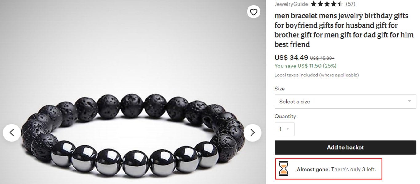
Here’s a good example from Etsy.com.
As you can see from the image below, Etsy adds an hourglass icon (indicating urgency) and the text ‘Almost gone. There’s only 3 left’, to create a sense of scarcity.
Impulsive buyers or anyone who is even remotely interested in the product would want to buy it quickly so as to not miss out on it.
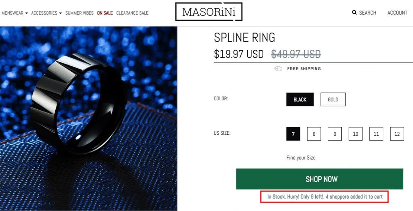
Here’s another example from Masorini.com. The text ‘4 shoppers added it to cart’, along with ‘Only 9 left’ creates a sense of urgency prompting the buyer to complete the order as soon as possible.
21. Use Exit Intent Pop-Ups to Convince Prospects to Buy
Exit pop-ups are pop-ups that appear when the customer is performing an action that indicates that they are ready to exit the page.
To reduce cart abandonment, you can show a pop-up when the customer is on the checkout page but is about to exit.
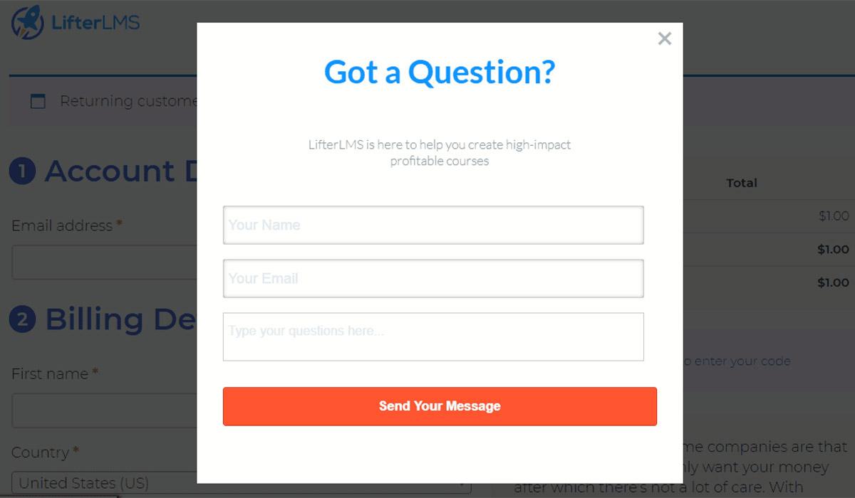
The pop-up can either show an exclusive deal or limited-time discount to persuade the customer to stay and make the purchase or it can be a pop-up that asks the customer if they need further assistance to complete the transaction.
The following is an example of an exit pop-up on LifterLMS.com that asks the customer if they need any help with their purchase.
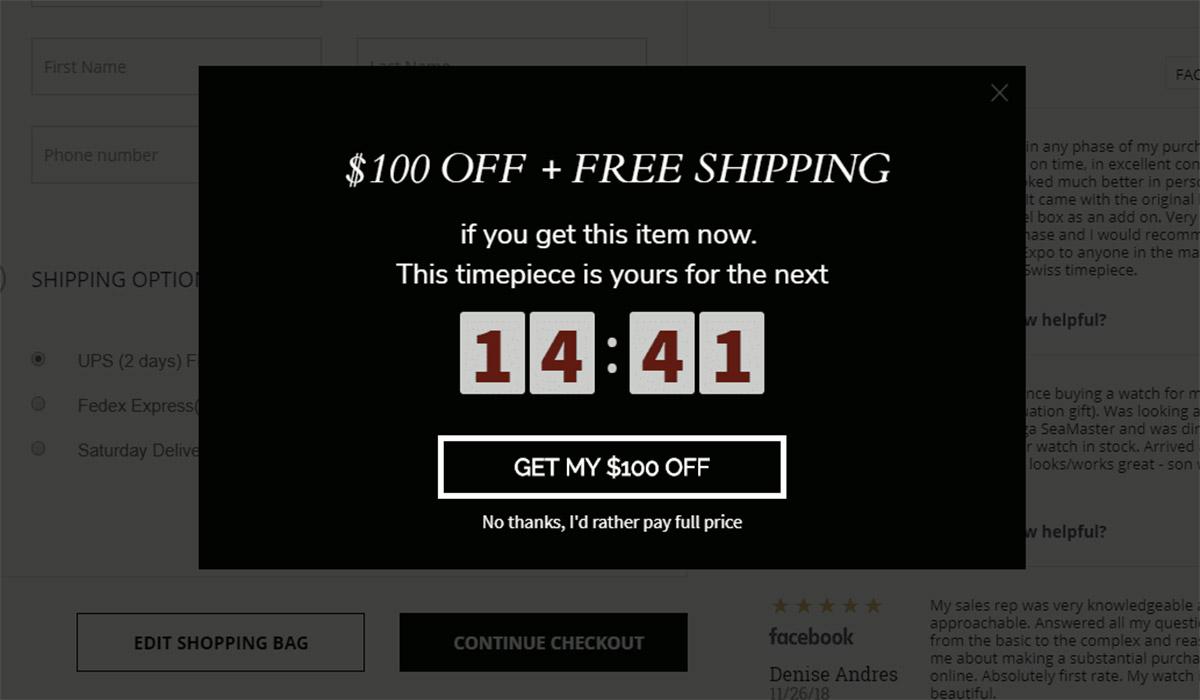
Here’s another example of an exit pop-up on Swisswatchexpo.com (image below) where they offer a limited-time $100 discount.
The time limit creates a sense of scarcity which should be just enough to persuade the customer to complete the transaction.
How to Design a Professional Checkout Page Using CartFlows?
As you would have realized from this guide so far, a professional checkout page is absolutely crucial to keep customers from abandoning their cart.
Checkout pages need to be designed from the ground up with an objective to maximize your conversion rates and minimize cart abandonment. Not only do they need to look professional, but they also need to be functional.
The following are some of the important aspects of a good checkout page.
The Design
- Your checkout page needs to look professional.
- The design should be consistent with your site’s look and feel.
- It should have minimal elements so as not to distract the customer. For example, it is best to remove the standard header and footer navigation links.
- Your page needs to display product image, product testimonials, trust seals/logos/icons, other security information, refund policy, and contact information, that will reassure your customer that they are making the right buy.
- There should be prominent CTA (Call to Action) buttons that are intuitive and encourage the customer to take action.
Functionality
- Your checkout form should not look long or complicated. It should have only the most important fields.
- The form should be broken into two or three steps so as to make it look less complicated.
- The form should clearly mark mandatory and optional fields as such.
- The checkout form should have inline error validation so the customer knows exactly what needs to be fixed in case of errors.
- The form should have elements to prevent duplicate entries.
- The form should be able to capture important customer information such as name and email address for remarketing purposes.
- Your checkout page and form should be fully responsive so mobile users can fill it without difficulty.
- The shopping cart should be easy to edit. The customer should be able to remove items, add additional quantities, change product variables like size, color, etc. from the checkout page if required.
- A variety of payment options with security information must be provided.
If you use WooCommerce, you would be aware that the standard WooCommerce checkout page looks pretty basic and unprofessional and could be one of the primary reasons for high cart abandonment rates.
So is there a way to convert this basic page into a highly professional and feature-rich page?
Yes, there is, you can do that using CartFlows. Let’s see how.
What is Cartflows?
CartFlows is a WordPress plugin that allows you to build highly optimized checkout flows (sales funnels) that convert better and massively reduce cart abandonment.
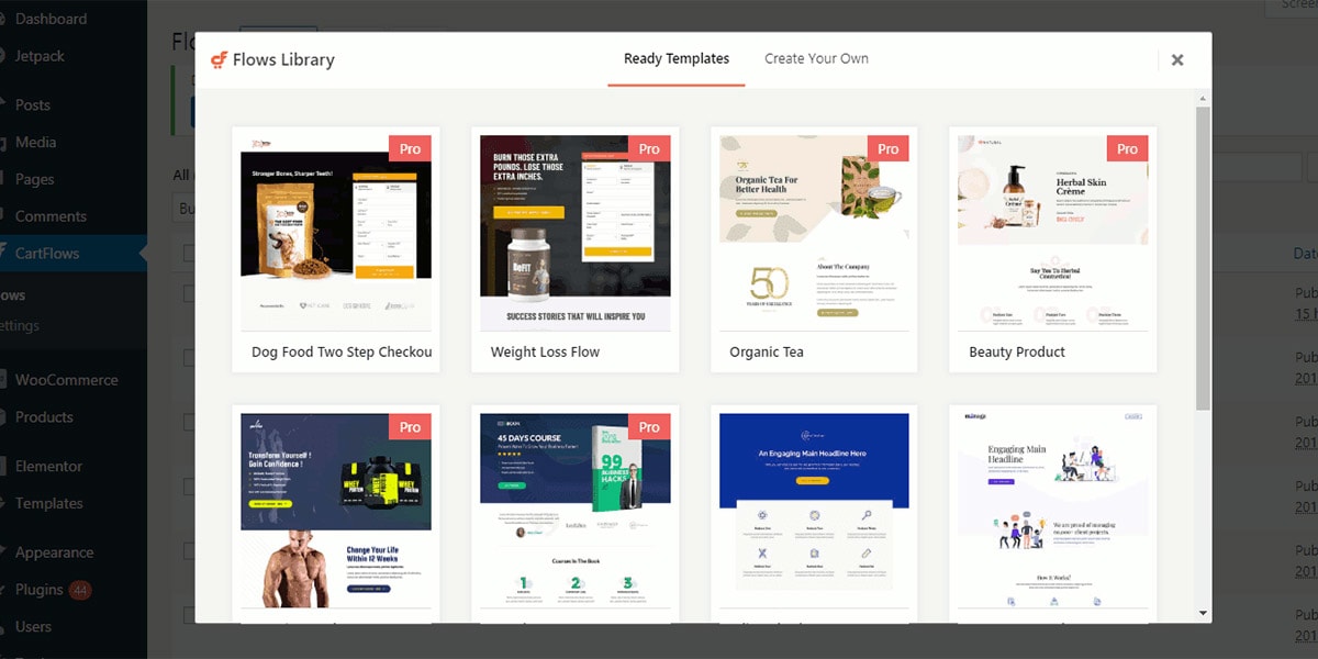
You can use CartFlows to design your entire checkout flow including building landing, checkout and thank you pages, creating checkout forms, adding order bumps, upsells and downsells.
CartFlows also comes with a range of pre-built templates that you can easily edit using your favorite page builder (be it Elementor, Divi or BeaverBuilder) to create highly professional checkout pages in a matter of minutes.
The following image is an example of an optimized checkout page created using one of CartFlow’s pre-built templates.
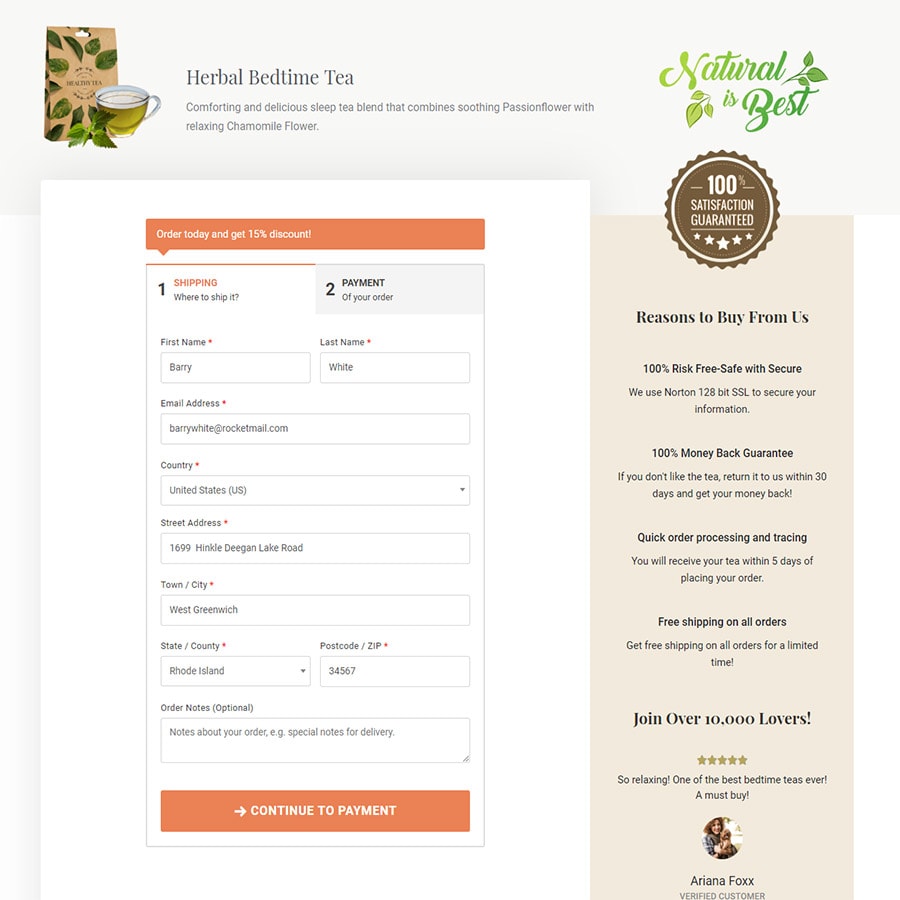
As you can see, this page has a clean and clutter-free interface along with the optimized elements discussed in this article.
Here’s another example.
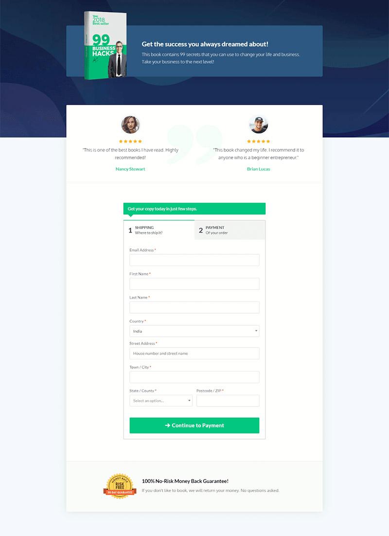
With CartFlows, you can churn out beautiful and professional-looking checkout pages like this within minutes.
Simply select a pre-built template of your choice and edit the template using a free page builder tool like Elementor. Divi or BeaverBuilder.
The best part is that you really need not have any technical knowledge to do any of this.
Now, let’s take a closer look at the checkout form used in this design. The form used here is a two-step checkout form. The first step contains fields for your customers to enter their shipping information and the second step contains fields to enter the credit card information.
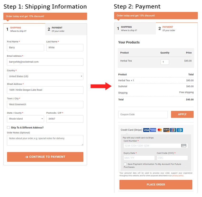
As you can see, the payment step contains information about the product purchased and the total amount that needs to be paid. The customer also has an option to add additional quantities to their order if required. Their order value will automatically be updated without the need to go back and forth.
With CartFlows you will be able to create powerful checkout forms like this in a matter of seconds.
You can create one column, two-column or two-step checkout forms and have complete control over the look and feel of the checkout form.
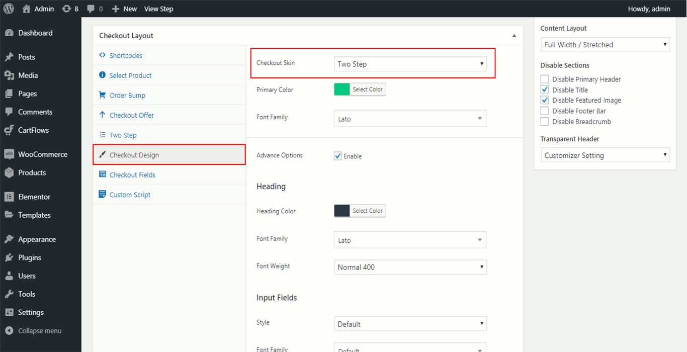
You can also add/remove form fields, drag and drop fields to change their position, add a different call to action button, add/remove coupons and a lot more with effortless ease, all from within your WordPress dashboard.
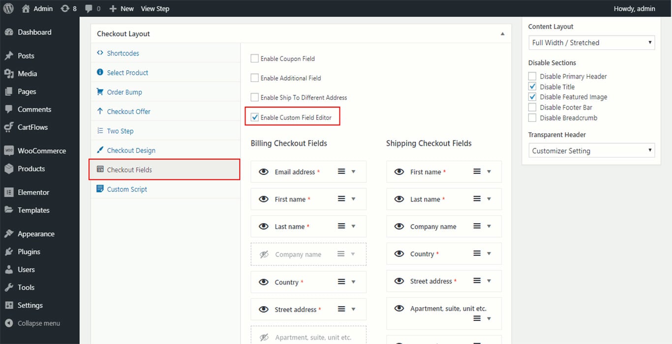
The best part is that CartFlows also comes with built-in analytics, so you can easily find out what is working and what is not and make changes accordingly.
CartFlow templates are also fully mobile responsive and load quickly which will help you lower mobile abandonment rates.
If you are using WooCommerce – then CartFlows is your best solution to reduce abandoned carts and boost your profit margins.
To get started, download and install the free version of CartFlows from the WordPress repository.
Wrapping Up
We have covered a lot in this article, so let’s do a little recap.
- We saw what cart abandonment is, and the industries that have the highest cart abandonment rates.
- We learned how you can measure the cart abandonment rate of your e-commerce store using Google Analytics.
- We looked at all the reasons why people abandon carts according to various research estimates.
- We went through 21 powerful strategies that you can use to bring down your cart abandonment rates right from optimizing your checkout pages to using strategies like Exit Intent Popups.
- And finally, we saw what CartFlows is and how you can use CartFlows to optimize your checkout pages and checkout flow to drastically bring down your cart abandonment rates.
The ball is in your court now. It’s time to take action.
If you start applying the ideas discussed so far in this guide – you will cut down your cart abandonment rates significantly, and also start to increase your eCommerce revenues.
Disclosure: This blog may contain affiliate links. If you make a purchase through one of these links, we may receive a small commission. Read disclosure. Rest assured that we only recommend products that we have personally used and believe will add value to our readers. Thanks for your support!



This solves my problem, really. I always have customers who abandoned their carts after hours of browsing my website. And there’s nothing I can do. Now I know how to reach them. This article really helps me. Thank you. Looking forward to more of your articles. Keep it up!
Do you have more articles about how to offer many channels of communication to address Customer Queries? I think this is what I really need. Thank you for the information. I’ll share this with my company and business partners. Keep up the good work.
I didn’t know that I can use my scarcity to my advantage and lower my cart abandonment rate. Great idea! Surely this will help me boost my sales and compensate for all the efforts I made to build this business. This article is worth reading. I’ll check for more articles on your website. Thanks for sharing
I agree with you. You really need to be upfront about any additional charges on your products.In my website, I always include all the charges and make sure nothing is hidden from my clients. It builds trust and generates more sales. It’s really a proven strategy. This article explains it well and many more things I can do to avoid cart abandonment. Very informative article. Great job.
This article is full of ideas I can use for my website. I like how you explain each item. I want to learn more about the concept of “social proof”, I hope you have more articles about it or links. I also agree with all the suggestions. Thanks for this informative blog. Big help!
Well done!
These are really powerful strategies to solve my cart abandonment problem. I’ve been searching for solutions and still can’t find one until I read your article. Here are the best solutions. I will definitely use these strategies.
Thank you.
Hello Efren,
So glad to hear that you found this article helpful. 🙂
Glad it was helpful, Steve!
Such a nice article!
I think you’re right. You should be very clear about any added costs that come with your products. It makes people trust you and leads to more sales. It is a tried-and-true plan. This article explains it well and tells me a lot of other things I can do to keep people from leaving their carts.