Halloween is a great time to show off your creative side and customize your website in the ‘spirit’ of the holiday.
According to Statista, over the past few years, Americans spent an annual average of $10 billion per year on Halloween-related items!
In fact, searches related to “Halloween deals”, “Halloween sales” or “Halloween discounts” are searched thousands of times every October.
Customers enjoy a lot this time of the year. Creating a spooky Halloween website will make you stand out from your competitors who are missing out on this opportunity.
If you’re an eCommerce store owner or are looking to capitalize on this holiday, continue reading these tips on how to create a website that will give your visitors the chills, in a good way.
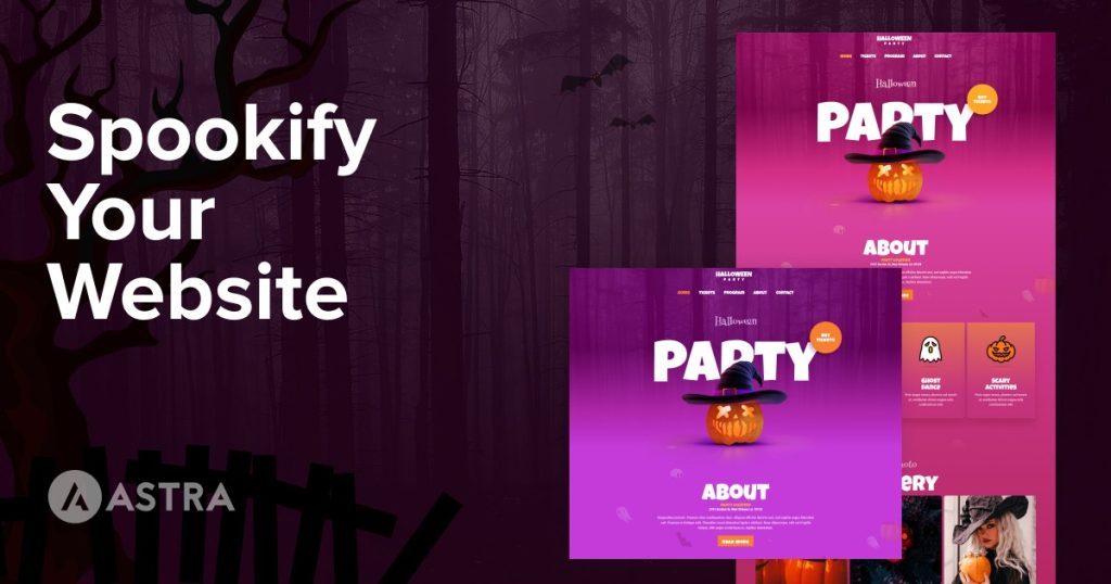
Example of Halloween-themed website
If you want to see what a 100% Halloween website looks like, we’ve made it easy for you.
We have just added a brand new Halloween template to our Starter Templates gallery.
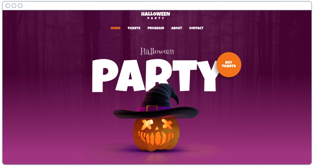
As it works on Astra, you are not limited to following the style you see in the image.
You can easily adapt the template to your brand, modifying the font, the logo, the colors and everything you see on the page.
Recommendations for customizing your website for Halloween
Before we begin, here are some general recommendations:
- It’s better to make subtle design changes than major changes that could affect the user experience of returning visitors.
- If you want to change your entire theme, build a staging website with the new design, and make it live for the duration of the event. This way you can return to the original theme effortlessly.
- Try to create a specific Halloween landing page that compiles all your deals. It will be highly linkable and could rank on Google.
- Start your Halloween promotion a few days before the actual date and end it a few hours after midnight. This way you’ll be taking into account the different time zones.
- Use media and copy from movies and books to make your site look up to date. But don’t forget to add typical elements of Halloween: pumpkins and spiderwebs, and lines and soundtracks from horror movies.
We’ll go into each of these in much more detail later on.
8 Essential tips to get your site ready for Halloween
Here’s how you can easily adapt your website for Halloween!
Change the visuals
There are different visual aspects of your website that you can change relatively easily.
Change the font
There are some fonts that will undoubtedly give a more frightening look to your website, but you should be careful with them, as they are not the most comfortable to read.
We suggest that you don’t use them on your entire website.
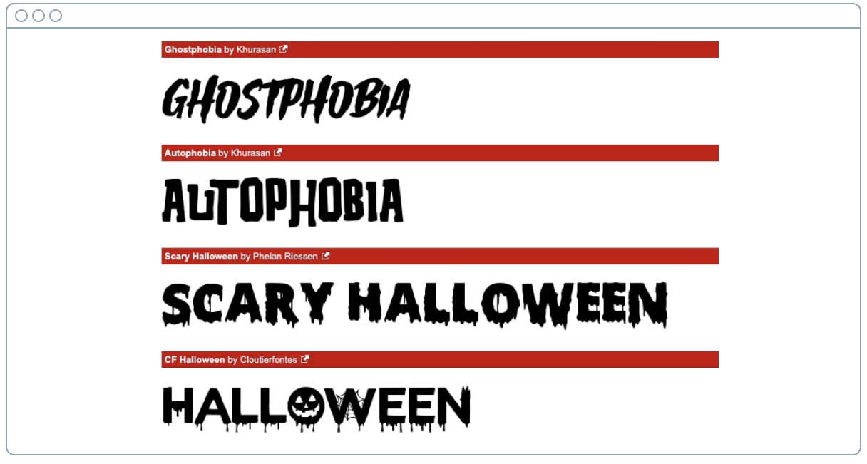
Only use these fonts in a few places, such as graphics that you design for the occasion, or headings. Don’t use them as the body of an article or for a product description as that can impact the user experience.
If you use Astra, modifying this is as simple as going to the WordPress Admin Panel > Appearance.
Then select Customize > Global > Typography.
Select Heading Font and change the font to something suitable:
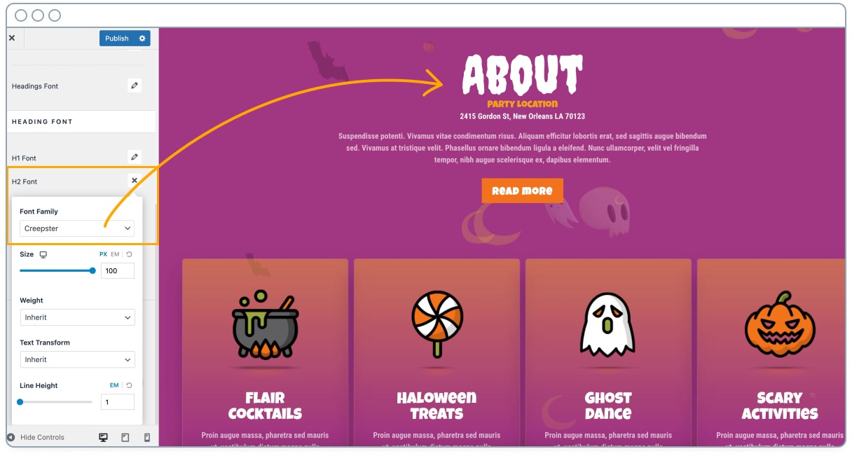
This will change all the headings on your website.
If you want to make the change only on specific pages, page builders like Beaver Builder or Elementor will allow you to do that.
You don’t have to download additional fonts, you can use Google fonts that may be included in your theme:
For more information, read our guide on how to change fonts in WordPress using different methods.
Modify your main color
We know that we recommended not making radical changes to your website. However, slightly modifying the colors or changing the font shouldn’t spoil the user experience or generate any incompatibility.
When we talk about Halloween, black and orange are the colors par excellence (although you can also play with green!).
Changing the colors is also very easy to do.
In Astra for example just go to the WordPress Admin Panel > Appearance > Customize.
Select Global > Colors and change the ones of the elements you want to modify.
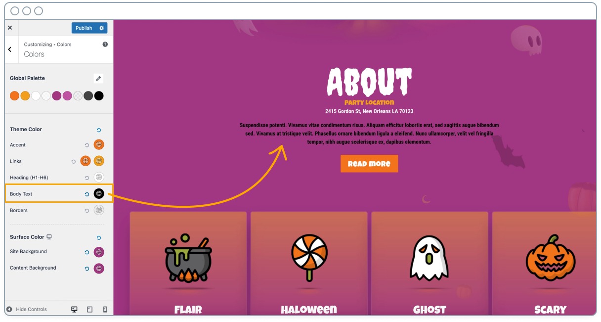
Returning to the original color is as easy as clicking the undo button.
If you are using another WordPress theme, you’ll also find options to modify the colors within this Customize menu.
Modify your logo
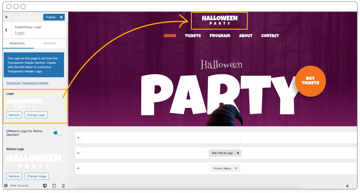
Your logo is a visual element shown throughout your entire website. It takes very little work to change it and doesn’t affect the user experience.
Modifying it is fun and is like putting a Halloween costume on your brand!
If you are not a designer you can outsource this small task on Fiverr, UpWork or 99Designs.
It won’t be very expensive, since it’s not a design from scratch. Plus, you’ll be able to reuse it every year.
You can also use a tool like Canva, simply upload your current logo, and add some Halloween elements to it.
Changing your logo on WordPress is easily done from the Customization panel of any theme.
Add terrifying pictures
A simple recommendation, especially if you are creating product landing pages, is to add terrifying images.
They can be generic Halloween images, but it’s much better if they are related to the main product you are selling.
Just be aware of your target audience. You don’t want to give your visitors too much of a fright!
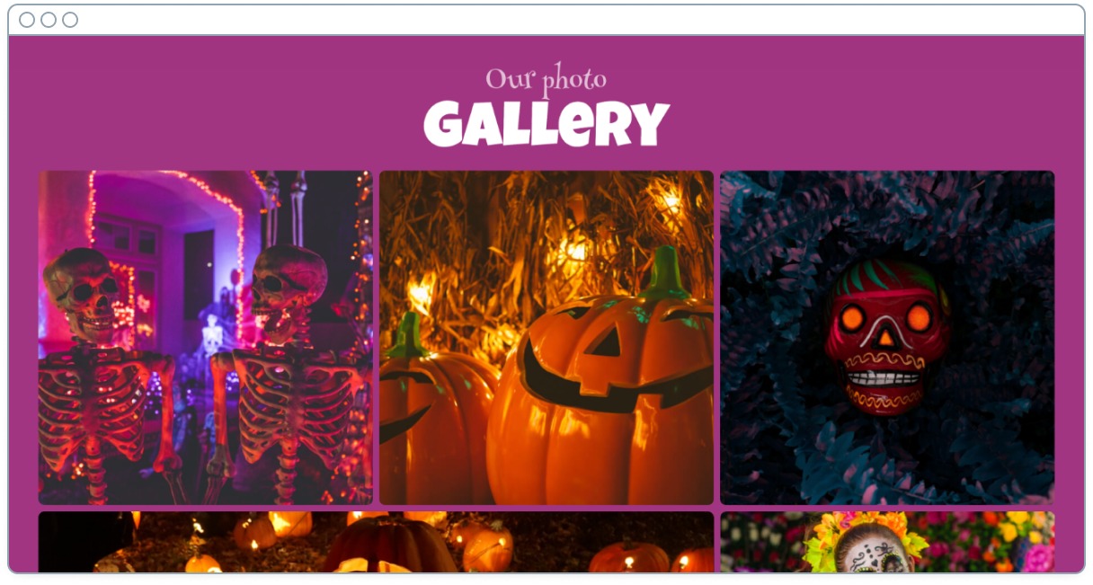
You can also modify photos you already have following a similar procedure to the one you saw with the logo. Better yet, let your own clients send you this kind of content.
If you are interested in this point, keep reading!
Add decorative elements
In addition to all of the above, there are other visual elements that you can add to pages.
These are a bit more complex to add without third-party plugins, but if you use a plugin like Ultimate Addons for Elementor, it’s very easy.
Ultimate Addons for Elementor is a Brainstorm Force plugin that adds extra elements to the Elementor page builder.
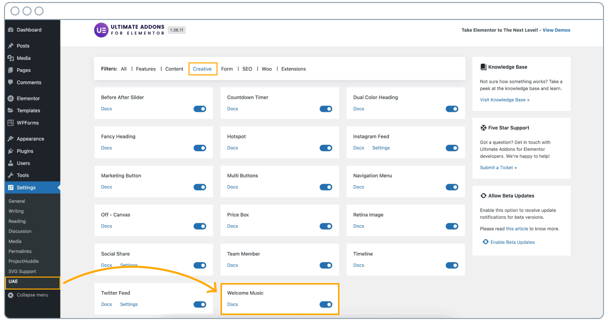
Once you install it on your website, go to the WordPress admin panel > Settings > UAE, and activate these extensions:
- Particle Background
- Party Propz
- Shape Divider
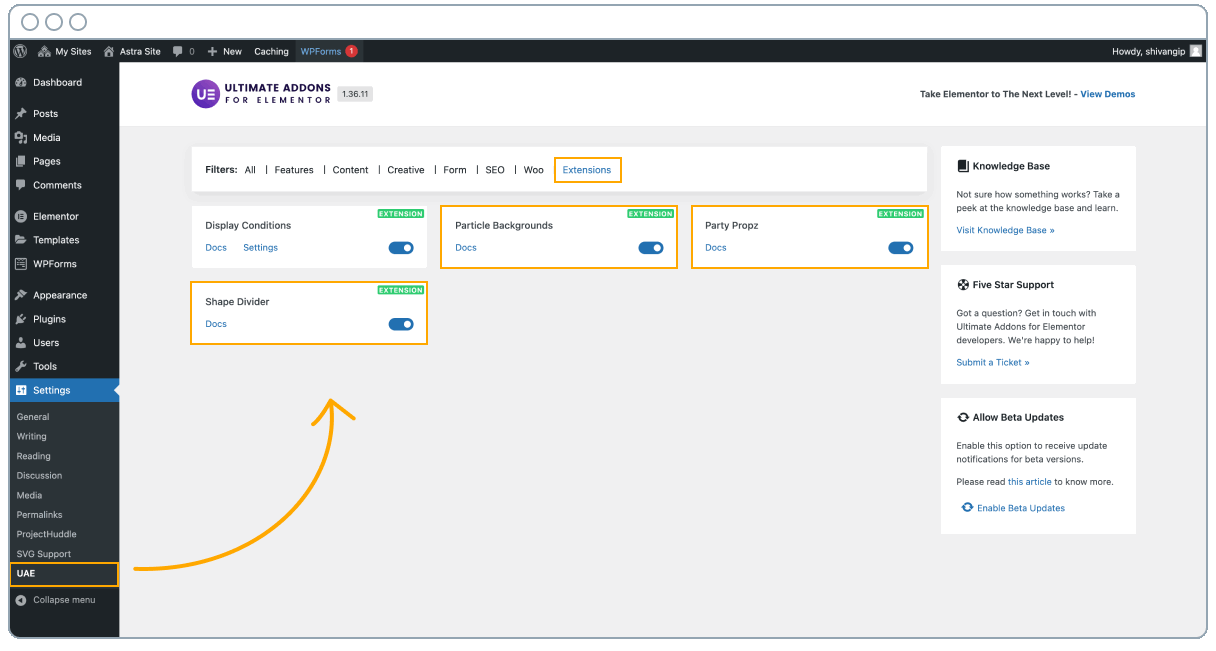
From now on you’ll find these options in the Elementor editor.
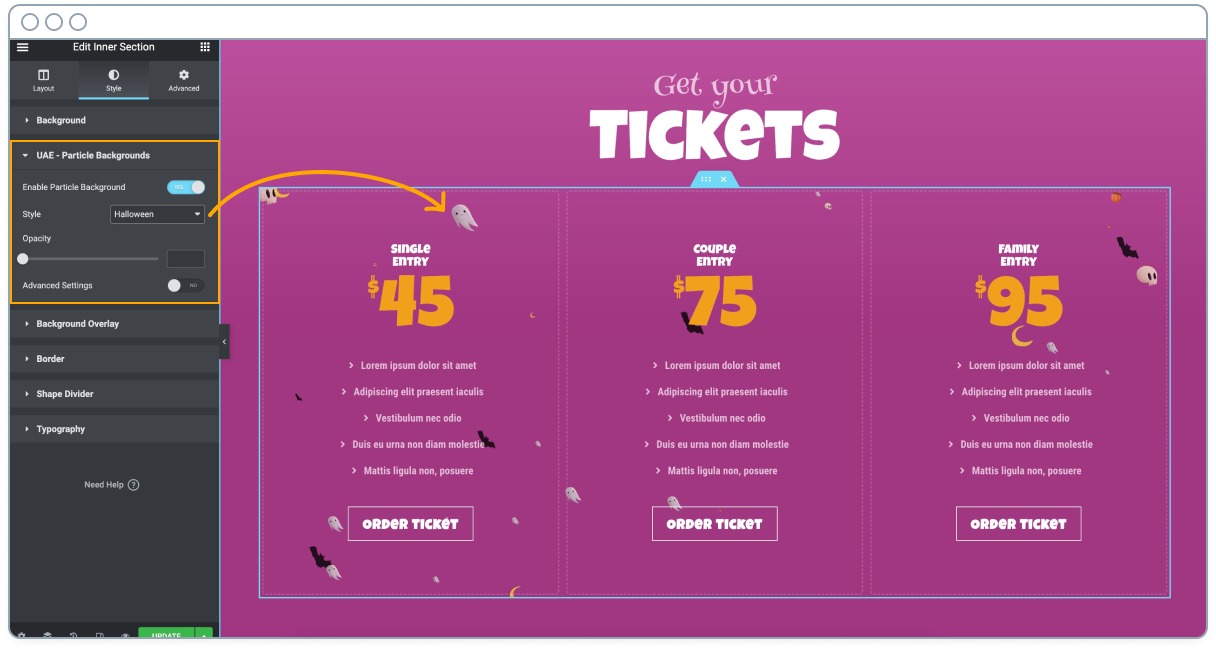
Particle background allows you to add moving particles to any Elementor block.
Select the one you want to add the particles to, and in the sidebar go to Style > UAE Particle Backgrounds > Style.
You’ll probably want to choose Halloween, although you have more available.
Note: Notice how the particles only go to the end of the block we’ve selected.
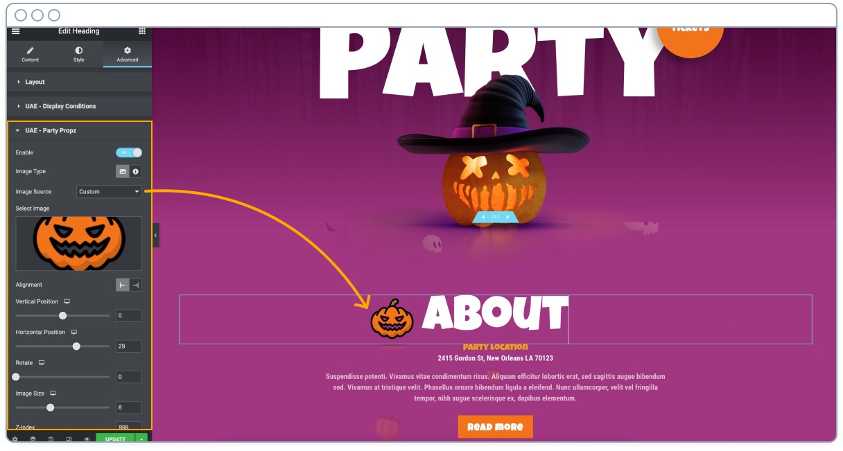
The Party Propz extension will allow you to add static decorative elements to any Elementor block..
After selecting the block, go to the Advanced tab > UAE Party Propz.
Once you activate this option, you’ll see that you can choose to add a predefined image, a custom image, or Font Awesome icon.
These elements can be shown anywhere in the block. All you have to do is use the position, size, and rotation controls.
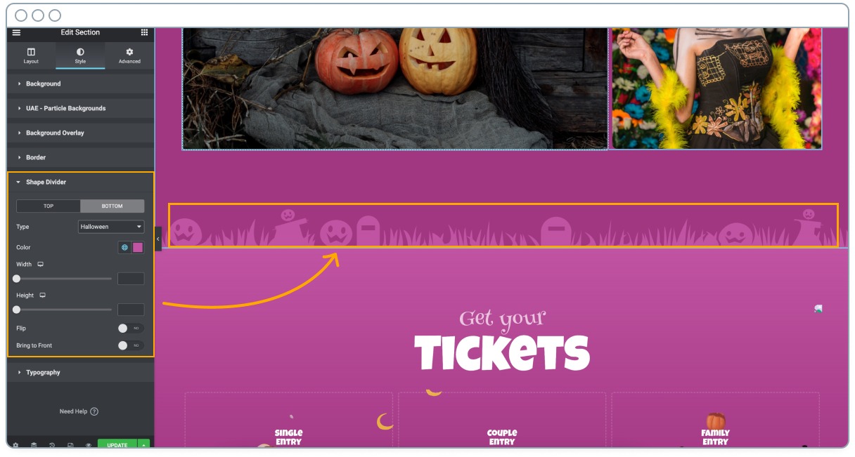
If you’re editing a section, you can go to Style > Shape Divider, and choose an extra decoration for the top or bottom area.
You have a Halloween option available that you can modify in size, position and color.
Other Halloween ideas for your website.
Here are a couple of extra ideas to help you fine-tune your Halloween campaign.
Use music
We don’t usually recommend playing music automatically on a page. But on certain occasions, it can be a good technique to engage customers and get them into a buying mood.
There are many ways to add music to a page. If you want to keep things simple, Ultimate Addons for Elementor has a block called Welcome Music.
You’ll find Welcome Music as an Elementor Widget.
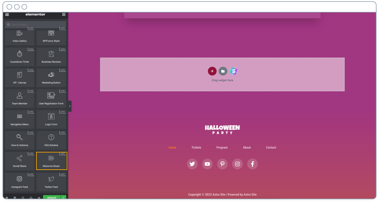
But in order for it to appear there, you must first enable it from the WordPress administration panel > Settings > UAE > Welcome Music.
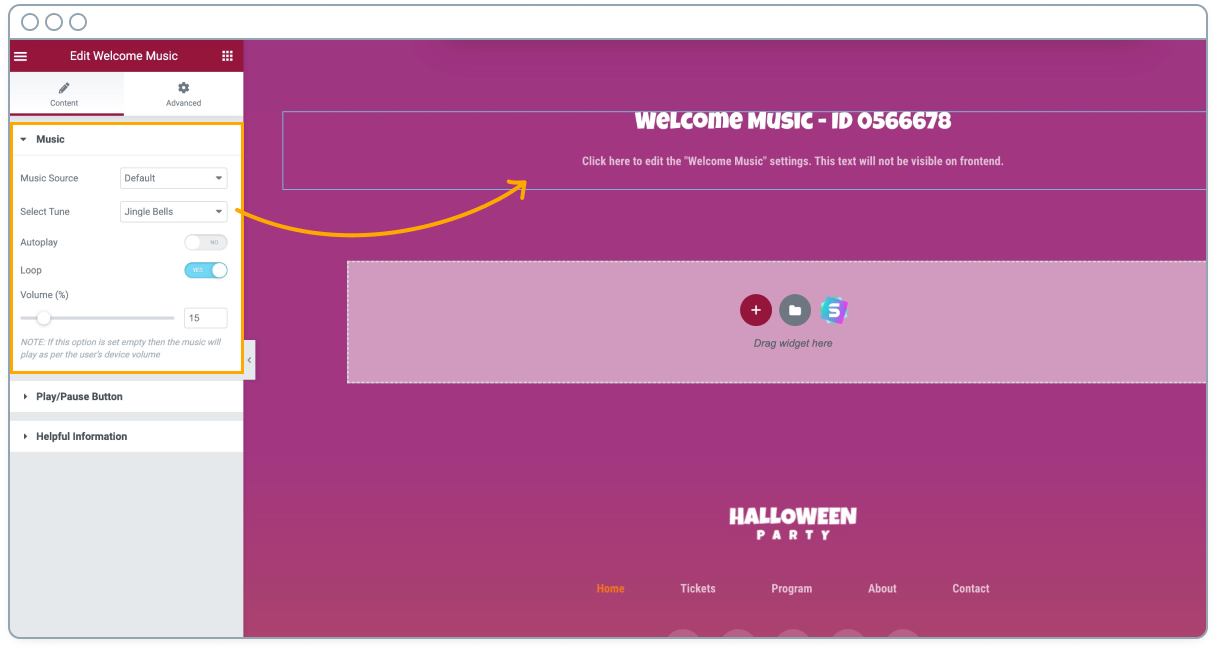
As soon as you add it to your page, you can define what kind of sounds or songs you want to be played, at what volume.
Most importantly, if you want to enable the autoplay or let the user start the music.
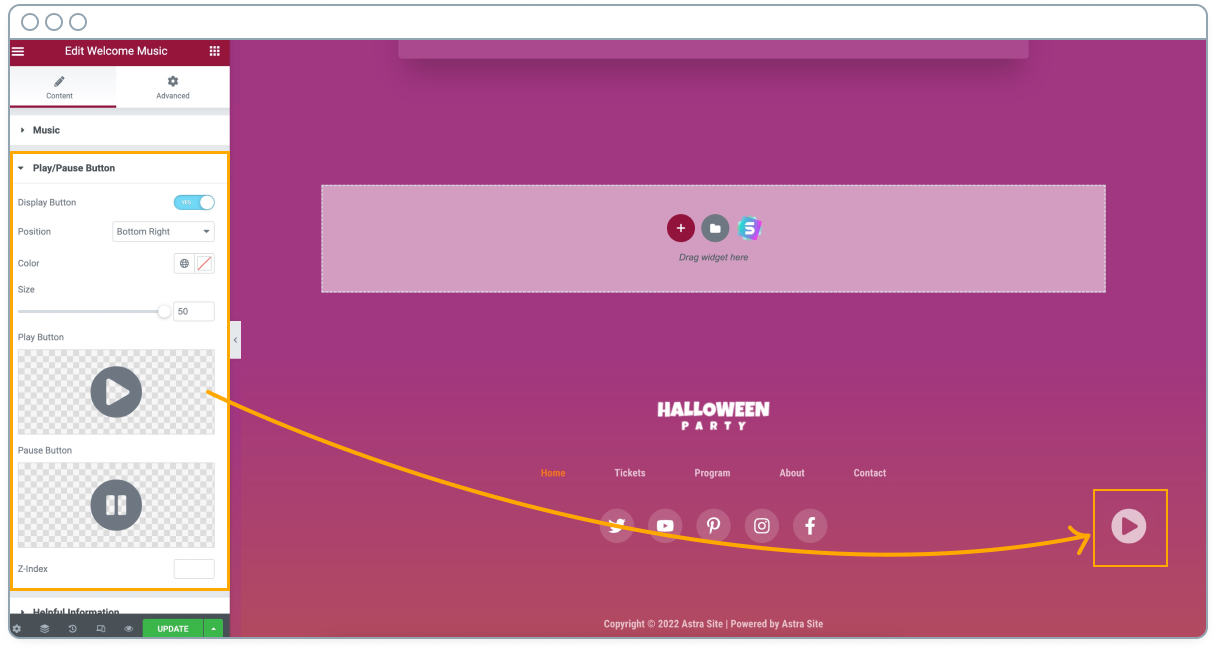
In any case, in the tab below of the preferences of this element, you can show whether you want the play and pause controls to be displayed, and where.
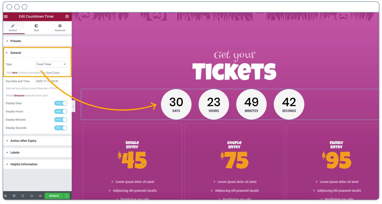
Show urgency with a countdown
As you already know, your terrifying Halloween website should be temporary in order to encourage buying. There’s nothing more enticing than a countdown indicating when your offers will expire.
There’s nothing quite like a Fear Of Missing Out (FOMO) to encourage people to buy!
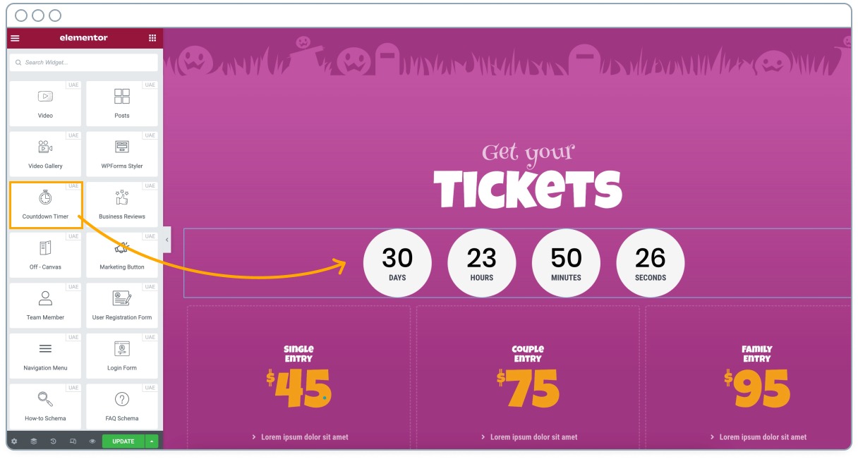
Just add it to the section where you want it to appear, choose a “fixed” type, as is the one that ends on a specific date, and design it as you like.
Run a contest with user generated content
Finally, remember that people don’t just “like Halloween”, they like to participate in Halloween!
There’s nothing better than a contest with discounts and gifts as a prize, in which visitors participate by sharing their own content, (content you can add on your landing page).
You not only get to engage visitors, you also get some free content for your site!
Don’t just ask for visual content (e.g. share your scariest photo with one of your products), but also written content.
If you have a bike store, you can ask your users to tell you stories in which they have been frightened when going out on the road. Or how one of your good helmets or your fantastic brakes saved them from certain death.
Pro tip: Generate a voting system for this user-generated content contest, and they will be in charge of driving traffic to your sales page.
Halloween website FAQs
Should I change the whole theme?
Changing to a Halloween theme may seem like a good idea. It may save you time and allow you to have a stunning design with a couple of clicks.
But changing your main theme has some drawbacks.
Maybe you are using a theme with extra functionality, that uses custom shortcodes, has specific integrations with for example LearnDash, or that is better optimized for SEO.
Or maybe that Halloween theme that looks so attractive is incompatible with an essential plugin.
Also, if you have recurring users, they are probably used to navigating using an interface they already know and feel comfortable with.
Changing the navigation to something more focused on increasing your sales may not be a good idea. Where did the shopping cart icon go?
It’s better to focus on making subtle changes, like the ones we’ll show you below.
If you do want to change your whole theme, you could build a staging website for your Halloween theme and make it ready for the event.
Then, when it’s time, switch it out for your standard site for the duration. Once done, flip the switch to bring your normal website back again.
Most web hosts use a one-click system for switching websites from staging to live so this could be done in seconds.
It’s a lot of work to prepare though!
Should I change all pages or create specific landing pages?
We don’t recommend changing all pages as it’s not efficient, but creating a specific landing page with your Halloween promotions is always a good idea.
You’ll only have to put everything back to normal once Halloween is over anyway and that could be a lot of work!
Instead, we would recommend using a staging site to build a copy of your standard site or use a landing page.
If you use landing page builders such as Elementor or Beaver Builder, you’ll be able to create scary landing pages, with all the creativity you want. All without affecting your main design.
Having a specific landing page for your offers will also come in handy for SEO purposes. At this time of the year, searches related to “Halloween deals” or “Halloween discounts” skyrocket.
Pro tip: Create your landing page aiming at your target audience. Here at Astra for example, our target market is WordPress users. That’s why we have a page dedicated to Halloween WordPress Deals.
With this landing page design, you’ll ideally promote your products, but if your online store is small and you only sell a couple of products, consider adding here related offers from other businesses.
You’ll end up with a more useful page for your users, it will rank better, and you’ll be able to increase your earnings if the other products you promote have affiliate programs.
When should I start and end the Halloween promo?
You should ideally start your Halloween promo a few days before October 31st and end the promo a day or two after.
If you sell digital products, you may have customers all over the world, and each country will start Halloween at a different time. Even time zones within the United States vary from coast to coast.
If you’re going to create a landing page to showcase your offers, we recommend you start working on it several days before, this way:
- You’ll give Google time to index the new page.
- You’ll give other bloggers time to prepare their affiliate promo pages and talk about your deals.
This will be good for you to increase expectations and generate more revenue, since you can run small offers of secondary products for example the week before, leaving huge discounts for the best products for Halloween.
Regarding the end date, just remember to keep in mind the different time zones, so better add a few extra hours of margin after midnight.
Mix trends and classics
People will enjoy visiting your online store and seeing references (photo, but also text!) of the latest horror movies or books.
But don’t leave aside the classic stuff.
There is no Christmas without Santa Claus, nor Halloween without ghosts, pumpkins, spider webs or witches!
Wrapping Up
As you have seen, it can be very easy to theme a website for Halloween, especially if you use the right tools and our Halloween template as a foundation.

It may seem trivial, but the mood of the buyer can influence the final purchase decision.
So, if you’ve never done it, we invite you to modify your website this year and analyze for yourself if that drives more sales.
If you have any questions, don’t forget to leave us a comment below.
And of course, share your terrifying website with us!
Disclosure: This blog may contain affiliate links. If you make a purchase through one of these links, we may receive a small commission. Read disclosure. Rest assured that we only recommend products that we have personally used and believe will add value to our readers. Thanks for your support!

Hello there, you have amazing content. They give the latest updates about Tech, employee benefits, finance, health tips, the latest events, holiday deals, and lots more.