Website design is an essential aspect of every business’s marketing strategy. The design you have on your site will determine how many people will actually visit your site and what they might do there.
If your design is not user-friendly or not truly reflective of your brand, then you’re not doing your company any favors.
Your website is your business card. Potential clients get the first impression of your brand and services when they visit your website.
To improve the user experience and get more people to visit your site, you need to design it strategically.
It doesn’t matter what type of business you have or what niche market you’re targeting. A few fundamental principles of website design will help you create a modern, user-friendly design that quickly catches a reader’s attention.
This article will give you insights into why these principles are essential and how they can be implemented in your website designs.
What makes a good website?
A good website is designed for the reader rather than the designer.
The design should be easy to navigate, load quickly, look good, and be intuitive and consistent with your branding. All these factors are crucial for a good user experience.
However, it’s important to note that design is not solely about aesthetics.
Good website design is about making it easy for visitors to find what they’re looking for and navigate the site without getting lost.
To make this happen, you need to consider these key factors:
- What are your visitors looking for?
- How are your visitors likely to interact with your site?
- What actions do they want or need to take?
Creating a business website is no easy feat.
The same goes for an online presence that shoppers and potential customers will take notice of.
But don’t worry, we got you covered!
8 website design principles
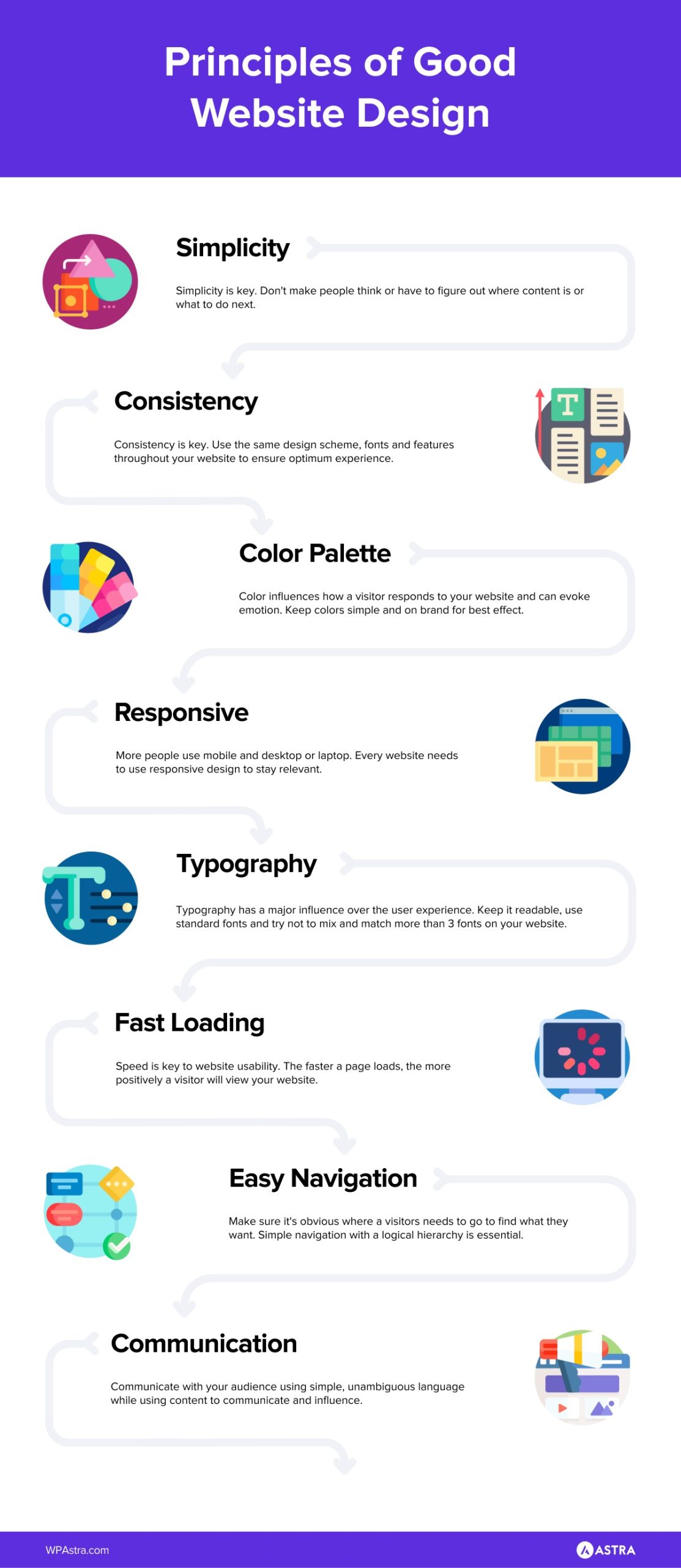
Whether you’re redesigning an existing website or launching a new one, it’s essential to keep in mind these web design principles when planning your new site.
They will help you create a website that is modern, intuitive, and easy to navigate.
1. Simple is best
The principle of simplicity is an integral part of any good website design. It is key to both the readability and usability of your website.
The latest trends in website design aren’t always the best ones.
If you’re trying to stand out from the crowd, you’ll see people using many complicated elements and templates that are difficult to navigate.
You need to keep your designs simple so they’re clear and easy to use. Don’t use unnecessary details or elements and keep your website clean and clutter-free.
You don’t have to go with a minimalist website design. But, when you add details, they need to be relevant and add value to the website.
You can let your content shine when your site is simple and easy to navigate.
2. Consistency
Good design is consistent in every way.
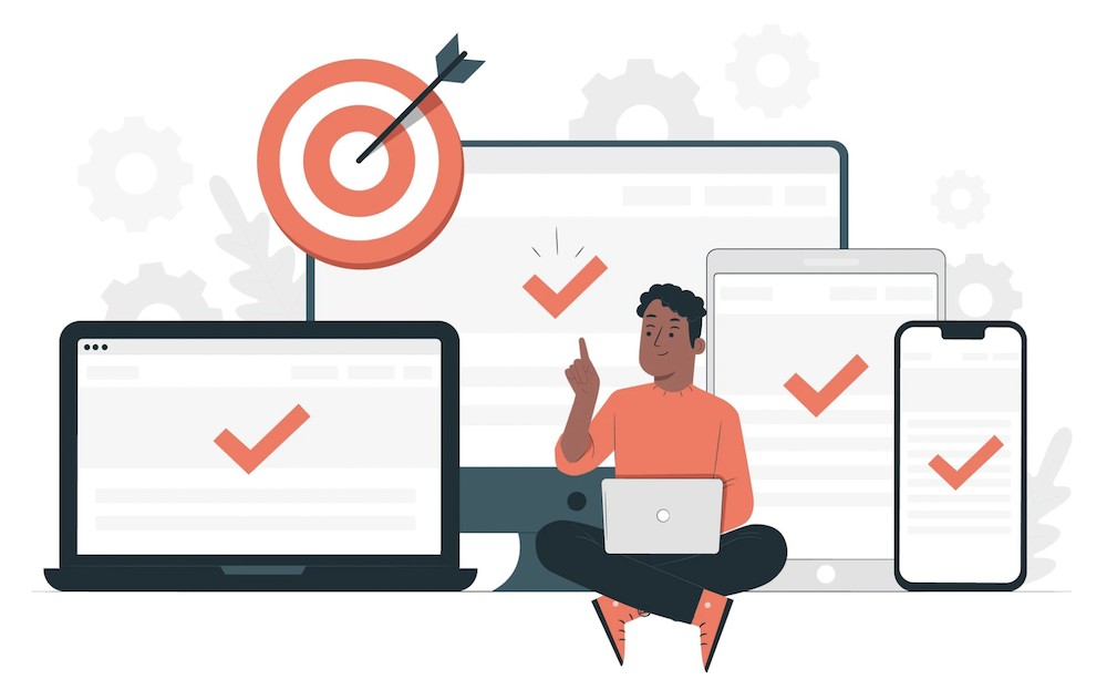
Ensuring your designs are consistent across channels will help to build trust and credibility with your target audience.
If you have a website, you should ensure the same visual style is used in your print and digital marketing materials.
Seeing the same message and the same colors and identity across multiple channels helps reinforce the brand and convey professionalism.
This will build familiarity and trust with your readers and show that you’re a brand that’s consistent in everything you do.
If you’re using multiple platforms to promote your business, you want to ensure that the visual design and tone remain consistent across all of them.
3. Typography and readability
You can’t expect people to read your content if it doesn’t look appealing.
That’s why you need to choose fonts that work well with the content of your website.
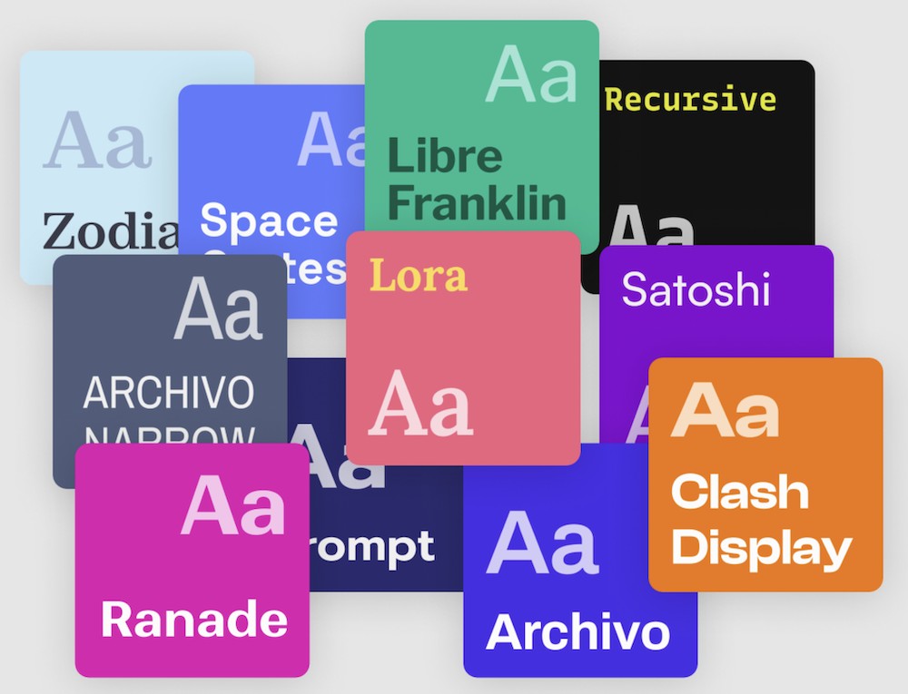
(Source: Fontpair)
A great tip is avoiding overly fancy fonts that look out of place on a website. Instead, stick to standard, easy-to-read fonts that are legible and professional.
It’s also useful to highlight the essential words and phrases in bold and capital letters. You can also use different font sizes to make your content more exciting and readable.
For example, instead of having all your content in one large font, use several smaller fonts with varying sizes to break up your page and help your readers see each section more clearly.
Also, if your font is too small or too large, it may be hard to read on a computer screen or any other mobile device.
4. Responsive and mobile friendly
With the growth of mobile, creating a user-friendly, responsive website is crucial for your success.
Did you know that nearly 60% of website traffic comes from mobile devices?
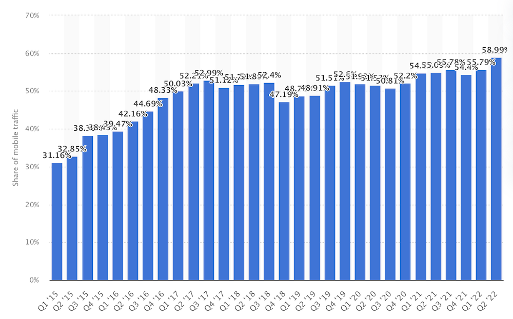
Users want to be able to navigate around your site quickly, so you need to make sure that the website is designed with mobile users in mind.
You can do this by using a responsive design that adjusts the layout according to the viewing device, such as a computer, tablet, or mobile phone.
5. Color palette and imagery
There are millions of color combinations that you can use in your website design. However, you don’t want to make it too broad or use too many colors.
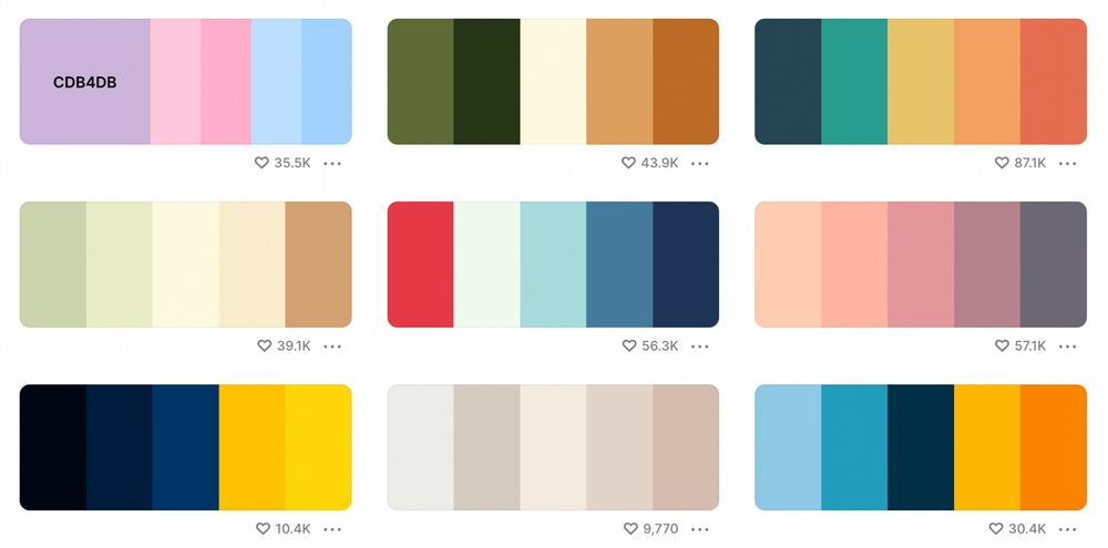
You should keep the palette simple and use only three to five colors in your design.
You don’t want to use too many images in your design either.
Use images that represent your brand, service, and products by all means. But you don’t want to include irrelevant images or any that don’t tell the story or add value.
When designing a website, it’s essential to consider the visual style and tone of the design.
At the same time, you also need to keep the design simple and clean so it’s easy to navigate.
You don’t have to use a complex design with many details, images, and elements on your website. A simple, clean, and modern design that’s easy to navigate is all you need.
6. Fast loading
In these days of instant gratification, you want to ensure your site loads fast. The longer your website takes to load, the higher the chances of customers leaving.
You don’t want your readers to spend too much time on your site when they’re trying to find information or make a purchase.
To ensure that your site loads quickly, you should use a WordPress theme that loads fast.
For instance, here’s how a website built using the Astra theme performs.
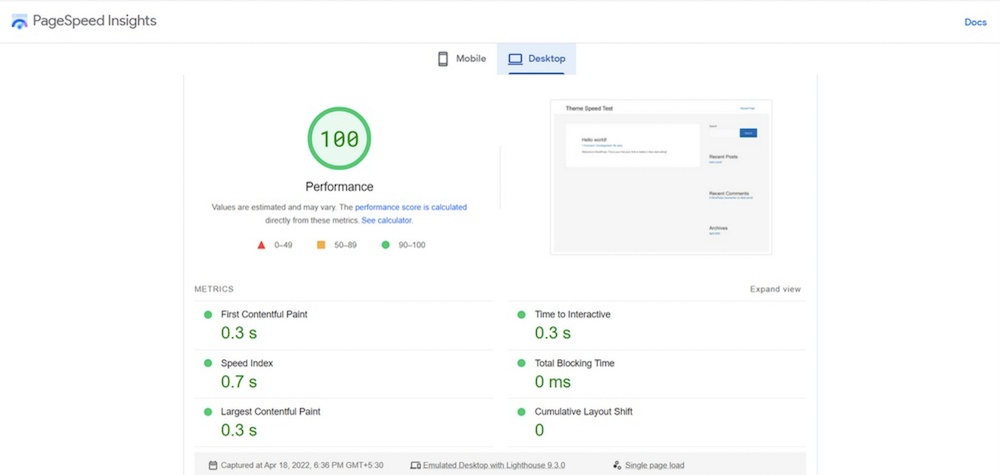
It scores a perfect 100 on PageSpeed Insights and loads in less than a second.
First impressions play a significant role. If your website loads slowly, most people won’t bother visiting it again.
It could also be the factor that causes people to leave your website before they find what they’re looking for.
7. Easy navigation
Navigation is the key to easy, modern website design.
You want to ensure that your navigation is straightforward with a logical hierarchy of links. That way, visitors can easily navigate from one section of your website to another.
Moreover, you want to ensure that your navigation is consistent across all your pages.
You can do this in several ways, including using a navigation menu, structured navigation, or a navigation bar.
8. Communication
Website design is all about communication.
You should ensure your website designs communicate effectively, so potential clients can easily understand the information you’re trying to present.
You can do this by using images, color palettes, and typography to help create a visual language that communicates your brand values and personality.
At the same time, you need to ensure that your visual designs are easy to navigate while also being quick to load.
Where to find website design inspiration
Creating a website can be a daunting task. Considering the countless platforms and design trends, it can feel almost impossible to stand out from the crowd.
Website design inspiration is everywhere. We just have to look for it. Creators are inspired by nature, poetry, art, music… the list goes on.
Fortunately, there are several places where you can find inspiration for your new site.
We wouldn’t want to overwhelm you with too many options.
Hence, here are some of the best sources for website design inspiration that should more than help you.
Starter Templates
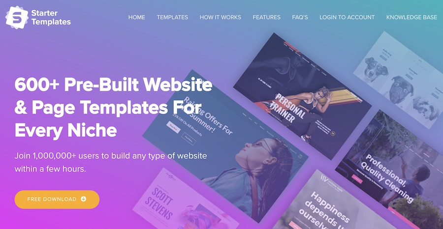
Would a library of 600+ professionally designed website templates help you?
We definitely think so! Especially when it covers almost every niche and industry there is.
Starter Templates has a pre-built website for just about anyone and anything. Be it personal blogs, static websites, online stores, restaurants, cafes, marketing agencies, and influencers.
Each of these templates has been thoughtfully planned and designed. Every element has been strategically thought out and incorporated into the website design.
By exploring the various templates, you are sure to find elements that you can, in turn, incorporate into your own designs.
Recommended Astra’s templates:
Dribbble
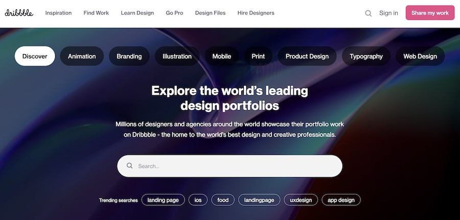
Dribbble is another resource to help you come up with ideas to get those creative juices flowing. It houses designs from creative professionals across the world.
Find inspiration for your next design project by browsing through their extensive portfolio.
And it’s not limited to just website designs. Dribbble has you covered even if you were looking for design options to create landing pages, apps, animation, branding, and more.
Bēhance
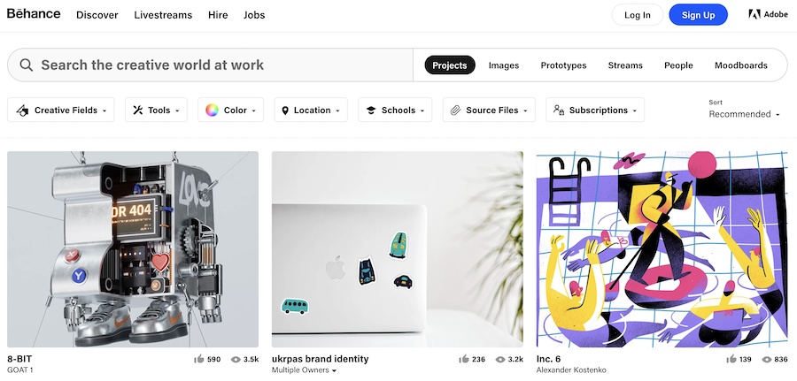
Behance is owned by Adobe and is a social media platform that showcases creative work from designers across the globe.
From poster and logo designs to branding, illustration, typography, and package designs, Behance boasts an impressive portfolio that encapsulates the latest illustration trends and graphic design styles.
Lest we forget, they’ve got an equally impressive portfolio of website design templates too!
9 best website design examples
When it comes to designing a website, you have a lot of options.
You can go the trendy route with flat colors and simple templates or stick with the classic design where you have to spend hours designing your site from scratch.
However, there’s an easier way.
By knowing a few web design principles and applying them to your page, you can create a visually appealing website that users will love visiting again and again.
We’ll explore ten great examples of website design so that you can get inspired. You can then apply some of these principles in your next project if you haven’t done so already.
The following website examples are some of the winners chosen by Awwwards.
This group recognizes the talent and awards the efforts of the best web designers, developers, and agencies worldwide.
1. VIITA Watches
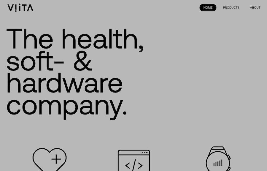
VIITA Watches manufactures high-end smartwatches for luxury and premium brands like Bugatti, Swarovski, Nano, and more. That had to be reflected in their website design.
What’s good about VIITA Watches website design?
The creative design uses minimal content allowing the images to do all the talking.
The one-page website uses impressive scrolling and parallax background effects that engage users from the get-go.
2. Rollie

Rollie is an eCommerce website that sells footwear for men and women. The website is elegantly designed and uses soft, pastel colors that are pleasing to the eye.
What’s good about Rollie website design?
The hero section of the website has a promotional video that runs in the background. Scroll down, and you’ll find the various footwear categories featured very creatively.
The background scrolling enhances the user experience, and the content is strategically placed to convey the message.
3. Icam
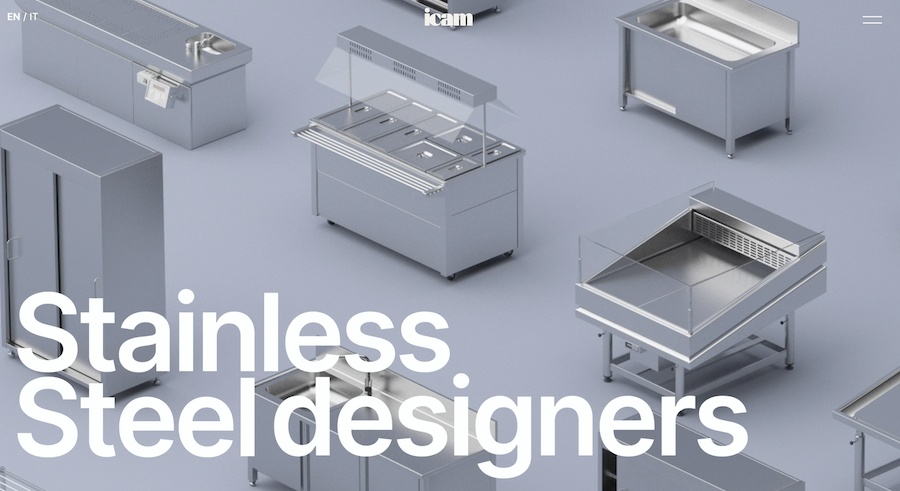
Icam are experts in the stainless steel industry, and that’s evident as soon as you land on their homepage.
What’s good about Icam website design?
The site uses all kinds of scrolling effects, such as parallax and infinite scrolling, to engage readers.
White background, minimal text, and impressive use of product images are what strike you about Icam’s website design.
4. DrawHistory
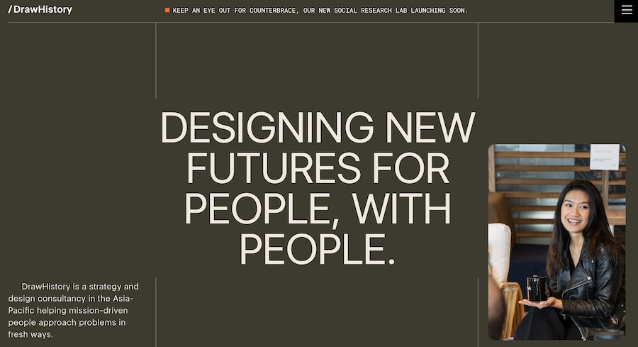
DrawHistory is a branding and design consultancy that provides solutions for businesses of all kinds.
What’s good about DrawHistory website design?
The homepage is strategically designed, having all the correct elements to capture the attention of prospective clients and customers.
We like the Read Me text that appears as soon as you hover over some of the case study images. The website looks great on mobile devices as well.
5. Hematogenix
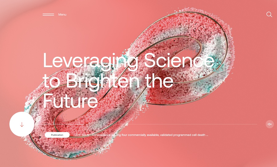
Hematogenix is an industry leader in cancer drug development and testing services. And the website design looks every bit a leader.
What’s good about Hematogenix website design?
The website is well designed and uses pastel colors and elegant scrolling effects that enhance the entire look and feel of the site. To top it all, soothing music runs in the background.
6. Kubota

Kubota has a wide range of products that support the lives of human beings. They offer solutions in the areas of food, water, and the environment, which is evident in their website intro.
What’s good about Kubota website design?
While their website is heavy on content, the design is clutter-free and offers users a great reading experience. They’ve also incorporated background music soothing to the ears and soul!
7. re_
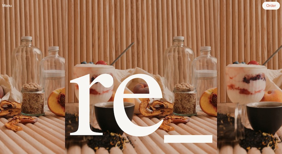
re_ is an online grocery store with several offline stores.
What’s good about re_ website design?
They are consistent with their branding and use website colors that match their offline stores.
Their shop page is easy to navigate and adding products to your shopping cart is pretty seamless. The website integrates the store’s Instagram account as well on the homepage.
8. Lewa House
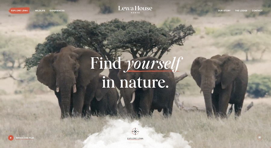
Lewa House is all about wildlife conservation and accommodation in Kenya.
What’s good about Lewa House website design?
We just love this website for a couple of reasons.
To begin, the introductory video sets the tone and explains what Lewa House is about. Next, an interactive map helps you get a bird’s eye view of the entire property.
Explore the lodge, wildlife, and more using this highly engaging and interactive map. Not to mention, a voiceover walks you through the entire website.
9. Ultima Collection

Ultima Collection deals in luxury properties in exotic locations across the world.
What’s good about Ultima Collection website design?
If you sell luxury, you’ve got to show it on your website. And Ultima Collection’s website does precisely that!
Every element on the website looks and feels luxurious, from the intro video to the use of colors and typography. The entire website is elegantly designed and built to sell luxury.
Wrapping up
The most important thing to remember when designing your website is that you have to design for your visitors.
They are the ones who will be using your website and reading your content, so make it as easy to navigate as possible for them so they will be more inclined to use it.
Good design isn’t about showing off with flashy elements and templates. It’s about creating a site that’s easy to use and navigate, looks good, and is simple enough for anyone to use.
That way, more people will find your business and use it!
While designing your website, you probably come across many different design inspiration sources.
Design inspiration can be a fantastic thing. It spurs new ideas and helps come up with new and fresh solutions.
However, it can also be a curse. It can result in you seeing and thinking about similar designs too much.
We’ve covered the web design principles that should help you come up with a nearly perfect website design and impress your audience. Furthermore, check the guide on the web design process to learn our secret to designing 300+ websites.
Is there something we missed? How do you design your website? Let us know. We’d sure like to hear from you.
Disclosure: This blog may contain affiliate links. If you make a purchase through one of these links, we may receive a small commission. Read disclosure. Rest assured that we only recommend products that we have personally used and believe will add value to our readers. Thanks for your support!


Nice article. Was difficult to acces to it by Google. Just browsing in 5th Google page and find it hehe.
This actions should be done step by step, taking at least between one-three months for each, to ensure the success of the entire project.
Thanks
For me it was the first
Good article!! I think that one of the most important thing for a good SEO job is the design of the pages, seo it’s not only technical or content issues.
I think numbers seven and eight can be condensed into one point.
Well! Maybe…
But as you can see that number 7 speaks about website navigation and page hierarchy that takes the user through the entire website. The 8th page is more about content on a single page and the way you can manage it. 🙂
Hey nice article, I really like that you give emphasis to simple design because simple designs are easy to load and hava a huge impact on the site ranking.
Wow! I really enjoyed reading this. All know that business website is the internet face of your company, so it’s of the utmost importance to create a great website design that will appeal to website visitors.
Those illustrations are something I am looking to boost my website with. I am trying to find ways to enhance my website/browsing experience for my clients. Great article thank you!
You’re welcome Adrian! 🙂
Thanks for the tips
I can relate to point 8, from my own attempts. It’s easy to insert to much text content that tries to impress the visitor about the history of your company and your achievements. When all that is needed is required is the information they seek, bulleted or listed. The finer details can be linked from the bullet points, should the visitor wish to learn more.
Good article!! I think that it is one of the most important things for a web development agency.
Thank you for this content. These tips will be very helpful.
I really love this Sujay! Totally agree with what you said, “Study shows that visitors stay more time on the websites having easy navigation.” That is soo true! I hate taking so long on a website to find what I need! Keep it up!
The facts have been discussed are really important, keep up the good work
thank u
You’re welcome! 🙂
Good article and excellent way to articulate, keep it up
Great article! Designing a website is an important part of any company’s online marketing campaign;
Good read, I like the info you supply for your articles, Thanks for sharing smart thoughts.
Thank you so much for sharing a great article. Keep up the great work!
We specialize in amazing luxury web design and luxurious graphic design. Well, this is a great post and thanks for sharing.
This is actually a really nice article. I’ve been wanting to start designing my website but I have no clue how. This is really helpful. Good job!
Very nice article! Although, number 6, doesn’t seem much related to web design as it is to user experience in general.
But overall nice article, this is extremely helpful!
Yes, that’s true!
But, this is an attempt to focus on things related to website design. Number 6 can be an extension to the CSS mentioned in number 2. Things like CSS code, etc. should be compressed.
And, we are glad you liked our article. 🙂
Very nice article! Although, number 6, doesn’t seem much related to web design as it is to user experience in general.
But overall nice article, this is extremely helpful!
Very nice article! Although, number 6, doesn’t seem much related to web design as it is to user experience in general.
But overall nice article, this is extremely helpful!
#5 Speaks to me so damn much! ?
I’ve never been able to pick the best color palette. And when I do my website looks like a splat of paint. But overall excellent points.
Would help if you can add tools for us to use.
Nice list! It’s concise and comprehensive at the same time.
Good job on this.
I agree so much with #1. Simple is key.
Very well thought out article. Kudos!
I thought I was getting old with the “three-click-rule”. Turns out it’s still the same.
Been wanting to update my site design for some time now. This is really helpful. Thanks!
Nice article! Albeit, number 6, doesn’t appear to be abundantly identified with website architecture all things considered to client involvement with general.
In any case, in general pleasant article, this is very useful!
Awesome article!
It would be helpful to add some tools in there too to complete the bunch.
But overall nice job!
That’s really informative post. I appreciate your skills. Thanks for sharing.
A good page layout and design are not only good for aesthetic purposes, but also for SEO. Thank you for your contribution with this post
#5 Speaks to me so damn much! ?
I’ve never been able to pick the best color palletes. And when I do my website looks like a splat of paint. But overall excellent points.
Would help if you can add tools for us to use.
This is actually a really nice article. I’ve been wanting to start designing my website but I have no clue how. This is really helpful. Good job!
Very nice article! Although, number 6, doesn’t seem much related to web design as it is to user experience in general.
But overall nice article, this is extremely helpful!
I agree so much with #1. Simple is key.
Very well thought out article. Kudos!
I thought I was getting old with the “three-click-rule”. Turns out it’s still the same.
Been wanting to update my site design for some time now. This is really helpful. Thanks!
Literally blank on how I can redesign my website.
I have no clue where to start. Thanks to this article for pointing them out.
#1 is a great point to emphasize too! Good job!
Consistency is the key! Excellent point to send across.
I see a lot of websites out there that are just all over the place! Yikes! Great job with the article.
And great job with Astra too! Love it!
This is actually a really nice article. I’ve been wanting to start designing my website but I have no clue how. This is really helpful. Good job!
Hello Nathaly,
Glad you found the article useful! 🙂
Love the article!
all aspects of this content, is brilliantly accommodating. A website after reading this informative piece, will surely exceed ones website.
Xie xie, Relishia
Really enjoyed your article as its highly informative
Thank you very much for presenting this data about good website design, it’s known how to get approved but what are the next steps after getting the approval… Wonderful information, thanks a lot for sharing kind of content with us… great post! One must check this flightdigital.co.nz it gives us more info on this topic.
the information presented is accurate and detailed, very interesting.
Hello there,
So glad to hear that you found the article useful! 🙂
hey there,
thank you for sharing the article. this article is so informative This is really a truly pleasant article. I’ve been needing to begin planning my site yet I do not understand how. This is truly useful. Great job!
Hello there,
Glad that you found this useful and thank you for leaving a comment. 🙂
Thanks for sharing nice blog post. Its blog information is very helpful and valuable.
Hello there,
Glad you found this article helpful. 🙂
Nice article keep sharing with us.
Glad that you liked it! 🙂
Very well !
I read this and really like because i’m looking website design agency services in Florida too. Thats really beneficial info for those who are interested for that.
Carry one author for share this kind of technical info.
Hello Henry, glad that it helped. 🙂
Nice article.
Best information! Thank you for sharing with us
This was a very meaningful post, so informative and encouraging information, Thank you for this post.
home services app development
Great article. Really useful information. Best I’ve read in a while on this subject. Thanks so much for all your efforts.
Everything is clear. Thank you!
This article explains some really good practices. Excellent insights. Well written!
Glad to hear that you liked the insights, David! 🙂
Excellent article! I’ve been wanting to start developing my website, but I have no idea how to do it. But you solved my all problems. This is very beneficial. Thank you.
Really enjoyed your article as its highly informative
Glad you liked it, Andy! 🙂
This really helpful. Really appreciate it. Thank you guys for the excellent work
Glad you liked it, Abraham! 🙂
Thank you for sharing the information. I appreciate reading it because it was both informational and beneficial.
Nice Blog
At Ideal designs, we believe that design should not just look good. It should also work well; it should be memorable and it should connect with the end-user. The success of many businesses today depends on how vital a role ‘good’ design plays in their business strategy. Design is often the first thing that the consumer comes in contact with, before you can meet the company representative, you see the logo… and ‘good’ or ‘effective’ design has already started playing a vital role.
This article contains some of the best information on this subject. I learned some principles of good website design after reading this article.
Excellent article! I’ve been wanting to start developing my website, but I have no idea how to do it. But you solved my all problems. This is very beneficial. Thank you
Great deals of important information and the articles are great.
I am bookmarking it for future reference and consultation. Many thanks for sharing! 🙂
Thanks for this informative and helpful blog! I look into the website’s speed and if it’s easy to navigate because it annoys me if both website characteristics are in a bad state.
I learned from one digital marketing course that website frameworks must work well to land on the correct link, and it also has to do with the psychological aspect of a website visitor. What are your tips on applying website wireframes to a website?
Great article to have good!
Very interesting and thanks for sharing such a good blog. Your article is so convincing that I never stop myself from saying something about it. You’re doing a great job. Keep it up.
Really very helpful and informative article!! Thanks for sharing your intelligent thoughts.
Hey that’s one helpful and interesting article you have shared here.
An extremely useful and educational article! I appreciate you giving your wise ideas. Your post convinces me so much that I simply can not help but comment on it. You’re performing excellently. Keep going.
Article is great, thanks for sharing
Thank you for sharing such kind information with us i am looking to develop a custom web development and your blog really helped me that what i need in my website.
keep sharing blogs like this.
Great post. Thank you for sharing.
New Product Design & Development Services
Thanks for sharing these ideas with us. Social media is one of the greatest ways to generate traffic & improve web design. The Marketing Muslimah is an online web design and development service, provider. If you need any help, please feel free to knock us.
Thanks for such an insightful article!!
A well-designed website should be easy to navigate, with a clean and professional layout. The website should be designed with the user in mind, and all content should be easy to find and read. The website should also be responsive so that it can be viewed on all devices.
Nextwebi, a leading web designing company, enhances your business growth with fast-loading, visually pleasing, user-friendly websites.
Thank you for sharing the information. I appreciate reading it because it was both informational and beneficial.
Thanks for sharing the article. I had a great time reading this, the article was informative and useful.
Great, Keep it up and Thanks for sharing such a good information.
Must-read content
Thank you so much for sharing this beautiful blog related to website development and digital marketing services it is very useful for all type of people to promote their business and increase their profitable level.
Hi there, that’s another amazing post on the subject. Thanks for the tips which you mentioned are very helpful while reading. We must follow all of them while reading and studying about them.
Hi,
Great Blog! Very Informative.
Very useful & helpful information about blog commenting. Thank you so much for sharing.
Very Nice Article.
Very informative post. Thanks for sharing.
Thank you for sharing your expertise in such a comprehensive manner!
Thanks For the best post very useful information .Thank you for sharing this post and help full content.
“Excellent article! The 8 principles of good website design you’ve outlined are spot on. The examples help illustrate each principle and how they can be applied in real-life situations. Thank you for sharing this valuable information.”
I agree. A website’s design is crucial to its success. It can make or break a user’s experience, so it is important to get it right. From understanding the importance of white space to making sure content is easily accessible, these principles will ensure that your website looks professional and functions well. By following these guidelines, you can create good website design that users will find enjoyable and easy to use. If you have some time you may visit artstream-media.com I highly recommend this team for anyone looking for quality web design services!
Great Work
Great post!