There is a lot that can stand in the way of visitors converting on your WooCommerce site. Slow-loading pages, unflattering product photos, copy ridden with errors… You have a tough crowd to please, so you should be thrilled when you start seeing sales come through the site.
That said, e-commerce conversion rates are notoriously low and seem to be shrinking every year. The average conversion rate for websites in Q1 2017 was reported to be 2.48%. Which means your e-commerce checkout page needs to be in tip-top shape.
How to Ensure the Best Checkout Experience for Customers?
Here’s the thing: what works for one e-commerce website may not work for all others. That said, there are certain best practices you can abide by that will enable you to masterfully craft a checkout experience that encourages visitors to complete their purchases.
To start, use the WooCommerce plugin and Astra theme. Then activate the WooCommerce add-on.
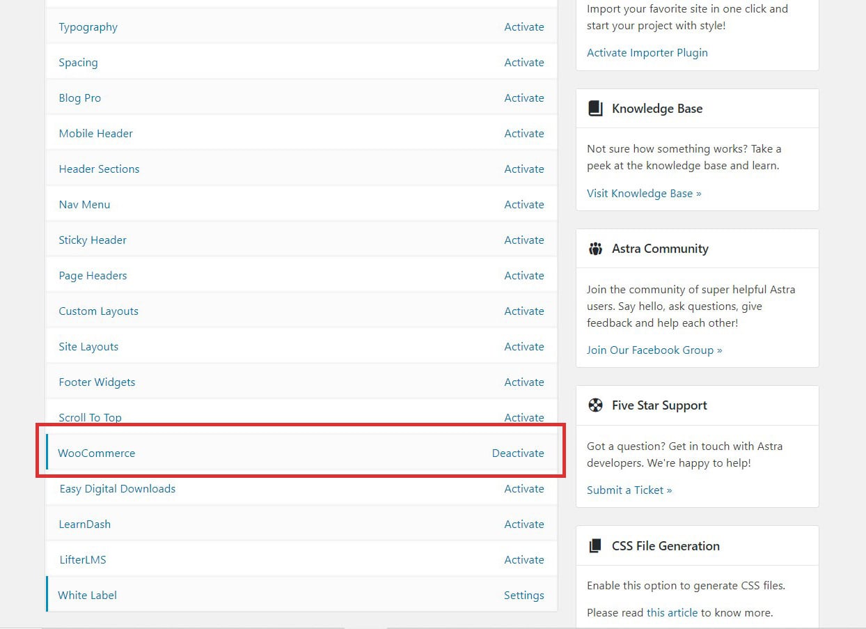
This will give you even greater checkout design and customization capabilities, so make sure these are in place before moving on. Now, let’s dig into what it takes to create a conversion-boosting checkout experience on your website.
1. Remove Distractions
The first step in this process is to remove unnecessary distractions from checkout.
Using the Astra Pro WooCommerce add-on, you can easily enable this type of distraction-free checkout in the Appearance > Customize menu.
Go to Layout > WooCommerce > Checkout Page.
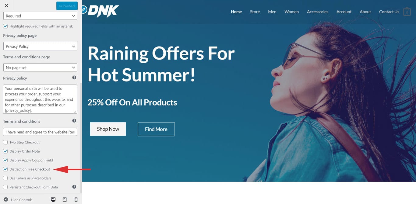
Select it, Publish the changes, and you’ll see that the header and footer from the main site disappear at checkout.
Ultimately, your goal here should be to get visitors straight through checkout without distraction. Removing the header and footer is essential to that as it removes the navigation bar, social media links, and other distractions that might have customers thinking about backtracking.
2. Determine Checkout Options
In this day and age, consumers expect to have choices. When it comes to checking out on a website, you could include:
- A login form (if you allow them to create accounts with the site)
- A guest checkout form (if you are okay with them bypassing the login)
- A one-click Facebook or Google login (if you want that integration)
- A one-click PayPal or Amazon checkout option (if you’d rather a third-party handle the transaction)
Warby Parker keeps it simple with two checkout options:
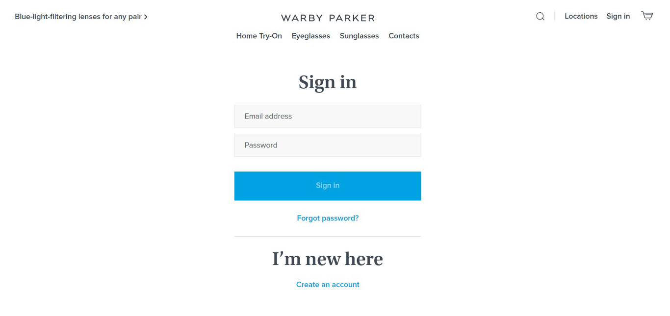
It’s up to you which options make the most sense for your site and customers.
3. Streamline the Form
There are times when a single-page checkout form makes sense. If there is very little information required (e.g. a shipping address and credit card number), you could get away with that type of design.
However, for more rigorous checkouts, you’d do best to split the form into multiple steps as REI has done:
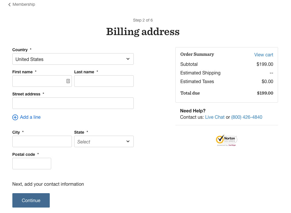
This will allow you to:
Keep each page’s contact form short, clearly labeled, and, consequently, quick to fill out. At first glance, Nordstrom’s checkout form looks pretty cumbersome. As a customer, you won’t feel that way as the oversized form fields and descriptive labels speed you right through checkout:
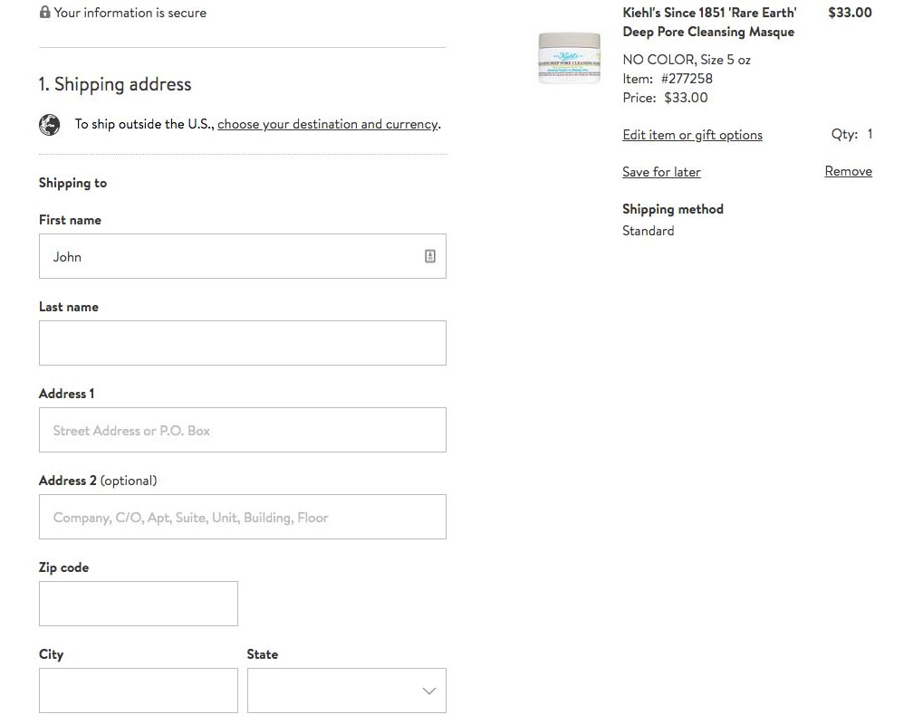
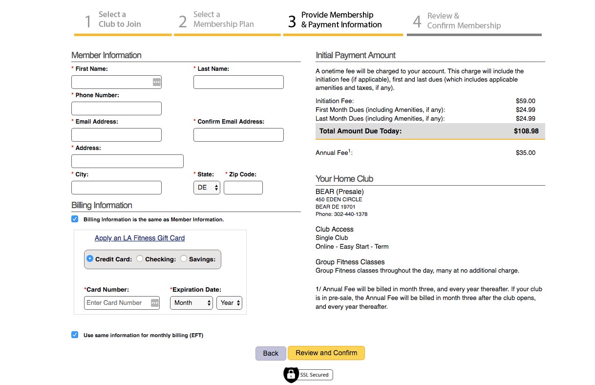
Organize the information collected on each page logically, which means you can also add a descriptive label to the top to let customers know what information is required on that page. LA Fitness uses these progress bar “breadcrumbs”:
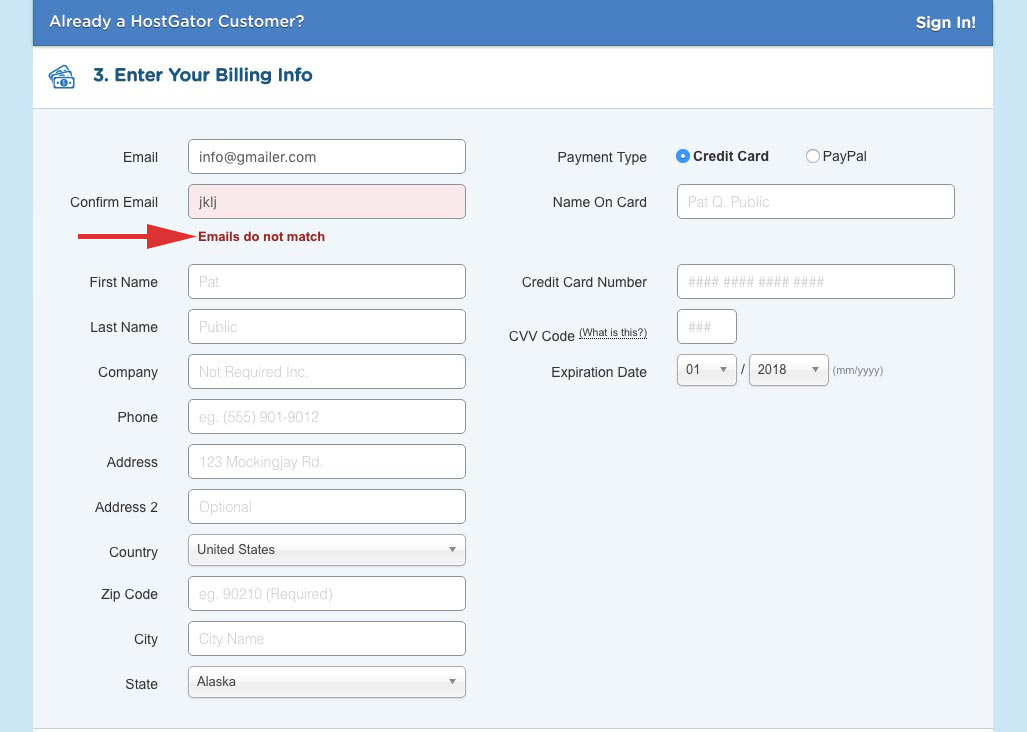
Prevent customers from leaving in frustration if they incorrectly submit a form and have to re-fill everything in. HostGator’s instant error notices are helpful in that regard:
Basically, anything you can do to remove friction while filling out the contact form is ideal.
4. Make the CTA Big and Bold
Design a big and boldly-colored call-to-action that tells visitors exactly what is going to happen when they click on it.
Will they “Continue” to the next page?
Will they now have a chance to “Review Order Details”?
Will they finally “Buy Now”?
Make the button descriptive. Make it beautiful. And don’t mess around with placement. It should go directly at the bottom of the contact form.
One tip I would like to give here is the faded-out CTA trick a lot of websites use nowadays. Basically, you see a button like this one used on the MoviePass website:
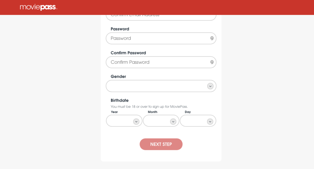
However, customers know that it’s faded out because the form is incomplete. It’s a much simpler and cleaner way of dealing with those pesky or missing error notifications you have to send customers when they mess up a form.
5. Build Trust
Despite the increasing amount of revenue generated through e-commerce every year, many consumers are still concerned about how secure their information really is. While you might know that your web hosting plan provides DDoS and malware protection and that your WordPress security plugins aim to cover everything else, customers cannot see that.
So, how do you instill trust at checkout?
A trustmark or trust seal plays a big part. Essentially, a trustmark is a symbol that informs customers about what measures have been taken to protect them.
The first thing you should use (and should really be non-negotiable) is an SSL certificate. This will put an extra layer of encryption between your server and customers.
The Birchbox website has the “Secure” note, lock, green lettering, and, of course, the “https://” indicative of an SSL certificate in the address bar:

Next, include logos of the trustworthy payment options you offer. If you allow for PayPal payment processing, add the logo. If you accept MasterCard, Visa, and Discover, include those logos. Demonstrating that your site works with the best-of-the-best to process payments will put customers’ minds at ease.
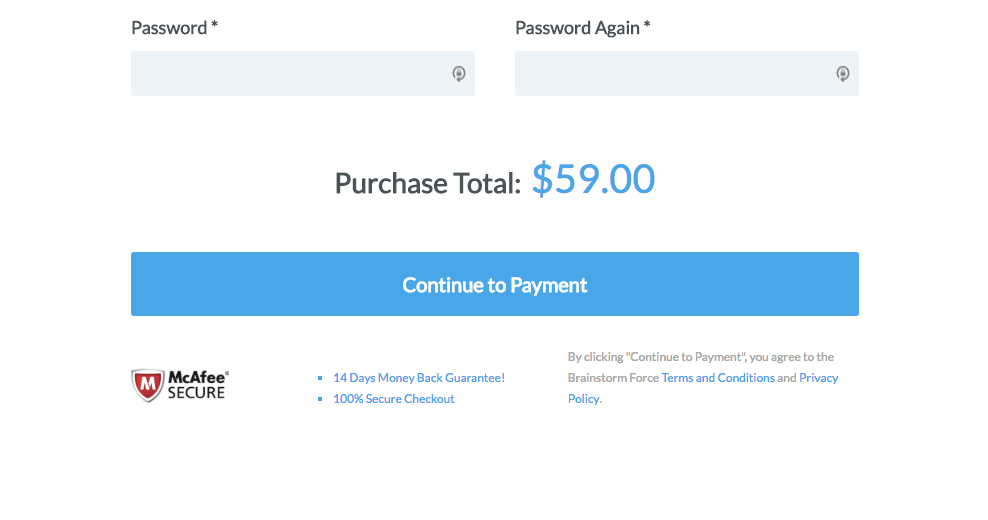
The nice thing about how this is done is that it not only comes with the recognizable McAfee logo, but it also includes other trustmarks like:
- A money-back guarantee
- A statement of security
- Links to the Terms and Conditions and Privacy Policy
Wrapping Up
As a web designer, you have so many tools available to ensure the best checkout experience for customers. At the end of the day, though, all you really need is to provide a safe, quick, and convenient experience for customers, so focus on how to fulfill those needs before you do anything else.
Disclosure: This blog may contain affiliate links. If you make a purchase through one of these links, we may receive a small commission. Read disclosure. Rest assured that we only recommend products that we have personally used and believe will add value to our readers. Thanks for your support!



How is it that you you add the security logos on the checkout page?
Great info! I think you say very important things in this post 🙂
I would love an answer to that question too: “How is it that you you add the security logos on the checkout page?”
Hello Niklas,
You can design a checkout page with any page builder and add an image/logo. Use a shortcode to display checkout fields and with page builder modules/widget you can display logos. In case you need to edit the default checkout page provided by the respective plugin, you can search for a filter/custom code that will help to display additional content on the default page.
Why does Astra not support currency converter plugin? It’s meant to be the most popular WooCommerce theme and it doesn’t support a simple thing as currency conversion!
Hello there,
We haven’t seen any similar reports. Can you reach out to us through our Support Portal so that we can help you in the best possible manner.