The header is the top section of your website, shown across all (or almost all) pages and posts. It’s something that every website visitor sees first… your chance for a great first impression.
This is a place for visitors to meet your brand, your offer or idea, and to be initially delighted and intrigued to explore your website further.
Astra Theme Walkthrough Docs:
- Astra Theme Walkthrough
- This Is Your Customizer
- Style Your Website With Global Settings
- Build Your Header (currently reading)
- Find the Way With Breadcrumbs
- Set Up Your Blog
- Add Your Sidebars
- Build Your Footer
- Host Google Fonts Locally – Performance Is the Key
- See Other Customizer Options
- How To Build Quick Sites With Astra?
- Getting the Most Out of Astra Theme
Astra theme comes with a drag & drop Header Builder – a perfect tool for you to create great headers quickly and effortlessly, without any coding. Here you will be able to add and customize your logo, site title, and tag, your header style, menus, buttons, social icons, and much more.
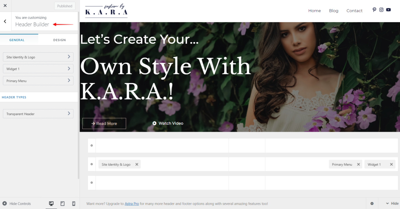
You have full freedom to position elements by just dragging them to any position in the header – as simple as that.
Header Builder – General Tab
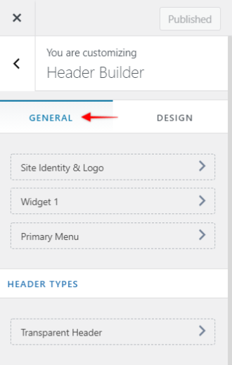
General tab is your default view when opening the Header Builder. Here you have an overview of your header setup.
On a left-side menu, all of your active header elements will be listed. Further down, under “Header Types” you can find the transparent header settings.
Rest of the screen is showing a live preview of your header and the position of your elements across header sections.
Transparent Header
Enabling a transparent header will remove the header background color and shift your content to the top of the page underneath the header, creating the transparency effect.
When the transparent header is enabled, it’s advisable to add a hero image (e.g., full-width image or video, sliders, etc.) or use sections without content (e.g., headings or text) positioned on top – this way, you will avoid overlapping the content and the header.
General Tab
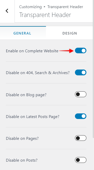
To enable transparency, activate the “Enable on Complete Website” option. This will also open additional options to disable transparent header for a specific page or post types.
Enable On – choose to enable transparent header on Desktop, Mobile or both (Desktop+Mobile)
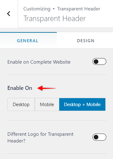
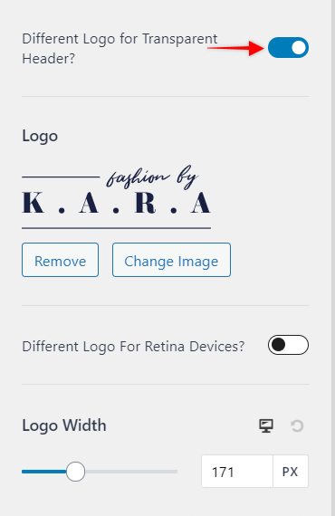
Different Logo for Transparent Header – if your Logo looks good on the standard header, but maybe not so much with a transparent one, you can activate this option and set the different logo to be used for the transparent header.
You can also set the transparent header Logo Width. Depending on the logo you’re using, you might want to add a logo for Retina (higher pixel density) screens which should be at least 2x larger or more. Just click on “Different Logo for Retina Devices” and upload your retina Logo.
Design Tab
Under the Design tab, you’ll find options for styling your Transparent header. You will be able to set the site title, background, menu, submenu, and colors. Also, there are options for setting background overlay and bottom border. The bottom border is by default set to 0px and thus not visible – increasing the border value (1px or more) will make it show on the frontend, and you will also get the option to set the Bottom Border Color.
Keep in mind that these settings are applied only to your Transparent header. If you’re using your regular header on some pages, these settings will not be applied there.
Header Builder – Design
Design tab is used to set your header spacing:
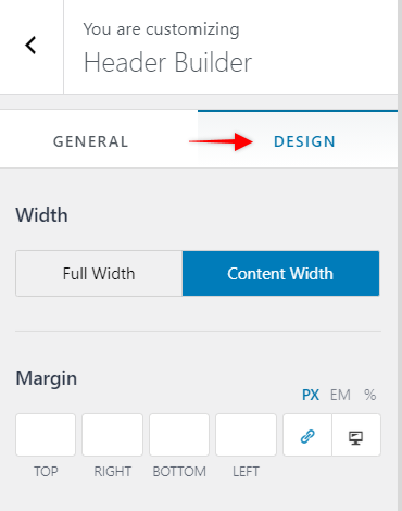
Width sets to total amount of space your header widgets will use:
- Full Width will spread your header widgets from edge to edge of the screen;
- Content Width limits your header widgets to be displayed using your content width – your header background will still be stretching from edge to edge of the screen.
Margin adds space to one or more sides of your header. This will add space to both your header widgets area and background.
Visual Header Builder
The header consists of three separate sections which you can see in the visual header builder area. You can use all three sections to add any element to any position.
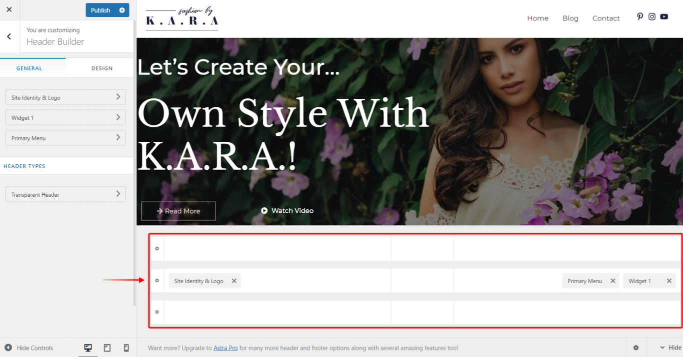
These three sections are:
- Primary Header – this header is the middle section. It is most commonly used for adding your most important elements like Logo, Primary Menu, or Search, Cart, and Account.
- Above Header – this header is the upper section, and it is displayed above Primary Header on your website. It can be used for your secondary elements, like the secondary menu, or elements like social icons, call to action buttons, etc. You can also use HTML code to add for example current discount period, breaking news or some notification for the website visitors.
- Below Header – this header is the lower section, and it is displayed below Primary Header on your website. The use of this header is the same as the Above Header.
The main purpose of Above and Below Headers is to avoid cluttering the Primary Header. They extend the available area for adding all elements and information you need in your Header, as well as to provide a certain level of prioritization.
You can customize each section by clicking on the “cog” icon on the left side of the sections.
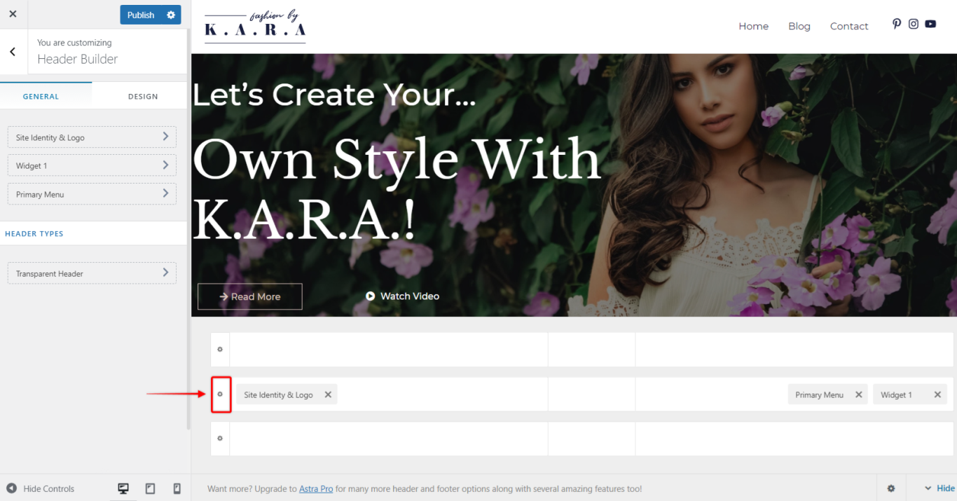
Each section has two tabs:
General
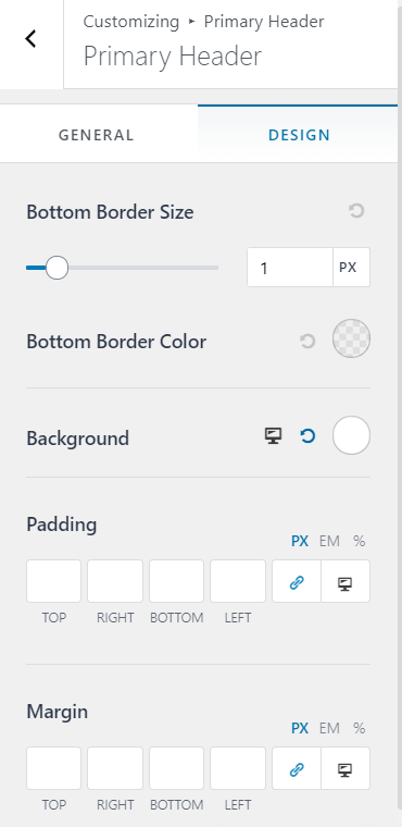
Height – set height of each header separately.
Design
Bottom Border Size (& Color) – if you need to separate your header from another section or website content you can add bottom border by setting the size of your border. Once you set your border size, additional option will appear (Bottom Border Color) for choosing the color of the border;
Background – set the header background color;
Padding – add padding on one or more sides of the header. This will add space between the header section edges and content;
Margin – add margin on one or more sides of the header. This will add space between that header and another website areas (other headers, page/post content, screen edges, etc.);
Each header can be customized separately for desktop and mobile and can have different elements added for each view. The position of elements can also be changed.
Off Canvas section
The Off Canvas section is used to edit your tablet/mobile menu. This menu is activated by clicking on the Toggle Button in the mobile menu (also called “hamburger” menu).
To edit this menu, switch to tablet or mobile viewport editing. You can add elements to this menu and set their order the same way you edit other header sections. Clicking on the “cog” icon will open the following tabs:
General
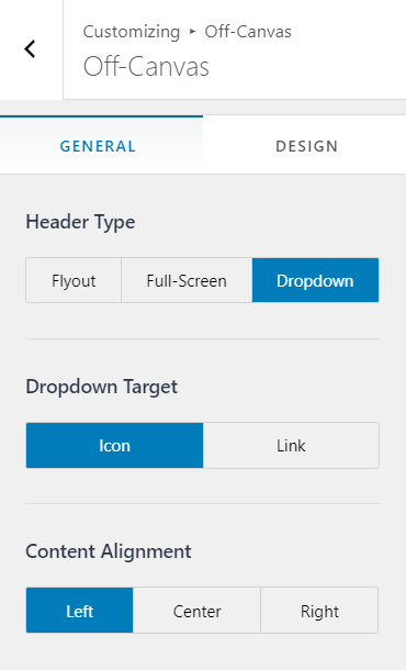
Header Type – set Off Canvas type to Flyout (menu flying in from right or left side of a screen), Full-Screen or Dropdown;
Dropdown Target – choose if you want your sub-menus to open by clicking on the down-arrow icon (Icon) or by clicking to a whole menu item (Link)
Content Alignment – align the Off Canvas section widgets to Left, Centar or Right;
Design
Inner Element Spacing – adding space between the elements;
Background – set the background color.
Header Element
Site Identity & Logo
This is your Site Identity & Logo element (previously named “Logo“). In the General tab, you can add your Logo, set Logo width, and add a Different Logo for Retina devices.
Using this element, next to Logo, you can set your Site Title, Site Tagline, and your Site Icon (favicon). This information is also displayed on the top of your website tab in your browser.
The Design tab is used if you want to add some Margin to this element.
Primary Menu
Here, you will find menu items added to your Primary Menu (Dashboard > Appearance > Menus).
The General tab provides you with several Submenu options: submenu Width, Container Animation (the animation used when expanding a submenu), Item Divider (adds or removes divider between submenu items).
You can also decide if to set your menu items to Stack on Mobile. This is the most common setup for mobile menus – the menu items will be stacked one on top of the other.
The Design tab will allow you to set Menu Hover Style, style your Submenu Container, set the Text and Background Colors, Menu Font, Manu Spacing, and Margin.
Search
Adding this element will add a search function to your header. You can set the Icon Size, Icon Color and Margin.
Social (Header)
You can add your social media icons using this element. You can manage your social media icons using the General tab – add, choose the icon or remove them.
The Design tab holds the options for styling the icons.
Button
This is used for adding a custom button to your header. Add the Text, Link and style (Design tab) the button here.
Secondary Menu
You can add another (secondary) menu to your header if you need it. You can also use this if you wish to split your primary menu into two separate menus – for example, if you want to create a header with a centrally positioned Logo, with your menu items next to it on the left and right sides.
You can customize this menu the same way as the Primary Menu.
HTML
Use this element to add HTML code or shortcodes.
Widget
This is used to add any of the website widgets (Dashboard > Appearance > Widgets) to your header.
Toggle Button
Toggle Button (also known as hamburger icon or button) is used to expand your tablet/mobile menu. Thus, this element is only available on tablet or mobile views.
The General tab will enable you to choose the button Icon and Icon Size, add Menu Label (text next to the icon) if you need it, and the Toggle Button Style.
The styling options are located in the Design tab: Icon Color, Background Color, Border Radius and Margin.
Account
If you have some plugins like LearnDash or WooCommerce active, you can add the user account shortcut using this element.
Cart
This will add a Cart icon (WooCommerce) to your header. Next, set if Cart Title should be displayed as well, or only the cart icon, and whether you want to display a Cart Total too (General tab). You can also style your cart and your cart tray (Design tab).
