Did you test your Elementor website on a mobile device and discover that it goes all over the place when you start scrolling down? Is it showing strange gaps on the sides while moving your finger left and right and an unwanted horizontal scrollbar?
If this is the issue you are experiencing, this document will show you how to fix the horizontal scrollbar issue on mobile devices.
Why Is This Happening?
This issue happens when there are one or more elements on the page that create an overflow.
What’s overflow? With some Elementor custom design settings, you can “push” the widget content out of its column area. This part of the content that is found outside of its column area is called overflow.
When either the widget content is too big or positioned to exceed the screen width on mobile devices, this creates a horizontal scroll issue. To also show this piece of content to website visitors, your browser will need to add a horizontal scrollbar.
How To Fix This?
The horizontal scrollbar issue on mobile devices can be fixed by setting overflow to hidden. You can do this by using the Elementor Section settings or by adding CSS code.
Method 1: Fix Overflow Issue With Elementor Settings
You can use the Elementor section settings to set the overflow to hidden. If you have more than one section which creates overflow, you’ll have to do this for each of those sections. If this is happening on more than one page, you’ll have to repeat this on other pages.
Let’s show you how to do this:
Step 1 – Navigate to the page that has the overflow issue and click on “Edit with Elementor”;
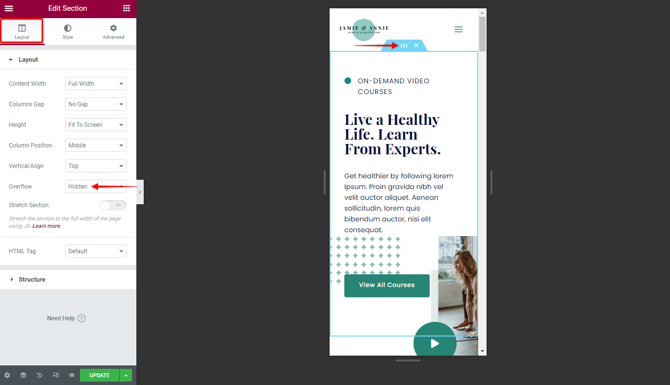
Step 2 – Click on the “Edit Section” option to start editing the section with the overflow;
Step 3 – Under the “Layout” tab, scroll down to the “Overflow” dropdown and select the “Hidden” option;

Step 4 – Click on “Update” to save changes.
That’s it. You solved the issue for this section.
Keep in mind here that this removes the overflow on all sides of the section. Thus, if you deliberately set some overflow on the top and bottom of the section, these will become hidden too.
In this screenshot, you can see the overflow areas that got hidden:

Method 2: Fix Overflow Issue By Adding CSS Code
There are two cases in which this method would help you more than using the Elementor options:
- You need to keep the overflow on the top and bottom of the section while hiding it on the sides to avoid horizontal scroll;
- You have too many elements with the overflow issue, and you need a solution that would apply to your whole website.
Please follow these steps to remove overflow using a custom code:
Step 1 – Navigate to Appearance > Customize > Additional CSS;
Step 2 – Add the following CSS code:
html,
body{
  width:100%;
  overflow-x:hidden;
}
Step 3 – Click “Publish” to save changes.
This method will remove all overflow on the left and right sides for all of your sections and pages. Also, it will keep your top and bottom overflow still visible where needed. You can see it in this video:
