In this guide, we’ll teach you how to make your buttons in the Gutenberg editor look just the way you want them to.
It’s really easy to change the appearance of your buttons. But if you ever get stuck while trying to customize them, this guide will help you!
We’ll explain how you can do these things without any fuss:
- Change colors of buttons
- Change shapes, sizes of buttons
- Changing padding of your buttons
- Change alignment of buttons
- Change border radius
- Add links to your button
So, let’s start with the basics!
How to Add a Button on a Page/Post
If you’ve used the Gutenberg block editor before, you probably know that you can easily put a button on your post/pages. Just grab the button block from the library and drop it where you need it.
Watch this video to see how to add the button:
Once you’ve added the button, you can make it look the way you want by customizing it.
How to Customize a Button?
You can change the appearance of your buttons in different ways using the options provided in the default block editor.
We’ve explained how you can use these options to make your buttons look different, like changing their colors or the space around them.
Let’s now take a closer look at these options.
Button Styles
We’ve got two main button styles: Fill and Outline.
Fill buttons are solid filled with single color, and outline buttons have a border around the text with a transparent background.
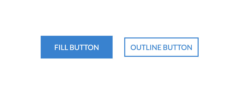
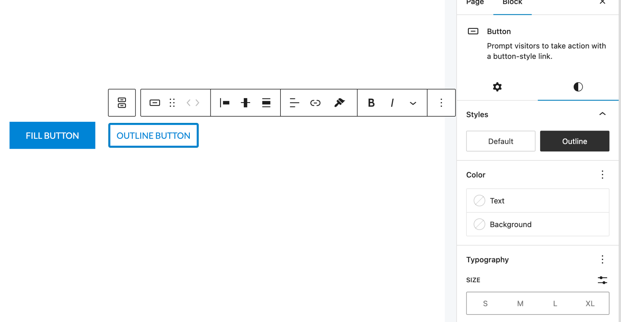
You can select the preferred style by simply choosing the options available on the right sidebar under styles tab.
Colors
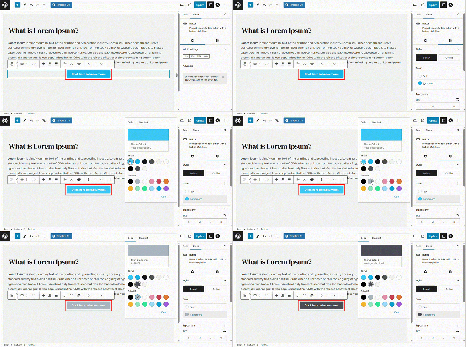
Gutenberg block editor gives you access to change the color of the text as well as the color of the background of the button easily.
Text Color: To change the color of the text on your button, follow the steps below:
- Navigate to the Styles option.
- Click on the Text Color.
- Click on the color picker and choose the color as per your choice.
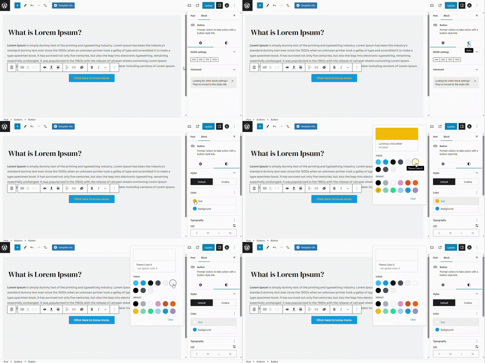
Background color: To change the background color of the button, follow the steps below:
- Navigate to the Styles option.
- Click on the Background Color.
- Click on the color picker and choose the color as per your choice.
Typography
You can easily change the typography of the button text using the gutenberg block editor including the font size, appearance, line height, letter spacing, text decoration and letter case.
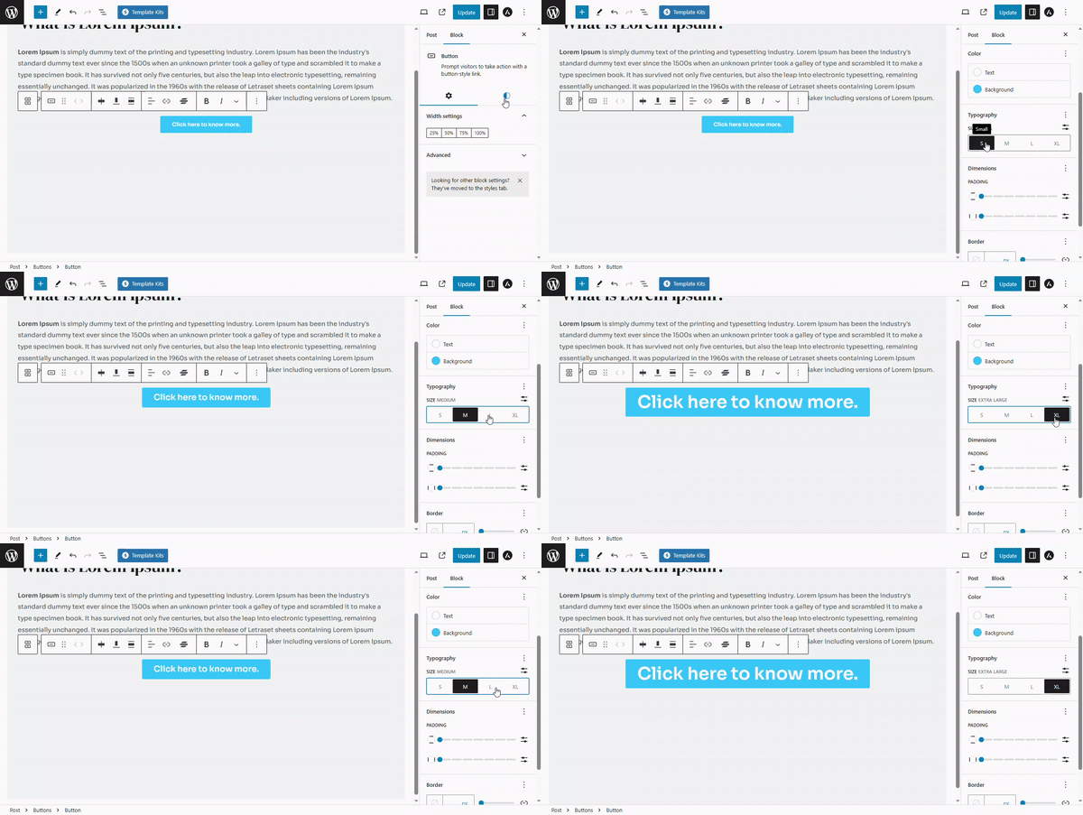
Font Size: Font size controls the size of the letters inside the button text. To change the font size, please follow the steps below:
- Navigate to the Styles option.
- Under typography, you will see the available font sizes such as S (small), M(medium),
- L(large) and XL(extra large).
- Click on the size that you would like to choose
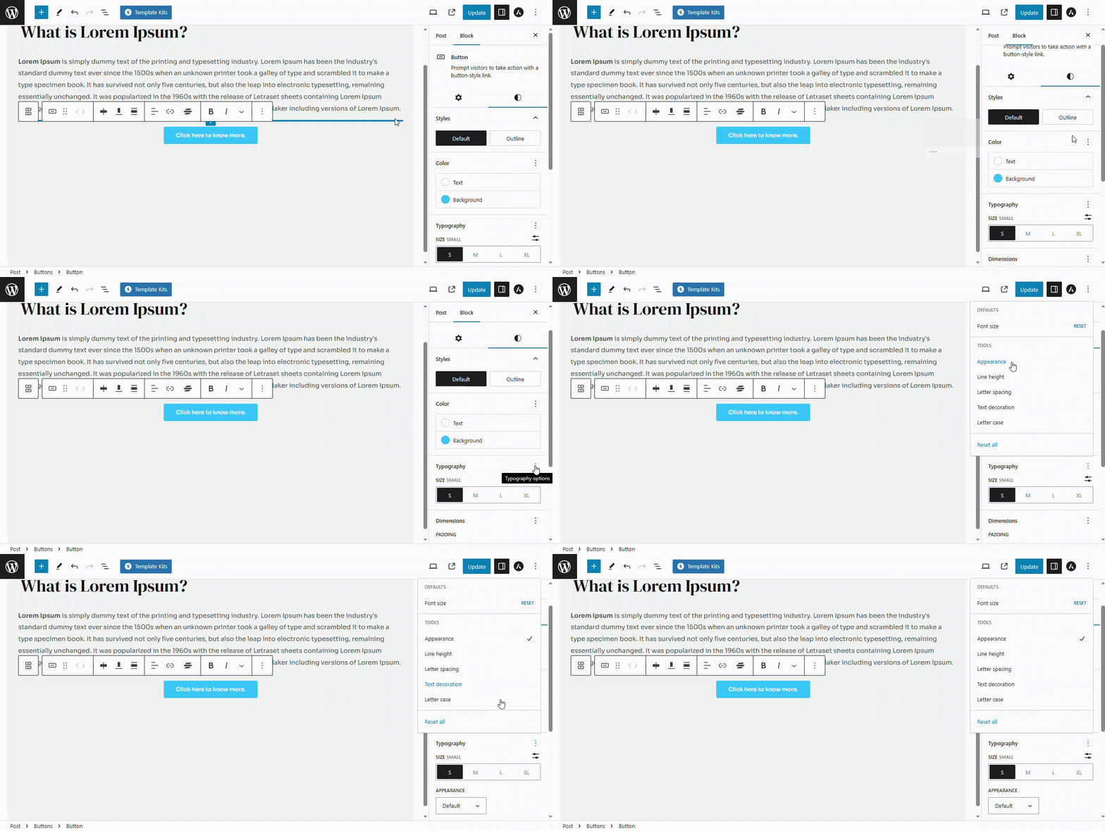
Advanced settings: advanced typography settings include options like Appearance, Line Height, Letter Spacing, Text Decoration and Letter Casing. To access any of these settings, you will need to follow the steps below:
- Navigate to the Styles tab
- Click on the three dots next to Typography option
- Click on the settings that you would like to enable
- A tick mark will appear next to the option indicating that it is enabled
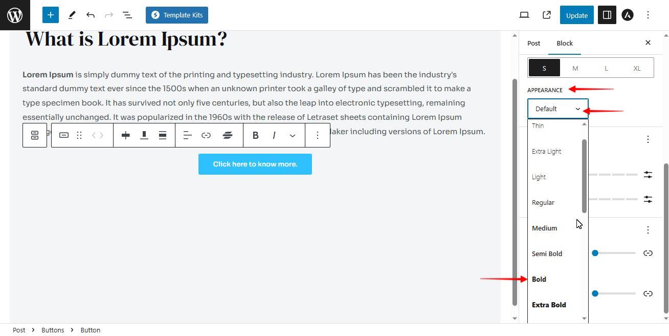
Appearance: Appearance decides whether your button text is extra-bold, bold, semi-bold, regular or thin. This option is normally disabled inside the gutenberg block. Follow the steps below to change the appearance:
- Click on the Default button to open the drop-down
- Select the appearance as per your choice
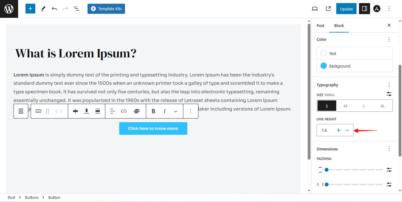
Line Height: It refers to the amount of vertical space between lines of text within a button. This option is also disabled by default.
Once this option is enabled, use the “+” or “-” icons to increase or decrease the line height inside your buttons.
Letter Spacing: Letter spacing is like adjusting how much space there is between each letter in a word or sentence. You can make the letters spread out more or squeeze them closer together.
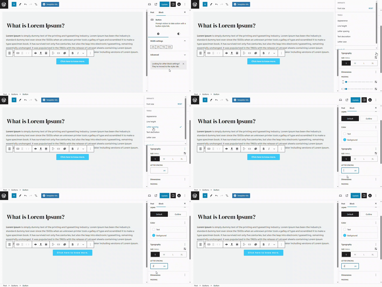
In the Gutenberg block editor, it is counted in Pixels. You can enter the desired amount of spacing in px inside the allocated field..
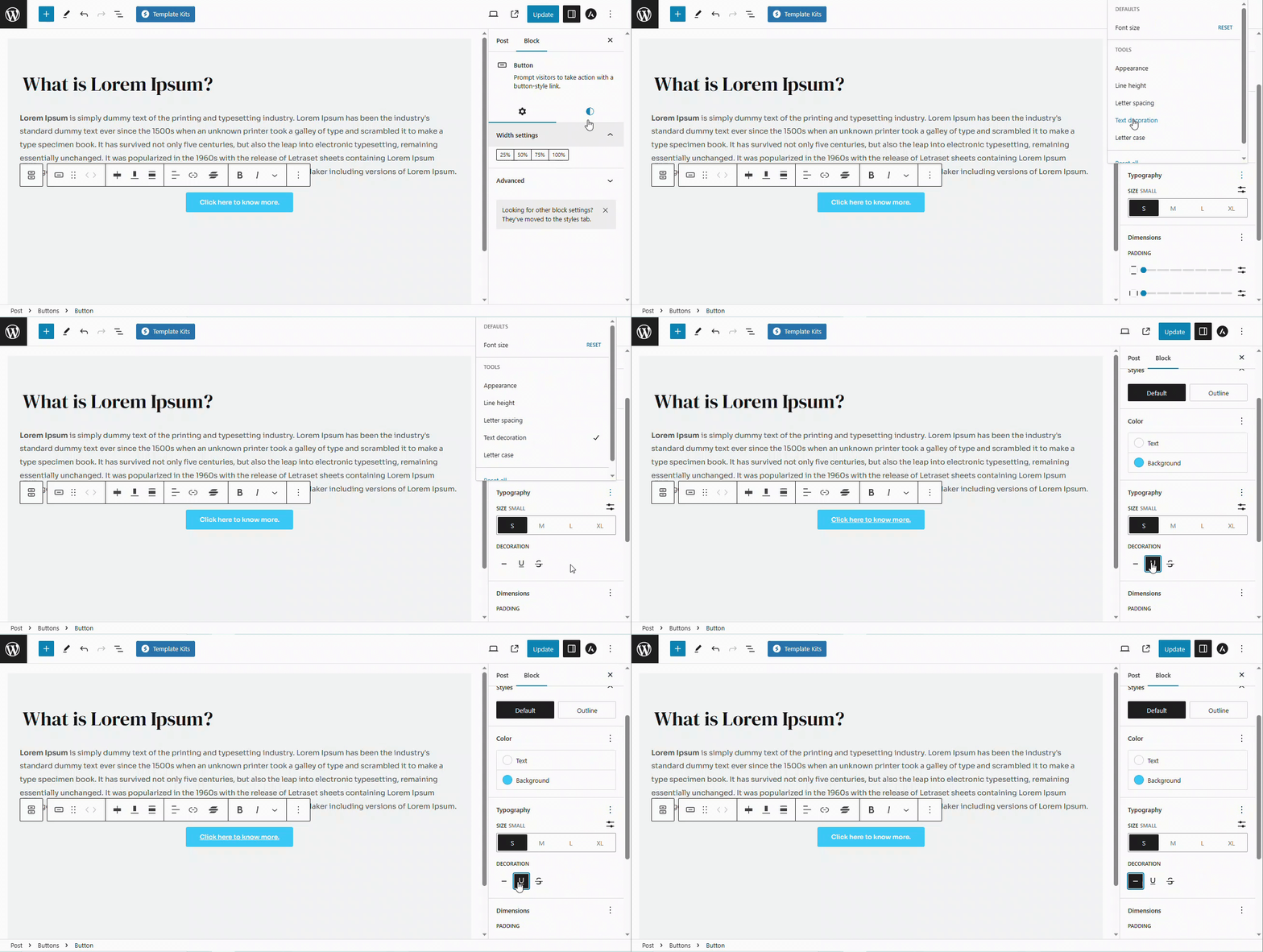
Text Decoration: It adds special effects to your text to make it stand out or look different. This option also needs to be enabled inside the typography section.
It has three different options as mentioned below:
- None: This does not change anything to your button text and is selected by default.
- Underline: This option adds a line under the button text.
- Strike Through: This option adds a line in between the letters of the button text.
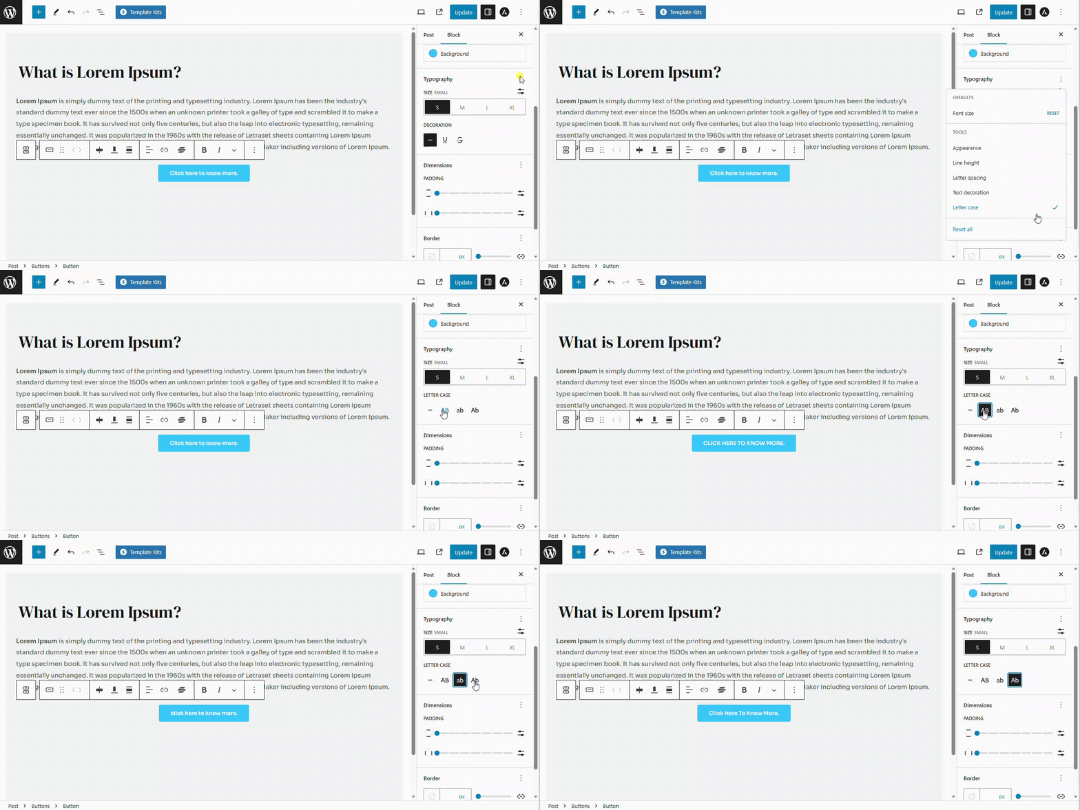
Letter Case: Letter case lets you add variety and change the appearance of your text for different purposes or to match your design. You can make the letters all uppercase (LIKE THIS), all lowercase (like this), or capitalize the first letter of each word (Like This).
Padding
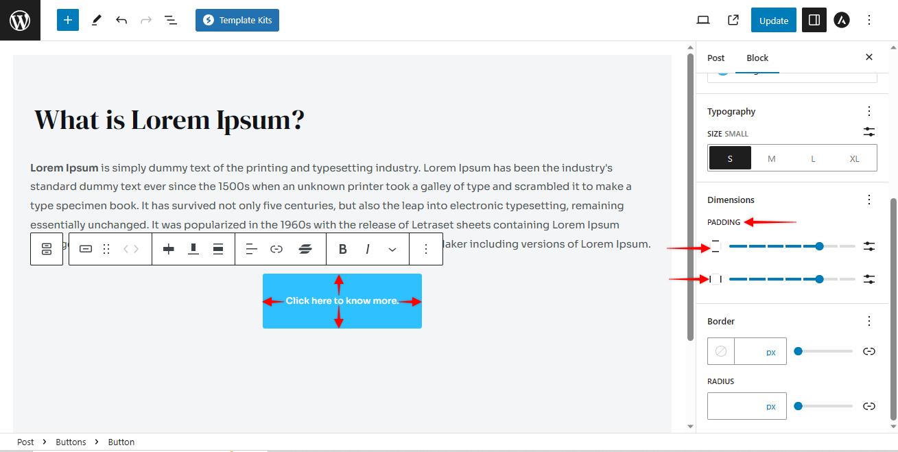
Padding is like giving your content some breathing space. It’s the extra room between the inside of a button, and its outer edges. You can adjust the padding from inside the Gutenberg blocks.
Vertical Padding: Vertical padding adds extra space above and below your button text, like the top and bottom of a button.
Horizontal Padding: Horizontal padding, on the other hand, adds space to the left and right sides of your button text.
Border Radius
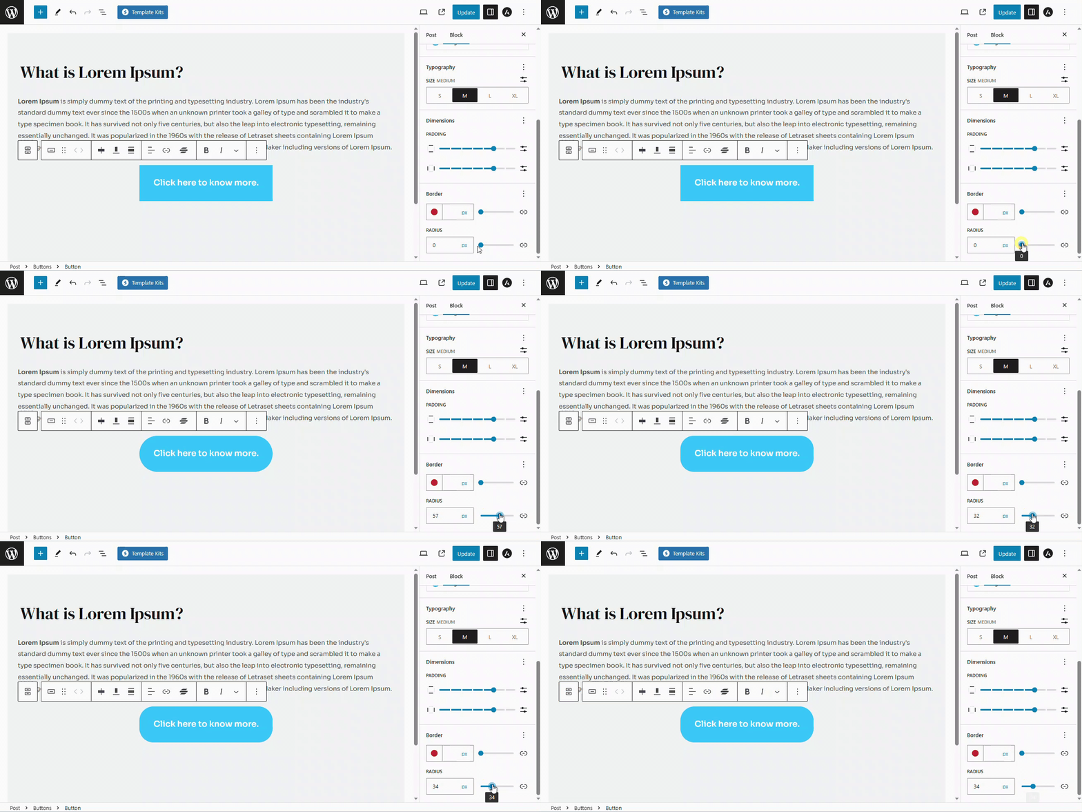
Border radius is like giving your corners a makeover. This option lets you round off the edges of a button. So instead of having sharp corners, you can make them nice and smooth. It’s like turning a square into a more friendly and curvy shape.
How to add a Link to a Button
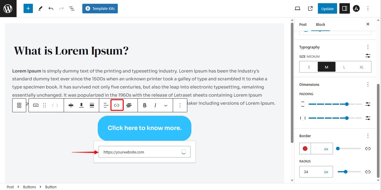
You can set up your button by adding a link to it so that when the users click on the button, they will be redirected to the link of your choice.
To add a link to a button, please follow these steps:
- Select the button that you would like to add a link to.
- Click on the link option from the toolbar.
- Enter the link that you would like your users to be redirected to.
- Press enter to save.
To know more about adding a link to a button, please read this article.
How to Publish Your Changes
Once you are happy with all the customization of the button, preview it by clicking on the preview tab. You can review it on desktop, tablets and mobile devices.
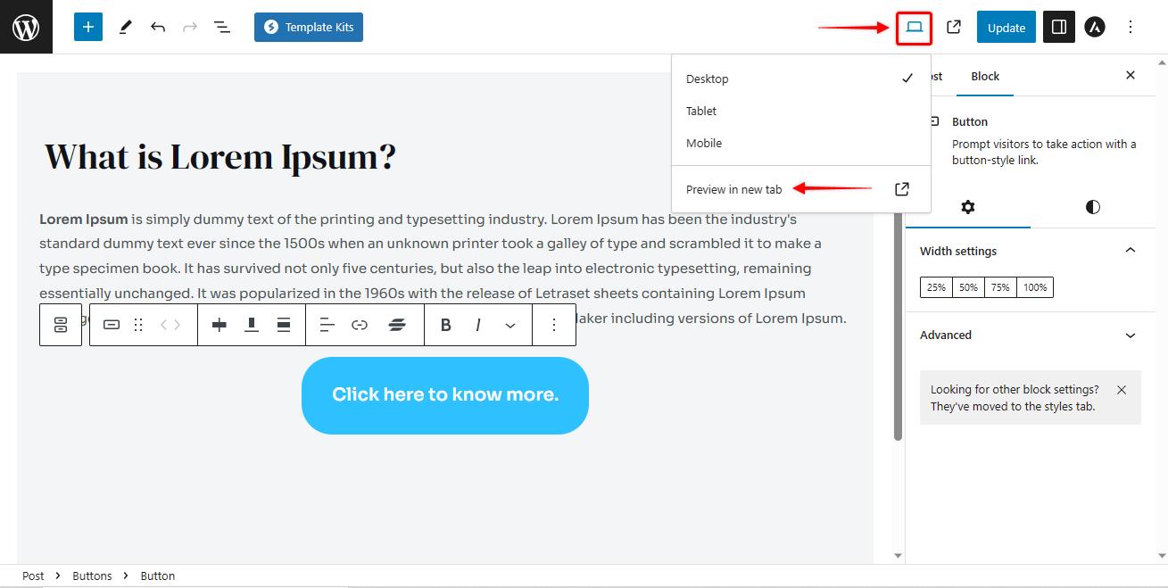
If everything looks right, click on the update/ publish button to publish the button.
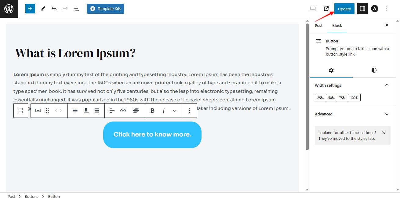
That’s it. Your button is now published.
Customising buttons in the Gutenberg Editor is a breeze. You can change colours, sizes, alignments, and even add links with just a few clicks.
It’s like giving your buttons a personalised touch to match your style.
