Astra Header Builder provides a dedicated option to design a mobile header. These options are available with the Astra theme out of the box, while advanced configuration options are available with Astra Pro.
Refer article here to know how to get started with Astra Header Builder.
Editing Mobile Header
Once you switch to the Header Builder, visit the Customizer.
Step 1 – Click on the Header Builder to start editing.
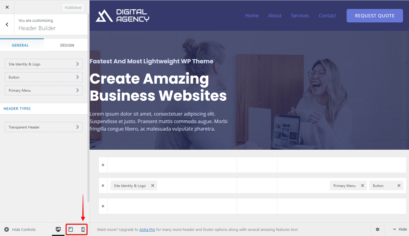
Step 2 – Switch to Tablet or Mobile View in the Customizer.

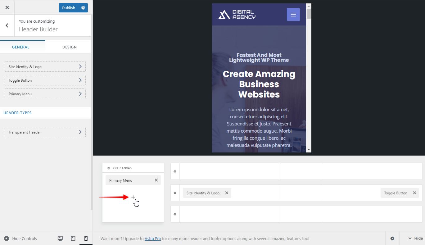
Step 3 – You will observe a separate dedicated box for a mobile header in the visual header builder. Off Canvas section allows you to configure header items inside the toggle button. While visual builder on the right side lets you configure all parts of the mobile header – you set separately your Primary header (middle), as well as Above, and Below headers. Usually, you would have your logo and toggle button in your Primary header here, but there are actually no limits to where you can place elements in your mobile header.
Step 4 – In the Off Canvas section, click on the plus sign to add header elements like the primary menu, button, widgets, HTML, and so on. The Off Canvas section is the one that is shown when the user clicks on the toggle button.

Step 5 – Click on the gear icon to set mobile header type, color, and other options.
You can choose the following options for header type –
- Flyout
- Full-Screen
- Dropdown
Under the dropdown option, you will find two options i.e. Icon and Link. If you select the icon option, the submenu will show as icons and if you select the dropdown option as the link, the submenu option will show as links. Please refer to the video below for more information.
Under the Design tab, you will find color options.
Step 6 – If you need to edit the Toggle button, click it and start configuring.

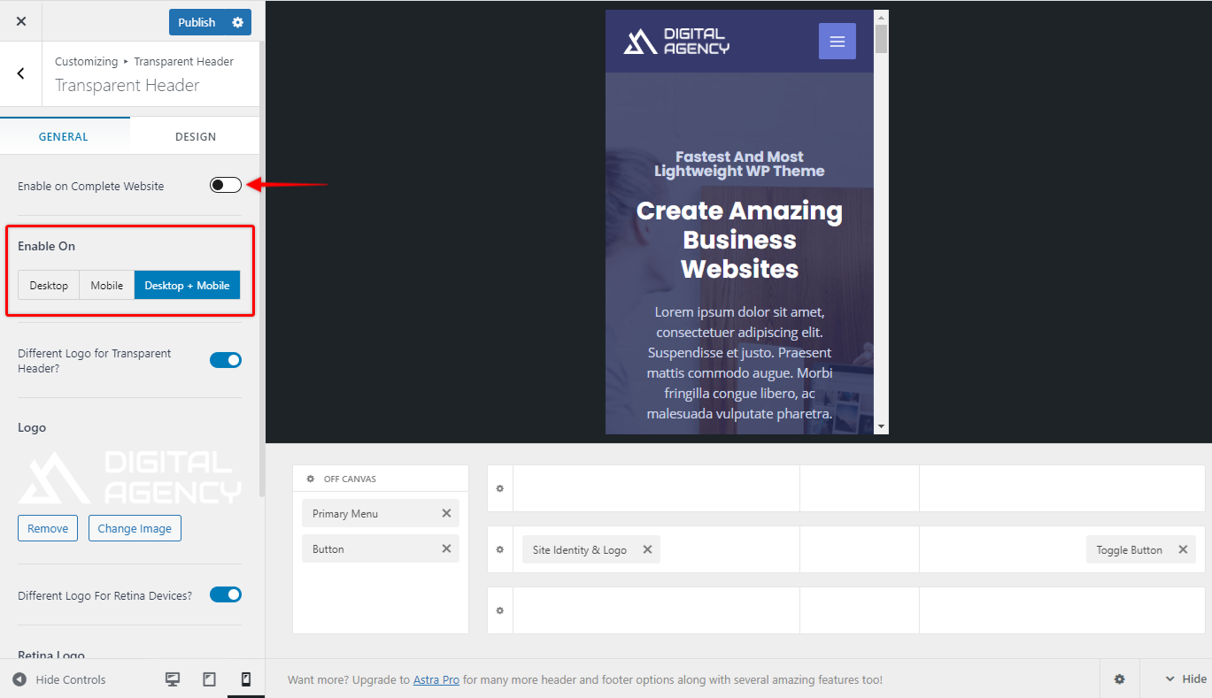
Step 7 – You can enable Transparent Header for mobile from customizer under Header Builder > Header Types. Choose to display it on mobile and configure it.

Similarly, With Astra Pro, you get an option for Sticky Header.
