Note:
We have recently released the Header Footer builder in Astra version 3.0.0, due to which you will find some new changes. Please refer to the following article for the same.
Now, you can add the Button element visually using the Header builder as the Last Element and make further changes as previously.
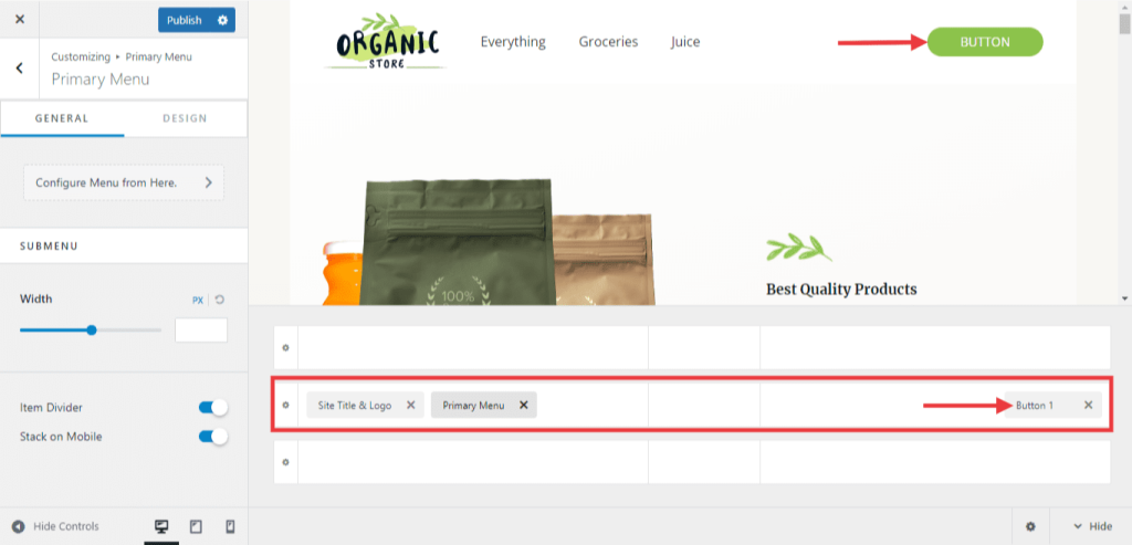
From WordPress Dashboard, navigate to Appearance > Customize > Header Builder > Primary Menu. Then, you can see the above header, primary header, and below header modules. On the primary header row, by clicking the + icon, you can see button1 and button2. Click the button of your choice and can make the text changes as per your requirement.
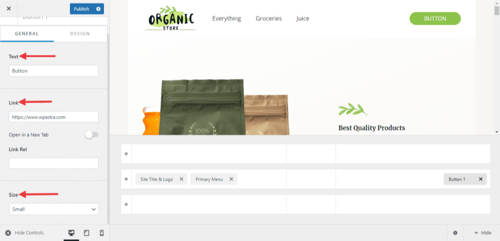
On clicking the button, you will be able to see the customization options on the left side of the editor. Here, you can change the button text and can add a button link. Also, you can select the button size from the available options.
You can also style the button under the ‘Design’ tab. This allows you to style the header button differently than a theme default button. It will offer the following options under the design section –
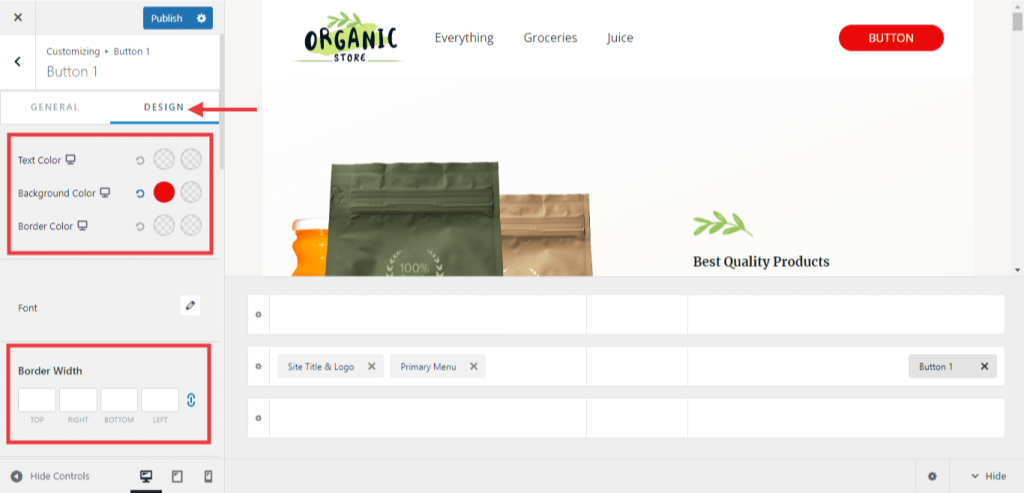
- Colors – Set the Text Color, Background Color, and border color.
- Border width and radius– Set the Border width and radius here.
- Box Shadow – Set the box shadow value, position and color.
- Padding – Set the overall Padding for the Header Button.
For Mobile Devices:
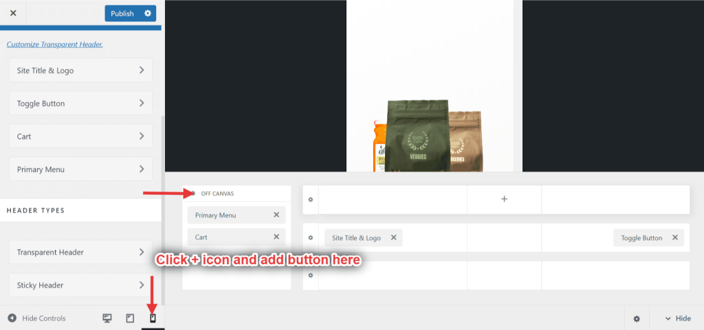
From WordPress Dashboard, navigate to Appearance > Customize > Header Builder. There, at the Hide controls, select Mobile device. Then, you will be able to see the off-canvas menu. Click + icon and add the button as the last item in the menu. Once you make the changes, don’t forget to click the ‘Publish’ button.
Following are the settings for Astra theme below version 3.0.0.
From WordPress Dashboard a setting can be found under Appearance > Customize > Header > Primary Menu > Last Item in Menu.

Choosing Button from Last Item in Menu dropdown will offer the following options –
1. Button Text – Add a text
2. Button Link – Give a link for the button
3. Button Style – With this option button can be displayed differently for different headers like primary header, transparent header, sticky header (option with Astra Pro). Below is the detailed description –
Button Style
1. Theme Button: Set a button style same as a theme button style. Choose a Theme Button option and click on the Customize Button Style link. The link will take you to the default button style options.
If you wish to set a similar style for all button on the site and different style just for the header button choose Theme Button option and click on the Customize Button Style link.
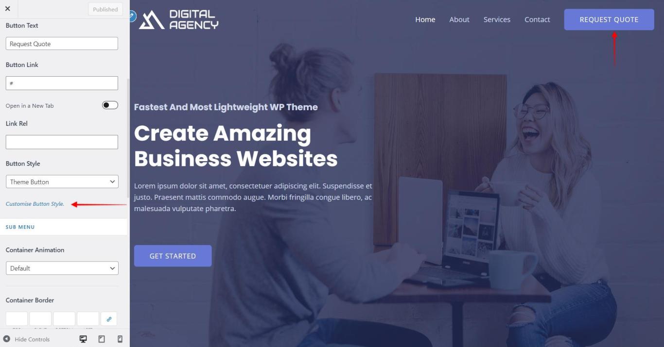
The Customize Button Style will redirect you here –

2. Header Button: This allows you to style the header button differently than a theme default button. It will offer the following options under the Header Button section –
- Colors – Set the Text Color, Background Color and also on Hover.
- Border – Set the Border width, Color, Hover Color, and Border Radius.
- Padding – Set the overall Padding for the Header Button.
Note: Header button styles cannot be set unless the option Header Button is chosen for the Button Style.
