Parallax scrolling is a great effect that can give your website a unique look and feel. Parallax scrolling allows your background to move slower than the foreground. This creates the illusion of depth and movement on the website for the visitors.
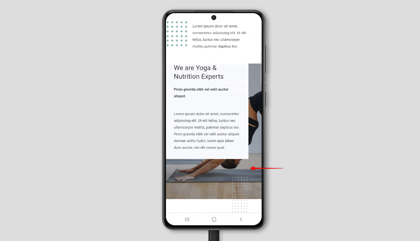
If you check it on mobile devices, you’ll notice that your parallax sections don’t work but show static images instead. This document will help you understand why this is happening and how you can work around it.

Why Is This Happening?
The parallax scrolling effect is created by setting your background image position as “fixed” (background-attachment: fixed). This fixed image effect (parallax) is currently properly supported only by the Mozilla Firefox browser.
When you use other browsers on any touch device, parallax scrolling will be overwritten for compatibility reasons. As a result, you will only see a static image instead of your parallax.
Due to responsiveness issues with parallax scrolling on mobile browsers and performance concerns, most mobile browsers still don’t support it.
What Can Be Done?
Since version 3.0.0 Astra Theme comes with the Header Footer Builder. Thus, you can add a parallax scrolling effect for both the header and footer as Header Footer Builder supports it.
Let’s show you how to activate this option, for example, for your Primary Footer:
Step 1 – Log in to your website and navigate to Dashboard > Header Builder > Primary Footer> Design > Background
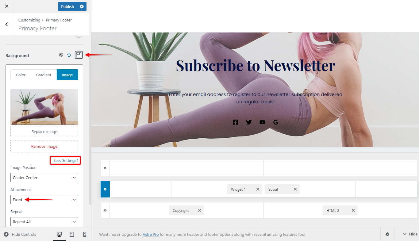
Step 2 – Here, set your background image, and click on “More Settings”
Step 3 – Under the “Attachment” dropdown, select the “Fixed” option. “Publish” to save changes.

Now that you have your parallax effect set on your desktop, you can add separate settings for different screen sizes since parallax scrolling doesn’t work on mobile. You can use Astra’s responsive editing options to remove parallax and design your footer (or header) for Tablet and Mobile. For this, continue with the following steps:
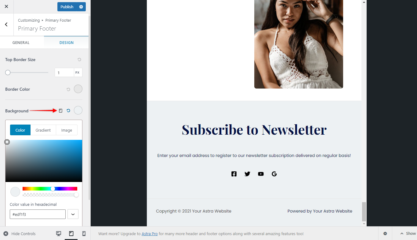
Step 4 – Switch to Tablet/Mobile editing by clicking on the responsive editing icon on the “Background” option.

Step 5 – Edit your Background settings for tablet/mobile and “Publish”
This way, you will be able to have parallax scrolling on desktop screens while having well-designed header and footer sections on tablet and mobile devices at the same time.
What About The Content?
Most often you will add content to your pages and posts by using page builders. Thus, the Astra theme parallax settings will not be applied here.
Therefore, you can use the Page builder responsive editing options in a similar way to Astra’s Header Footer Builder.
Still, in some page builders (Elementor), you will not be able to separately adjust these settings for different viewports. Here, your parallax scrolling will automatically be replaced by a static image.
