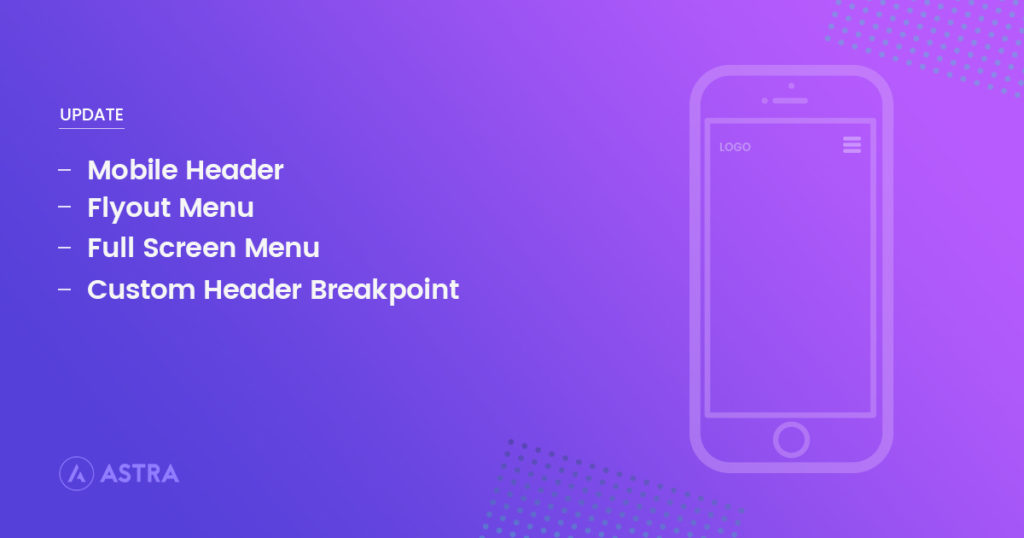
As hinted in my previous blog post, we have been working on Mobile Header options.
And today, I’m excited to announce the beta version 1.4 of Astra and Astra Pro that introduce the amazing option which makes it easy to have gorgeous Mobile Header without any custom code ?
Here are just some sneak peeks of the possibilities:

Custom Breakpoints:
Choose your own breakpoint to enable mobile header.
Different Logo for Mobile
Need to display a different logo on mobile devices? Now, you can easily do that!
Stunning Menu Styles
We’re introducing two new styles for the menus: Flyout and Full-Screen.
Flyout menu appears from the edge of the screen with slide animation. And Full-Screen menu is displayed in a popup that covers the entire screen.
Typography & Colors
Besides these new features, we have added Colors and Typography options for mobile headers, so design exactly as you need.
Give it a try!
This is a beta release and we encourage you to try it your staging and development sites and let us know how you like it.
To get started, backup your website and follow the steps below:
- Download the beta versions of the theme and plugin from the members area.
- Delete the currently installed Astra theme and Astra Pro Addon plugin from your site. Don’t worry you won’t lose any data.
- Install the downloaded zip files in step 1, just like any WordPress theme and plugin.
- Enable the new mobile header module in Astra Pro and navigate to Customizer
- Layout related options under: Layout ▸ Header ▸ Mobile Header
- Fonts and related options under: Typography ▸ Header ▸ Mobile Header
- Colors related options under: Colors ▸ Header ▸ Mobile Header
That’s about it! If there are any improvements or features you would to see in this update, please feel absolutely free to let us know. We look forward to see what kind of mobile headers do you build with these new amazing options!
Cheers!
Disclosure: This blog may contain affiliate links. If you make a purchase through one of these links, we may receive a small commission. Read disclosure. Rest assured that we only recommend products that we have personally used and believe will add value to our readers. Thanks for your support!

Awesome work Sujay and team! I’m sure many people will be rather excited to see this update. Thanks guys and gals.
Great work Sujay. I would love to see some more options for the Desktop version as well, e.g. inline logo, or sidebar navigation, two options which I’ve seen in Beaver Theme .
You guys ROCK. Thanks a lot. I will give the beta a try.
Nice. I’m using a plugin for a flyout menu option. This should simplify.
Man, was I waiting for an update like this. Awesome work Astra Team
Yes, I do love seeing the mobile options, but we do primarily desktop first work and I would love to see more desktop options to make the desktop rock.
Yes! what we’ve been waiting for! Now do desktop flyout and fullscreen too please!
Yes, That will be the next update where we bring navigation menu addon which will extend the current desktop menus
Is there an official release date for this update? So anxious to implement it.
When will the 1.4 be fully released?
We just released second beta versions for mobile headers updates. Check the changelog here
We will try to release the stable release in next few days.
Really excited about this. Any idea on your time frame?
We just released second beta versions for mobile headers updates. Check the changelog here
We will try to release the stable release in next few days.
This is sooo cool. It will be even more awesome if you can have a “smooth“ toggle effect, you know what I am talking about here?
Yes, That is in our plan to add transition animation for the navigation toggle menu.
You guys need to add a flyout option for woocommerce cart for mobile. Similar to the flyout menu option for the regular menu.
Flyout Sidebar already exists for WooCommerce from Astra Pro. It’s called “Off-Canvas Sidebar” in WooCommerce Settings. Check out the documentation here
The “Off Canvas Sidebar” is only for the WooCommerce shop page filter (the documentation states, “It will not trigger it on any other page”). I believe Chad is referring to a global flyout option for the shopping cart for mobile.
Hello, is it possible to get sub-menu items expanded by default ?
Hi, there is a way to use a different menù for mobile with your theme? ThankYou
Hello,
Sorry, we don’t have any option where you can assign a different menu for mobile devices.
However, you can use any third-party plugin to add a different menu for a mobile device.