Black Friday is just around the corner and everyone is gearing up for the year’s best deals.
Savvy shoppers will expect to find something different when they visit your site. So what can you offer them to make their shopping experience more exciting?
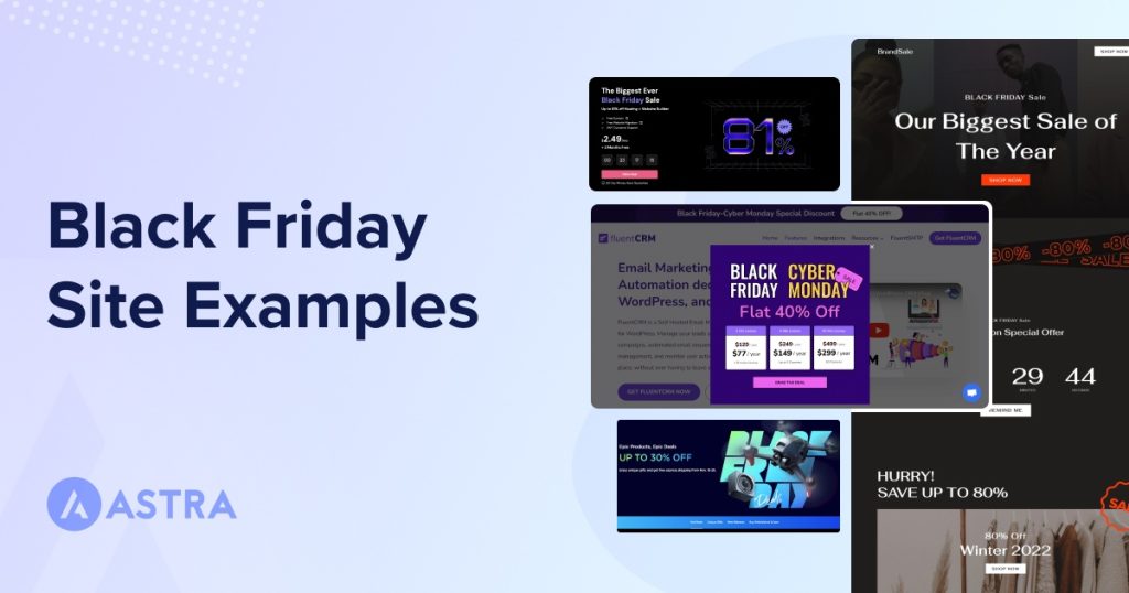
We’ve compiled a list of Black Friday websites and landing pages that will give you new design and marketing ideas for this sales season.
If you’re struggling to come up with something compelling, perhaps one of these will give you the inspiration you’re looking for!
First of All, a Productivity Tip!
If you work on your own you’ll find it very easy to grab some specific ideas from this list, apply them to your site and make changes until you get the result you’re looking for.
But if you work in a team things will become a little bit more complicated, as you’ll have to give feedback to your designers and developers.
Client: Can you change the color of the border of the third foto on the right to black?
Designer: this one?
Client: No, not that one! The other one!
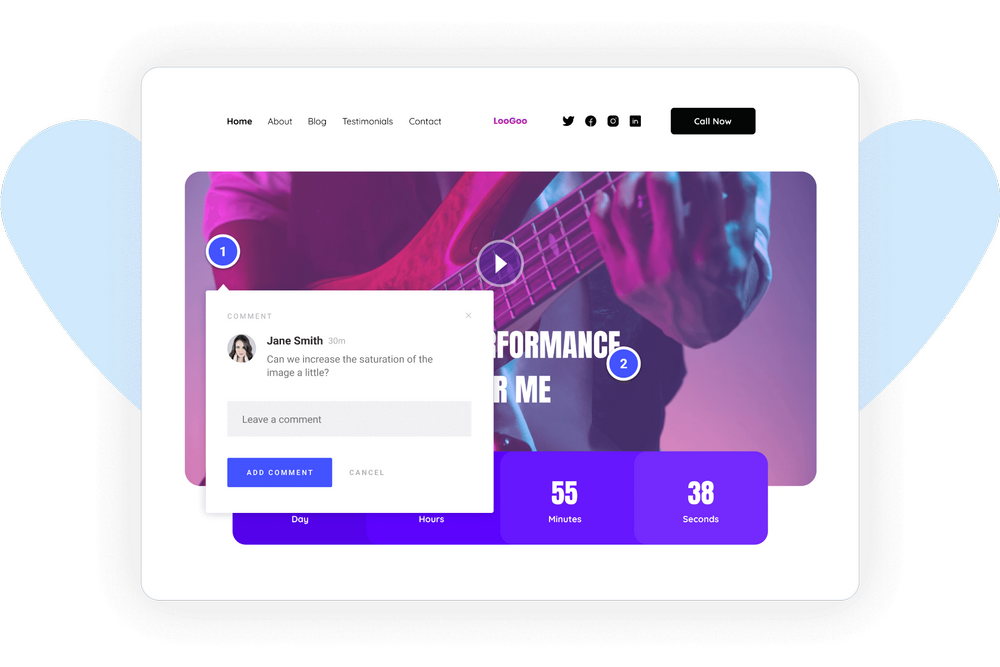
To avoid that back and forth of emails that only clutters your inbox and to avoid your requests getting lost in a crowded Slack channel, we recommend you start using SureFeedback.
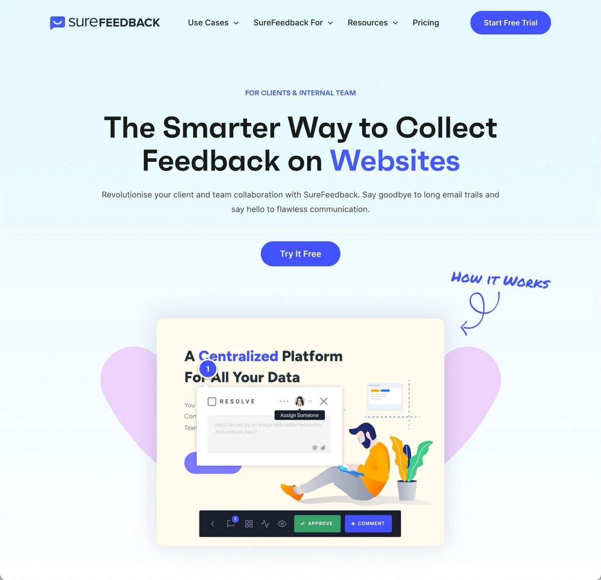
It’s a fast, efficient way to communicate with your team or client directly on the website you’re working on.
Just click wherever you’d like to make a change, add your comments and you’re ready to go!
Best 7 Black Friday Website Examples
Use these examples to find inspiration for a successful Black Friday campaign!
1. Amazon
You cannot talk about selling online without talking about the king in this space: Amazon.
Amazon is not known for changing its interface or appearance drastically and for good reason.
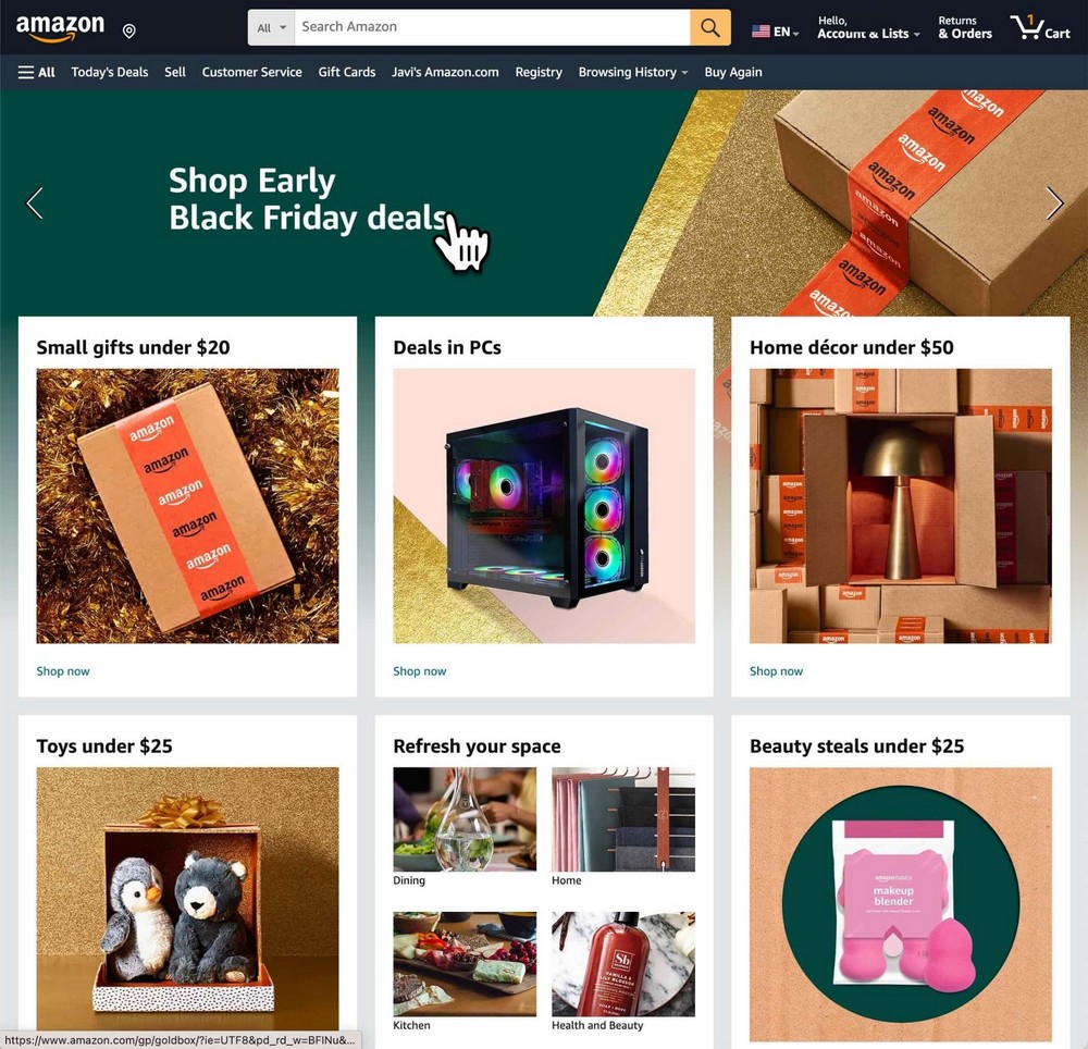
Amazon customers usually enter the website looking for a good price, free shipping and a good return policy.
So once they get to the homepage the call to action is clear: there are Black Friday deals, click here to see them.
Everything else is familiar and relatable, making the visitor feel right at home.
That’s one of the simplest approaches you can follow: Keep the design intact and just add a banner pointing to the Black Friday landing pages with the offers.
How To Do Something Similar
If you use Astra you’ll find several spots where you can add your Black Friday banner.
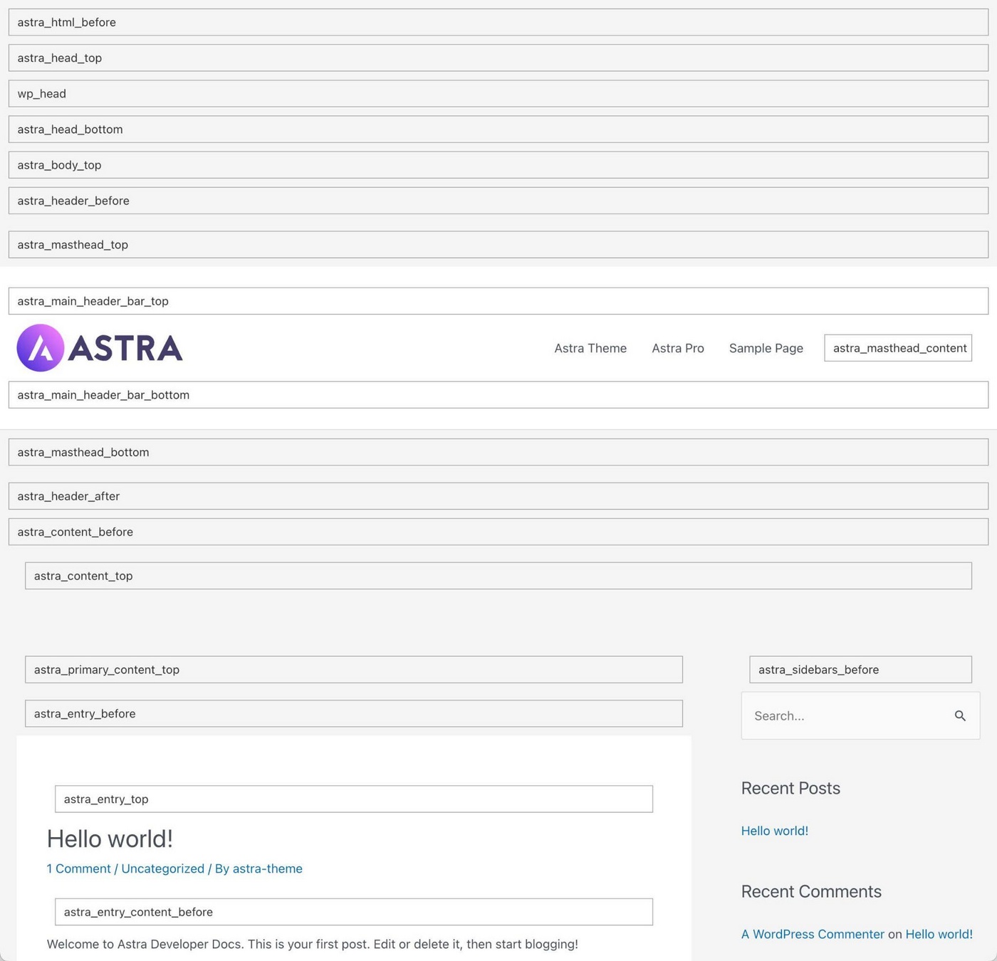
Here’s a video tutorial that shows you how to do it step by step:
2. FluentCRM
FluentCRM is another example of how to promote deals during Black Friday without changing your main design.
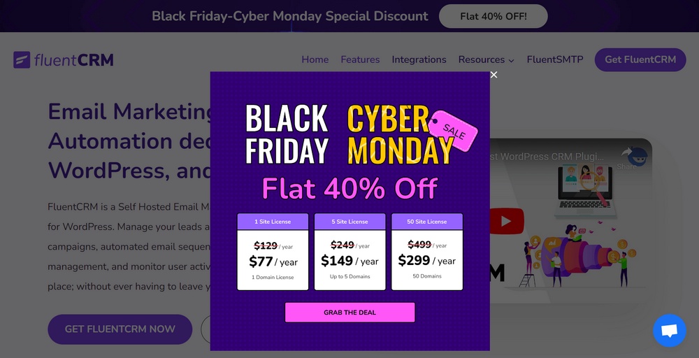
The trick here is not adding just a banner on your homepage, but a popup instead.
This way all your visitors will see the deals, no matter if they are reading a blog post, on your homepage, or browsing your store.
Not everyone likes popups and some browsers block them, but this is a simple and very effective way to promote Black Friday without changing your website.
How To Do Something Similar
Spectra Pro comes with a powerful yet easy-to-use popup builder. You can set different triggers and display rules, so you’re in absolute control of where the popup appears.
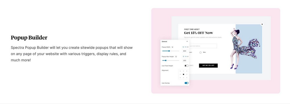
If you have used Spectra before, the popup builder uses the same menus and controls so you should be able to create something amazing with very little effort!
3. Hostinger
Hostinger doesn’t simply add a banner like Amazon but changes its homepage.
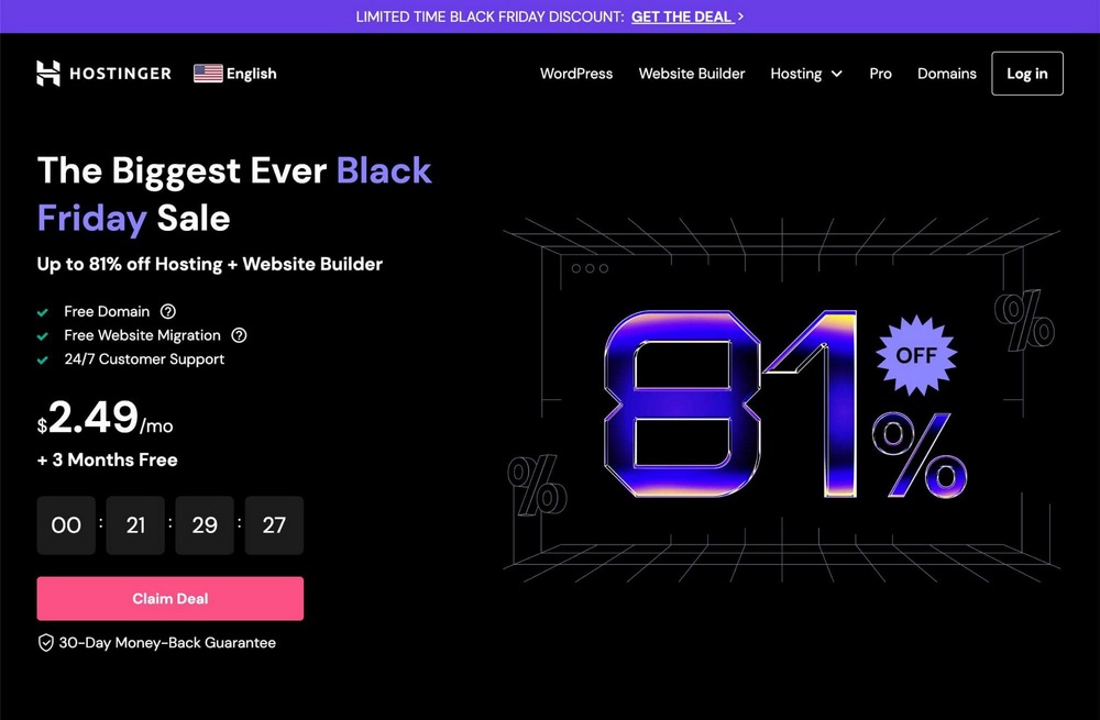
This puts the client firmly in the Black Friday mood!
Compare it to what the homepage looks like the rest of the year and you can see just how big the changes are.
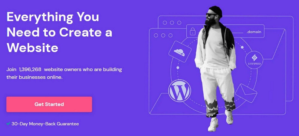
Besides the colors, the displaying of prices and deals and the different hero image, there is another important key factor here: the countdown.
Black Friday is not just about a Friday anymore.
Many sites have a Black Week, some extend their deals for longer and others keep it to Black Friday and Cyber Monday.
The result is that nowadays it is not always clear when Black Friday deals expire.
Having a countdown will help customers understand this while urging them to make a purchase.
Plus, there’s nothing like a countdown to instill a fear of missing out to help conversion!
How To Do Something Similar
Astra Pro has a neat feature that lets you create multiple headers.
This is handy because it lets you give your website a new appearance without having to change the whole theme.
For instance you might use a transparent header so the black background design is better seen on your homepage, or use a black header across the web temporarily.
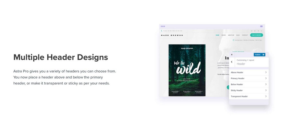
Spectra Pro also includes a countdown builder. It works in much the same way as the popup builder and is very simple to create countdowns for any reason.
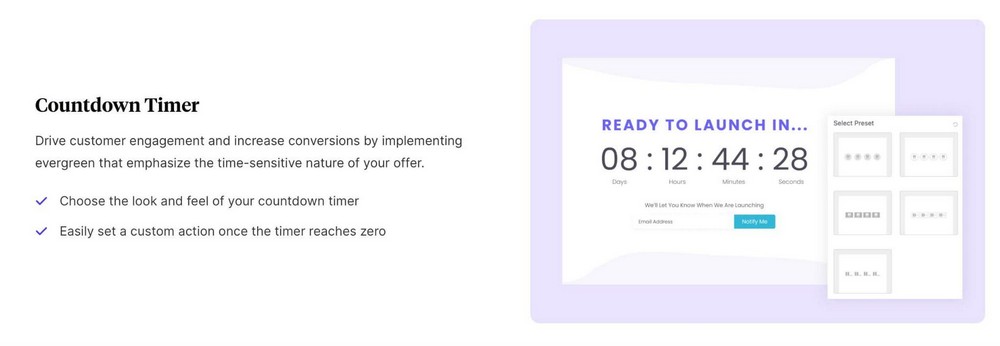
You can also add custom actions when it gets to zero and include evergreen countdowns that never run out. You have full control over the countdown block so it’s entirely up to you how you use it!
4. Nike
Nike also likes to keep things simple in their store on Black Friday. There is more made of the sale elsewhere, but the store pages are purposely kept minimal.
Aside from the simple banner at the top, there’s very little that’s different than any other day.
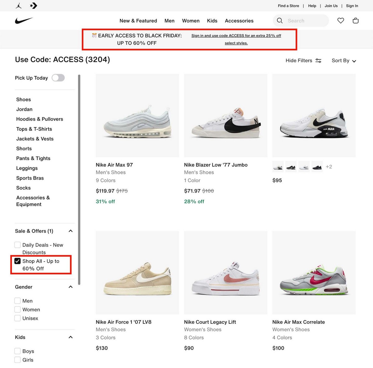
Besides the top banner, Nike has added a new filter in their store to quickly find all the Black Friday deals.
This is quite clever. Rather than segregating Black Friday deals from the rest of the store, there’s a filter where you can browse both sale and non-sale items.
Even if there’s nothing you want in the sale, it doesn’t mean you’ll leave empty handed!
How To Do Something Similar
Astra Pro has a greater integration with WooCommerce, one of the top leading eCommerce platforms for WordPress.
You can create new product pages with a different design specifically for sales.
You could add a banner like Nike or use other methods depending on your brand.
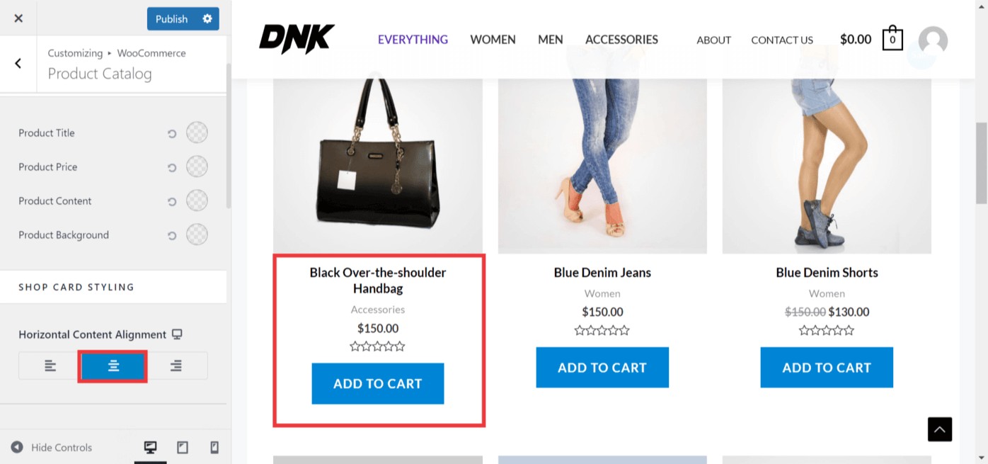
If you want to show all products and not only those with a discount, you can enable attention-grabbing sale bubbles too.

You can customize the shape, color and text, so it’s very easy to adapt them to your liking!
5. DJI
DJI is a brand with a relatively small product catalog. That’s why they can manually gather all their product deals on a specific landing page.
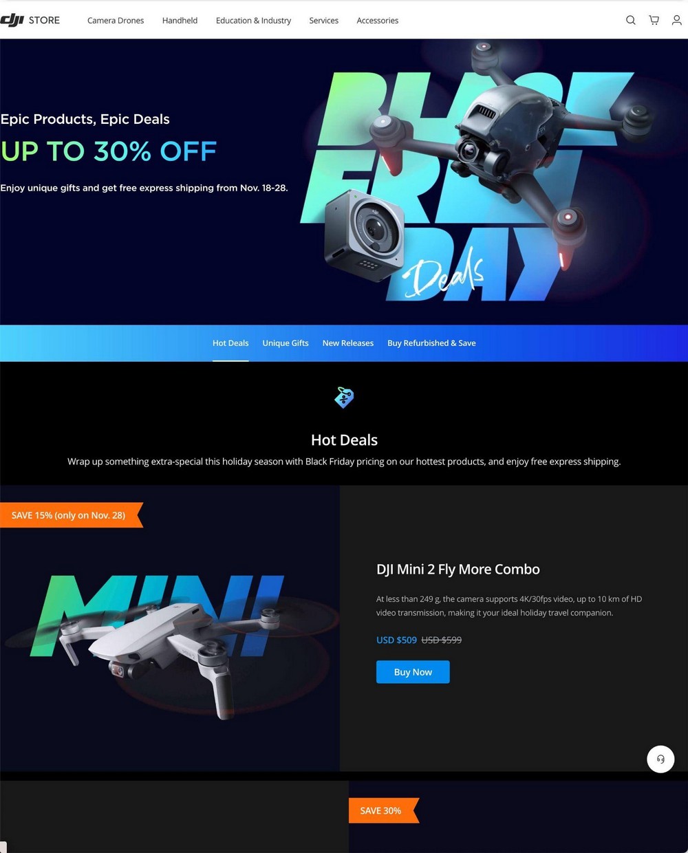
If you want to create the same level of drama, a black background is always the way to go!
Besides the main hero image, DJI has added a secondary navigation menu so users can quickly navigate between sections without having to scroll much.
How To Do Something Similar
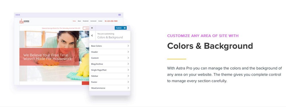
With Astra Pro you can easily customize the colors of any part of your website. So you can add that predominant black color that your users expect anywhere on the page!
And thanks to Astra’s Sticky Header Pro addon you can easily create menus that stay visible while visitors scroll.
Sticky Header in Astra Header Footer Builder
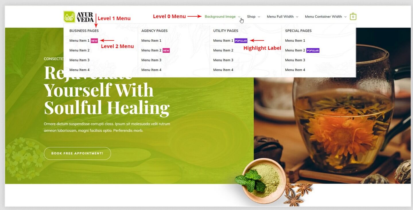
If you have more products than DJI but still you want to show them all in your menu, try the Astra Mega Menu addon.
It will let you display several items in a very organized way. You can even add highlights to drive attention to your more popular sales.
By the way, creating on-page anchor links to scroll to certain parts of the page with a click is easier than you might think!
6. pCloud
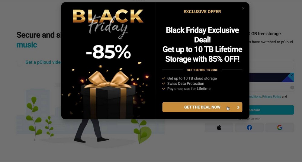
pCloud runs its Black Friday deals within a particular landing page that gets you in the mood for the sale.
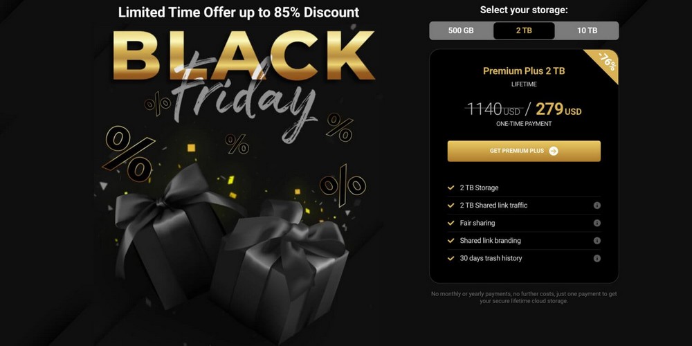
This design is the complete opposite of the light colors they normally use so it makes quite the impact.
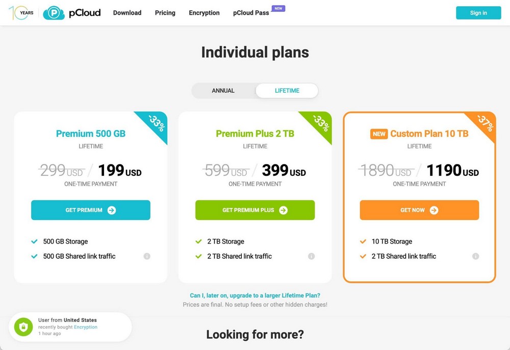
They drive traffic to that landing page using a popup, something that you’ve already seen.
How To Do Something Similar
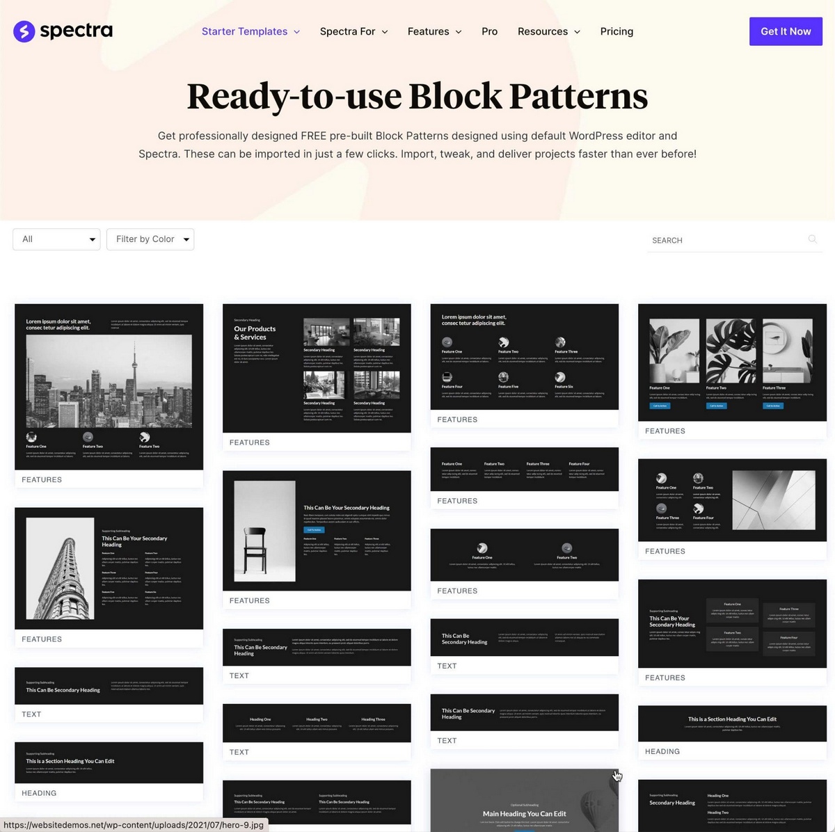
You can create unique designs for sales using Spectra Pro. You can then create a popup to help drive visitors towards them.
Spectra Pro comes with dozens of block templates to quickly showcase features, FAQs, calls to action, hero images, and all the things you could ever need to design an outstanding landing page.
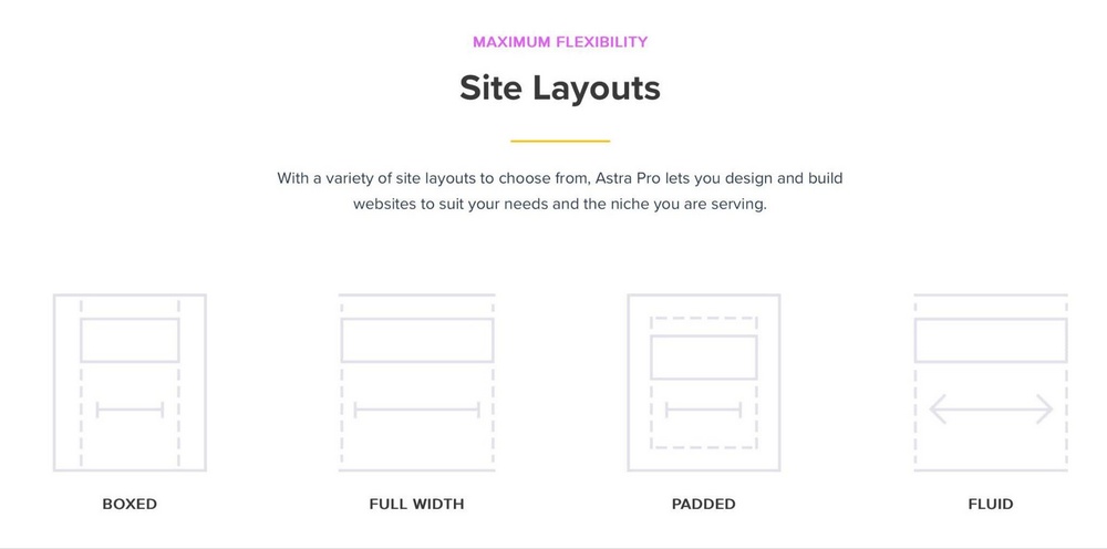
Combine that with Astra’s Site Layouts and you’ll have a powerful solution to create the design you need in a simple way.
7. Starter Templates
As you’ve seen many of the big players follow a simple and similar approach.
- They create banners and popups to let users know about the deals.
- They create specific pages for those deals that are either:
- Landing pages with a neat design and all the deals manually picked and displayed.
- Product catalogs with a filter for Black Friday deals or a custom discount coupon.
But if you’re all-in for Black Friday, you could change your whole design by using a different theme.
You’ll find one specific for the sales season at Starter Templates, which is included in the Astra Pro bundle.

You could create a staging site and duplicate your standard pages with this new design, switch it to live for the sales and switch it back once you’re done.
It’s much easier to do than you might think!
Wrapping Up
Creating a captivating and high-converting Black Friday website is not hard if you have the right tools.
An eye-catching and intuitive design should go hand in hand with effective marketing tactics. That’s the winning combination.
You’ll find more ideas in our website tips for Black Friday guide!
Is there any other Black Friday website that has grabbed your attention? Let us know in the comments below!
Here’s to a successful Black Friday!
Disclosure: This blog may contain affiliate links. If you make a purchase through one of these links, we may receive a small commission. Read disclosure. Rest assured that we only recommend products that we have personally used and believe will add value to our readers. Thanks for your support!
