A mobile menu is a special type of menu designed specifically for small screens like smartphones and tablets. This is the hamburger icon that readers can click on and use to navigate different sections of your website.

It is important to ensure that your website delivers a consistent user experience on any device.
Astra Header Builder provides a dedicated option to design a mobile menu.
Here’s your comprehensive guide to building a mobile menu with the Astra theme, which allows your website visitors to effortlessly navigate your site on their smartphones.
Creating a Mobile Menu
To create a mobile menu in Astra, you can follow these steps:
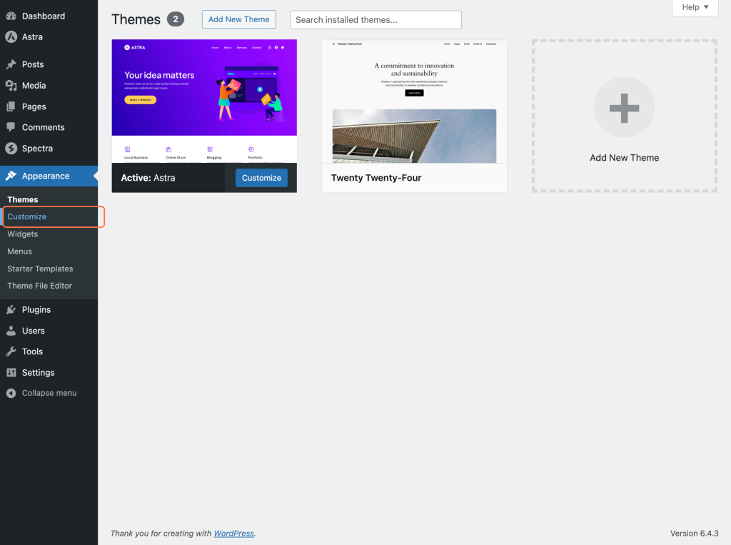
Log in to your WordPress dashboard and navigate to Appearance > Customize.
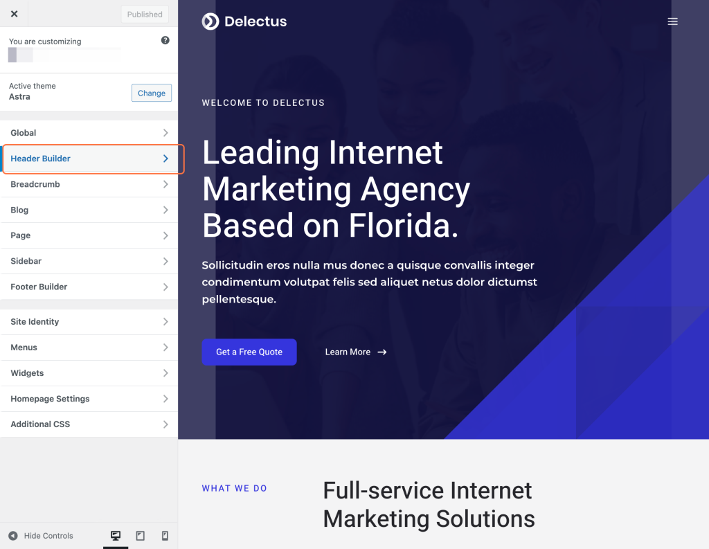
Within the Customizer, find the section labeled Header Builder.
Switch to Mobile View in the Customizer: You will observe a separate dedicated box for a mobile view in the visual header builder.
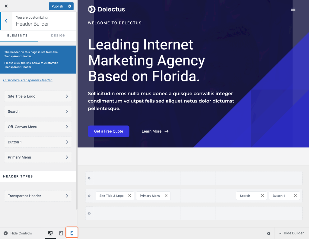
The off-Canvas section allows you to configure header items inside the toggle button. Usually, you would have your logo and toggle button in your Primary header here, but there are no limits to where you can place elements in your mobile header.
Click on the + icon to add a mobile menu.
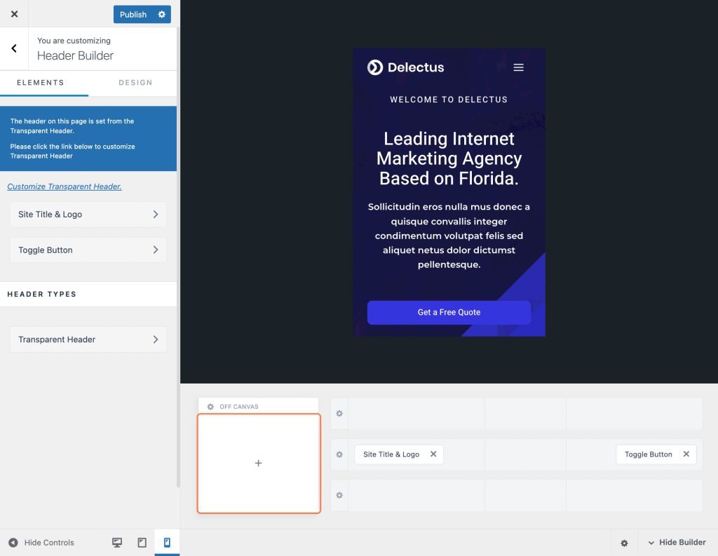
Select the Off-Canvas Menu option to add a mobile menu.
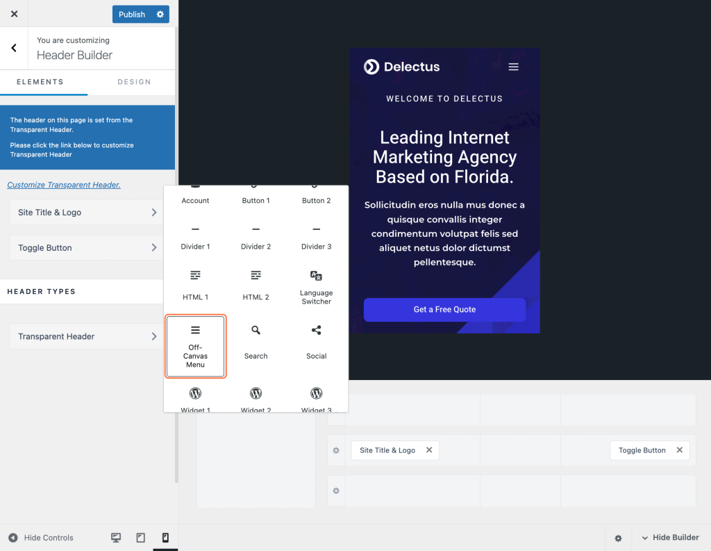
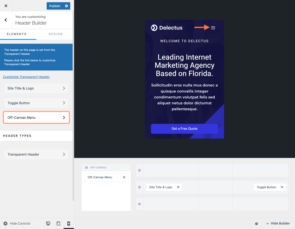
A new option named Off Canvas Menu will be visible in the side menu. Access this option to customize your mobile menu settings.
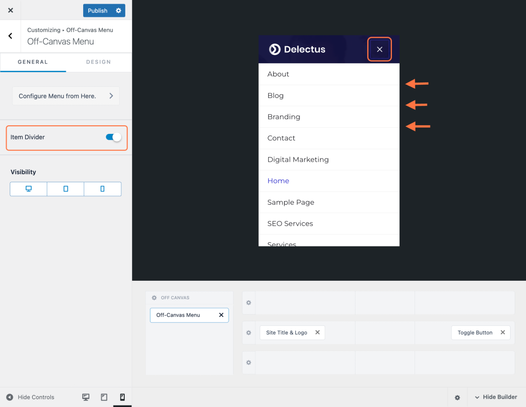
You will find some options in the General section including the option to enable Item Divider. This adds a line between each menu item, separating them for a better look.
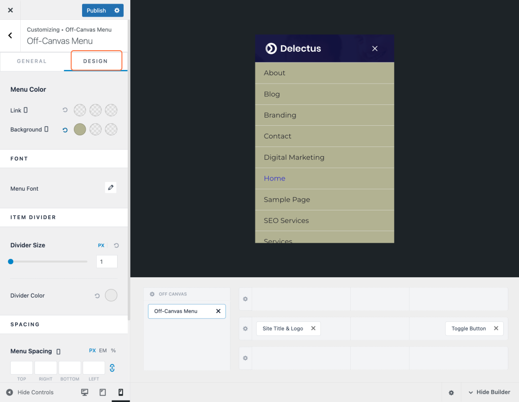
You will find all the color and appearance options in the Design tab.
Once satisfied, click the Publish button to make your changes live on your website.
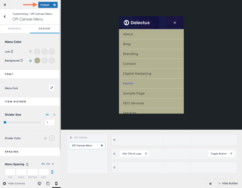
After publishing, test the mobile menu on different devices to ensure it displays correctly and functions properly on mobile devices.
By following these steps, you can easily create a mobile menu in Astra and optimize your website for mobile users.
